Create a FREE Account
Instant access to 1,000+ real slides from top companies like McKinsey, BCG, Goldman Sachs, Google and many more!
First Name
Last Name
Email
Password
I agree to all
Terms & Privacy Policy
Thank you! Your submission has been received!
Oops! Something went wrong while submitting the form.
Have an account?
Sign in
Library
Templates
Courses
Pricing
My Account
My Slides
My Templates
✦ AI
AI Prompt Library
AI Search
Sign in
Start Here
Logout
My Saved Slides
Circle chart and bar charts showing worker satisfaction levels across different SEA countries.
Market Analysis and Trends
Financial Services
This slide presents the levels of worker satisfaction in various SEA countries, indicating a significant portion of dissatisfaction.
worker satisfaction, SEA, circle chart, bar chart, survey
Multiple Chart
IPSOS
Saved
The slide features multiple icon-based indicators representing key business aspects, such as lending, investment, and innovation, accompanied by column charts reflecting loan origination metrics. Layout is well-organized with a clear division between text and graphical data.
Financial Performance
Financial Services
This slide discusses JPMorgan's strategic positioning in commercial real estate, emphasizing innovations and results in loan processing speed and investments.
CRE, lending, innovation, real estate, performance, investment, transparency, risk management, digital delivery
Mixed Chart
JP Morgan
Saved
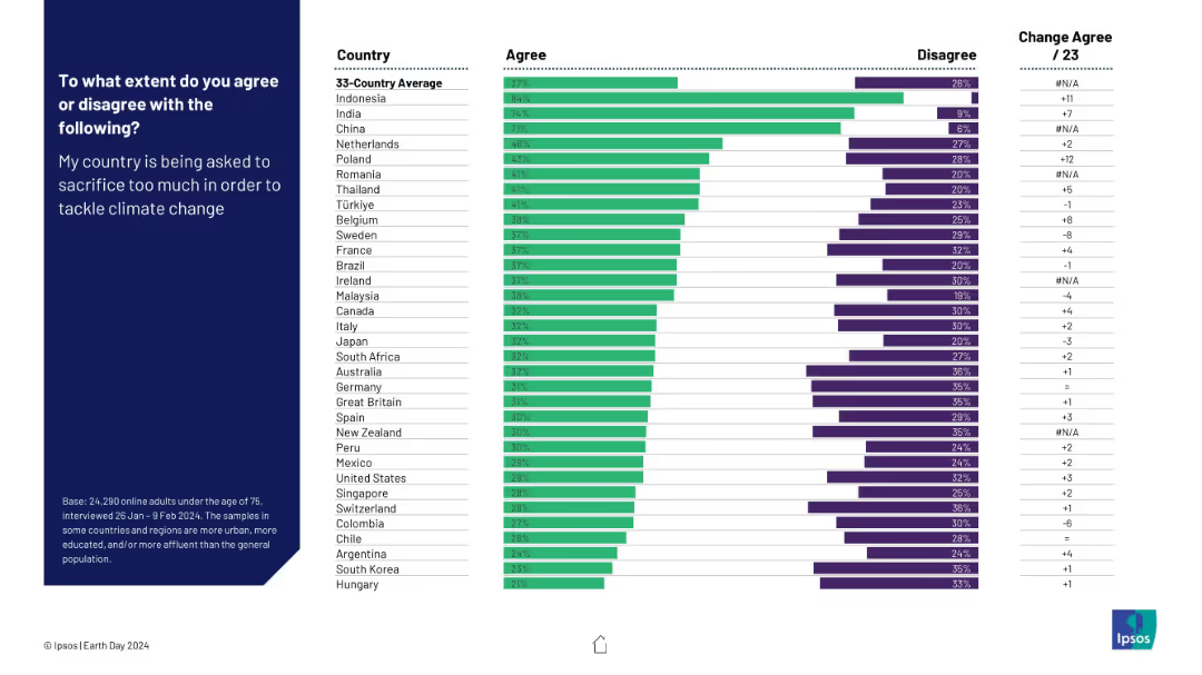
Bar chart comparing country-level agreement and disagreement with the sentiment that their own country is being asked to sacrifice too much for climate action.
Risk Assessment and Management
Environmental Services & Sustainability
This slide reveals the degree to which populations feel their own countries are unfairly burdened in climate action efforts. India and China report the highest levels of agreement, signaling potential resistance or fatigue in contributing more to global climate goals.
climate burden, national sacrifice, public resistance, climate fatigue, equity concerns, international cooperation, Ipsos, Earth Day
Mixed Chart
IPSOS
Saved
The slide features a bar chart depicting the ability of respondents to correctly identify crypto assets, comparing 2023 to 2022.
Technology and Digital Transformation
Financial Services
This slide shows the percentage of respondents who could correctly identify crypto assets, highlighting changes between 2023 and 2022. It is useful for assessing awareness and knowledge levels.
Crypto, Identification, Awareness, Knowledge, Comparison
Mixed Chart
IPSOS
Saved
Column charts and tables are used to display IPO numbers and proceeds for Mainland China and Hong Kong stock exchanges.
Market Analysis and Trends
Financial Services
The slide highlights key IPO market data for Mainland China and Hong Kong, including sector breakdowns and changes from 2021 to 2022.
Mainland China, Hong Kong, IPOs, stock exchanges, sectors
Multiple Chart
EY
Saved
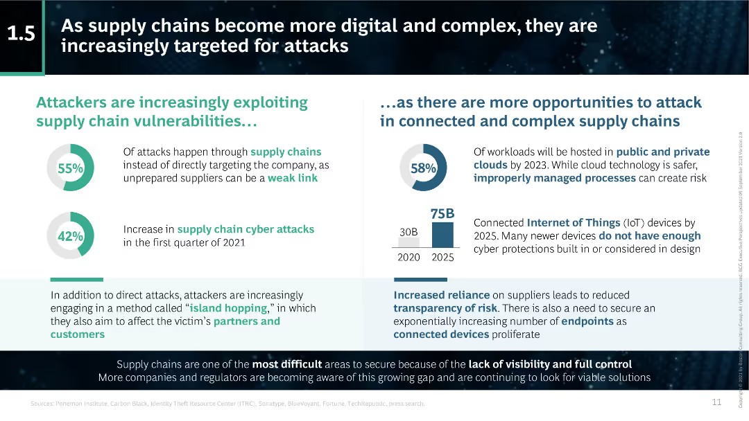
The slide features statistics and pie charts highlighting the vulnerabilities in supply chains and the increase in cyber attacks targeting these vulnerabilities.
Risk Assessment and Management
Transportation & Logistics
This slide explains how the increasing digitalization and complexity of supply chains make them more susceptible to cyber attacks. It includes data on the percentage of attacks occurring through supply chains and the rise in such attacks during 2021.
supply chains, digitalization, complexity, cyber attacks, vulnerabilities, statistics, pie charts, BCG
Multiple Chart
BCG
Saved
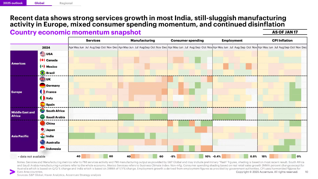
Grid heatmap comparing Services, Manufacturing, Consumer Spending, Employment, and CPI Inflation across countries and months. Color-coded scale visualizes relative activity/momentum.
Market Analysis and Trends
Financial Services
A color-coded economic snapshot across global regions shows stronger services momentum in India and sluggish manufacturing across Europe. The heatmap allows visual comparison of economic indicators like CPI, employment, and consumer spending as of January 2025.
Economic Momentum, Heatmap, India, CPI, Employment, Services, Manufacturing, Consumer Spending, Regional Analysis
Single Chart
Accenture
Saved
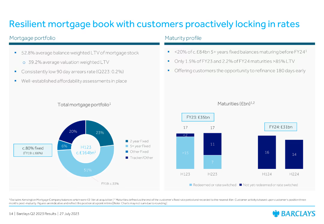
The slide includes a pie chart for mortgage portfolio composition and a column chart for maturity profiles over different periods.
Risk Assessment and Management
Financial Services
The slide discusses the resilience of the mortgage book, with data on average loan-to-value ratios and maturity profiles, emphasizing customer behavior in locking rates.
mortgage, portfolio, resilience, customer, rates, LTV, maturity, financial, pie chart, column chart
Multiple Chart
Barclays
Saved
Bar chart showing percentages of various HRIS types, including outsourced, off-the-shelf, and in-house solutions. The largest bar represents HRIS custom developed by outsourced specialists at 46%.
Human Resources and Talent Management
Professional Services
This slide displays a bar chart categorizing HR information systems by type within organizations, highlighting the prevalence of outsourced solutions.
HRIS, outsourcing, in-house, off-the-shelf, bar chart
Single Chart
PwC/Strategy&
Saved
Slide presents a column chart showing marketers' ratings on how climate-related changes influence customer experience, divided by business sectors.
Product and Service Analysis
Environmental Services & Sustainability
Evaluates marketers' beliefs regarding the impact of climate-related changes on customer experience, providing insights across different sectors.
climate change, customer experience, product changes, marketer opinions, sustainability
Mixed Chart
Deloitte
Saved
Contains line charts depicting the growth in exports and FDI outflows for several country groups, presented with a clean and organized layout.
Market Analysis and Trends
Financial Services
This slide explores the projection of export capabilities and FDI flows, crucial for understanding future economic interactions and investments.
exports, FDI flows, economic analysis, BRICS, investment opportunities
Mixed Chart
Roland Berger
Saved
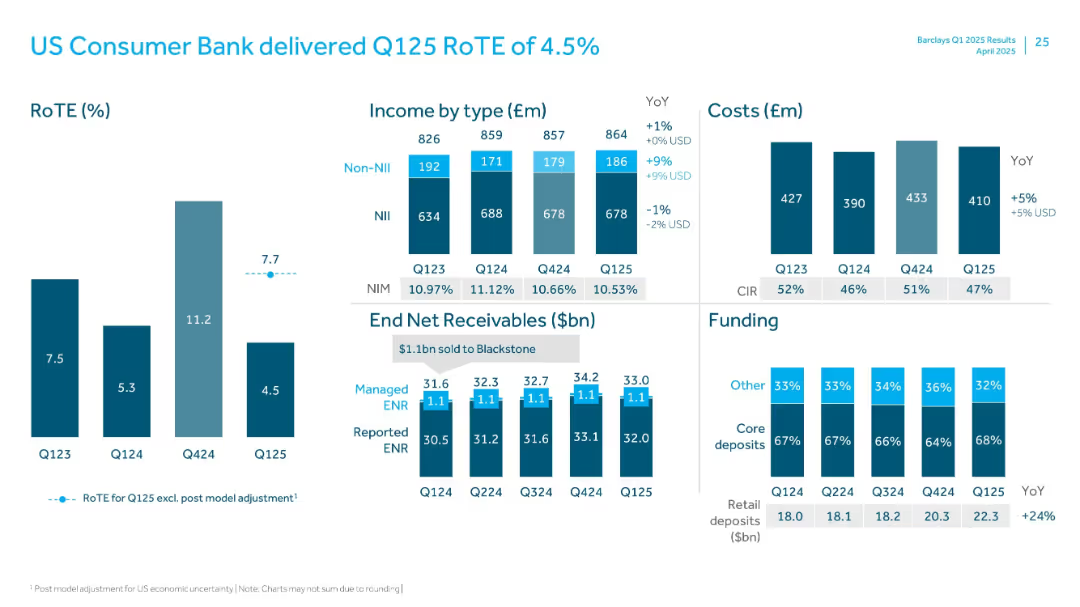
Visuals include RoTE bars, income breakdown, cost bars, ENR trend, and deposit funding mix.
Financial Performance
Financial Services
Analyzes performance of US Consumer Bank with a low RoTE of 4.5%. Contains income and cost breakdowns, net receivables trend, and funding mix. Retail deposits up 24% YoY. Includes post-model adjustment commentary.
US Consumer, RoTE, ENR, Retail Deposits, Income, NIM, Non-NII, Q125
Multiple Chart
Barclays
Saved
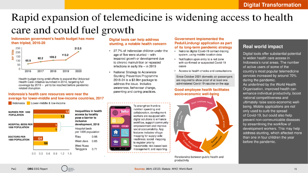
The slide features text sections on telemedicine growth, a line chart of the health budget, and an infographic on healthcare resources. The layout is visually engaging with a balanced mix of text and graphics.
Technology and Digital Transformation
Healthcare & Pharmaceuticals
This slide discusses the growth of telemedicine in Indonesia, focusing on healthcare access improvement, budget increases, and digital tools to address health concerns. It provides insights into the potential benefits of telemedicine for socio-economic development.
Telemedicine, Healthcare, Digital Tools, Indonesia, Growth
Multiple Chart
PwC/Strategy&
Saved
Column charts and tables showing survey results on climate and environmental risk priorities, with a focus on changes expected in the next three years.
Risk Assessment and Management
Financial Services
The slide examines the increasing importance of climate and environmental risks for CROs, detailing priority shifts and the need for better risk management practices.
Climate Risk, Environmental Risk, Priorities, Survey Results
Multiple Chart
EY
Saved
Bubble chart organized by sector activities like 'Manage' and 'Expertise' with color-coded bubbles representing different sectors and their automation potential.
Strategic Planning
Industrial & Manufacturing
Evaluates the automation potential across various sectors, identifying sectors like manufacturing and agriculture with high potential for automation based on current technology capabilities.
Sectors, Automation Potential, Technology, Manufacturing, Agriculture
Multiple Chart
McKinsey
Saved
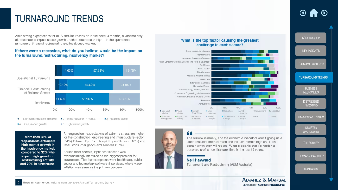
Dual-section layout with bar chart on recession impact across three restructuring areas and a multicolor stacked bar on sector-specific challenges; textual summary and expert quote included.
Strategic Planning
Professional Services
This slide discusses the potential impact of a recession on three key areas: operational turnaround, financial restructuring, and insolvency. It also identifies the top challenges for various sectors, with cost inflation being the most cited issue. The chart reveals significant stress expectations in construction, hospitality, and retail sectors.
recession impact, turnaround, insolvency, restructuring, sector stress, Alvarez & Marsal, inflation, market challenges, Australia
Multiple Chart
Alvarez & Marsal
Saved
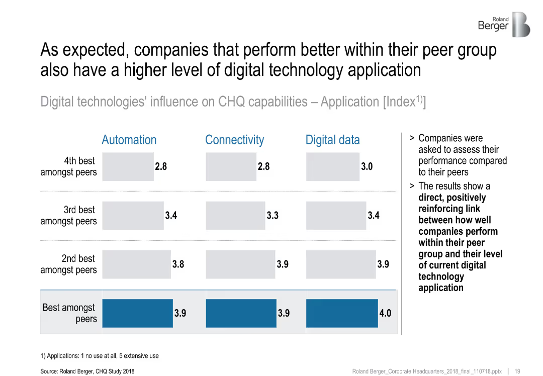
Matrix-style bar chart comparing application levels of digital technologies across peer performance groups
Strategic Planning
Professional Services
This slide shows that top-performing companies have higher levels of digital technology application across automation, connectivity, and data. It reinforces a positive correlation between tech adoption and peer-relative performance.
digital performance, peer comparison, tech application, CHQ, strategy
Multiple Chart
Roland Berger
Saved
Depicts execution rates of expenditure over three fiscal years using vertical thermometers, showing percentages to illustrate fiscal discipline or lack thereof.
Financial Performance
Government & Public Sector
Evaluates the effectiveness of Namibia's government expenditure over three fiscal years, highlighting trends in budget utilization and fiscal management. Useful for assessing government efficiency and fiscal health.
Expenditure, Budget, Fiscal, Efficiency
Single Chart
PwC/Strategy&
Saved
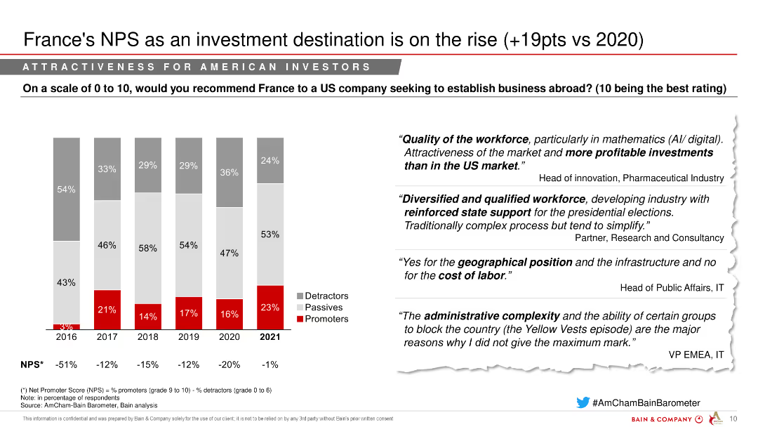
The slide features a column chart displaying the Net Promoter Score (NPS) of France as an investment destination from 2016 to 2021, segmented into detractors, passives, and promoters. Quotes from industry experts are on the right.
Investment Analysis
Healthcare & Pharmaceuticals
This slide indicates an increase in France's attractiveness as an investment destination, with a notable rise in its NPS score in 2021.
NPS, Investment destination, Pharmaceuticals, Market attractiveness, Investment trends
Mixed Chart
Bain
Saved
Similar to the previous slide, this one has a circular diagram with the Goldman Sachs logo at the center. "Continuous Improvement" is highlighted, and there are bullet points for different aspects like "Risk Appetite and Cycle Preparedness."
Risk Assessment and Management
Financial Services
This slide expands on the element of "Continuous Improvement" from the risk management cycle at Goldman Sachs. It enumerates key areas such as risk appetite, regulatory compliance, cybersecurity, and reputation. The slide is suitable for presentations aimed at detailing risk mitigation strategies and preparedness in financial operations.
risk, management, Goldman Sachs, continuous improvement, compliance
Linear Flow
Goldman Sachs
Saved
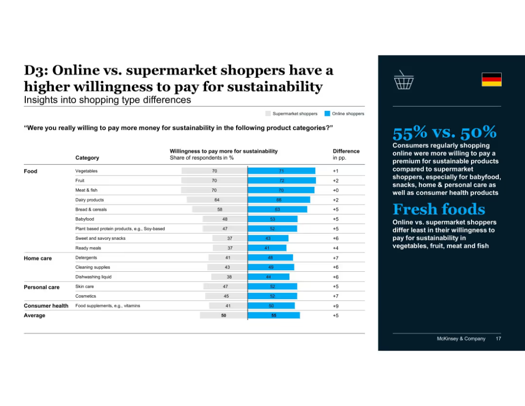
Two-part layout: left side features a bar chart comparing supermarket vs. online shopper willingness to pay more for sustainability across product categories, with numeric labels and color-coded bars; right side has a dark blue background with bold white and blue text summarizing insights and a German flag icon.
Customer and Market Segmentation
Retail & E-commerce
Highlights that online shoppers show greater willingness to pay for sustainability than supermarket shoppers in categories such as babyfood, snacks, and personal care, with less difference for fresh food categories like meat, fruit, and vegetables.
sustainability, online shopping, supermarkets, consumer behavior, willingness to pay, food categories, fresh produce, babyfood, personal care, market segmentation
Mixed Chart
McKinsey
Saved
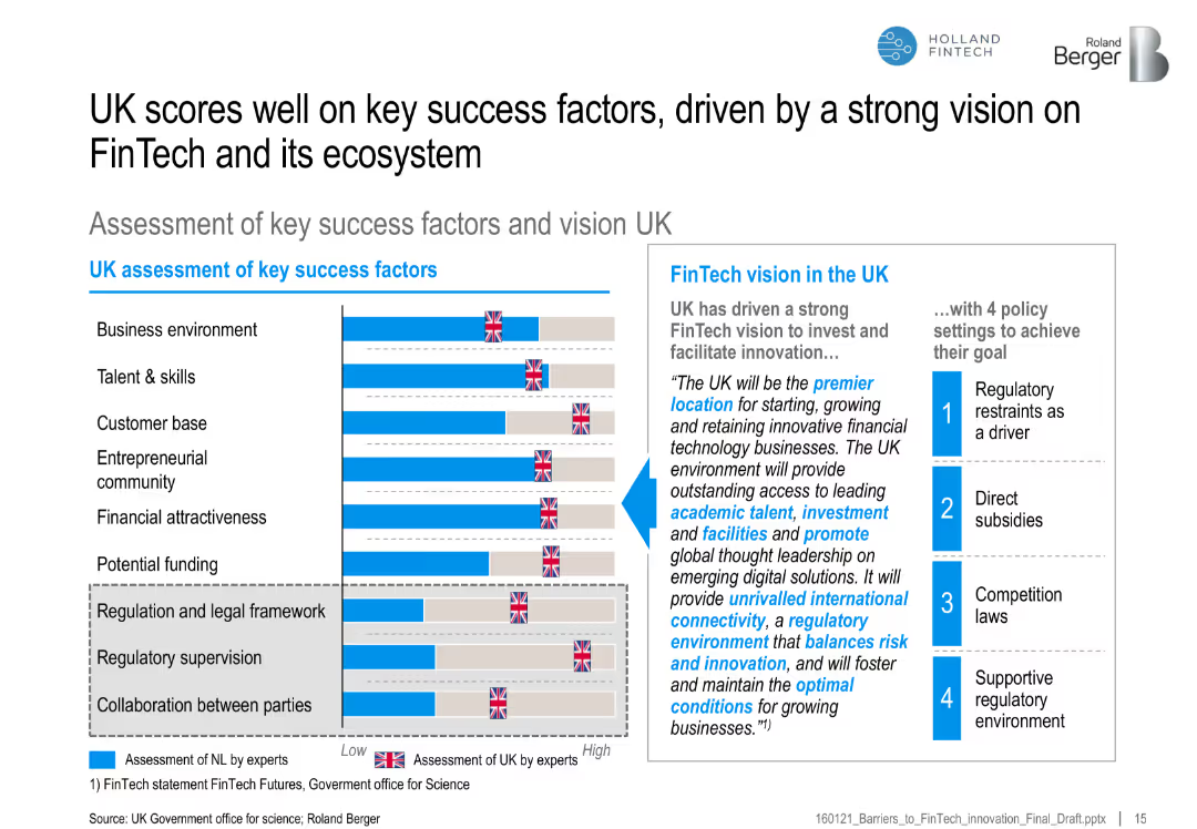
Bar chart of UK vs. benchmark on FinTech success factors, with a vision statement and four supporting policy actions
Strategic Planning
Financial Services
Highlights the UK’s strong performance across FinTech-enabling factors, backed by a clear vision and regulatory framework, promoting its position as a FinTech hub.
UK FinTech, ecosystem, regulatory vision, success factors, funding, policy, entrepreneurship, talent
Mixed Chart
Roland Berger
Saved
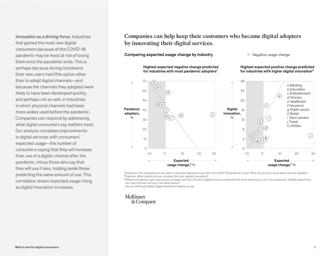
Dual scatter plots comparing pandemic adoption vs. usage change and innovation vs. usage change. Grayscale points labeled by industry.
Strategic Planning
Technology & Software
The slide uses two scatter plots to correlate digital innovation with future digital usage. It shows that industries with high pandemic adoption but low innovation risk losing users, while those with high innovation are expected to see sustained or increased usage.
innovation, pandemic adoption, usage change, digital services, correlation, scatter plot, strategy, industry risk
Multiple Chart
McKinsey
Saved
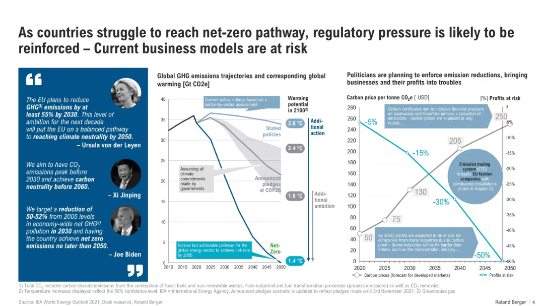
Split layout: quotes with images on the left, central graph showing GHG trajectories, and right graph comparing carbon prices vs profits at risk. Uses icons, line graphs, and infographics.
Regulatory and Compliance
Environmental Services & Sustainability
The slide outlines increasing regulatory pressures toward net-zero goals and the economic impact on businesses. It shows projected global warming scenarios, policy-based emission paths, and the potential financial risks from rising carbon prices, especially for emissions-heavy industries.
net-zero, regulation, carbon pricing, emissions, business risk, climate policy, COP26, GHG, ETS, profit impact
Multiple Chart
Roland Berger
Saved
Slide with a pie chart and world map indicating market share and growth expectations. Use of icons and color-coding for regions.
Market Analysis and Trends
Financial Services
Analyzes global ultra-high net worth investable assets with goals for hiring wealth advisors and regional growth percentages.
wealth management, market share, UHNW, global assets, growth expectations, private wealth advisors, regional analysis, hiring goals, strategy
Mixed Chart
Goldman Sachs
Saved
Previous
Next
If nothing, comes up, please save your slides first
Create a FREE account to continue browsing
Receive Instant Access to 1,000+ slides from companies like McKinsey, Google, and Goldman Sachs
First Name
Last Name
Email
Password
I agree to all
Terms & Privacy Policy
Thank you! Your submission has been received!
Oops! Something went wrong while submitting the form.
Have an account?
Sign in
Column Chart
Heatmap
Chevron
Org Chart
Infographic
Callouts
Timeline
List
Graphic
Picture
Process Flow
Diagram
Paragraph
Map
Table
Framework
Subtitle
Takeaway Box
Icon
Other Chart
Radar Chart
Waterfall Chart
Mekko Chart
Pie Chart
Scatter Plot
Line Chart
Bar chart
Bullet points