Create a FREE Account
Instant access to 1,000+ real slides from top companies like McKinsey, BCG, Goldman Sachs, Google and many more!
First Name
Last Name
Email
Password
I agree to all
Terms & Privacy Policy
Thank you! Your submission has been received!
Oops! Something went wrong while submitting the form.
Have an account?
Sign in
Library
Templates
Courses
Pricing
My Account
My Slides
My Templates
✦ AI
AI Prompt Library
AI Search
Sign in
Start Here
Logout
My Saved Slides
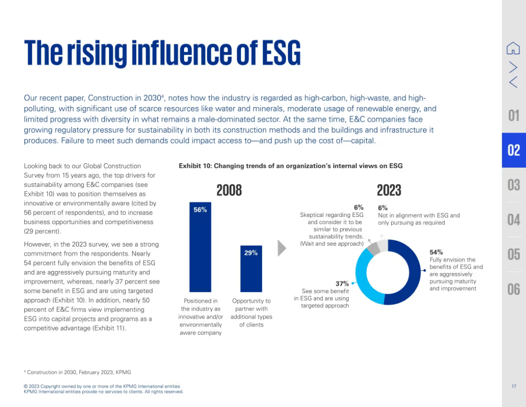
Text on left with a bold title and subtitle; right side features side-by-side bar and donut charts showing ESG perception shifts from 2008 to 2023. Blue accents highlight key data.
Strategic Planning
Real Estate & Construction
This slide presents the growing importance of ESG in construction. It compares ESG sentiment from 2008 to 2023, noting a shift from surface-level awareness to full integration. 54% now fully embrace ESG's value, with significant increases in those pursuing ESG maturity. The industry recognizes ESG as both a strategic and compliance priority.
ESG, sustainability, construction, awareness, maturity, climate, corporate strategy, environmental policy
Multiple Chart
KPMG
Saved
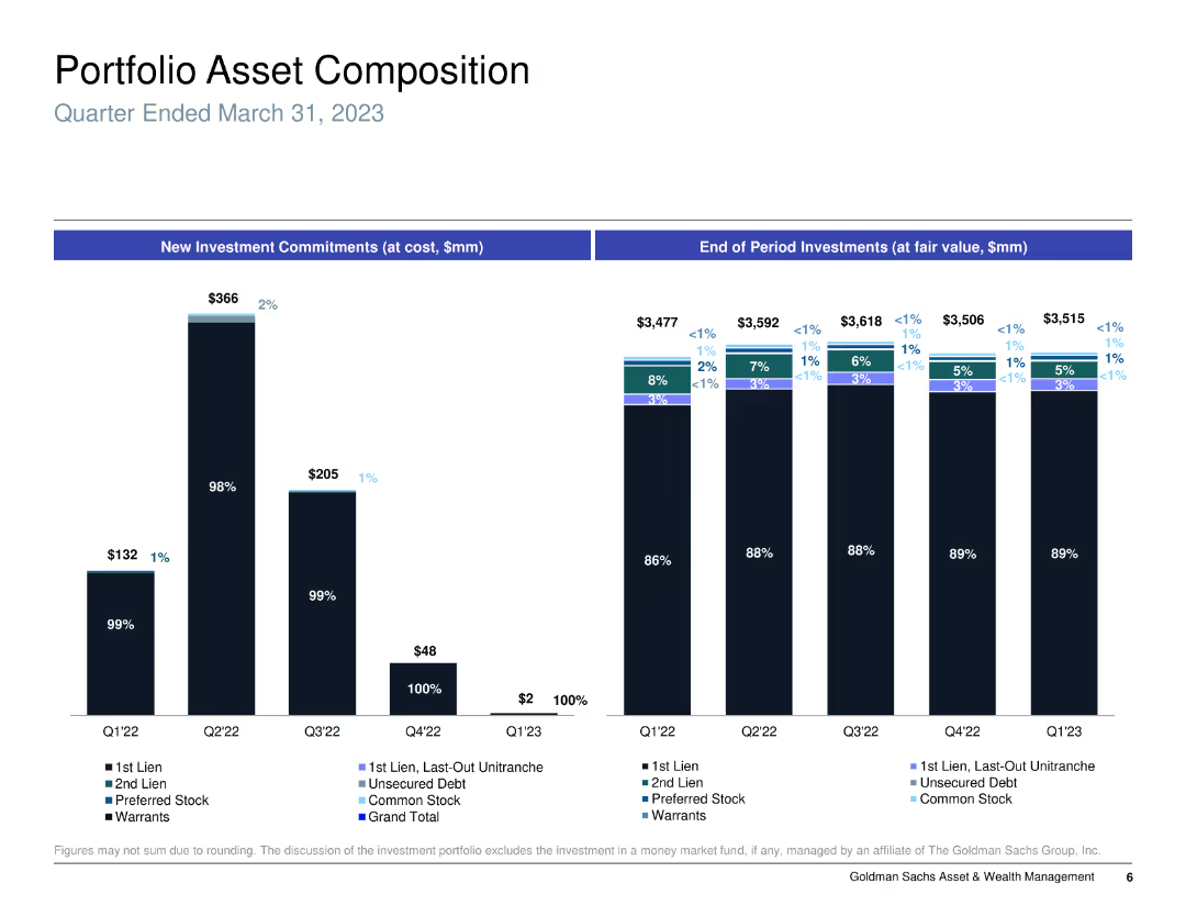
Column chart showing new investment commitments and end of period investments, categorized by type of asset.
Investment Analysis
Financial Services
Analyzes the portfolio asset composition for a specific period, detailing types of investments and their changes over time.
portfolio, assets, investment, commitments
Multiple Chart
Goldman Sachs
Saved
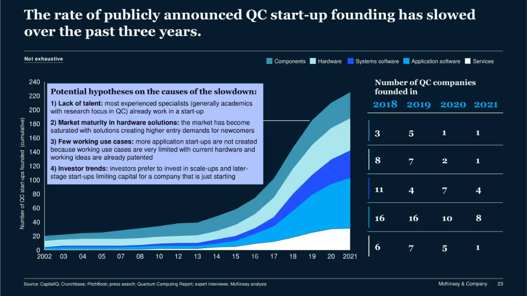
Area graph showing cumulative QC startups by category (components, hardware, etc.); overlay box listing slowdown causes; startup counts by year.
Market Analysis and Trends
Technology & Software
This slide discusses the reasons behind the recent slowdown in QC startup formation, including talent shortages, hardware market maturity, limited use cases, and investor preference for late-stage funding. The visual includes cumulative growth and yearly startup counts by segment.
QC startup, slowdown, market saturation, investor trend, hardware
Single Chart
McKinsey
Saved
Data-heavy slide with bar graphs and charts showing daily cases, growth of daily new cases, recovery rates, and testing data for the top 15 economies by GDP.
Risk Assessment and Management
Government & Public Sector
Presents detailed COVID-19 case numbers, recovery rates, and testing data for major economies, highlighting the disparity in pandemic management.
COVID-19, Economy, Recovery, Testing, GDP, Pandemic Management
Multiple Chart
BCG
Saved
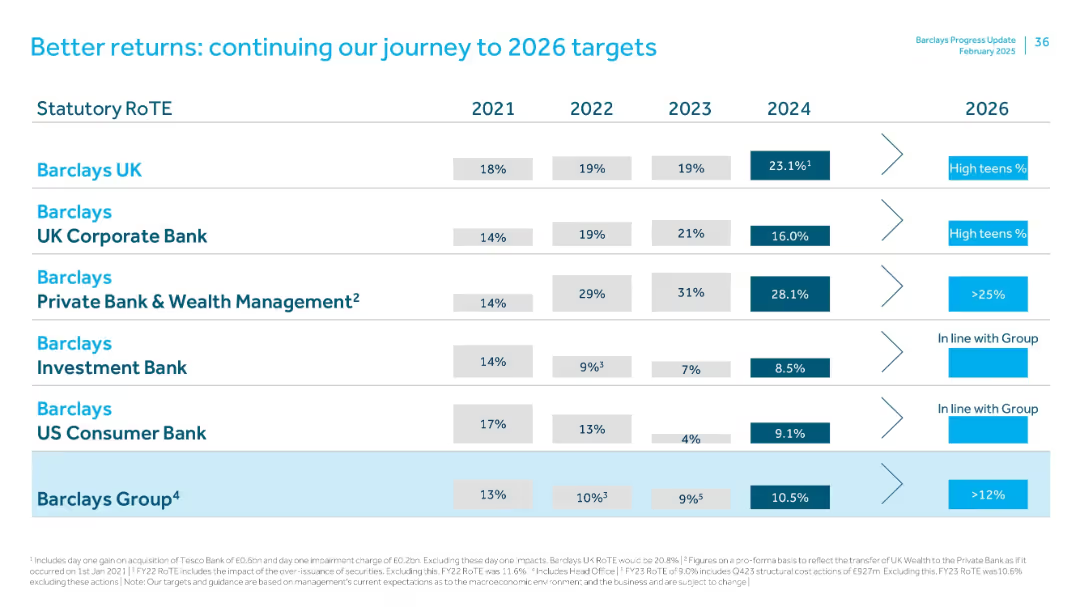
Table comparing RoTE by Barclays divisions from 2021–2024 with 2026 targets. Uses horizontal alignment with industry-specific goals and strategy callouts.
Strategic Planning
Financial Services
Lays out RoTE performance and 2026 targets across Barclays’ divisions. Barclays UK shows strong 2024 gains (23.1%), while Investment Bank and US Consumer Bank show modest improvements. Group target RoTE is >12% by 2026.
RoTE, targets, strategy, Barclays UK, investment bank, 2026 outlook
Single Chart
Barclays
Saved
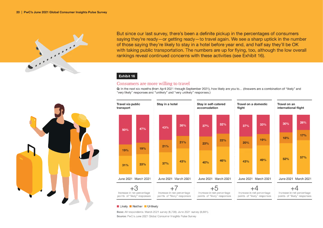
A series of comparative column charts depicting the primary reasons consumers shop online across different product categories, such as price, quality, and convenience, with percentage breakdowns for each category.
Market Analysis and Trends
Retail & E-commerce
The slide examines the main reasons for online shopping, focusing on factors like price, quality, and convenience across various product categories, based on consumer survey responses.
online shopping, consumer reasons, price, quality, convenience, product categories
Multiple Chart
PwC/Strategy&
Saved
Features column charts and informational text blocks discussing international banking revenue and digital banking.
Market Analysis and Trends
Financial Services
The slide outlines JPMorgan's strategy and positioning for growth in digital banking outside the U.S., with projections and comparative analysis.
Digital banking, market growth, international, revenue, cost analysis, traditional banking, digital challengers
Multiple Chart
JP Morgan
Saved
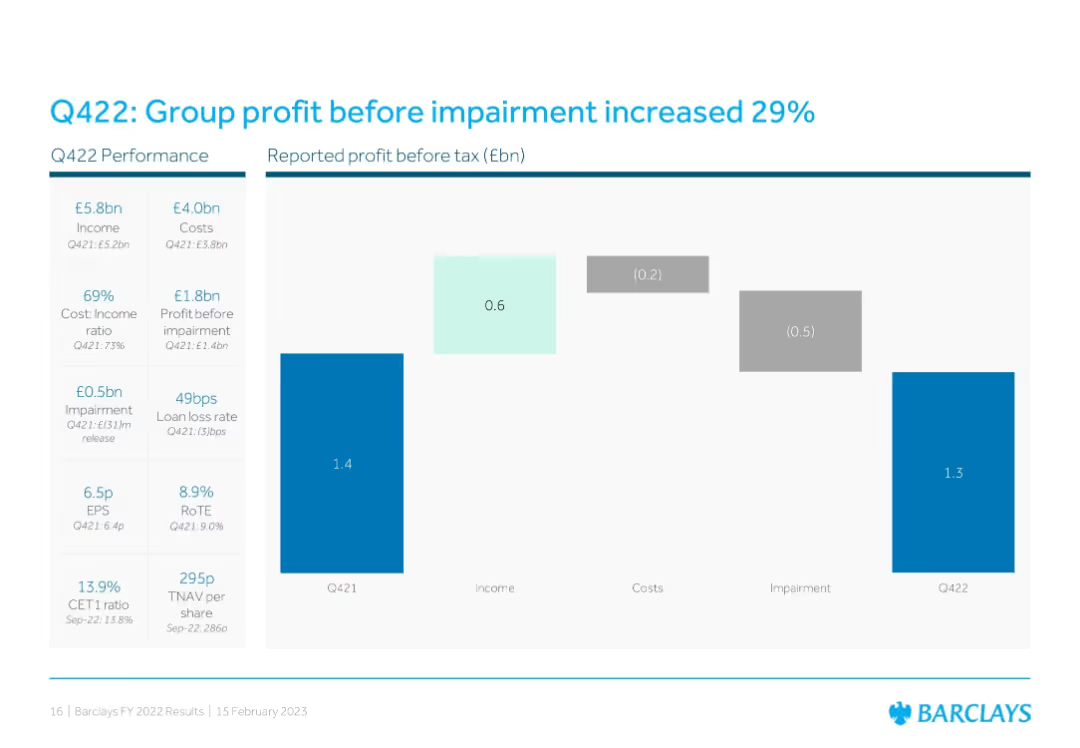
Waterfall chart format comparing Q421 to Q422 reported profit before tax, showing contributions from income, costs, and impairments. Left sidebar lists financial metrics and ratios.
Financial Performance
Financial Services
Shows a 29% YoY increase in group profit before impairment, with detailed breakdowns in cost, income, and impairment changes. Financial ratios like EPS, RoTE, and CET1 are also presented for Q422 vs. Q421.
Q422, profit growth, impairments, EPS, RoTE, CET1, waterfall chart, Barclays group
Single Chart
Barclays
Saved
Contains a list ranking top countries by market position, bar graphs showing sales percentage in leading positions, and a pie chart indicating consumer trust.
Competitive Landscape
Consumer Goods
Analyzes Nestlé's market dominance and customer trust across key emerging markets, showcasing their leading positions and competitive advantages. This slide is useful for assessing market leadership and brand trustworthiness.
market positions, consumer trust, sales, leading positions, Nestlé
Mixed Chart
Deutsche Bank
Saved
Slide showcases four segments with images and text, highlighting concepts of hyperpersonalization, ultraconvenience, community, and sustainability.
Customer and Market Segmentation
Retail & E-commerce
Discusses the evolving expectations of consumers for personalized and convenient experiences, emphasizing community and sustainability.
hyperpersonalization, ultraconvenience, community, sustainability, consumer behavior, engagement, millennials, Generation Z, demographics, ESG
Header Horizontal
BCG
Saved
The slide includes multiple column charts showing priorities for operational resilience enhancements over the next three years, categorized by overall, G-SIB, and non-G-SIB responses.
Operational Efficiency
Financial Services
The slide outlines various priorities for operational resilience enhancements, highlighting differences between G-SIBs and non-G-SIBs, such as cybersecurity controls and technology capacity.
operational resilience, column charts, G-SIB, non-G-SIB
Multiple Chart
EY
Saved
Two column charts show 3-year deposit CAGR and national retail deposit share, with Chase compared against industry and large banks. The slide has a clear visual distinction between Chase and its peers, using color coding to highlight differences.
Market Analysis and Trends
Financial Services
This slide analyzes the bank's deposit growth and market share relative to the industry, emphasizing the bank's outperformance in deposit CAGR and its ascension in retail deposit share rankings, evidencing competitive advantage and market influence.
Deposit growth, Market share, Competitive analysis, CAGR, Retail banking, Industry comparison
Multiple Chart
JP Morgan
Saved
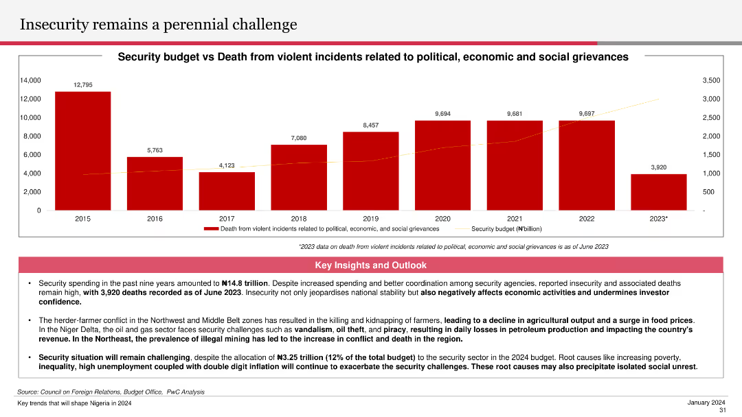
The slide features a column chart showing the security budget versus deaths from violent incidents from 2015 to 2023. Key insights and outlooks below the chart discuss the impact of insecurity on economic activities and investor confidence.
Risk Assessment and Management
Government & Public Sector
The slide highlights the ongoing security challenges and their economic implications, detailing the trend in security budgets and related deaths. It emphasizes the importance of addressing security issues to improve investor confidence and economic stability.
insecurity, security budget, violent incidents, economic impact, investor confidence
Mixed Chart
PwC/Strategy&
Saved
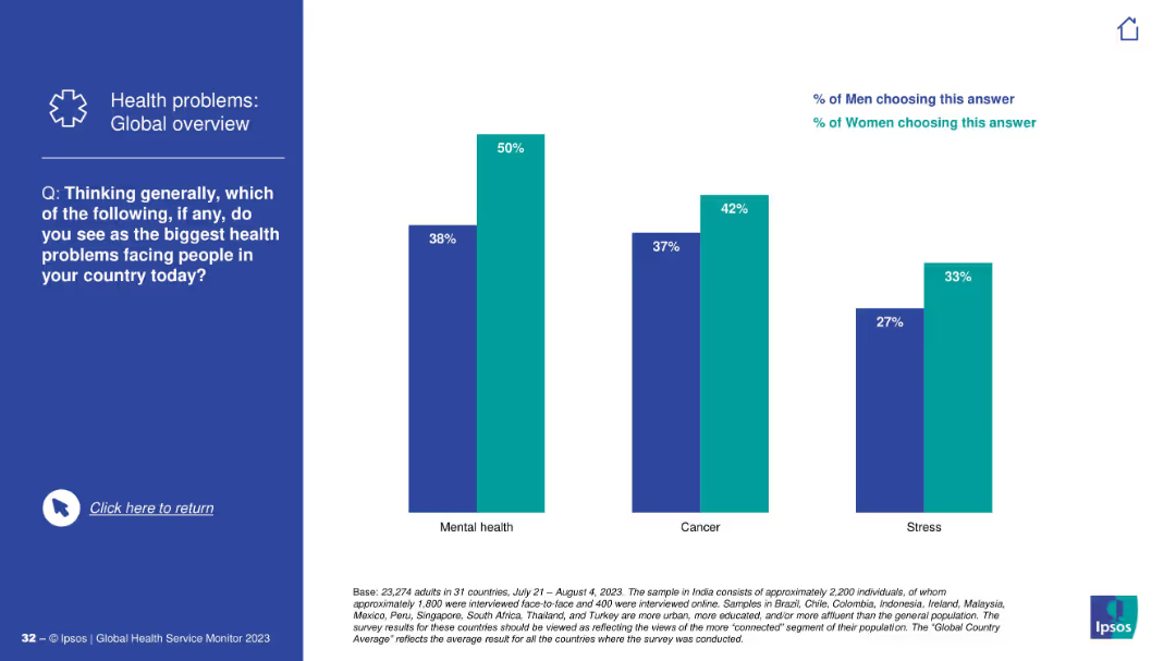
Vertical bar chart comparing gender responses; light blue for women, dark blue for men.
Customer and Market Segmentation
Healthcare & Pharmaceuticals
Gender-specific data reveals that women are significantly more concerned than men about mental health, cancer, and stress, highlighting notable differences in health perception.
gender insights, health concerns, survey data
Mixed Chart
IPSOS
Saved
Displays pie chart and bar charts detailing job titles, account premiums, respondents' ages, and years in the insurance industry for personal lines-focused underwriters.
Market Analysis and Trends
Financial Services
Offers a detailed demographic and financial profile of personal lines-focused underwriters, including job roles, premium sizes, age groups, and industry tenure.
personal lines, insurance, demographics, job roles, premiums, age distribution, tenure, financial analysis
Multiple Chart
Accenture
Saved
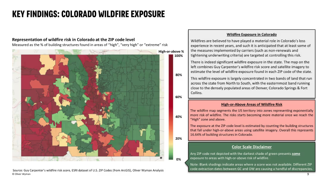
Left side features a color-coded ZIP code heat map of wildfire risk; right side contains descriptive text explaining the data and risk interpretation; uses red-green gradient with three text boxes for context and definitions.
Risk Assessment and Management
Environmental Services & Sustainability
This slide presents the wildfire exposure in Colorado at ZIP code level, identifying areas with high percentages of structures at significant wildfire risk. It highlights concentrated wildfire zones and their correlation with recent underwriting actions by insurers. About 16.6% of Colorado structures are in high-risk zones, influencing carrier decisions.
wildfire risk, ZIP code, building exposure, insurance, risk zones, high-risk areas, Colorado, wildfire impact, underwriting decisions
Mixed Chart
Oliver Wyman
Saved
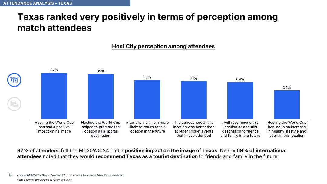
Horizontal bar chart with blue bars illustrating various positive perceptions of Texas; includes stats and commentary.
Performance Metrics and KPIs
Hospitality & Tourism
This slide captures positive attendee sentiment about Texas, with 87% indicating a positive image due to the event and 69% saying they’d recommend Texas as a tourist destination.
perception, image boost, Texas, tourism, attendee sentiment, KPIs, destination feedback
Single Chart
Nielsen
Saved
A content slide with graphical elements such as icons representing "EMPLOYER DIVERSE TALENT," "MAKE INNOVATION ACCESSIBLE TO ALL," and "DRIVE COMMUNITY RESILIENCE." Green and yellow color theme with text sections and labeled graphics.
Strategic Planning
Professional Services
Slide detailing a company's ESG strategy including internal and external drivers with three main pillars aimed at securing a resilient and equitable future.
ESG, strategy, diversity, innovation, resilience, governance, sustainability
Pillar
Booz Allen Hamilton
Saved
The slide is divided into textual content and infographic elements with percentage figures and pictograms related to agility and talent. Green and grey color highlights are used for emphasis.
Organizational Structure and Change
Professional Services
Discusses the Adaptable Organization (AO) as a shift in management philosophy to increase agility through empowered networks of teams. It points out the current state of digital disruption, organizational agility, leadership, and the need for new talent within professional services.
Adaptable Organization, management, agility, talent, disruption, teams
Linear Flow
Deloitte
Saved
The slide has several sections: a large bar graph at the bottom, two smaller graphs to the right, and a section with bullet points explaining the data at the top left corner.
Regulatory and Compliance
Environmental Services & Sustainability
The slide presents the greenhouse gas emissions data for FY22, showing the progress and targets set by the company. It is suitable for audiences interested in environmental impact data and the company’s efforts in reducing its carbon footprint.
emissions, greenhouse gas, data, environmental impact
Multiple Chart
Booz Allen Hamilton
Saved
Slide includes column charts showing GDP growth by quarter and future projections compared to the rest of the world. The visual elements are organized neatly, using green and purple to differentiate between past performance and future expectations, enhancing readability.
Strategic Planning
Government & Public Sector
Analyzes China's economic recovery post-COVID-19 and its projected impact on global GDP growth, focusing on sector-specific growth and future contributions to the world economy.
economic recovery, GDP growth, China, post-COVID-19, global impact
Mixed Chart
BCG
Saved
This slide features a central column chart surrounded by explanatory text and smaller charts, highlighting the caseload distribution in two courts with a focus on family law. The layout is organized and color-coded for clarity.
Operational Efficiency
Government & Public Sector
It showcases the total number of court cases handled by two courts, emphasizing the distribution and percentage of family law cases, useful for workload analysis and operational insights.
caseload, courts, distribution, family law, analysis
Single Chart
PwC/Strategy&
Saved
A table showing environmental impacts categorized by different metrics like climate change and resource use, with specific indicators highlighted for focus.
Regulatory and Compliance
Environmental Services & Sustainability
Provides a detailed analysis of the environmental impacts of the Kiruna-1 ground station, using life cycle assessment data to emphasize significant areas such as climate change and resource depletion.
Environmental impacts, lifecycle assessment, Kiruna-1, climate change, resource use, impact analysis, sustainability, environmental metrics
Table
Deloitte
Saved
The slide has a dark theme and presents two main sections, one with financial economics statistics and another with a layered area chart depicting revenue paths.
Investment Analysis
Financial Services
This slide informs about the economic viability of point-of-sale lending, with emphasis on on-balance sheet growth, merchant discount rates, and projected revenues.
economics, on-balance sheet, merchant lending, discount rates, APR, credit losses, revenue path, projections
Mixed Chart
Goldman Sachs
Saved
The slide features a large section of text explaining the importance of AI maturity, accompanied by a column chart illustrating the projected time for AI transformation compared to digital transformation.
Market Analysis and Trends
Technology & Software
This slide emphasizes the critical role of AI in gaining competitive advantage, highlighting survey data on the importance of AI, and showing a projection of AI transformation timelines.
AI maturity, competitive advantage, transformation, digital transformation, survey data
Pillar
Accenture
Saved
Previous
Next
If nothing, comes up, please save your slides first
Create a FREE account to continue browsing
Receive Instant Access to 1,000+ slides from companies like McKinsey, Google, and Goldman Sachs
First Name
Last Name
Email
Password
I agree to all
Terms & Privacy Policy
Thank you! Your submission has been received!
Oops! Something went wrong while submitting the form.
Have an account?
Sign in
Column Chart
Heatmap
Chevron
Org Chart
Infographic
Callouts
Timeline
List
Graphic
Picture
Process Flow
Diagram
Paragraph
Map
Table
Framework
Subtitle
Takeaway Box
Icon
Other Chart
Radar Chart
Waterfall Chart
Mekko Chart
Pie Chart
Scatter Plot
Line Chart
Bar chart
Bullet points