Create a FREE Account
Instant access to 1,000+ real slides from top companies like McKinsey, BCG, Goldman Sachs, Google and many more!
First Name
Last Name
Email
Password
I agree to all
Terms & Privacy Policy
Thank you! Your submission has been received!
Oops! Something went wrong while submitting the form.
Have an account?
Sign in
Library
Templates
Courses
Pricing
My Account
My Slides
My Templates
✦ AI
AI Prompt Library
AI Search
Sign in
Start Here
Logout
My Saved Slides
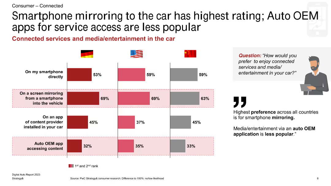
The slide shows a comparative bar chart indicating preferences for different ways to access connected services and media in cars among consumers in Germany, the US, and China.
Product and Service Analysis
Consumer Goods
This slide presents data on consumer preferences for accessing connected services and media in cars, highlighting a strong preference for smartphone mirroring over other methods in Germany, the US, and China.
smartphone mirroring, connected services, consumer preferences, Germany, US, China, bar chart
Multiple Chart
PwC/Strategy&
Saved
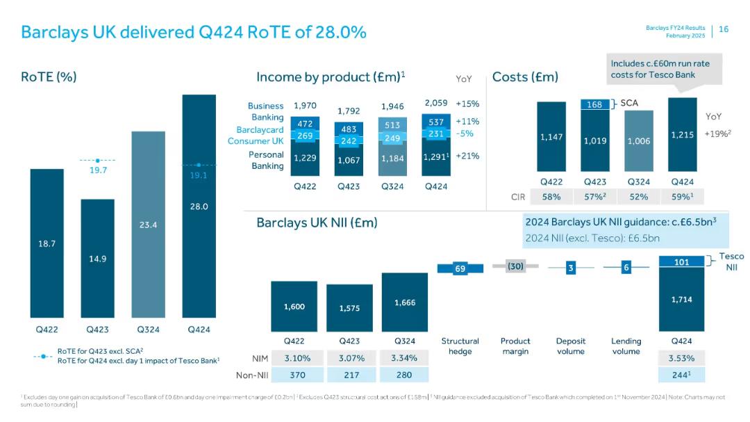
Left: vertical RoTE bar chart; Center: stacked bars for income by product; Right: cost bars; bottom: NII breakdown waterfall
Financial Performance
Financial Services
Reports Barclays UK’s return on tangible equity for Q424, dissecting revenue by product and costs, with insights into Tesco Bank's financial integration. Structural hedge and product margin effects on NII are also highlighted.
RoTE, Barclays UK, NII, Tesco, income breakdown, cost analysis, structural hedge, Q424
Multiple Chart
Barclays
Saved
The slide features a map of Europe on the left, highlighting countries in blue. On the right, there are three vertical sections with numbers 1, 2, and 3, each containing text. The layout is simple and visually balanced.
Strategic Planning
Professional Services
The slide outlines the benefits of KnowledgePanel's expansion across Europe, highlighting increased brand recognition, revenue gains, and expanded market presence.
Europe, KnowledgePanel, expansion, strategy, benefits
Graphic
IPSOS
Saved
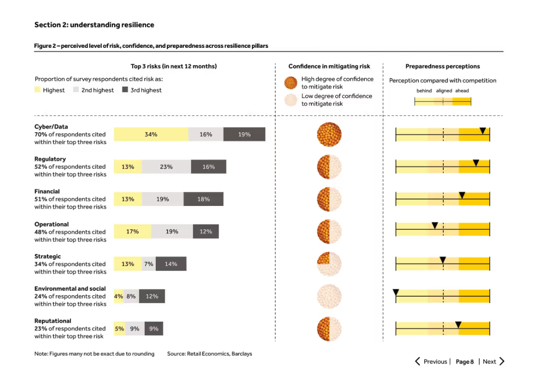
Horizontal bar chart with color-coded risks, confidence indicators, and preparedness perceptions. Visual-heavy slide.
Risk Assessment and Management
Retail & E-commerce
Survey-based data shows retailers' perceived top risks (cyber, regulatory, financial), their confidence in mitigating them, and how they compare to peers. Combines qualitative and quantitative elements to assess resilience.
resilience, cyber risk, preparedness, confidence, retailer, survey
Multiple Chart
Barclays
Saved
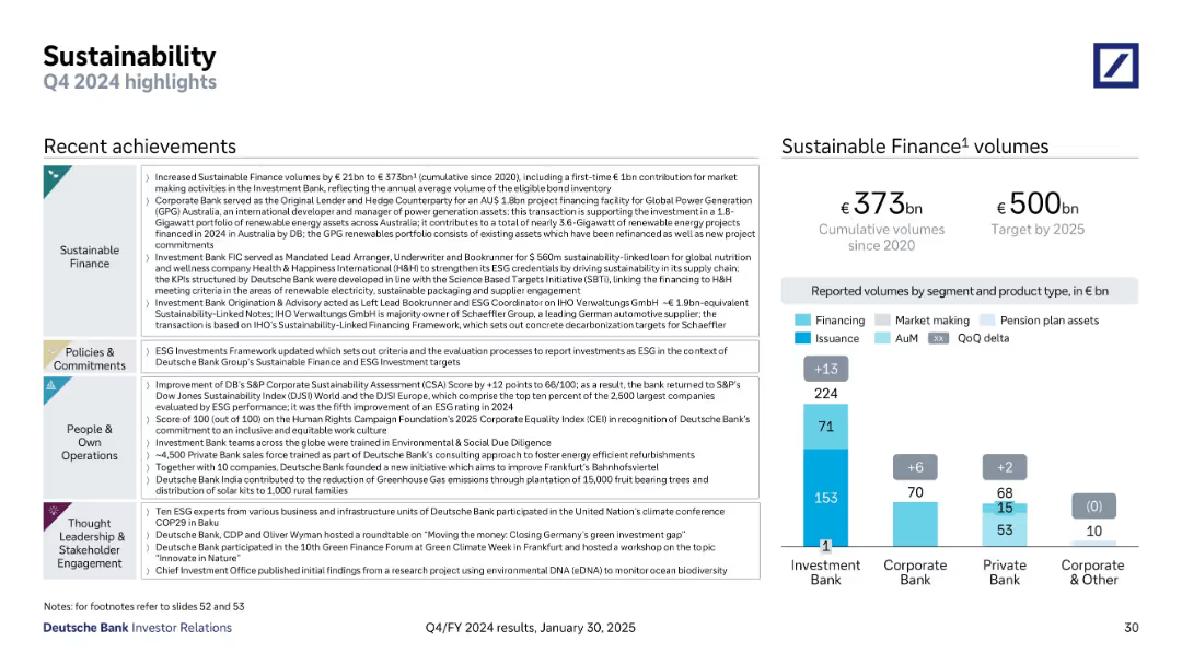
Multi-section text layout on the left; bar chart on the right showing sustainable finance volumes
Financial Performance
Financial Services
The slide summarizes Deutsche Bank’s sustainability initiatives, including €373bn in cumulative sustainable finance volumes, ESG framework enhancements, and environmental & social contributions. The right-hand chart shows volume contributions by business segment.
Sustainability, ESG, Finance Volumes, Climate, Renewable Energy
Mixed Chart
Deutsche Bank
Saved
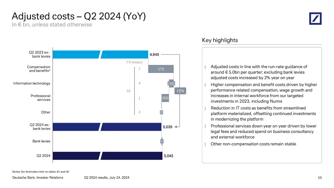
Waterfall chart showing changes in cost components YoY with a right-hand key highlights box.
Operational Efficiency
Financial Services
Illustrates cost drivers from Q2 2023 to Q2 2024, highlighting increased compensation, reduced IT and professional services costs, and FX impacts. The slide explains cost containment in line with quarterly guidance and strategic workforce investments.
adjusted costs, compensation, IT savings, professional services, Q2 2024, Deutsche Bank
Mixed Chart
Deutsche Bank
Saved
Features a line chart comparing net charge-off performance against a peer group over a decade, alongside bullet points summarizing portfolio diversification and market conditions. The visual complexity is moderate with a clear focus on risk metrics.
Risk Assessment and Management
Financial Services
Outlines JPMorgan's risk discipline in commercial and industrial lending, highlighting historical performance and strategies for downturn preparedness.
risk discipline, commercial banking, loan security, industry analysis, performance metrics, market commentary
Mixed Chart
JP Morgan
Saved
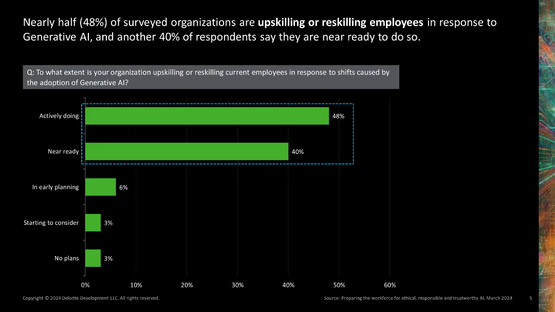
Single column chart showing the extent of organizations upskilling or reskilling employees for AI adoption.
Human Resources and Talent Management
Technology & Software
Displays survey results on the extent to which organizations are preparing their workforce for generative AI by upskilling or reskilling employees.
upskilling, reskilling, AI adoption, workforce preparation, human resources
Single Chart
Deloitte
Saved
A flow diagram illustrating inefficiencies in linear value chains and potential interventions. Contains icons and labeled stages from product design to end-of-life disposal.
Strategic Planning
Environmental Services & Sustainability
This slide explains the concept of the circular economy by identifying key inefficiencies in traditional linear business models and suggesting strategic interventions to mitigate these inefficiencies, thereby creating business value through sustainability practices.
circular economy, sustainability, business strategy, value chain, inefficiencies
Linear Flow
Accenture
Saved
This slide contains two graphs: one showing the impact of capex on electrolysis costs and another depicting the effect of electricity prices and utilization rates.
Market Analysis and Trends
Energy & Utilities
The slide details how reducing capex and optimizing electricity prices and load factor can improve the LCOH for electrolysis, using visual data to support the points.
LCOH, electrolysis, capex, electricity price, load factor
Multiple Chart
Kearney
Saved
The slide displays a large column chart for net profit contribution over time and a donut chart for net operating income composition. It is clean and well-organized, with a white background and the Macquarie logo at the bottom left.
Financial Performance
Financial Services
Providing a financial performance review, this slide depicts the net profit contribution and net operating income sources for the commodities and global markets division. The visual data demonstrates the division's financial trajectory and income distribution across different areas.
net profit contribution, operating income, commodities, global markets, financial review, chart
Multiple Chart
Morgan Stanley
Saved
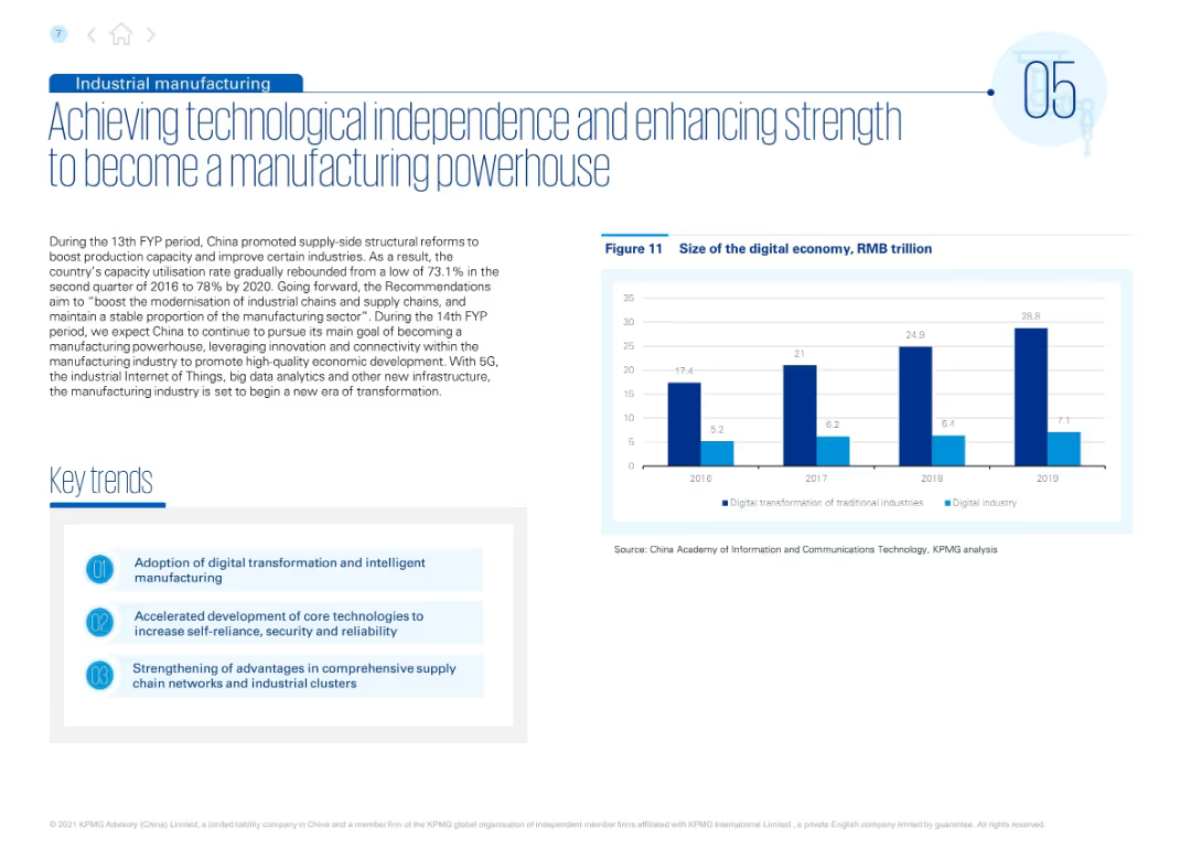
Split layout with text and “Key trends” on the left; right side includes a vertical bar chart showing growth of the digital economy by year.
Strategic Planning
Industrial & Manufacturing
This slide emphasizes China’s drive for technological self-reliance and manufacturing modernization. It outlines key policies and trends, including adoption of digital transformation, core tech development, and supply chain strengthening. Supporting chart illustrates digital economy expansion from 2016 to 2019.
industrial reform, manufacturing, supply chain, digital economy, innovation, 5G, IoT, AI, China strategy, economic development
Mixed Chart
KPMG
Saved
Features column charts comparing education funding levels and allocations within the Indonesian government budget over several years. Additional bar charts compare Indonesia's education spending to neighboring countries, with annotations highlighting key statistics and trends.
Financial Performance
Education & Training
Reviews the sustainability of government funding for education in Indonesia, comparing it to neighboring countries and discussing potential impacts of policy changes on funding levels. Offers insights into the challenges and opportunities within the education funding landscape.
demand, subsidy
Multiple Chart
BCG
Saved
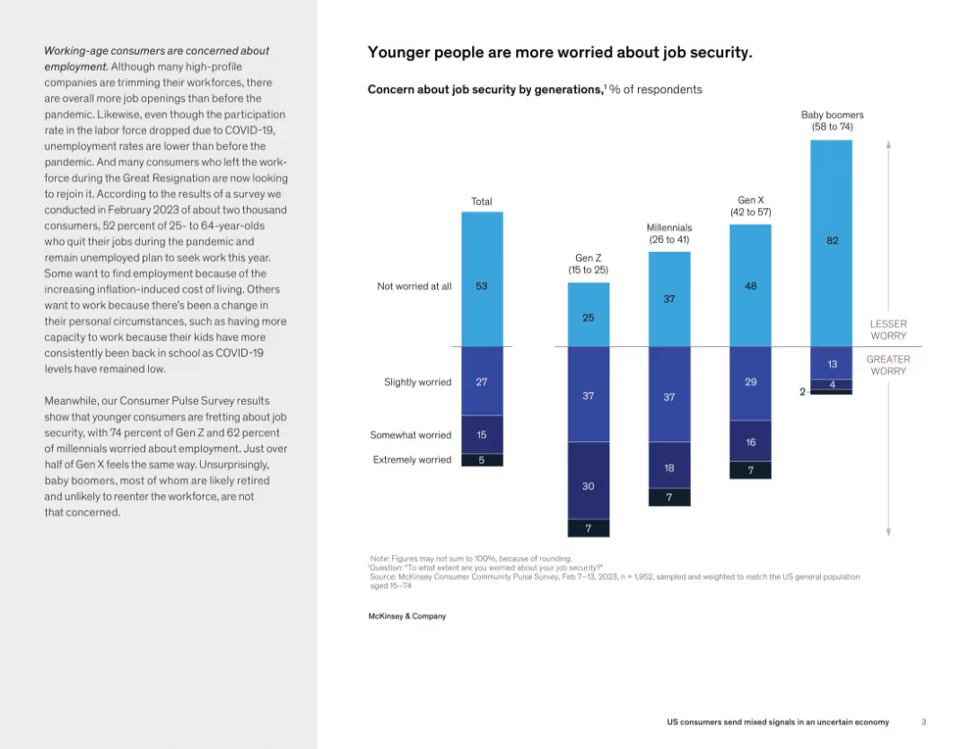
Split layout with descriptive text on left and vertical stacked bar chart on right showing job security concern by generation.
Human Resources and Talent Management
Professional Services
This slide conveys that younger generations, particularly Gen Z and millennials, are much more concerned about job security compared to Gen X and baby boomers. This reflects generational differences in employment sentiment post-pandemic.
job security, generational worry, Gen Z, millennials, employment concerns, workforce, consumer sentiment
Mixed Chart
McKinsey
Saved
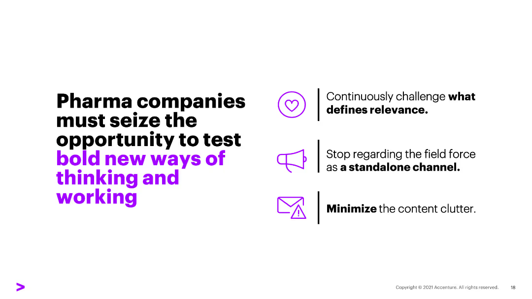
The slide has text on the left emphasizing bold new ways of thinking, with three bullet points on the right indicating strategic initiatives for pharma companies.
Strategic Planning
Healthcare & Pharmaceuticals
The slide encourages pharma companies to continuously challenge what defines relevance, stop regarding field force as standalone, and minimize content clutter.
pharma, bold, strategies, relevance, content clutter
Vertical Flow
Accenture
Saved
This slide presents column charts showing Tyson's core product volume growth compared to the overall food and beverage market. The charts use shades of blue to signify Tyson's performance, contrasting with gray for the total market, effectively highlighting the differences.
Market Analysis and Trends
Agriculture & Food Production
Focuses on Tyson's significant volume growth within its core product range over several fiscal years, compared to the general food and beverage market. It aims to highlight Tyson's market strength and successful product performance, which may interest investors or business analysts evaluating industry leaders.
Tyson, Market Growth, Volume, Food, Beverage, Analysis
Single Chart
Barclays
Saved
The slide contains a mix of column charts and text segments detailing Singapore's emission profile, government commitments, and a "2030 Trajectory" map with recommended actions.
Regulatory and Compliance
Environmental Services & Sustainability
Discusses Singapore's approach to green transitions, highlighting government commitments to the environment by 2030, and the challenges and enabling factors for these policies.
Singapore, emissions, green buildings, carbon tax, 2030
Header Horizontal
Bain
Saved
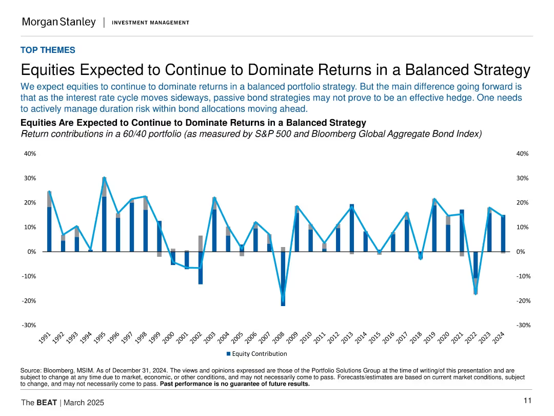
Line/bar combo chart showing equity vs bond contributions in a 60/40 portfolio across decades. Horizontal layout with dual y-axes.
Investment Analysis
Financial Services
Argues that equities will likely continue driving returns in balanced portfolios, given a flat interest rate outlook. The chart displays equity and bond return contributions since 1991, highlighting equity dominance except in select downturns.
equities, balanced strategy, bonds, returns, 60/40 portfolio, asset allocation
Single Chart
Morgan Stanley
Saved
This slide showcases a column chart comparing awareness of DeFi marketing from crypto trading platforms between 2022 and 2023, with percentages of responses.
Market Analysis and Trends
Financial Services
It presents data on the awareness of DeFi marketing, showing a drop in people recalling such ads, and highlighting differences across age and gender demographics.
DeFi, crypto trading platforms, marketing, 2023, 2022, awareness, demographics, ads
Mixed Chart
IPSOS
Saved
This slide features two line charts; one shows global oil supply and demand, and the other shows historical oil prices with notable peaks and troughs marked.
Market Analysis and Trends
Energy & Utilities
The slide examines short-term market dynamics in the oil industry, focusing on supply and demand trends and significant price movements.
oil supply, demand, market dynamics, price trends, energy market
Multiple Chart
JP Morgan
Saved
The slide presents various graphical representations, including pie charts, bar graphs, and an illustrative side panel with an image of an industrial scenario. It utilizes green, black, and white color scheme with clean lines and a structured layout.
Technology and Digital Transformation
Technology & Software
Focuses on integrating AI into business processes, highlighting the importance of collaboration between tech teams and business units for effective AI adoption. Stresses on both the financial and transformational impacts of AI with real-world business examples.
AI adoption, business transformation, collaboration, technology integration, industry case study
Mixed Chart
BCG
Saved
Line chart showing Japan's policy rate and yield curve control band. Another chart shows BOJ's holdings of government bonds and ETFs.
Market Analysis and Trends
Financial Services
Examines the Bank of Japan's monetary policy, highlighting the policy rate and bond holdings to understand its impact on the market.
Bank of Japan, monetary policy, yield curve, bonds, ETFs
Multiple Chart
JP Morgan
Saved
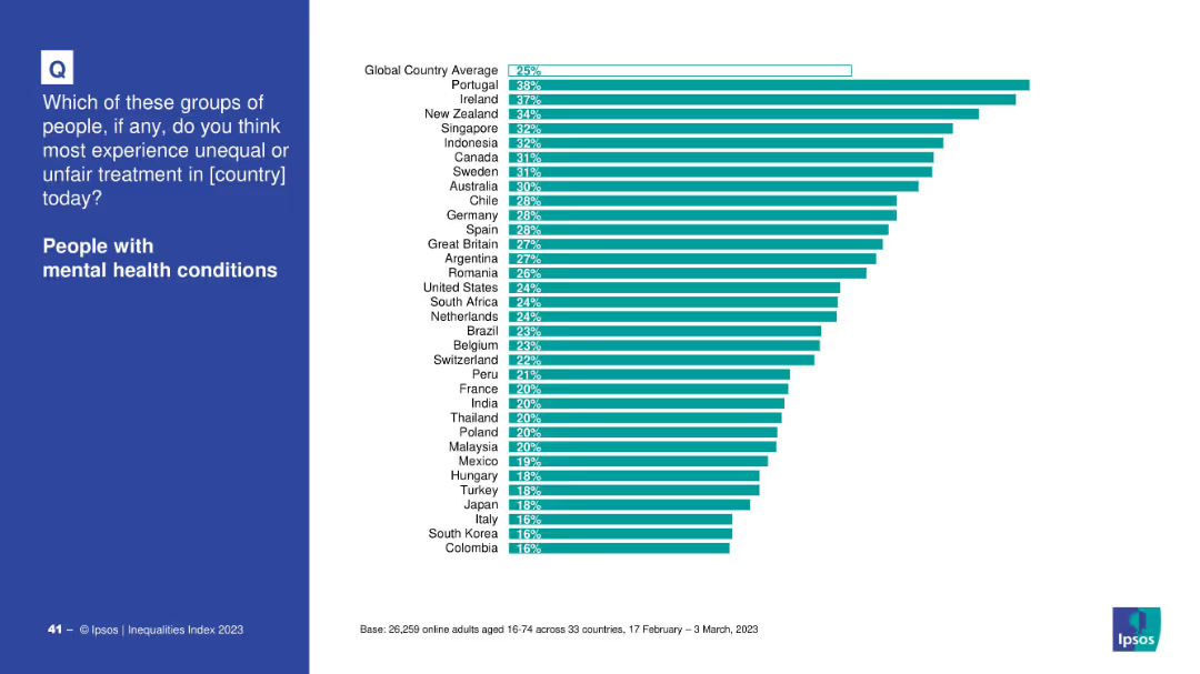
Blue question panel with right-hand bar chart ranking countries by perceived unfair treatment.
Market Analysis and Trends
Healthcare & Pharmaceuticals
Ranks countries based on the percentage of people who believe those with mental health conditions face unfair treatment. Portugal and Ireland are highest.
mental health, discrimination, country comparison, inequality, treatment, global perception
Mixed Chart
IPSOS
Saved
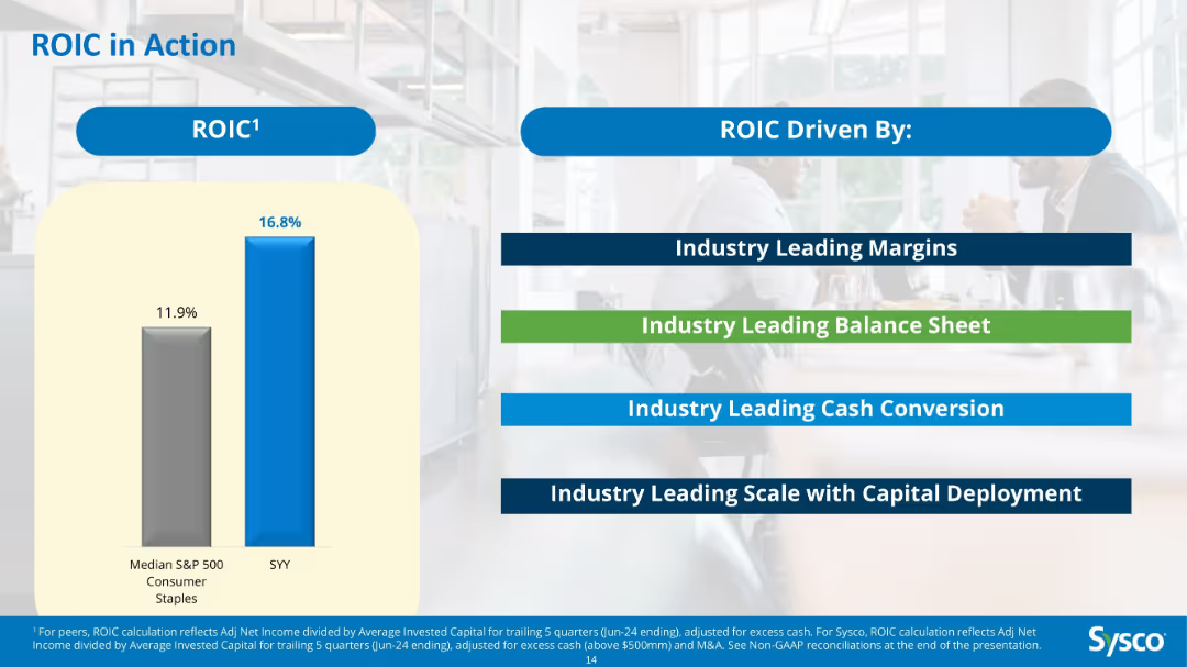
Bar chart comparing ROIC of Sysco vs S&P 500 median; text boxes listing drivers like margins, balance sheet, and capital deployment.
Investment Analysis
Consumer Goods
Demonstrates Sysco’s superior 16.8% ROIC compared to the 11.9% median for S&P 500 consumer staples. The slide attributes this to leadership in margins, balance sheet strength, cash conversion, and capital scale.
ROIC, Sysco, capital efficiency, investment, consumer staples, return metrics, comparison
Mixed Chart
Barclays
Saved
The slide displays a diagram outlining data collection methods for operations and maintenance, linking past surveys to updated methods and areas of focus like energy use.
Operational Efficiency
Environmental Services & Sustainability
Highlights the methodology for collecting data on operations and maintenance, updating from past practices to improve accuracy in resource use and environmental impact assessments.
Data collection, operations, maintenance, environmental impact, resource use, methodology update, energy consumption, sustainability practices
Diagram
Deloitte
Saved
Previous
Next
If nothing, comes up, please save your slides first
Create a FREE account to continue browsing
Receive Instant Access to 1,000+ slides from companies like McKinsey, Google, and Goldman Sachs
First Name
Last Name
Email
Password
I agree to all
Terms & Privacy Policy
Thank you! Your submission has been received!
Oops! Something went wrong while submitting the form.
Have an account?
Sign in
Column Chart
Heatmap
Chevron
Org Chart
Infographic
Callouts
Timeline
List
Graphic
Picture
Process Flow
Diagram
Paragraph
Map
Table
Framework
Subtitle
Takeaway Box
Icon
Other Chart
Radar Chart
Waterfall Chart
Mekko Chart
Pie Chart
Scatter Plot
Line Chart
Bar chart
Bullet points