Create a FREE Account
Instant access to 1,000+ real slides from top companies like McKinsey, BCG, Goldman Sachs, Google and many more!
First Name
Last Name
Email
Password
I agree to all
Terms & Privacy Policy
Thank you! Your submission has been received!
Oops! Something went wrong while submitting the form.
Have an account?
Sign in
Library
Templates
Courses
Pricing
My Account
My Slides
My Templates
✦ AI
AI Prompt Library
AI Search
Sign in
Start Here
Logout
My Saved Slides
This slide features a column chart comparing the delivered levelized cost of low-carbon ammonia across various regions. It distinguishes between 'green' hydrogen (renewable energy) and 'blue' hydrogen (carbon capture) across the pre-IRA and post-IRA periods. The slide background is dark with text and graph elements highlighted in green, blue, and gray, showcasing clear visual distinctions between different data points.
Market Analysis and Trends
Energy & Utilities
The slide analyzes the cost competitiveness of low-carbon hydrogen in North Asia, contrasting pre and post-Inflation Reduction Act scenarios in the U.S. and other regions. It highlights how U.S. hydrogen production becomes more competitive internationally post-IRA, affecting global energy market dynamics.
low-carbon hydrogen, North Asia, IRA, energy market, competitiveness, renewable energy, carbon capture, cost analysis
Mixed Chart
BCG
Saved
The slide includes a horizontal bar chart showing the percentage of workforce with access to approved Generative AI tools. The bars are color-coded by levels of expertise, ranging from little to very high expertise.
Human Resources and Talent Management
Technology & Software
It examines the extent to which organizations are providing their workforce with access to approved Generative AI tools, highlighting disparities based on expertise levels and workforce penetration rates.
workforce, Generative AI, access, expertise, tools
Mixed Chart
Deloitte
Saved
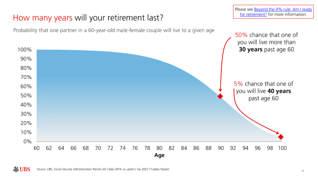
The slide includes a probability chart showing the likelihood of a 60-year-old couple living to different ages, illustrating longevity risk in retirement.
Market Analysis and Trends
Financial Services
The slide assesses the longevity risk in retirement, emphasizing the importance of planning for an extended retirement period to ensure financial security.
Retirement, Longevity, Risk, Probability, Planning
Single Chart
UBS
Saved
The slide includes a pie chart and a heatmap to present data on payment prediction using machine learning algorithms. It shows invoice status distribution and customer rating distribution, using various colors to highlight different data points.
Financial Performance
Energy & Utilities
The slide demonstrates the use of machine learning algorithms for predicting payment outcomes, showing data input analysis and correlation heatmap, helping in financial performance forecasting and decision-making.
Payment Prediction, Machine Learning, Algorithm, Invoice Status, Customer Rating
Multiple Chart
EY
Saved
Features three numbered steps with corresponding icons, describing the process of operationalizing SDG initiatives, including templates, timelines, and tracking methods.
Strategic Planning
Professional Services
Offering a strategic blueprint, this slide outlines essential steps to operationalize and measure the impact of SDG initiatives, aiming to enhance clarity and accountability in sustainability efforts within corporate strategies.
SDGs, Strategic Planning, Operationalization, Impact Measurement, Accountability
Pillar
McKinsey
Saved
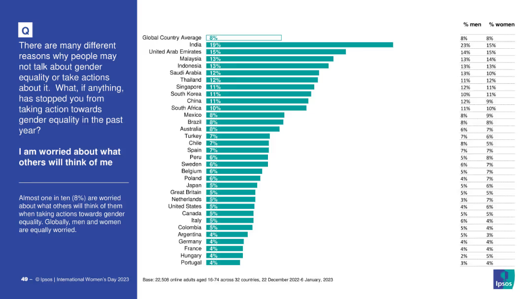
Standard bar chart with country-level responses and right-side gender table; includes title and intro on a blue background panel to the left.
Risk Assessment and Management
Government & Public Sector
This chart details the share of people who refrained from taking gender equality actions out of fear of judgment. India ranks highest (19%), while the global average is 8%. The data suggests similar concern levels between men and women globally.
perception, judgment, gender, equality action, stigma, social pressure, Ipsos survey
Mixed Chart
IPSOS
Saved
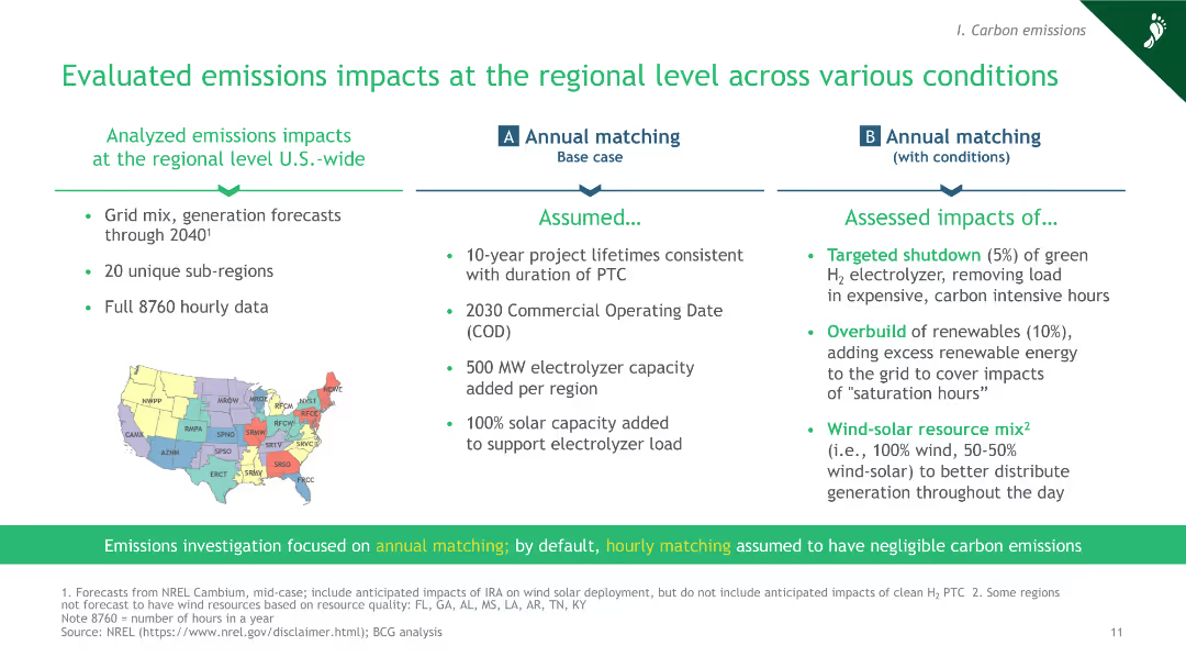
The slide includes a map of the U.S. divided into regions, with bullet points outlining the assumptions and assessed impacts of annual matching under various conditions.
Market Analysis and Trends
Energy & Utilities
This slide evaluates the emissions impacts of green hydrogen production at the regional level across the U.S., considering various conditions like targeted shutdown, overbuild of renewables, and wind-solar resource mix.
green hydrogen, regional impacts, emissions evaluation, annual matching, U.S. grid
Header Horizontal
BCG
Saved
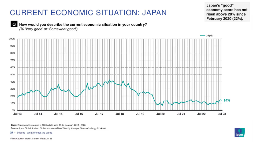
Line graph showing sentiment trend from 2013 to July 2023, marked with latest score (14%) and annotation.
Market Analysis and Trends
Financial Services
Japan's public perception of its economy has remained low, not surpassing 20% since February 2020. This slide reflects long-term pessimism with little improvement over the past three years.
Japan, economic sentiment, low confidence, Ipsos, trend analysis, public perception, long-term data, economic pessimism, survey, time series
Single Chart
IPSOS
Saved
Detailed graphical representation of the mobility value chain, showing segments like infrastructure, vehicles, and end-user experience with icons and names of key players in each segment, using various colors and labels.
Technology and Digital Transformation
Transportation & Logistics
Describes the evolving mobility landscape, identifying key players and segments within the infrastructure and vehicle operations. Useful for understanding shifts in transport and technology sectors.
mobility, value chain, infrastructure, technology, transport innovation
Linear Flow
BCG
Saved
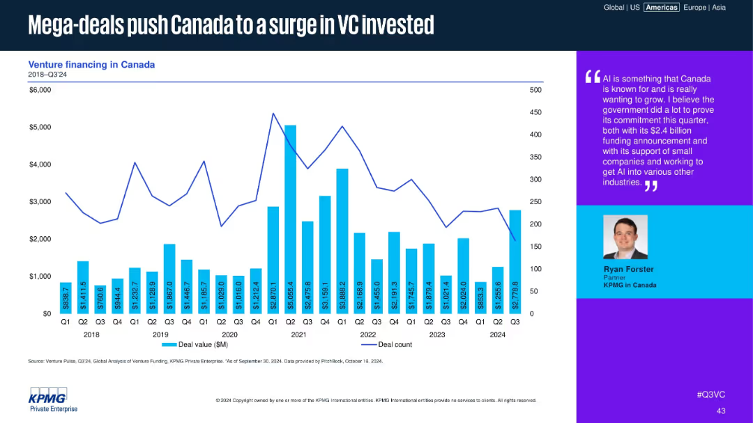
Bar and line graph of Canadian deal values and counts, with a text box quoting a KPMG partner.
Financial Performance
Financial Services
The chart shows quarterly Canadian VC deal activity, highlighting recent spikes due to mega-deals. A quote from a KPMG partner emphasizes Canada’s strategic investment in AI and the government's role in enabling ecosystem growth.
Canada, VC, mega-deals, AI, funding spike, government support, KPMG, deal value, ecosystem, investment
Mixed Chart
KPMG
Saved
The slide shows comparative column charts for the Shanghai, Shenzhen, Beijing, and Hong Kong Stock Exchanges, detailing the number of IPOs and proceeds from 2019 to YTD 2023.
Market Analysis and Trends
Financial Services
This slide highlights the IPO market performance of Mainland China and Hong Kong, breaking down the data by stock exchange and sector, including the top sectors by number of IPOs and proceeds.
IPO, China, Hong Kong, stock exchange
Multiple Chart
EY
Saved
The slide features three column charts and line icons in a well-organized layout. Green highlights and infographics are used to emphasize key data points.
Industry Overview
Education & Training
This slide presents data on the impact of community hubs on English language improvement and confidence boosting for immigrants. It utilizes various data visualizations to show improvements in language skills and the consequential increase in employment and social satisfaction.
community hubs, language improvement, confidence, employment, social connections
Multiple Chart
Deloitte
Saved
The slide features a graph plotting 'Support for the change' against 'Time', marked with phases from 'Awareness' to 'Embedded'. Red dots are connected by a rising curve, with text annotations indicating stages of change acceptance. The background is white, with a minimalist design and red textual highlights.
Organizational Structure and Change
Professional Services
This slide portrays a change curve model, demonstrating how communication leads to understanding, followed by engagement, and culminating in commitment. It outlines the phases of adopting change, from awareness to the change being fully embedded in behavior.
communication, engagement, commitment, change curve, adoption process
Single Chart
Bain
Saved
The slide features a mix of text and bullet points, organized into sections with icons, summarizing the decline in demand for Chinese suppliers and the rise in opportunities for others.
Strategic Planning
Healthcare & Pharmaceuticals
The slide discusses the opportunities and challenges for pharmaceutical companies due to the US BIOSECURE Act, focusing on supply chain resilience and the potential shift from China.
BIOSECURE Act, supply chain, opportunities, challenges, pharma
Table
LEK
Saved
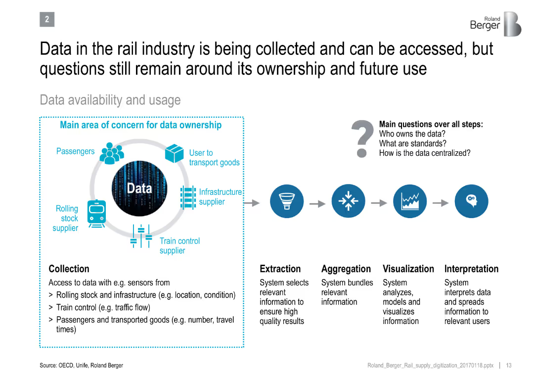
Diagram showing data flow from collection to interpretation, with concern areas around ownership and standards
Technology and Digital Transformation
Transportation & Logistics
Explains the lifecycle of rail industry data usage and the unclear governance issues around data ownership, standardization, and centralization.
rail industry, data ownership, IoT, data lifecycle, interpretation, infrastructure, digital systems
Diagram
Roland Berger
Saved
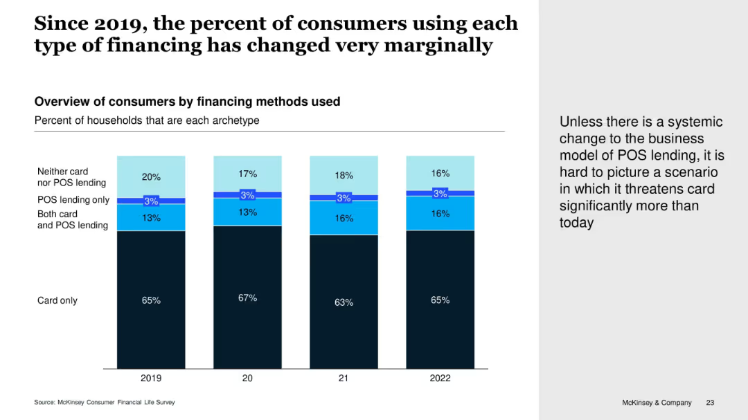
Vertical stacked bar chart showing consumer financing preferences by year (2019–2022), segmented by card use and POS lending combinations. Includes callout text on the right.
Customer and Market Segmentation
Financial Services
The slide shows little change over time in the types of consumer financing used. The majority continue to rely solely on cards, while POS lending adoption remains minimal. The narrative suggests POS lending isn't significantly threatening card use without a structural change.
POS Lending, Credit Cards, Consumer Behavior, Lending Trends, McKinsey Survey
Mixed Chart
McKinsey
Saved
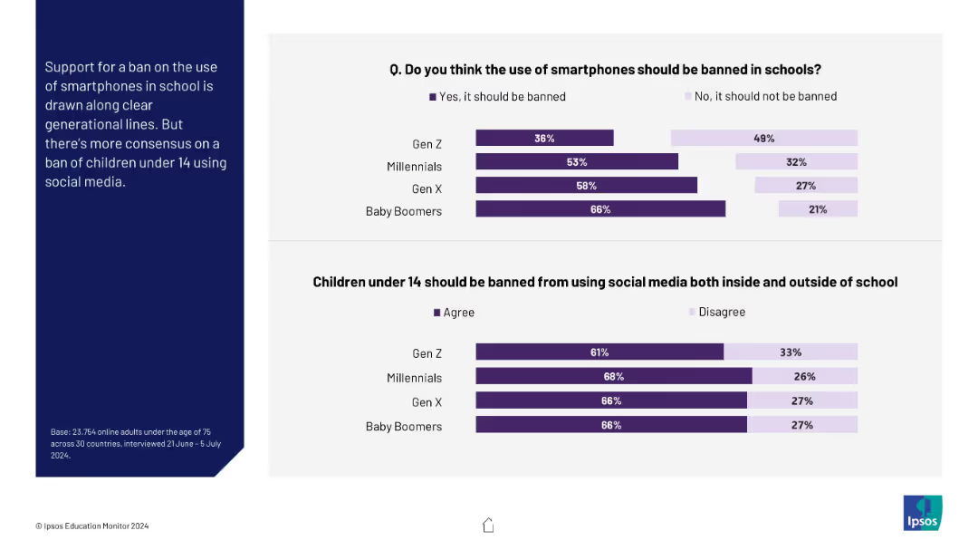
Two horizontal bar charts comparing generational views on smartphone bans and under-14 social media bans
Market Analysis and Trends
Education & Training
This slide examines generational differences in support for banning smartphones in school and children under 14 from using social media. Older generations (especially Boomers) are more supportive of restrictions.
generations, Gen Z, Baby Boomers, smartphone ban, social media, children, education
Mixed Chart
IPSOS
Saved
Two column charts comparing U.S. real business investment, future capex intentions, personal interest payments, and credit card delinquencies.
Market Analysis and Trends
Financial Services
The slide presents trends in U.S. business investment and consumer finances, focusing on capex intentions and personal interest payments over time.
business investment, capex, consumer finance, credit card delinquencies, U.S. economy
Multiple Chart
JP Morgan
Saved
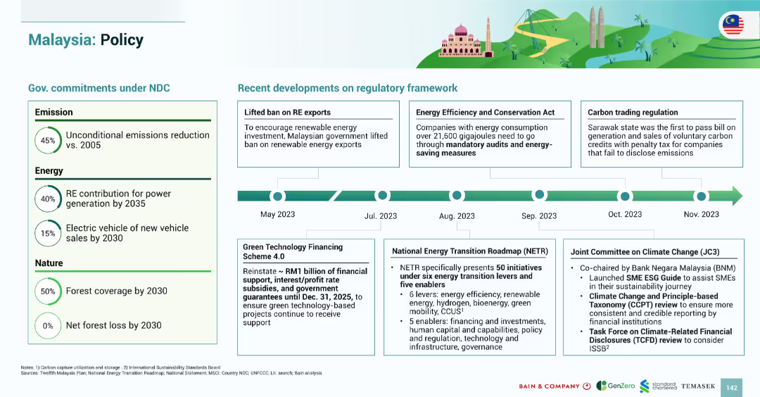
Clean layout with two sections: government NDC commitments on the left and a horizontal regulatory timeline on the right.
Regulatory and Compliance
Government & Public Sector
This slide outlines Malaysia’s commitments under the NDC including 45% emissions reduction and 50% forest coverage by 2030. It details regulatory changes from May to November 2023 such as lifted RE export ban, new Energy Efficiency Act, and carbon trading regulation in Sarawak.
Malaysia, policy, emissions, RE exports, carbon trading, regulation, 2030 targets, NETR
Mixed Chart
Bain
Saved
Comprising mainly of column charts, this slide illustrates 'Resilient Capital Ratios' over time and the 'Track Record of Dynamic Capital Management'. Each bar chart is accompanied by bullet points that explain the capital management strategy.
Regulatory and Compliance
Financial Services
The slide reviews capital ratios and management strategies, crucial for stakeholders assessing compliance with financial regulations and the company's financial prudence.
capital management, CET1 ratio, bar chart, financial compliance, regulatory standards, capital ratios, dynamic management, financial prudence, strategic oversight, stakeholder communication
Multiple Chart
Goldman Sachs
Saved
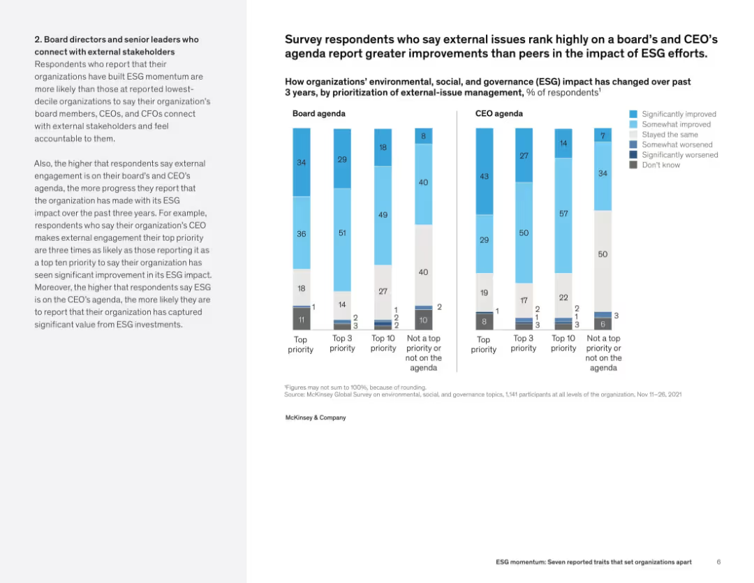
Left-aligned narrative with side-by-side vertical bar charts comparing ESG improvements based on board and CEO prioritization.
Human Resources and Talent Management
Professional Services
This slide links ESG success with the prioritization of external issues on leadership agendas. Organizations with high board and CEO ESG focus report significantly better ESG impact outcomes. Charts compare performance across four priority levels.
ESG impact, board leadership, CEO agenda, organizational outcomes, external engagement, ESG prioritization
Mixed Chart
McKinsey
Saved
The slide includes a bar chart comparing the roles of various corporate leaders in driving SDG initiatives, prominently highlighting the role of CEOs with a backdrop of subtle blue tones.
Market Analysis and Trends
Professional Services
This slide presents survey data on the driving forces behind SDG implementation in companies, emphasizing the significant role of CEOs compared to other leadership roles like CSR managers and sustainability project managers.
SDGs, CEO, leadership, corporate governance
Single Chart
McKinsey
Saved
Diagram listing the top 10 levers for operational efficiency, including product portfolio, R&D, procurement, production, logistics, sales & marketing, and service & after-sales.
Strategic Planning
Financial Services
The slide presents the top 10 operational efficiency levers for 2019, focusing on key areas such as cost improvement in the product portfolio, material cost reduction, and production efficiency. It highlights the strategic initiatives that companies are prioritizing to enhance their competitiveness and operational performance.
Operational Efficiency, Cost Improvement, 2019
Table
Roland Berger
Saved
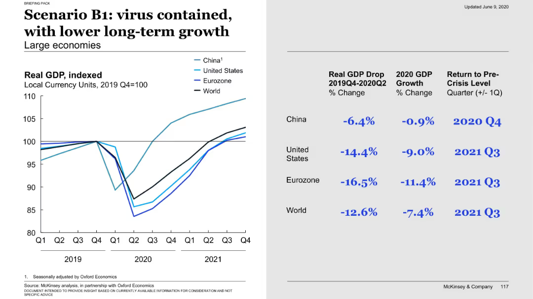
Left graph shows recovery followed by slower long-term trend; right side presents GDP drop and recovery timing across regions.
Financial Performance
Government & Public Sector
The B1 scenario anticipates virus containment but at the cost of sustained economic damage. Though a recovery occurs, long-term growth remains below previous levels. Data highlights severe GDP drops in US and Eurozone with recovery by Q3 2021.
B1, virus containment, long-term growth, GDP impact, economic damage, recovery timing, scenario
Mixed Chart
McKinsey
Saved
This slide features multiple vertical bar (column) charts showing the S&P 500 sectors' current P/E ratios against 10-year highs, lows, and averages, with annotations for specific dates and a descriptive legend below. The layout is information-dense with a mix of vibrant colors for differentiation.
Financial Performance
Financial Services
The slide presents a comparative valuation analysis of S&P 500 sectors using current and historical P/E ratios, useful for financial analysts and investors.
S&P 500, valuation, P/E ratio, financial analysis, equity markets, historical comparison, investment, sector analysis
Single Chart
Morgan Stanley
Saved
Previous
Next
If nothing, comes up, please save your slides first
Create a FREE account to continue browsing
Receive Instant Access to 1,000+ slides from companies like McKinsey, Google, and Goldman Sachs
First Name
Last Name
Email
Password
I agree to all
Terms & Privacy Policy
Thank you! Your submission has been received!
Oops! Something went wrong while submitting the form.
Have an account?
Sign in
Column Chart
Heatmap
Chevron
Org Chart
Infographic
Callouts
Timeline
List
Graphic
Picture
Process Flow
Diagram
Paragraph
Map
Table
Framework
Subtitle
Takeaway Box
Icon
Other Chart
Radar Chart
Waterfall Chart
Mekko Chart
Pie Chart
Scatter Plot
Line Chart
Bar chart
Bullet points