Create a FREE Account
Instant access to 1,000+ real slides from top companies like McKinsey, BCG, Goldman Sachs, Google and many more!
First Name
Last Name
Email
Password
I agree to all
Terms & Privacy Policy
Thank you! Your submission has been received!
Oops! Something went wrong while submitting the form.
Have an account?
Sign in
Library
Templates
Courses
Pricing
My Account
My Slides
My Templates
✦ AI
AI Prompt Library
AI Search
Sign in
Start Here
Logout
My Saved Slides
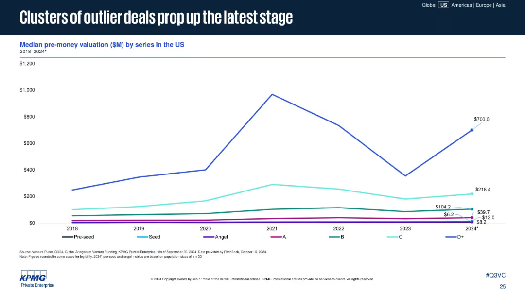
Single line chart showing median pre-money valuation by series from 2018–2024*. Uses a clean grid with legends for each series (Pre-seed to D+).
Investment Analysis
Financial Services
The chart reveals that while most early-stage valuations remain flat or slowly rise, D+ stage valuations have spiked in 2024, driven by outlier deals. This reflects increased valuation concentration at later funding stages.
pre-money valuation, D+ stage, venture funding, outlier deals, late-stage investment, valuation trends, 2024 VC
Single Chart
KPMG
Saved
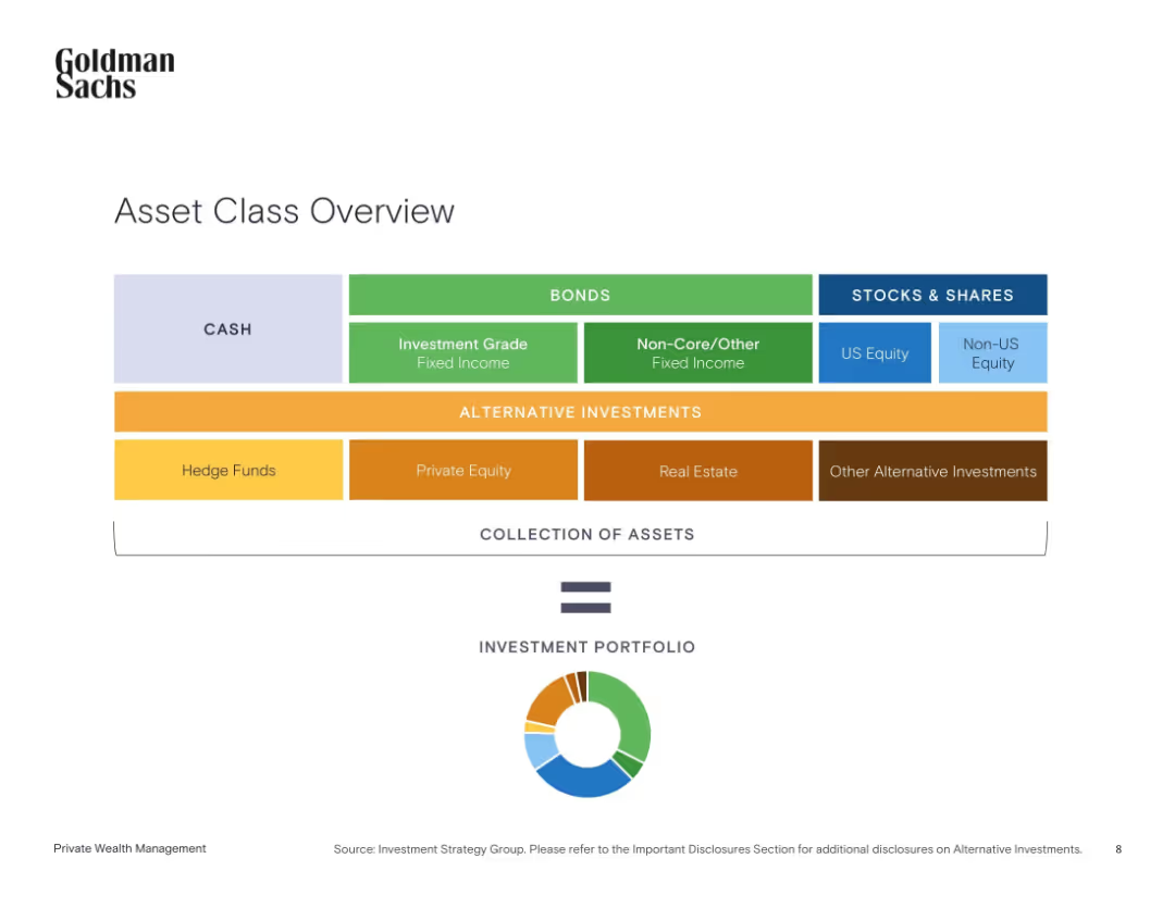
Clean horizontal layout of colored boxes grouped by asset class with a circular diagram below summarizing asset types.
Strategic Planning
Financial Services
This slide categorizes different types of investment assets into groups like cash, bonds, stocks, and alternative investments. It demonstrates how these components form a diversified investment portfolio and shows the visual balance via a pie chart.
asset allocation, cash, bonds, equities, alternatives, portfolio, diversification, investment strategy, Goldman Sachs
Single Chart
Goldman Sachs
Saved
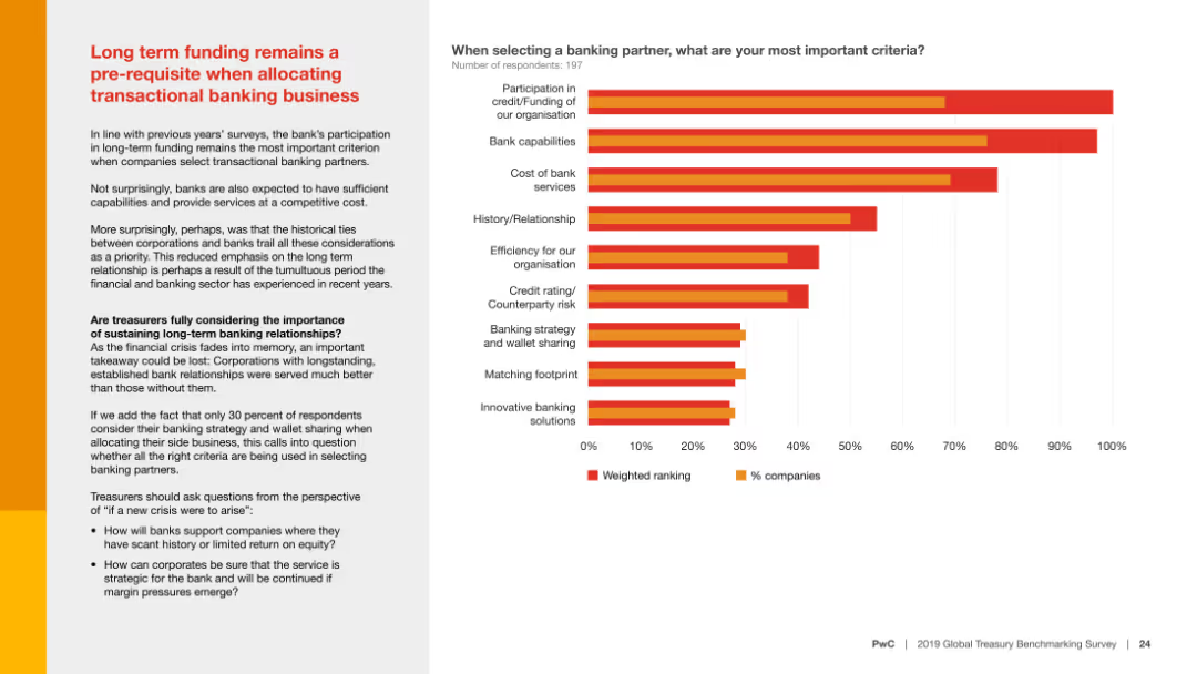
Includes two pie charts showing the frequency of core and secondary bank relationship reviews. Text explains the importance of systematic reviews.
Operational Efficiency
Financial Services
Highlights the lack of regular review of bank relationships by treasurers, suggesting systematic, scheduled reviews to enhance service and future readiness.
Bank relationships, review, frequency, systematic, treasurers
Mixed Chart
PwC/Strategy&
Saved
Discusses factors impacting Chile’s competitiveness in hydrogen exports, illustrated with a comparative column chart.
Competitive Landscape
Energy & Utilities
Evaluates competitive factors for Chile in the hydrogen market, considering production and transportation costs.
hydrogen, export, competitiveness, Chile, production costs, market share
Mixed Chart
McKinsey
Saved
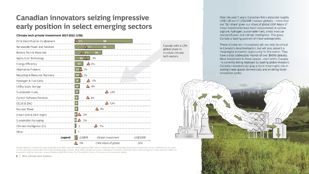
The slide includes a bar chart displaying the climate tech private investment from 2017 to 2022 across various sectors. It also features a small map of Canada, a detailed legend, and an illustration of a factory emitting green arrows to represent sustainable practices.
Market Analysis and Trends
Energy & Utilities
Highlights Canada's leading position in various emerging climate tech sectors through investments. Includes data on global and Canadian investments, emphasizing Canada’s share of the global market in these sectors.
Climate tech, Investment, Canada, Emerging sectors, Chart
Mixed Chart
BCG
Saved
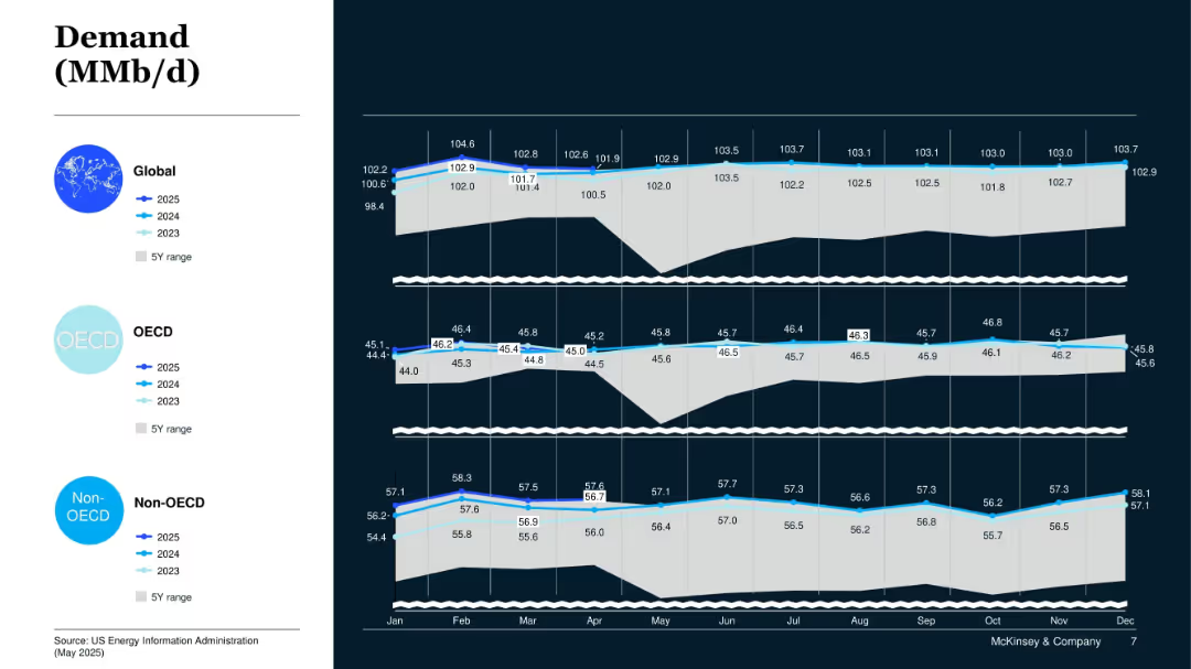
Layered line area chart across three panels: Global, OECD, Non-OECD; shows 2023–2025 demand outlook and 5Y range.
Market Analysis and Trends
Energy & Utilities
This slide compares global oil demand trends across OECD and non-OECD regions. It indicates steady global demand growth led by non-OECD consumption.
Oil Demand, OECD, Non-OECD, Global Energy, Consumption Forecast, 2025 Outlook
Mixed Chart
McKinsey
Saved
The slide presents column charts comparing the anticipated changes in the use of private vehicles and trains for intercity travel, split by current vehicle ownership status.
Market Analysis and Trends
Transportation & Logistics
Analyzes anticipated changes in vehicle use for intercity travel, considering vehicle ownership.
intercity travel, vehicle usage, ownership, projections
Multiple Chart
McKinsey
Saved
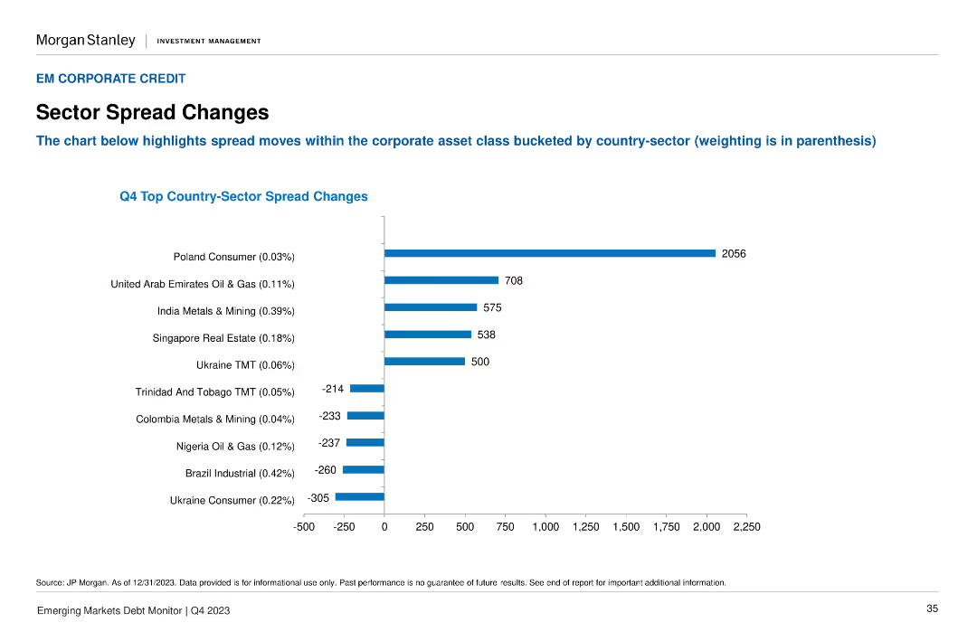
A column chart illustrates the Q4 Top Country-Sector Spread Changes, with the highest spread changes highlighted for different sectors and countries.
Market Analysis and Trends
Financial Services
It highlights the significant spread changes within the corporate asset class, broken down by country-sector combinations. Useful for sector-specific market analysis.
sector spreads, corporate asset, Q4, country-sector, market changes
Single Chart
Morgan Stanley
Saved
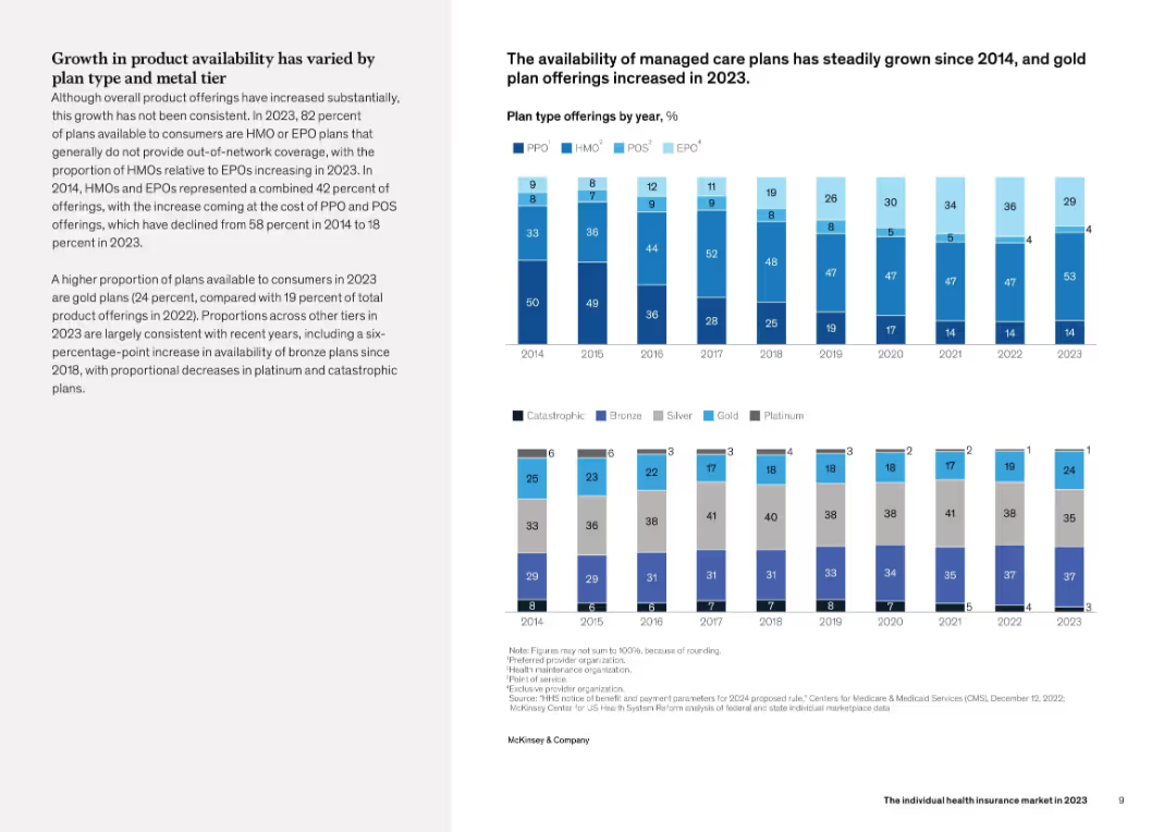
Dual chart layout on right side showing plan type offerings by year (2014–2023) and metal tier breakdowns. Left column contains explanatory text. Color-coded bar segments differentiate plan types and tiers.
Product and Service Analysis
Healthcare & Pharmaceuticals
This slide examines changes in health insurance product offerings from 2014 to 2023. It notes increased availability of managed care plans like HMOs and EPOs, and a rise in gold plans. The proportions of PPO and POS plans have decreased, while bronze plans have become more widely available, suggesting a shift in plan affordability and design preferences.
health plans, PPO, HMO, metal tiers, product availability, trends
Mixed Chart
McKinsey
Saved
Comparative column charts detailing perceptions of ROI on different educational degrees among Gen Z students.
Market Analysis and Trends
Education & Training
Compares the perceived value and ROI of four-year degrees versus associates’ degrees among different student demographics.
education, ROI, Gen Z, degree value, student perceptions
Multiple Chart
BCG
Saved
Contains a pie chart detailing reasons for vaccine wastage, and a column chart showing the impact of unreliable power on vaccine preservation in Nigerian healthcare centers.
Regulatory and Compliance
Healthcare & Pharmaceuticals
Focuses on the critical issues of vaccine wastage linked to inadequate power supply in Nigeria, advocating for solar energy solutions to ensure vaccine preservation and enhance immunization rates.
vaccine wastage, unreliable power, healthcare, Nigeria, solar power, immunization, public health
Mixed Chart
BCG
Saved
A column chart comparing the performance returns of the MS INVF Emerging Leaders Equity Fund against the MSCI EM Index over various time periods.
Financial Performance
Financial Services
This slide shows the performance returns of the MS INVF Emerging Leaders Equity Fund, highlighting excess returns and performance benchmarks.
Performance, Returns, Emerging Leaders, Equity Fund, MSCI, Index, Investment, Financial, Comparison, Benchmark
Mixed Chart
Morgan Stanley
Saved
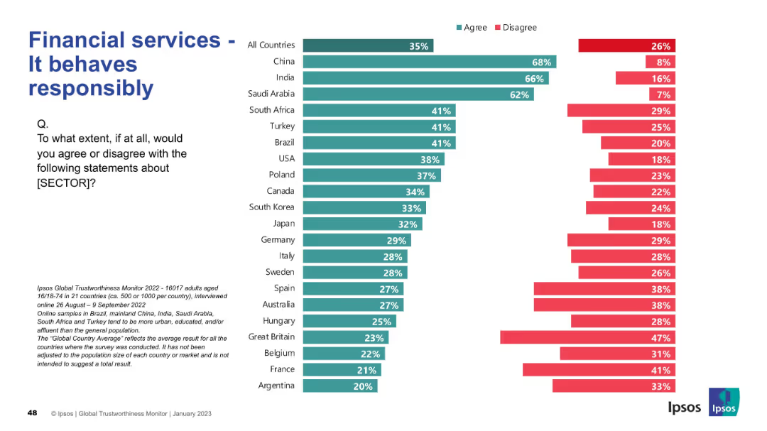
Consistent design with previous: bar chart by country, "Agree" vs. "Disagree"; title in blue
Regulatory and Compliance
Financial Services
This slide reflects global views on the responsibility of financial services. China, India, and Saudi Arabia rank highest in agreement (62–68%), whereas European countries show moderate to low confidence.
responsibility, compliance, trust, Ipsos, financial services, international, agreement, perception
Mixed Chart
IPSOS
Saved
This slide is a Comparative Slide, showcasing two columns labeled 'DEEP-INNOVATION CAPABILITIES' and 'MICHELIN'S HIGH-TECH MATERIALS ACTIVITIES' with icons and brief points underneath each. There are four points on the left with corresponding icons and three sections on the right detailing different product categories. The slide has a clean, professional design with a balance of text and icons.
Industry Overview
Industrial & Manufacturing
The slide presents Michelin’s strengths in innovation and product offering. On one side, it emphasizes their abilities in research and development, manufacturing, simulations, and sustainable materials. On the other, it showcases their high-tech material activities including sealing technologies, belting solutions, and engineered fabrics and films, highlighting the synergy between these areas.
innovation, manufacturing, materials, synergy, sustainability, technology, engineered fabrics, engineered polymers, high-tech
Header Horizontal
Morgan Stanley
Saved
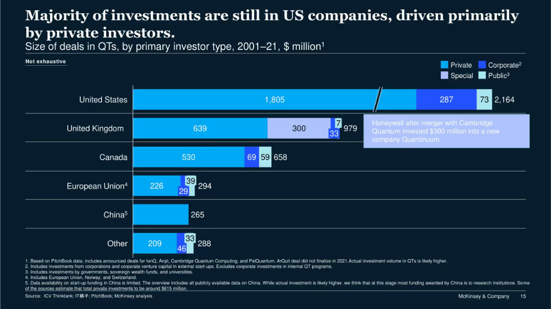
Horizontal bar chart on dark background showing QT investments by country and investor type; annotations and color-coded segments distinguish investor types.
Investment Analysis
Financial Services
The United States leads QT investments, primarily from private and corporate sources. UK, Canada, and EU follow, with varying levels of public and special investment. The slide highlights a $300M investment post-Cambridge Quantum merger.
QT investment, US, investor type, corporate, public funding
Single Chart
McKinsey
Saved
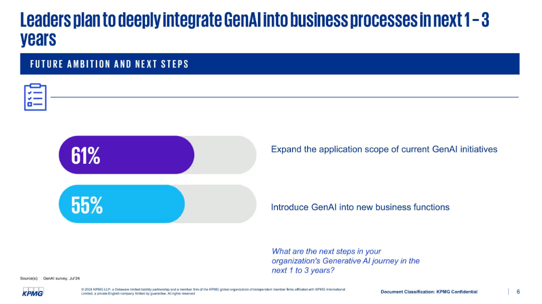
Simple layout with two horizontal progress bars showing future plans: expand scope and introduce into new functions
Strategic Planning
Artificial Intelligence
This slide outlines executive ambitions to scale GenAI integration over the next 1–3 years. 61% of leaders plan to expand current initiatives, while 55% aim to introduce GenAI to new business areas. The layout is minimalistic, focusing attention on the percentages and intended actions.
GenAI roadmap, expansion, business functions, KPMG, adoption, strategy
Single Chart
KPMG
Saved
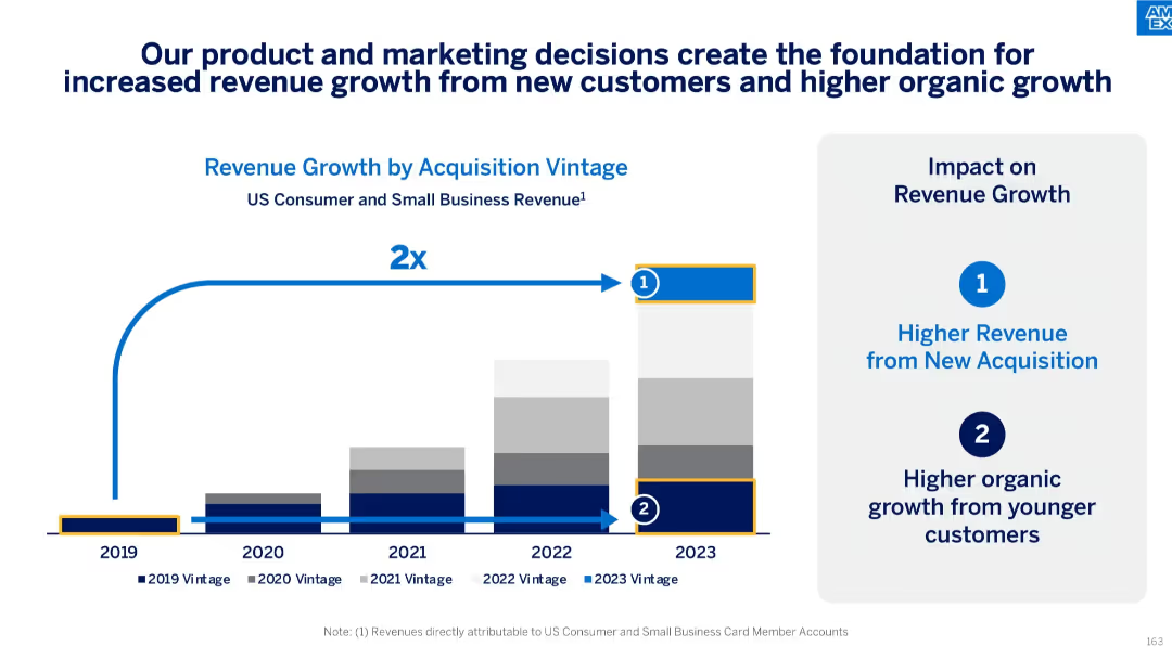
Stacked bar chart (2019–2023) with callouts for vintage revenue growth; two blue callout icons summarizing revenue sources
Strategic Planning
Financial Services
This slide outlines the doubling of revenue from 2019 to 2023, driven by strategic product and marketing efforts. It attributes growth to both new customer acquisitions and increased spending from younger customer cohorts, emphasizing sustainable organic growth.
revenue growth, customer acquisition, marketing impact, organic growth, vintage analysis, small business, consumer revenue
Mixed Chart
McKinsey
Saved
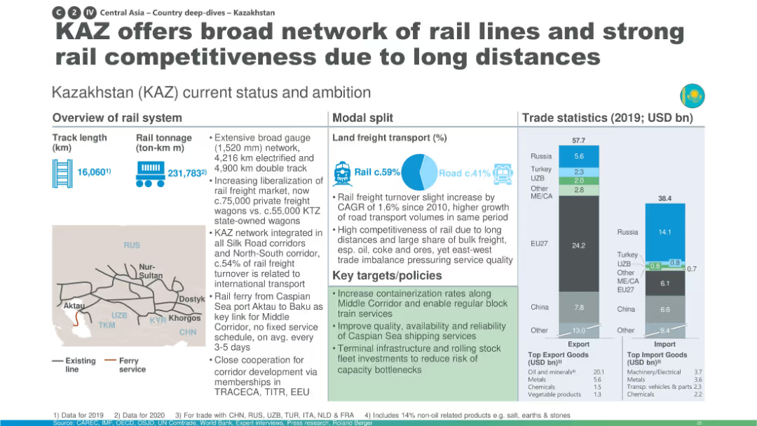
Map-heavy layout with large pie chart for modal share; emphasis on long-distance transport and containerization.
Industry Overview
Transportation & Logistics
Kazakhstan is presented as a key player in rail freight across Central Asia due to its extensive network, liberalized market, and integration into multiple corridors. The slide focuses on capacity enhancements and future development goals to maintain competitiveness.
Kazakhstan, containerization, rail freight, Caspian ferry, competitiveness, infrastructure
Multiple Chart
Roland Berger
Saved
Features a large pie chart showing percentages of Generative AI tool usage among the public, with explanatory text providing additional context on usage barriers.
Market Analysis and Trends
Technology & Software
Analyzes the percentage of the population that has used Generative AI tools, emphasizing the low engagement despite high awareness.
Generative AI, usage statistics, technology adoption, market barriers, public engagement
Mixed Chart
Deloitte
Saved
Features scatter plots and other visual representations to show various applications of the Purchasing Chessboard® in different contexts.
Market Analysis and Trends
Professional Services
Demonstrates diverse applications of the Purchasing Chessboard® in managing procurement stakeholders and category profiles.
Purchasing Chessboard, applications, procurement, stakeholders, category profiles, scatter plots, visual representation
Uncategorized
Kearney
Saved
Column charts comparing YTD financial results with previous years, highlighted with key financial metrics.
Financial Performance
Financial Services
Summarizes Deutsche Bank's YTD financial performance for 2023, including pre-provision profit and risk management statistics.
financial performance, YTD results, banking, revenue growth, risk management
Mixed Chart
Deutsche Bank
Saved
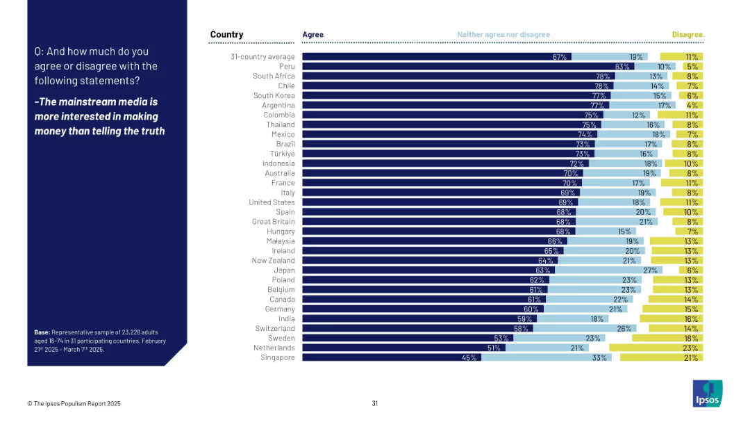
Horizontal bar chart showing agreement across countries that media prioritizes profit over truth, with neutral/disagree splits and ranking.
Market Analysis and Trends
Media & Entertainment
The slide reveals skepticism toward mainstream media, with 67% of global respondents agreeing that media prioritizes money over truth. Japan (63%) ranks above average, while countries like Peru and South Africa show the highest agreement.
media, truth, profit, skepticism, public trust, Ipsos, journalism, populism, 2025, perception
Mixed Chart
IPSOS
Saved
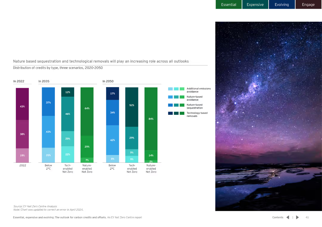
Dark background with column charts showing the distribution of credits by type over different years. Detailed and colorful visualization.
Market Analysis and Trends
Environmental Services & Sustainability
Examines the role of nature-based and technological removals in different scenarios and their increasing importance.
nature-based sequestration, technological removals
Multiple Chart
EY
Saved
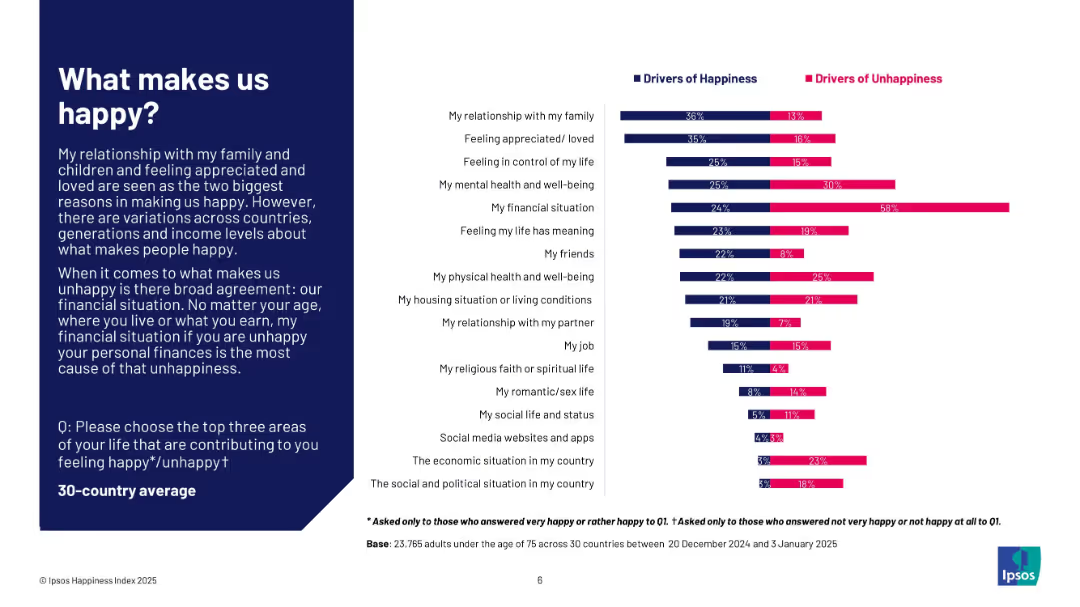
Dual bar chart comparing happiness and unhappiness drivers; left-aligned explanatory text in dark blue box; white background chart area.
Customer and Market Segmentation
Professional Services
The slide identifies key personal factors that contribute to happiness and unhappiness across 30 countries. Relationships and feeling loved are top drivers of happiness, while financial situation is the dominant cause of unhappiness. The layout compares these drivers side-by-side for clear contrast.
happiness, unhappiness, drivers, financial, relationships, mental health, global study, Ipsos, well-being, satisfaction
Mixed Chart
IPSOS
Saved
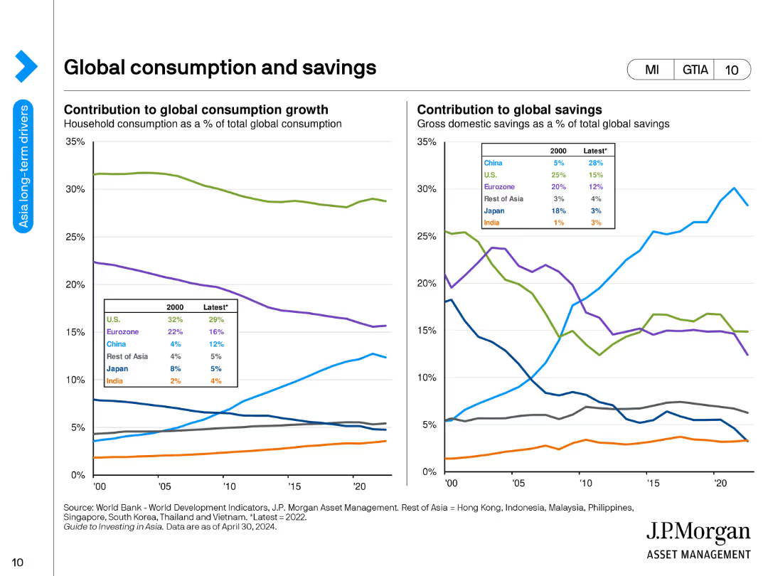
Two line charts. The left chart shows the contribution to global consumption growth by region, and the right chart shows the contribution to global savings.
Market Analysis and Trends
Financial Services
The slide presents the global consumption growth contributions by region and the changes in global savings percentages over time.
consumption, savings, global, trends, regions, financial analysis, economic behavior, growth, forecast, development
Multiple Chart
JP Morgan
Saved
Previous
Next
If nothing, comes up, please save your slides first
Create a FREE account to continue browsing
Receive Instant Access to 1,000+ slides from companies like McKinsey, Google, and Goldman Sachs
First Name
Last Name
Email
Password
I agree to all
Terms & Privacy Policy
Thank you! Your submission has been received!
Oops! Something went wrong while submitting the form.
Have an account?
Sign in
Column Chart
Heatmap
Chevron
Org Chart
Infographic
Callouts
Timeline
List
Graphic
Picture
Process Flow
Diagram
Paragraph
Map
Table
Framework
Subtitle
Takeaway Box
Icon
Other Chart
Radar Chart
Waterfall Chart
Mekko Chart
Pie Chart
Scatter Plot
Line Chart
Bar chart
Bullet points