Create a FREE Account
Instant access to 1,000+ real slides from top companies like McKinsey, BCG, Goldman Sachs, Google and many more!
First Name
Last Name
Email
Password
I agree to all
Terms & Privacy Policy
Thank you! Your submission has been received!
Oops! Something went wrong while submitting the form.
Have an account?
Sign in
Library
Templates
Courses
Pricing
My Account
My Slides
My Templates
✦ AI
AI Prompt Library
AI Search
Sign in
Start Here
Logout
My Saved Slides
The slide displays column charts in varying shades of blue, showcasing asset growth over time with annotations. Arrows are used to indicate trends and future projections.
Financial Performance
Financial Services
This slide presents asset growth data and projections for future growth, illustrating traditional and alternative net inflows, with the ultimate goal of reaching a projected AUS of approximately $2.2 trillion.
Asset, Growth, Inflows, Projections, Financial
Single Chart
Goldman Sachs
Saved
U.S. map with color gradients representing daily cases per million, bar graphs for top 5 states by daily cases, and temporal changes from April to July.
Risk Assessment and Management
Government & Public Sector
Displays the shift in COVID-19 hotspots within the U.S. over time, with a focus on case distribution per state.
COVID-19, Hotspots, Case Distribution, USA, Regional Shift
Mixed Chart
BCG
Saved
This slide features three column charts showing the adoption rates of newer digital health technologies such as Remote Patient Monitoring, Chatbots/Voice-enabled technology, and Digital Therapeutics from 2016 to 2021. Colors differentiate the years, highlighting trends over time.
Market Analysis and Trends
Healthcare & Pharmaceuticals
The slide presents data on emerging digital health technologies with a focus on recent growth trends. It's particularly useful for stakeholders interested in the adoption rates of innovative health technologies and their impact on healthcare delivery. The increasing usage of digital therapeutics in 2021 suggests a growing market acceptance.
emerging technologies, digital health, adoption rates, healthcare innovation, market trends
Multiple Chart
Accenture
Saved
Gartner Hype Cycle diagram for blockchain applications in 2021, showing different stages from innovation trigger to plateau of productivity.
Technology and Digital Transformation
Technology & Software
This slide presents the Gartner Hype Cycle for blockchain applications, illustrating the different stages of technology maturity. It predicts that blockchain will significantly decentralize markets and make trade more efficient, highlighting the expected timeline for various blockchain applications to reach mainstream adoption.
Blockchain, Hype Cycle, Decentralization
Mixed Chart
Roland Berger
Saved
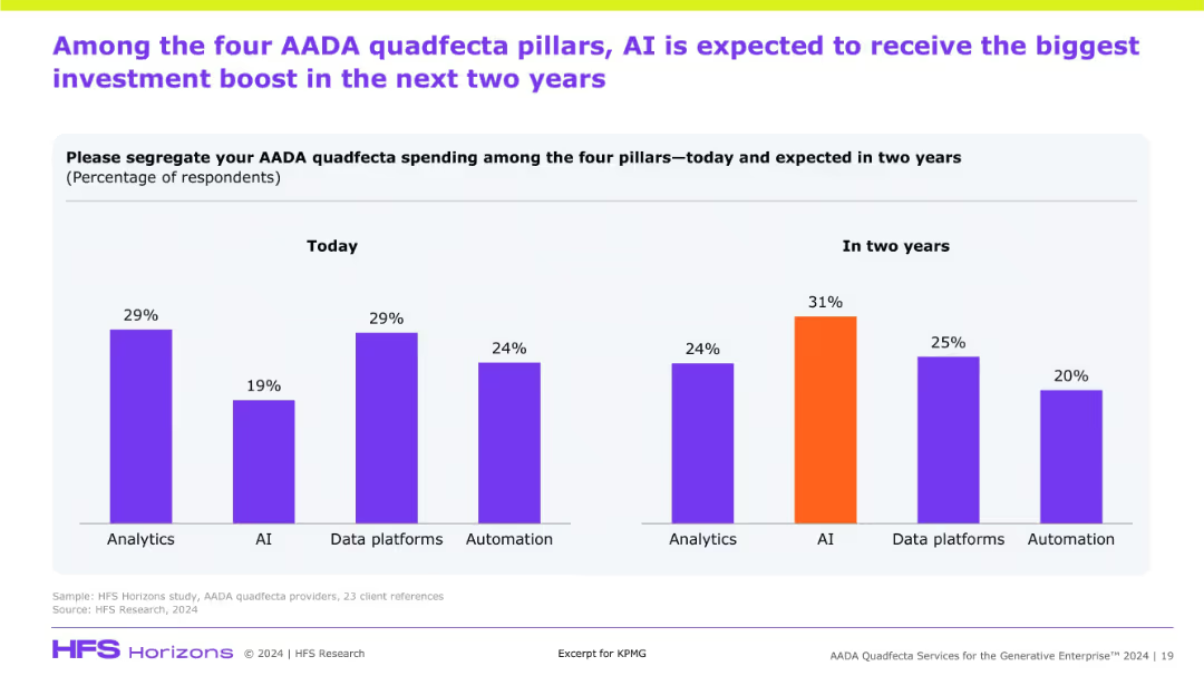
Double bar chart comparing current and future investment allocation across AADA pillars. AI shows the highest projected increase.
Investment Analysis
Artificial Intelligence
The slide compares current and expected investment distribution across AADA pillars, showing AI as the largest growth area. It illustrates a shift in strategic focus toward AI over the next two years.
AADA investment, AI, analytics, automation, data platforms, future spend, strategic focus
Multiple Chart
KPMG
Saved
This slide contains two vertical column charts. The left chart, 'Quarterly CLO Creation and Mutual Fund Flows', shows data in blue tones, with pattern differentiation for CLOs, Loan Funds, and the total. The right chart, 'Institutional Loan Volume Backing M&A', features dark and light blue bars representing different types of loans.
Investment Analysis
Financial Services
The left chart analyzes the trends in CLO creation versus mutual fund flows, suggesting an investment climate. The right chart details the volume of institutional loans supporting mergers and acquisitions, indicating market activity and investor sentiment.
CLO Creation, Mutual Fund Flows, Institutional Loans, M&A, LBO, PE-backed, Corporate, Investment Climate, Market Activity
Multiple Chart
Morgan Stanley
Saved
Contains flow chart and icons illustrating three major market trends affecting the financial sector.
Strategic Planning
Financial Services
Outlines key trends shaping the market, such as the growth of B2B, competitive B2C environments, and alternative payments.
market shifts, B2B growth, competition, B2C, payments
Pillar
BCG
Saved
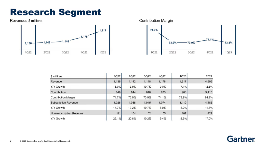
Two line graphs (Revenue and Contribution Margin) and a comparison table for revenue, contribution, subscription performance over 5 quarters.
Performance Metrics and KPIs
Technology & Software
This slide focuses on financial details of the Research segment, including steady growth in revenue and margins over time. Subscription revenue trends and Y/Y growth rates are provided for both subscription and non-subscription income streams.
research, segment analysis, subscription revenue, contribution margin
Multiple Chart
Gartner
Saved
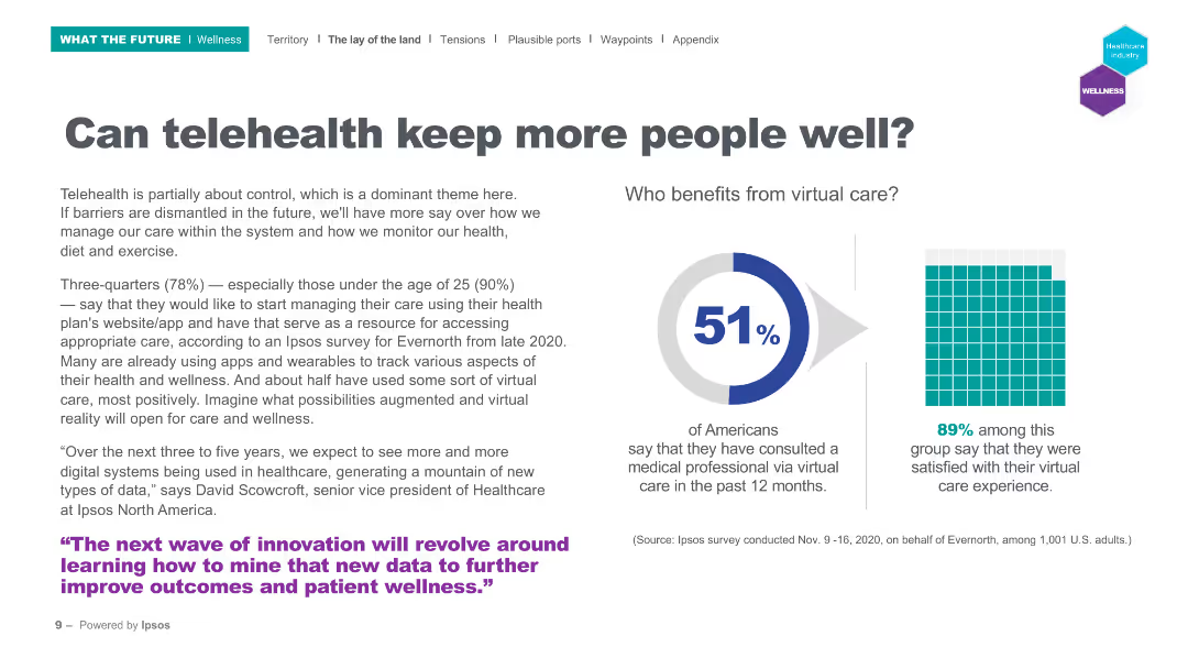
The slide includes a pie chart showing the percentage of Americans who have used virtual care and a grid chart on satisfaction with virtual care.
Technology and Digital Transformation
Healthcare & Pharmaceuticals
This slide discusses the adoption of telehealth, with 51% of Americans having used virtual care and 89% of those users being satisfied. It emphasizes the potential of telehealth to improve patient wellness.
Telehealth, virtual care, patient satisfaction, digital health, wellness
Mixed Chart
IPSOS
Saved
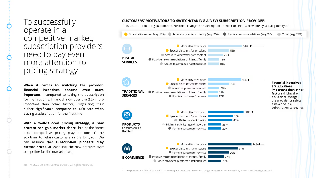
The slide has a column chart listing the top motivators for customers to switch subscription providers, categorized by type. It emphasizes financial incentives and their significance compared to other factors.
Market Analysis and Trends
Consumer Goods
This slide discusses the importance of pricing strategies for subscription providers in competitive markets. It details how financial incentives are crucial in influencing customer decisions to switch providers.
pricing strategy, financial incentives, competitive market, customer motivators, subscription providers, ecommerce, retail
Multiple Chart
Deloitte
Saved
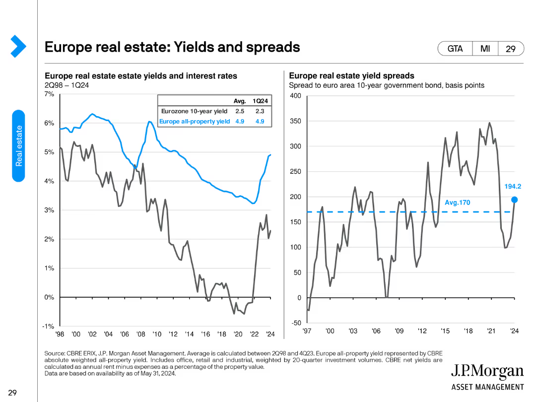
This slide features two column charts. The left chart compares Eurozone 10-year yield with all-property yield, while the right chart shows yield spreads.
Financial Performance
Real Estate & Construction
It compares Eurozone 10-year government bond yields with all-property yields, highlighting trends from 2Q98 to 1Q24, useful for investment analysis.
real estate, yields, spreads, Eurozone, investment, property, trends, analysis
Multiple Chart
JP Morgan
Saved
Slide contains a mixture of column charts and line graphs, depicting revenue trends and forecasts.
Market Analysis and Trends
Media & Entertainment
Discusses the significant drop and recovery forecast of box-office collections in India from 2020 to 2025, with specific growth percentage figures.
cinema, India, box-office, CAGR, recovery
Multiple Chart
PwC/Strategy&
Saved
Contains two column charts detailing the impact of increased solar penetration on electricity generation and GHG emissions from household fuel generators. Each chart is complemented by annotations and a decrease marker, highlighting the reductions in emissions and fuel usage.
Regulatory and Compliance
Energy & Utilities
This slide quantifies the impact of solar adoption on reducing reliance on household fuel generators in Nigeria by 2030. It demonstrates a notable decrease in both electricity generated from these generators and associated GHG emissions, underscoring solar's environmental and health benefits.
solar, impact, electricity, generators, GHG emissions, reduction, 2030, Nigeria, energy
Multiple Chart
BCG
Saved
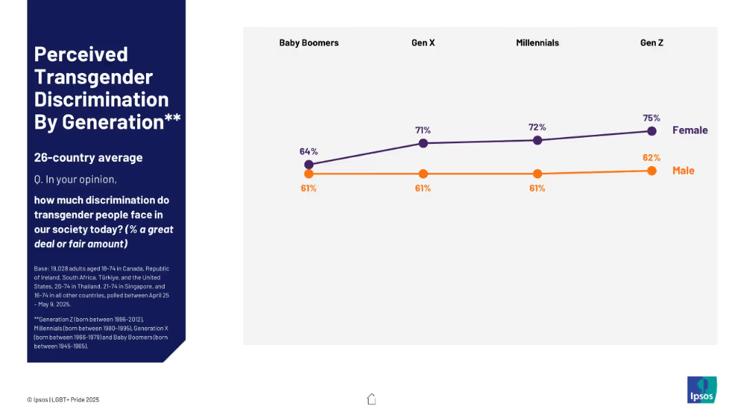
Line chart with male and female lines across four generations
Risk Assessment and Management
Government & Public Sector
This slide shows generational perceptions of transgender discrimination. Female respondents increasingly perceive high levels of discrimination from Baby Boomers to Gen Z. Male perceptions remain largely stable, with a slight increase among Gen Z.
transgender, discrimination, perception, gender difference, generation gap, Ipsos
Mixed Chart
IPSOS
Saved
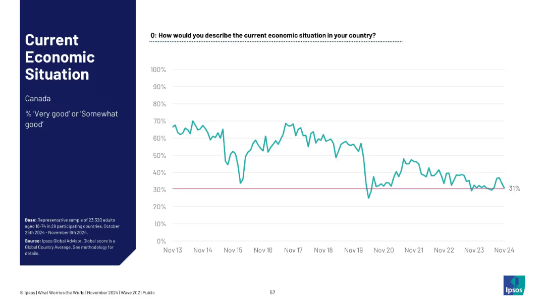
Single-country (Canada) line chart tracking positive economic sentiment since 2013; ends at 31%.
Financial Performance
Financial Services
Tracks Canadian public sentiment on the economy from 2013–2024. After high early optimism, sentiment declines and stabilizes below 40%, reflecting shifting economic realities such as inflation, housing, and employment factors.
Canada, economic trend, financial sentiment, Ipsos, time series, public opinion, macroeconomy, national outlook
Single Chart
IPSOS
Saved
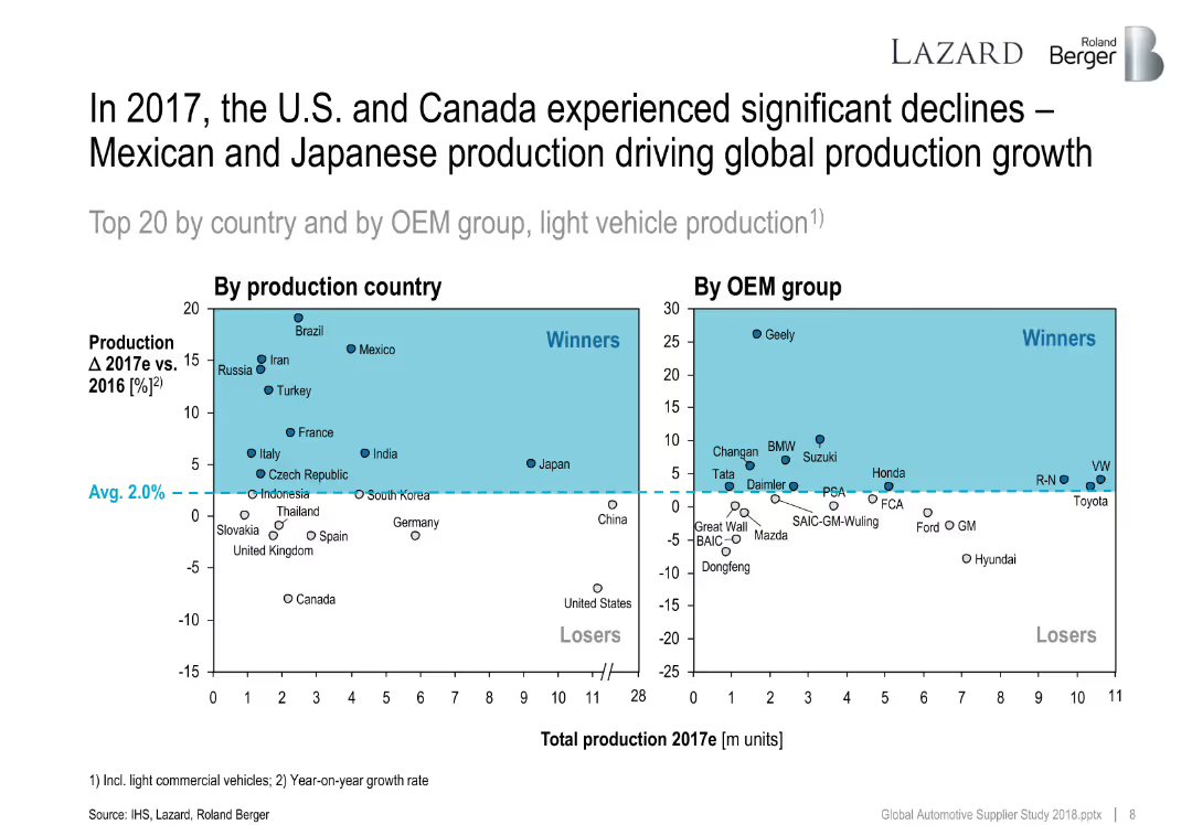
Two quadrant scatter plots showing production country and OEM group changes in 2017 vs. 2016. Average growth line divides winners and losers.
Performance Metrics and KPIs
Industrial & Manufacturing
This slide maps growth in vehicle production by country and OEM group. Winners include Mexico and Geely, while the U.S. and Canada declined. It highlights global shifts in automotive output.
production growth, OEMs, countries, vehicle output, 2017, performance, global ranking
Multiple Chart
Roland Berger
Saved
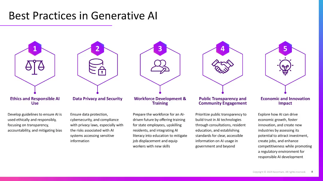
Five-column layout with numbered icons and headers, each describing a best practice. Uses visual symmetry and hexagonal icons with consistent purple theme.
Regulatory and Compliance
Artificial Intelligence
Lists five best practices for generative AI: ethical use, privacy/security, workforce training, public transparency, and fostering economic impact. Each section outlines strategic and regulatory considerations.
AI ethics, security, workforce training, transparency, innovation, best practices
Pillar
Accenture
Saved
A bar chart (horizontal) showing the likelihood of consumers to save energy at home across various countries. The chart differentiates between likely and unlikely responses using different colors.
Market Analysis and Trends
Consumer Goods
This slide presents comparative data on the likelihood of saving energy at home. It includes insights into consumer attitudes and behaviors towards energy conservation across different regions.
energy conservation, consumer behavior, sustainability, global attitudes, comparative data
Multiple Chart
IPSOS
Saved
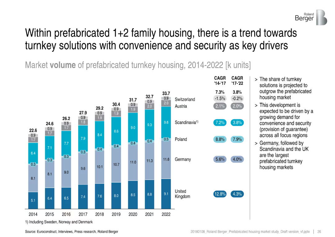
Bar chart layout with annual market volume in stacked segments by country, side notes on trends, and CAGR values for 2014–17 and 2017–22
Market Analysis and Trends
Real Estate & Construction
This slide presents the market volume of prefabricated turnkey housing across multiple European countries from 2014 to 2022. It highlights growth trends and CAGR data, emphasizing the shift towards turnkey solutions driven by convenience and security. Germany, Scandinavia, and the UK lead the market in volume.
turnkey, prefabricated, housing, market volume, CAGR, Germany, Scandinavia, UK, security, convenience
Mixed Chart
Roland Berger
Saved
A U.S. map pinpointing U.S. Bank and State Farm locations, alongside line graphs showcasing crypto fund flows and the number of new accounts, using red and blue colors.
Strategic Planning
Financial Services
Outlines strategic partnerships with State Farm and NYDIG, detailing the expansion of deposit accounts and the introduction of cryptocurrency custody services, reflecting diversification and digital advancement strategies.
Strategic Partnerships, Crypto, State Farm
Multiple Chart
Goldman Sachs
Saved
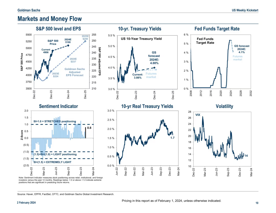
Six mini-panel layout of line charts; covers equity, bond yields, rates, sentiment, and volatility in a concise dashboard format.
Market Analysis and Trends
Financial Services
A multi-panel dashboard providing a snapshot of market indicators including S&P 500 price and EPS trends, treasury yields, sentiment, Fed funds rate projections, real yields, and VIX volatility. The slide is a macroeconomic pulse check summarizing key movements and outlooks as of early 2024.
equity, yields, sentiment, Fed rate, volatility, S&P 500, EPS, VIX, bonds
Multiple Chart
Goldman Sachs
Saved
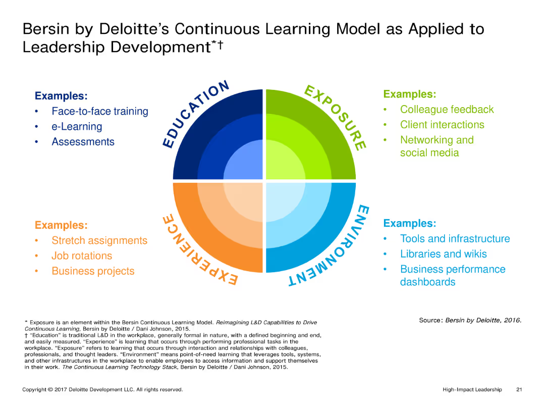
A circular diagram divided into four quadrants representing Education, Experience, Exposure, and Environment. Each quadrant lists examples and methods associated with that aspect of learning.
Market Analysis and Trends
Education & Training
The slide explains Deloitte's Continuous Learning Model, focusing on how education, experience, exposure, and environment contribute to leadership development. Each quadrant provides examples of activities and tools used in these areas.
Continuous Learning, Leadership Development, Education, Experience, Environment
Framework
Deloitte
Saved
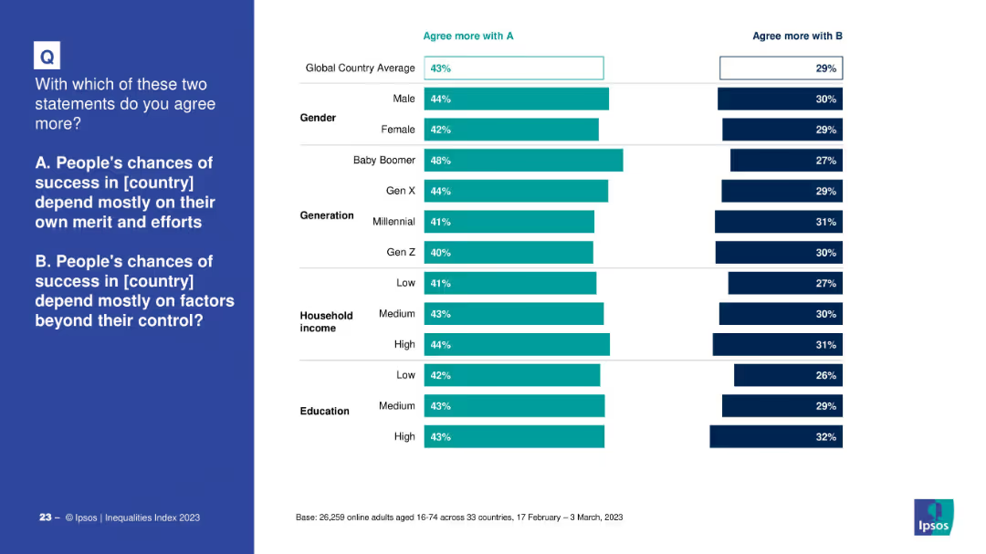
Vertical bar comparison by gender, generation, income, and education. Contrasts agreement with "success depends on own effort" vs. "depends on external factors." Uses a similar color scheme and format to Slide 19768.
Market Analysis and Trends
Government & Public Sector
This slide breaks down belief in meritocracy across demographic lines. Older generations and higher-income/educated individuals are more likely to believe success is based on effort, while younger generations and lower-income groups are more divided.
generational gap, success, meritocracy, demographics, education, income, Ipsos, social mobility
Mixed Chart
IPSOS
Saved
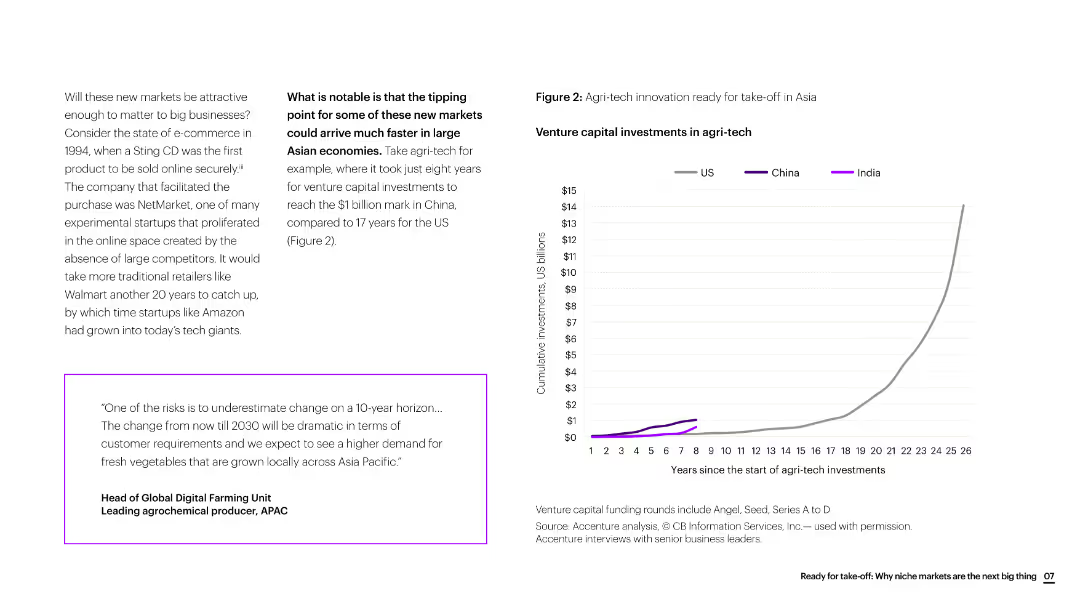
The slide includes text, a quote box, and a line chart showing venture capital investments in agri-tech over time, comparing the US, China, and India.
Market Analysis and Trends
Agriculture & Food Production
The slide discusses the rapid growth of agri-tech innovation in Asia, particularly highlighting the faster investment growth in China compared to the US.
agri-tech, innovation, Asia, venture capital, investment growth, agriculture, market trends
Mixed Chart
Accenture
Saved
Features a table, a column chart, and detailed textual descriptions.
Financial Performance
Financial Services
Discusses management fees, incentive fees, equity investments, and net revenue impacts with year-on-year comparisons.
Asset, Management, Fees, Incentives, Investments, Bar Chart, Revenue, Performance, Net Earnings, Financial
Mixed Chart
Goldman Sachs
Saved
Previous
Next
If nothing, comes up, please save your slides first
Create a FREE account to continue browsing
Receive Instant Access to 1,000+ slides from companies like McKinsey, Google, and Goldman Sachs
First Name
Last Name
Email
Password
I agree to all
Terms & Privacy Policy
Thank you! Your submission has been received!
Oops! Something went wrong while submitting the form.
Have an account?
Sign in
Column Chart
Heatmap
Chevron
Org Chart
Infographic
Callouts
Timeline
List
Graphic
Picture
Process Flow
Diagram
Paragraph
Map
Table
Framework
Subtitle
Takeaway Box
Icon
Other Chart
Radar Chart
Waterfall Chart
Mekko Chart
Pie Chart
Scatter Plot
Line Chart
Bar chart
Bullet points