Create a FREE Account
Instant access to 1,000+ real slides from top companies like McKinsey, BCG, Goldman Sachs, Google and many more!
First Name
Last Name
Email
Password
I agree to all
Terms & Privacy Policy
Thank you! Your submission has been received!
Oops! Something went wrong while submitting the form.
Have an account?
Sign in
Library
Templates
Courses
Pricing
My Account
My Slides
My Templates
✦ AI
AI Prompt Library
AI Search
Sign in
Start Here
Logout
My Saved Slides
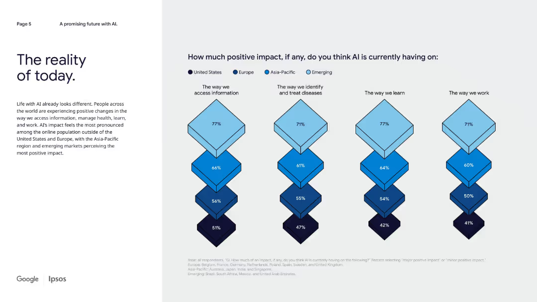
Left-aligned narrative text with right side diamond charts comparing AI’s positive impact across four domains by region.
Strategic Planning
Artificial Intelligence
This slide presents survey results on perceived positive AI impact globally, emphasizing that emerging and Asia-Pacific markets see more benefits across information access, healthcare, learning, and work compared to the U.S. and Europe.
AI today, regional comparison, impact by domain, emerging markets, health, learning, information access
Mixed Chart
IPSOS
Saved
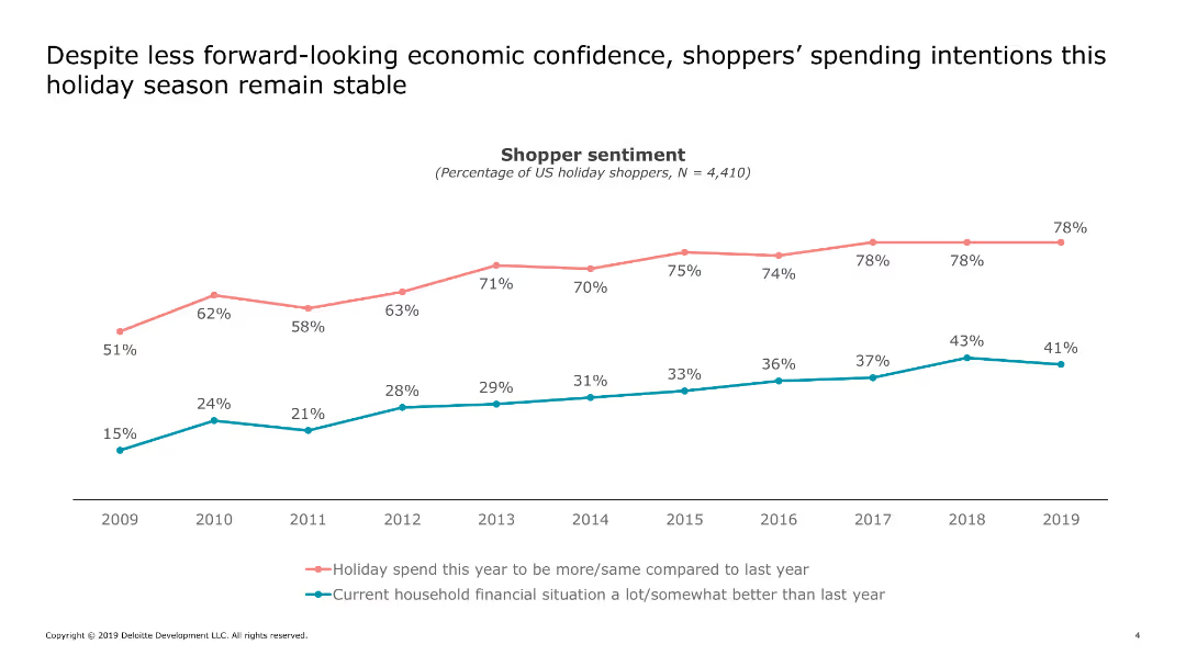
Displays a line chart comparing holiday spending intentions with household financial situations from 2009 to 2019.
Market Analysis and Trends
Retail & E-commerce
Analyzes shopper sentiment regarding holiday spending and household financial situations over a decade, showing trends and changes in economic confidence.
shopper, sentiment, holiday, spending, financial, confidence, trend, analysis
Single Chart
Deloitte
Saved
Column chart on customer outreach and circular flow diagram for branch team roles. Muted colors with blue highlights.
Strategic Planning
Financial Services
Transition to proactive customer engagement and integrated branch team roles in various banking services.
Customer Outreach, Integrated Teams, Wealth Management, Relationship Development, Proactive Engagement, Branch Network
Mixed Chart
JP Morgan
Saved
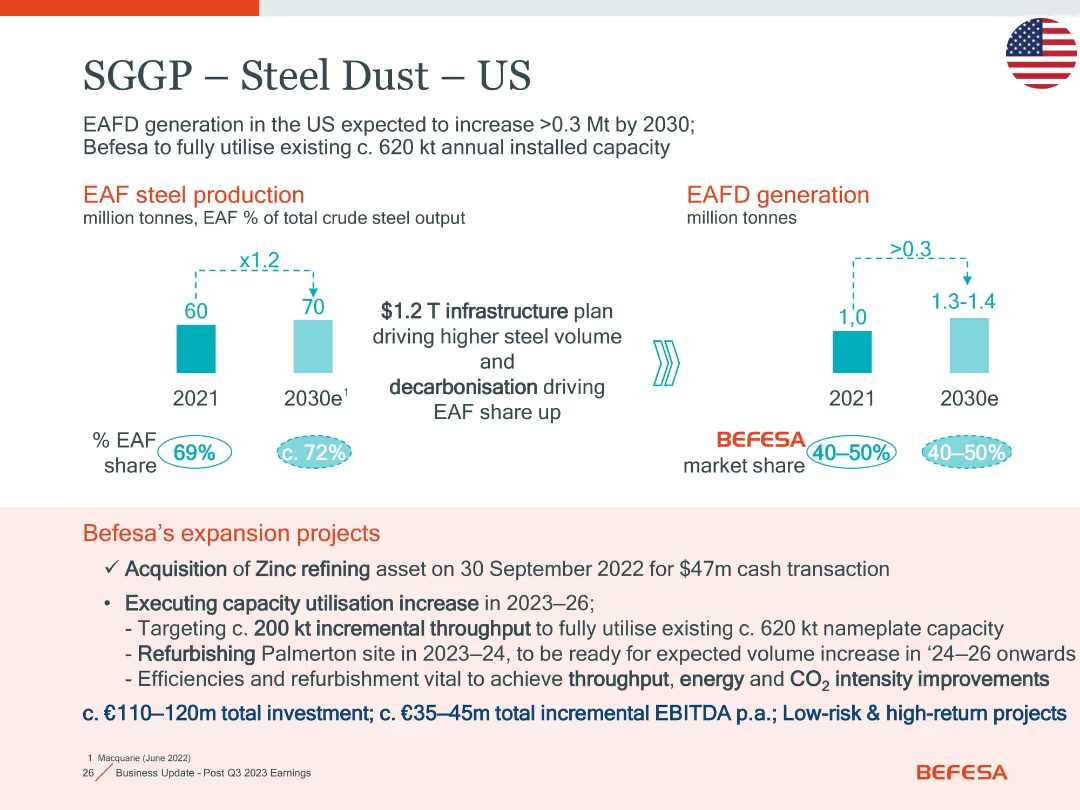
Two bar charts for EAF production and EAFD generation; bottom section lists Befesa’s US expansion actions and investment details.
Strategic Planning
Industrial & Manufacturing
Focuses on EAFD growth and market share in the US through 2030. It outlines Befesa’s strategic projects, including zinc refining and Palmerton refurbishment, with low-risk high-return investments (€110–120m) aimed at capacity and efficiency improvement.
EAFD, expansion, zinc refining, Palmerton, CO2, throughput, investment
Mixed Chart
Goldman Sachs
Saved
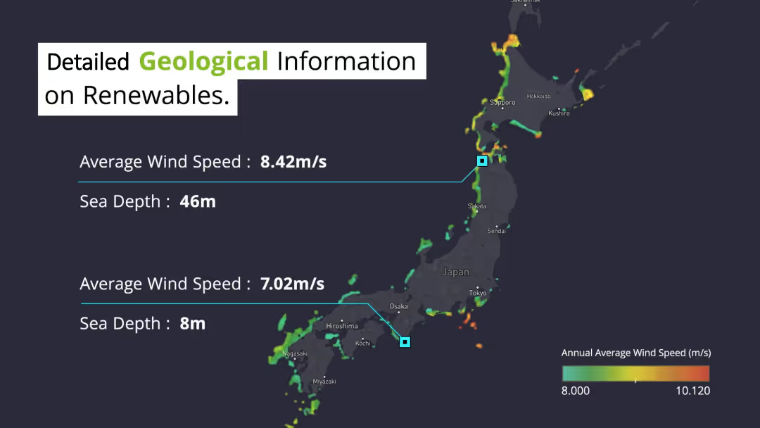
Displays a map of Japan with highlighted areas showing average wind speeds and sea depths. Text on the left and center provides specific wind speed and sea depth data for two locations. The dark background map contrasts with highlighted data points and textual information.
Market Analysis and Trends
Environmental Services & Sustainability
Shares detailed geological data on renewable energy potential in Japan, focusing on average wind speeds and sea depths in various regions. This information is crucial for planning and optimizing renewable energy projects, particularly offshore wind farms.
Renewable, Wind Speed, Sea Depth, Japan, Geological
Graphic
Deloitte
Saved
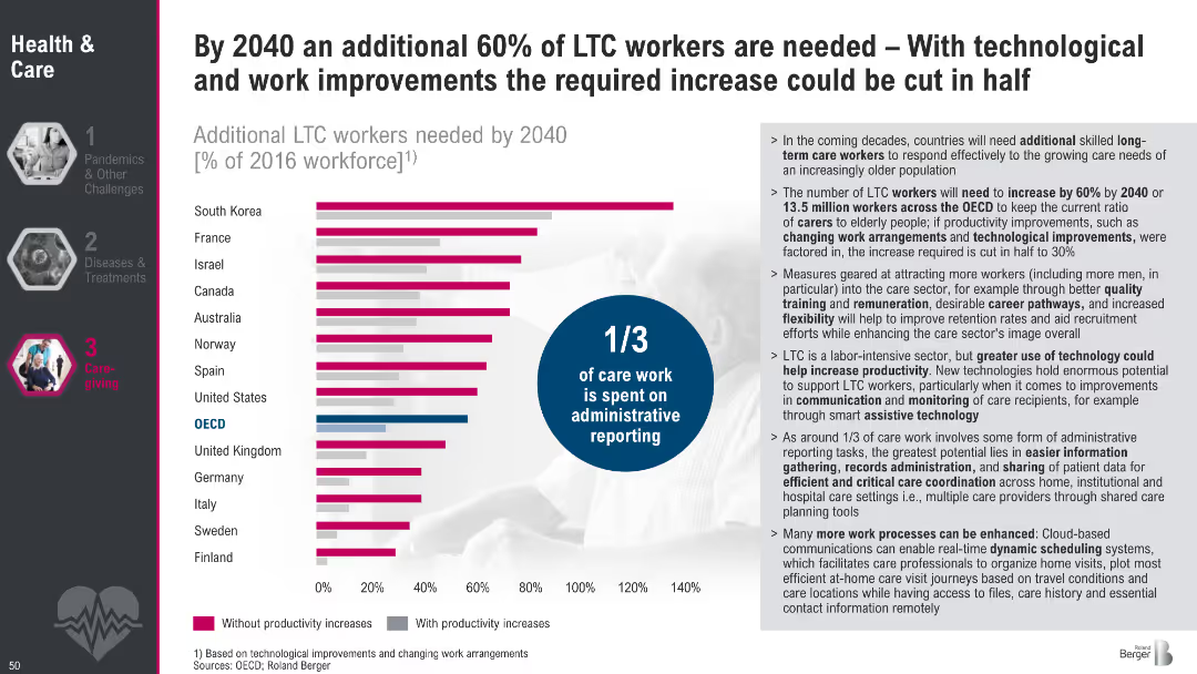
Horizontal bar chart comparing LTC workforce needs by country with and without productivity improvements; infographic circle notes 1/3 of care work is administrative; explanatory text to the right
Strategic Planning
Healthcare & Pharmaceuticals
This slide presents projected increases in demand for LTC workers by 2040, with and without productivity gains. It emphasizes how improving processes and leveraging technology could halve workforce needs. The text explains contributing factors and areas where tech could boost efficiency.
LTC, workforce, projections, productivity, administrative burden, eldercare, 2040, care work, staffing needs
Mixed Chart
Roland Berger
Saved
Column chart showing net agreement percentages (agree-disagree) about privacy concerns across various markets, highlighting significant variations from market to market.
Risk Assessment and Management
Technology & Software
Demonstrates the varying levels of concern about privacy across different markets, with India showing the highest concern and Japan showing the lowest, indicating diverse perspectives globally.
privacy, markets, concern, survey, variation
Mixed Chart
IPSOS
Saved
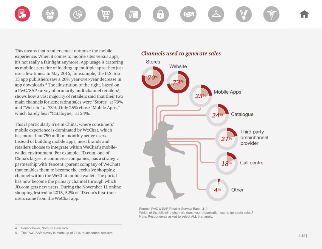
Flowchart showing different channels used to generate sales, such as stores, websites, mobile apps, catalogues, etc., with respective percentages.
Sales and Business Development
Retail & E-commerce
The slide details various channels used to generate sales, with percentages for each. It emphasizes the importance of stores and websites. Useful for business development strategies.
sales, channels, generate, stores, websites
Mixed Chart
PwC/Strategy&
Saved
This slide displays a dark blue background with one large column chart showing the progressive increase in deal values...
Investment Analysis
Financial Services
The slide provides an overview of deal values in the first half of 2021 compared to previous years, indicating a sign...
Malaysia, deal value, investments, financial analysis, H1 2021, trend, surpass, previous years
Single Chart
Bain
Saved
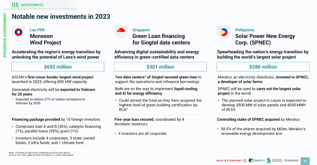
Three-column layout with country flags and icons; each block details a major investment project including funding size, partners, and strategic importance.
Investment Analysis
Energy & Utilities
The slide showcases key 2023 investment cases: Laos' $692M Monsoon Wind Project, Singapore’s $401M Singtel data center loan, and the Philippines’ $286M solar mega-project. Each project highlights energy transition goals, cross-border electricity, advanced technologies like liquid cooling and AI, and strategic partnerships.
green energy, investment projects, wind power, solar farms, data centers, ASEAN, Laos, Singapore, Philippines
Pillar
Bain
Saved
Slide with column charts showing quarterly leverage exposure and risk-weighted assets, divided into categories like lending and derivatives.
Financial Performance
Financial Services
Provides an overview of the bank's financial exposure and risk through various asset categories, highlighting changes in leverage and risk management.
leverage, risk, assets, financial, banking, exposure, derivatives, management
Multiple Chart
Deutsche Bank
Saved
The slide includes bar charts showing various levers in sales and marketing with corresponding activity levels and trends over time.
Sales and Business Development
Consumer Goods
Highlights sales and marketing levers focusing on effectiveness and growth opportunities, with a detailed view of activities for 2019.
Sales, Marketing, Effectiveness, Growth, Trends
Single Chart
Roland Berger
Saved
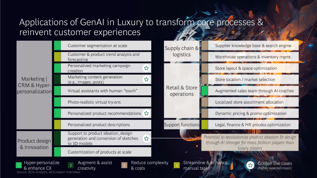
Matrix layout categorizing GenAI use cases across business functions, with color-coded impact labels and icons
Technology and Digital Transformation
Artificial Intelligence
This slide presents a comprehensive matrix of GenAI applications across marketing, product design, retail operations, supply chain, and support functions. High-impact use cases include dynamic pricing, AI-assisted sales, and virtual try-ons, transforming both front-end and back-end operations.
GenAI, luxury, CRM, product design, automation, customer experience, AI use cases
Table
BCG
Saved
A comparative slide with a two-column list ranking barriers to adoption by geography, complemented by side notes highlighting regional nuances.
Strategic Planning
Technology & Software
Highlights the regional differences in barriers to digital adoption between Java and non-Java areas, emphasizing the importance of a localized approach for startups and investors.
digital adoption, regional barriers, Java, non-Java, Indonesia, startups, investors
Table
Kearney
Saved
Includes a stacked column chart showing debt maturity by year and a small pie chart detailing credit ratings. Design elements highlight key statistics like '€600mln ESG linked Term Loan' and credit rating changes over time from three agencies.
Financial Performance
Financial Services
The slide emphasizes a balanced debt maturity structure and favorable credit ratings, presenting both historical and current data. This information is critical for investors assessing the company's financial health and risk profile.
debt maturity, credit rating, ESG, financial health
Mixed Chart
Goldman Sachs
Saved
Features bubble charts and a linear scale to showcase the digital transformation's potential in logistics, including positive and negative value impacts.
Operational Efficiency
Transportation & Logistics
Analyzes how digital transformation could unlock $4 trillion in value for the logistics industry, emphasizing innovations like drones and shared transport capacity.
Logistics, Digital Transformation, Societal Impact, Industry Value, Innovation
Mixed Chart
Accenture
Saved
This slide has a colorful and dynamic layout with pie charts, icons, and significant percentages displayed, highlighting year-over-year growth in YouTube watch time, with a particular emphasis on mobile device usage.
Market Analysis and Trends
Technology & Software
The slide details the three main factors contributing to the increase in YouTube watch time: non-English content, local language searches, and mobile-first content. It showcases the impact of these forces with the aid of visual data representations.
YouTube, growth, mobile, local language, watch time
Linear Flow
BCG
Saved
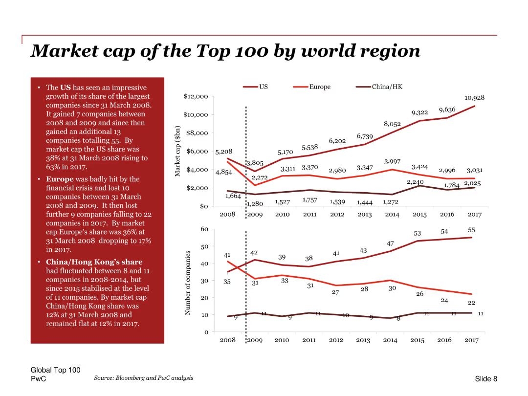
Line charts showing the market cap of top 100 companies by region over time, with annotations and comparison of the US, Europe, and China/Hong Kong.
Market Analysis and Trends
Financial Services
Analyzes the market capitalization of the top 100 companies by region, highlighting the growth in the US share, the impact of the financial crisis on Europe, and trends in China/Hong Kong.
Market cap, top 100, regions, US, Europe, China, financial crisis, growth, trends, comparison
Multiple Chart
PwC/Strategy&
Saved
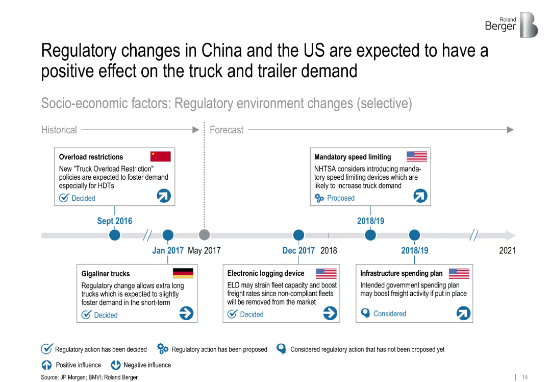
Timeline with icons indicating regulatory events and their impact on demand. Visual coding for positive/negative effects and decision status.
Strategic Planning
Transportation & Logistics
This timeline outlines selected regulatory changes between 2016 and 2021 in China, the US, and Germany. These include overload restrictions, speed limiting proposals, and infrastructure plans that influence heavy truck and trailer demand.
['regulations', 'truck demand', 'policy', 'China', 'US', 'timeline', 'logistics', 'forecast', 'strategic planning']
Uncategorized
Roland Berger
Saved
This slide features multiple line charts tracking the net interest margin development for Corporate and Private Banks. It includes column charts showing group NIM development. There's a side panel with key highlights in bullet points.
Financial Performance
Financial Services
The slide illustrates the development of net interest margins within a financial institution, comparing corporate and private banking sectors over several quarters.
NIM, banking, financial analysis, interest rates, quarterly performance
Multiple Chart
Deutsche Bank
Saved
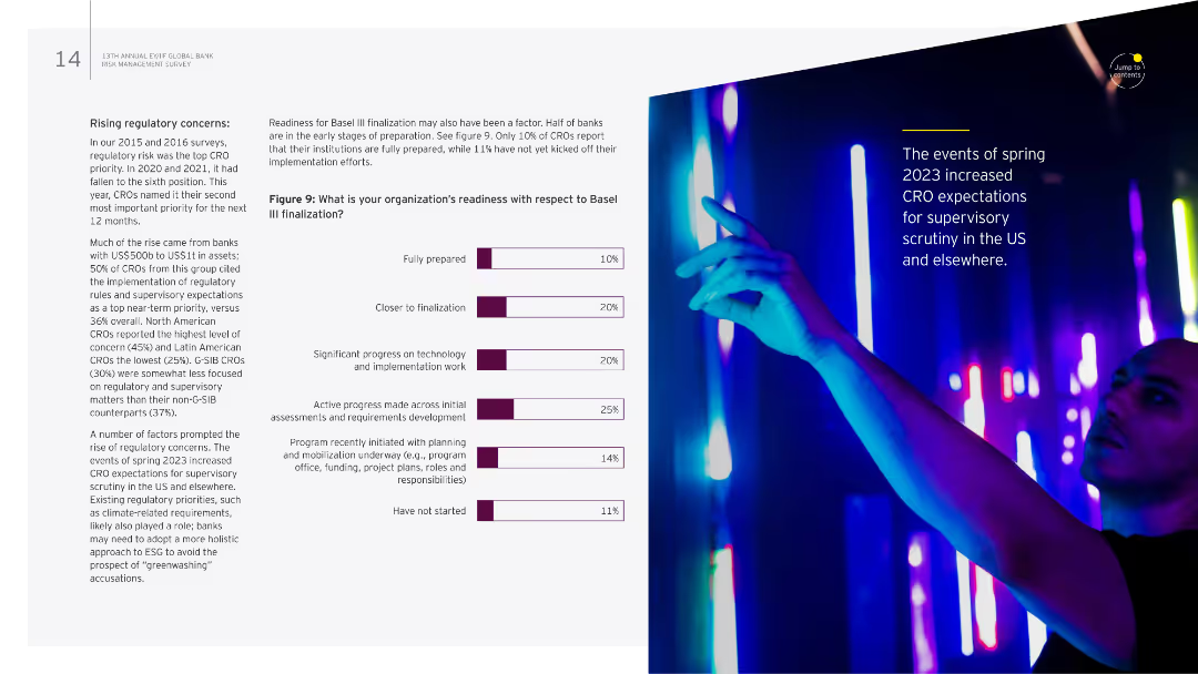
The slide has a textual overview on the left and a column chart on the right. The chart shows readiness levels for Basel III finalization among organizations.
Regulatory and Compliance
Financial Services
It details regulatory concerns, especially the readiness for Basel III finalization, and discusses varying levels of preparedness among institutions.
Regulatory concerns, Basel III, readiness, compliance, risk management
Mixed Chart
EY
Saved
The slide features a line chart showing the carbon price in USD per ton over time (1990-2020) for various countries, with a legend on the left side listing the different carbon taxes and ETS initiatives tracked.
Regulatory and Compliance
Energy & Utilities
This slide shows the historical carbon price trends in Nordic countries and other regions, highlighting Sweden as having the highest carbon tax. It provides comparative data for different carbon pricing mechanisms over time.
carbon price, Nordic countries, Sweden, ETS, tax
Single Chart
Kearney
Saved
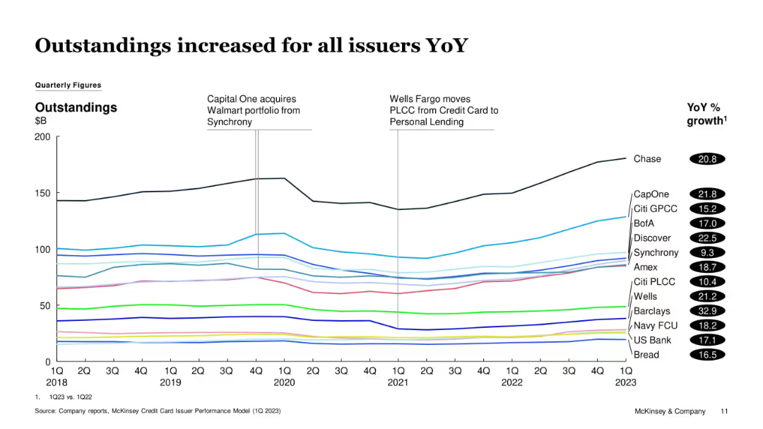
Line graph with multiple issuer lines showing quarterly credit card outstandings from 2018 to 1Q23. Vertical markers highlight key events. YoY % growth listed in black ovals on the right.
Financial Performance
Financial Services
The slide shows year-over-year growth in credit card outstandings for various issuers, with all showing increases. Chase, Capital One, and Discover led in volume. Major events like portfolio acquisitions and PLCC transitions are annotated.
Outstandings, Credit, Issuers, Growth, Chase, Capital One, Discover, Synchrony, Citi, Quarterly
Single Chart
McKinsey
Saved
Hype Cycle chart depicting the maturity and adoption stages of various API technologies, from Innovation Trigger to Plateau of Productivity, highlighting trends like API Security Testing and Business Ecosystems.
Market Analysis and Trends
Technology & Software
The slide outlines the Gartner Hype Cycle for API technologies, showing where different API-related innovations currently stand in terms of expectations and market maturity.
hype cycle, API technologies, maturity, Gartner
Single Chart
Gartner
Saved
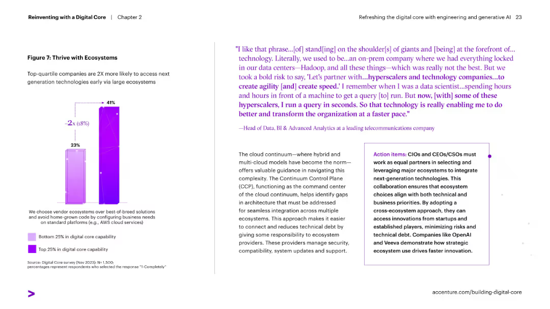
Split layout with a quote and paragraph on right and a bar chart on left comparing digital ecosystem adoption between top and bottom quartile companies.
Strategic Planning
Technology & Software
Shows how top digital performers leverage large ecosystems to access new technologies faster. Emphasizes the value of vendor ecosystems over home-grown solutions.
ecosystems, cloud, innovation, digital adoption, vendor strategy, hyperscalers, agility
Mixed Chart
Accenture
Saved
Previous
Next
If nothing, comes up, please save your slides first
Create a FREE account to continue browsing
Receive Instant Access to 1,000+ slides from companies like McKinsey, Google, and Goldman Sachs
First Name
Last Name
Email
Password
I agree to all
Terms & Privacy Policy
Thank you! Your submission has been received!
Oops! Something went wrong while submitting the form.
Have an account?
Sign in
Column Chart
Heatmap
Chevron
Org Chart
Infographic
Callouts
Timeline
List
Graphic
Picture
Process Flow
Diagram
Paragraph
Map
Table
Framework
Subtitle
Takeaway Box
Icon
Other Chart
Radar Chart
Waterfall Chart
Mekko Chart
Pie Chart
Scatter Plot
Line Chart
Bar chart
Bullet points