Create a FREE Account
Instant access to 1,000+ real slides from top companies like McKinsey, BCG, Goldman Sachs, Google and many more!
First Name
Last Name
Email
Password
I agree to all
Terms & Privacy Policy
Thank you! Your submission has been received!
Oops! Something went wrong while submitting the form.
Have an account?
Sign in
Library
Templates
Courses
Pricing
My Account
My Slides
My Templates
✦ AI
AI Prompt Library
AI Search
Sign in
Start Here
Logout
My Saved Slides
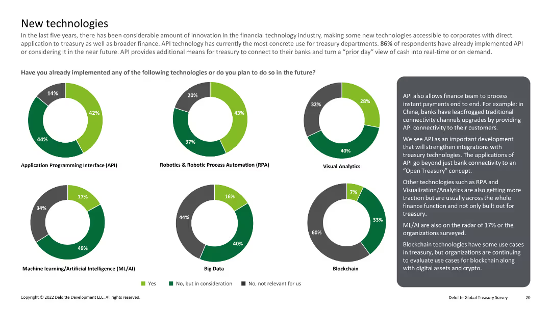
Multiple pie charts showing implementation of technologies like API, RPA, visual analytics, ML/AI, big data, and blockchain
Technology and Digital Transformation
Financial Services
Reviews the implementation of emerging technologies in treasury departments, including APIs, RPA, and blockchain.
New technology, API, RPA, ML/AI, blockchain
Multiple Chart
Deloitte
Saved
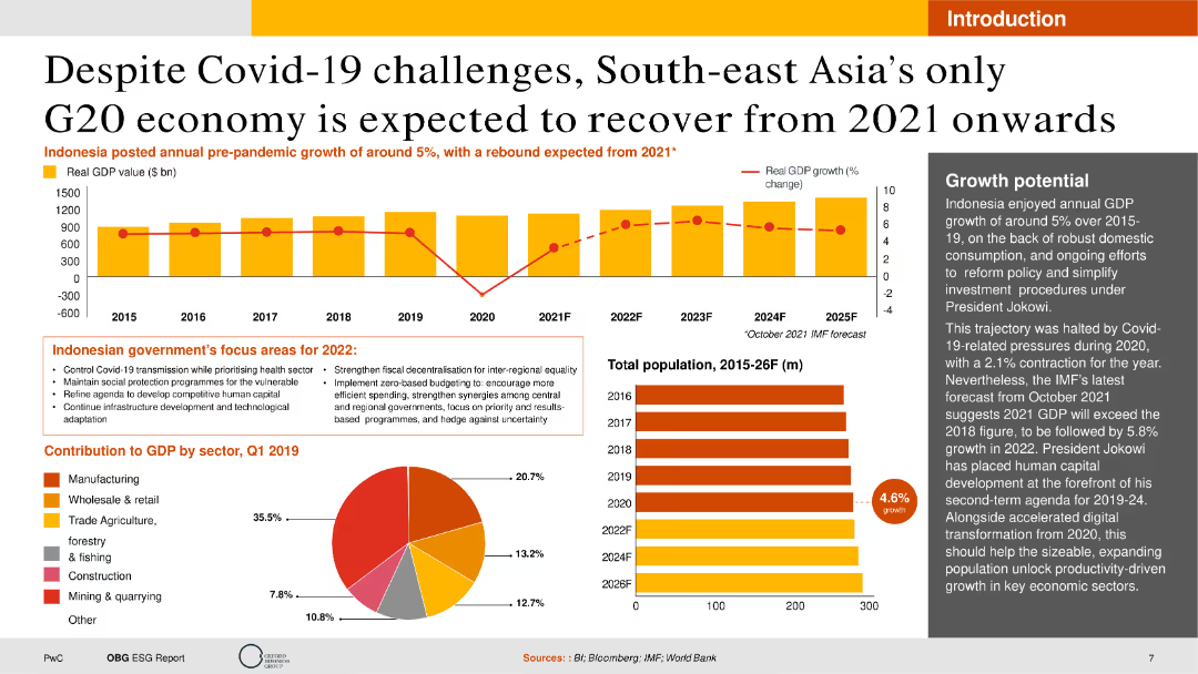
The slide contains a combination of text, a column chart showing GDP growth, and a pie chart detailing sector contributions to GDP. The layout is rich with data and visuals but remains clear and accessible.
Market Analysis and Trends
Financial Services
This slide provides an analysis of Indonesia's economic recovery post-Covid-19, focusing on GDP growth, government policies, and sector contributions. It's useful for understanding market recovery trends and economic forecasts.
GDP, Economic Recovery, Covid-19, Indonesia, Growth
Multiple Chart
PwC/Strategy&
Saved
The slide provides demographic information and wealth distribution across customer life cycles, using column chart and a life cycle curve. It illustrates the number of affluent adults and their corresponding liquid wealth in tranches. The slide is clean, with contrasting colors for different data segments, primarily green and grey. Textual descriptions accompany each visual, providing context. The Quilter logo is visible in the corner.
Customer and Market Segmentation
Financial Services
The slide explores the wealth distribution among UK adults and opportunities for wealth management services throughout the customer lifecycle, suitable for discussions on market segmentation and service offering development.
Customer Lifecycle, Wealth Management, Demographic Analysis, Market Segmentation, Asset Bands, Financial Services, Quilter, Customer Wealth
Mixed Chart
Morgan Stanley
Saved
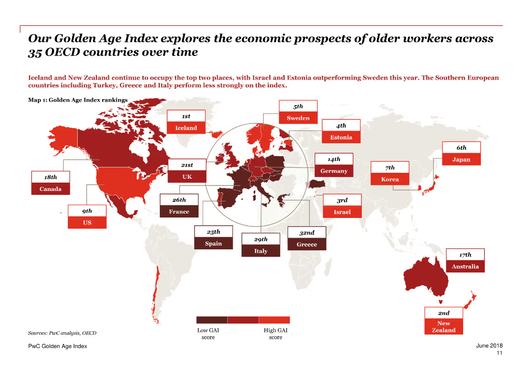
A world map highlighting countries in various shades of red indicating their Golden Age Index rankings.
Market Analysis and Trends
Government & Public Sector
The slide explores the economic prospects of older workers across 35 OECD countries over time, with Iceland and New Zealand leading the rankings.
Golden Age Index, older workers, OECD, economic prospects, rankings, countries, map, trends, employment, analysis
Graphic
PwC/Strategy&
Saved
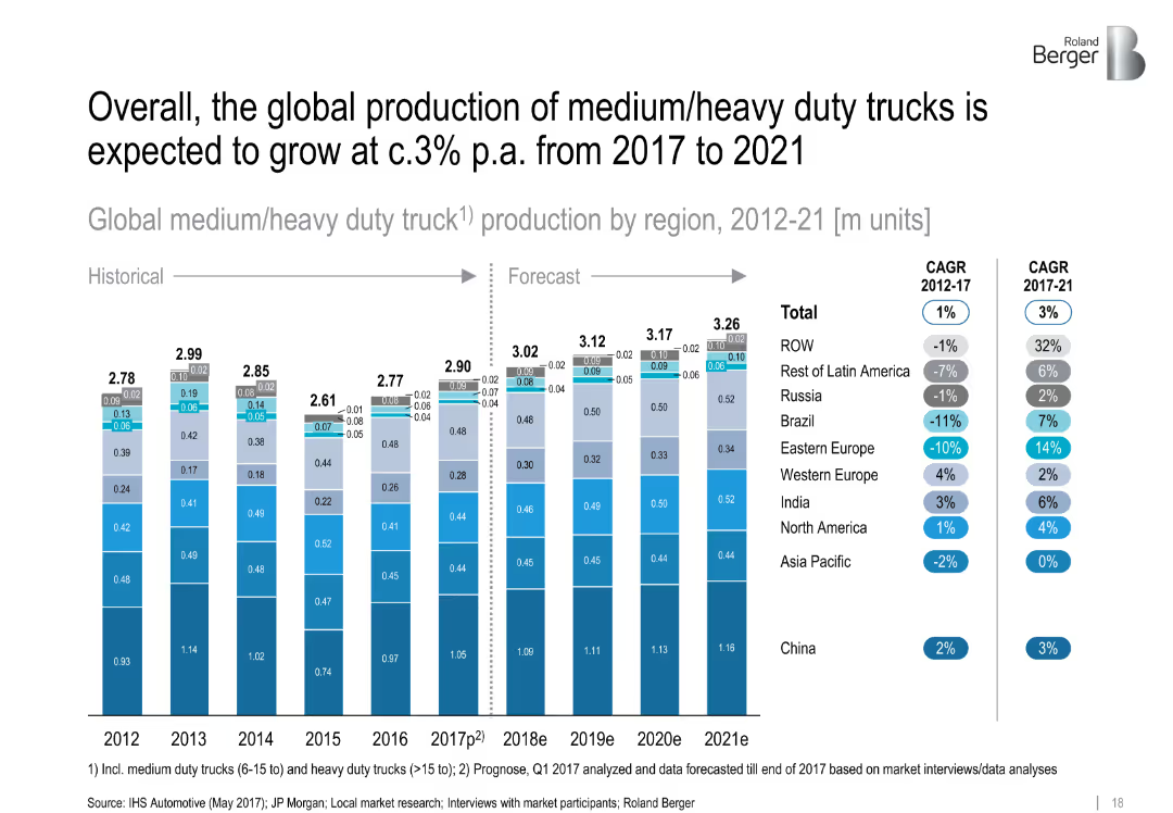
Stacked bar chart comparing truck production by region (2012–2021) with CAGR data. Segments color-coded and neatly aligned.
Financial Performance
Transportation & Logistics
This slide presents the volume and forecast of global medium/heavy duty truck production. Regional breakdowns show China as the leader, while emerging markets see modest growth. Includes CAGR data for historic and forecast periods.
['truck production', 'heavy duty', 'regional growth', 'CAGR', 'China', 'forecast', 'manufacturing', 'automotive']
Single Chart
Roland Berger
Saved
The slide features a line chart comparing the likelihood of listing investment properties for sale from Fall 2018 to Fall 2020.
Market Analysis and Trends
Real Estate & Construction
This slide presents data on the likelihood of investment property owners listing their properties for sale, comparing trends over three years.
property sale, market trends, investment, likelihood, line chart, historical data, real estate
Single Chart
IPSOS
Saved
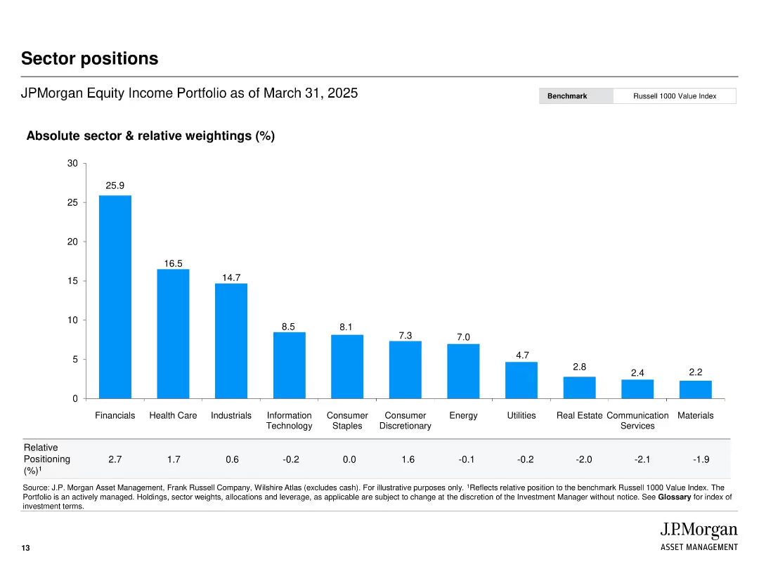
Vertical bar chart layout ranking sector exposure by absolute and relative weightings.
Investment Analysis
Financial Services
Presents sector allocation for JPMorgan’s Equity Income Portfolio, highlighting top exposures (e.g., Financials, Healthcare) as of March 31, 2025. The chart includes both absolute weight and relative position to the Russell 1000 Value Index.
sector weights, portfolio allocation, JPMorgan, financials, equity income, relative positioning, benchmark
Single Chart
JP Morgan
Saved
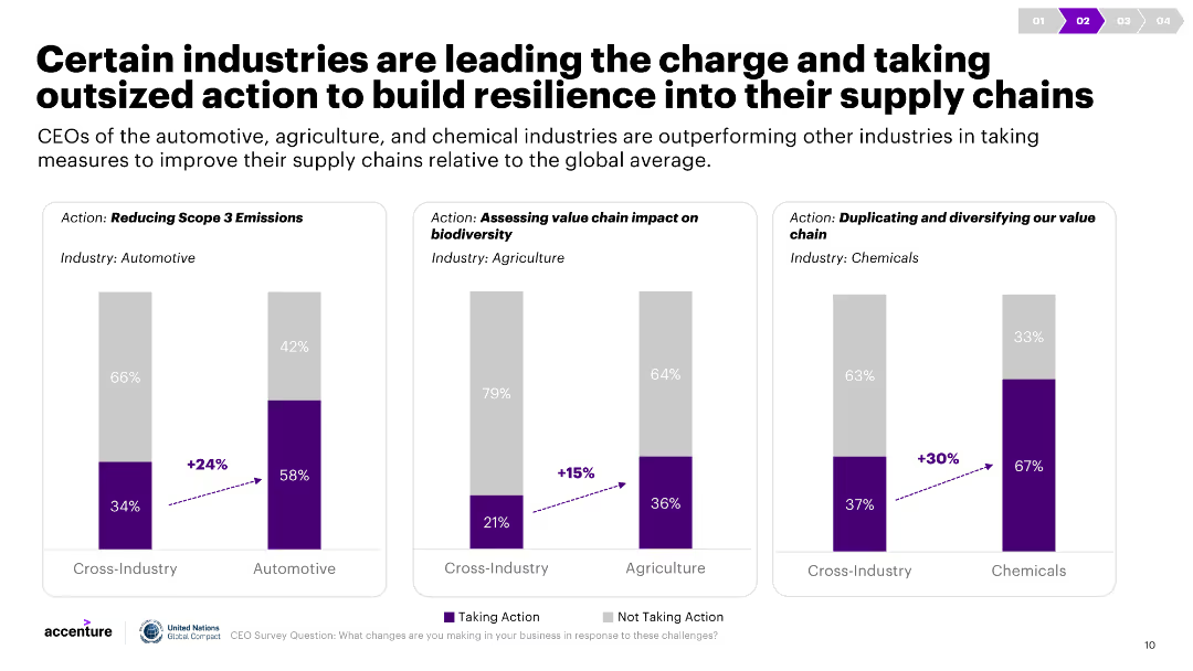
Three column charts illustrate actions taken by different industries to improve supply chain resilience, with cross-industry comparisons. Commentary explains the data.
Strategic Planning
Transportation & Logistics
The slide compares the automotive, agriculture, and chemical industries' efforts to improve supply chain resilience, highlighting measures like emissions reduction and biodiversity assessments.
Industry actions, supply chain, resilience, automotive, agriculture, chemicals
Multiple Chart
Accenture
Saved
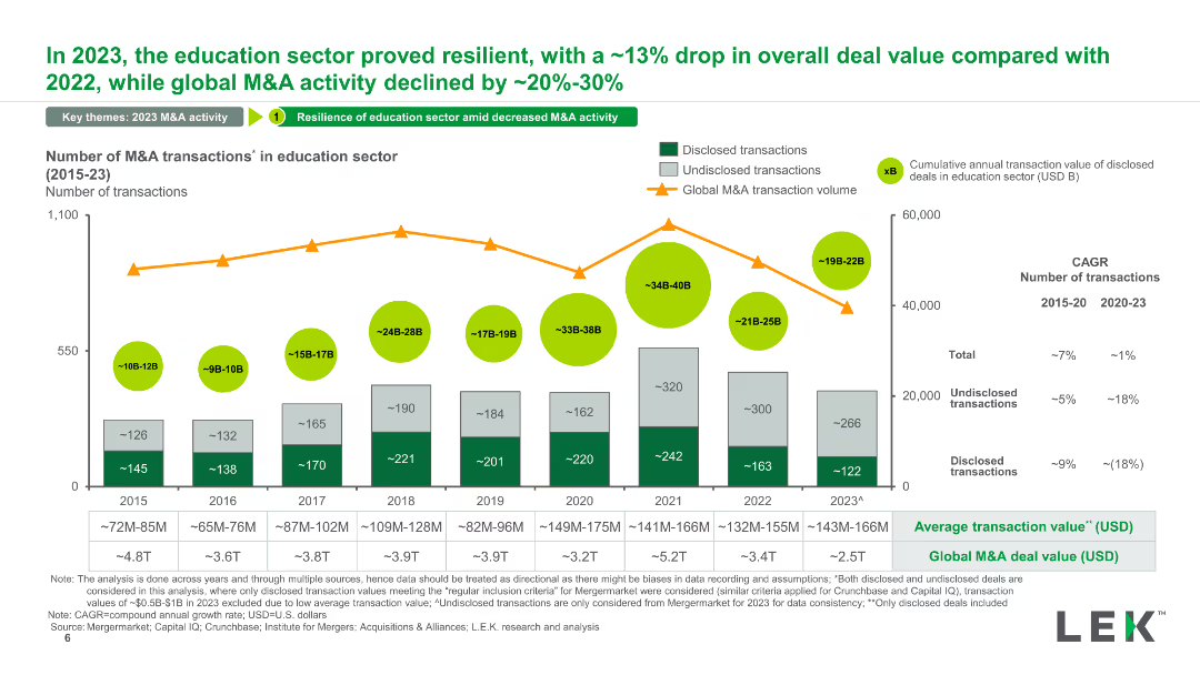
A column chart depicting the number of M&A transactions in the education sector from 2015 to 2023. It includes disclosed and undisclosed transactions and an overlay of global M&A transaction volume trends. Color-coded sections highlight values.
Mergers and Acquisitions
Education & Training
The slide analyzes the trend in M&A transactions within the education sector, showing resilience in 2023 compared to the global decline. It highlights transaction values and provides cumulative annual transaction data for disclosed deals.
M&A, education sector, transactions, disclosed, global trend
Mixed Chart
LEK
Saved
The slide includes a column chart illustrating the transition to renewable energy on farms and electric vehicles. It provides detailed descriptions of included actions and example initiatives.
Technology and Digital Transformation
Agriculture & Food Production
This slide outlines the transition to renewable energy and electric vehicles in agriculture. It highlights the adoption of renewable energy on farms, the transition to electric vehicles, and their impact on emissions reduction and cost savings.
Renewable energy, Electric vehicles, Agriculture, Emissions, Cost savings
Mixed Chart
EY
Saved
Features multiple horizontal bars in varying colors representing different tax categories such as VAT, customs, and corporate income, set against a percentage scale.
Regulatory and Compliance
Government & Public Sector
The slide provides a breakdown of tax revenue composition, useful for financial strategists to understand major fiscal contributors and planning.
tax, revenue, composition, VAT, customs, corporate income, financial planning, government, strategy, analysis
Single Chart
PwC/Strategy&
Saved
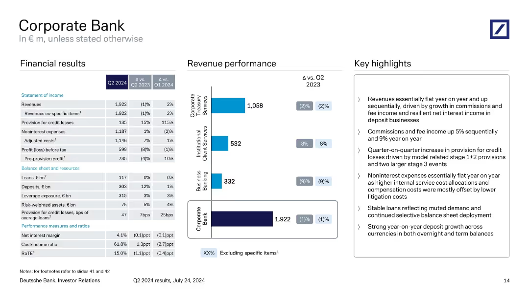
Three-column layout with financial table, revenue bar chart, and key highlights.
Product and Service Analysis
Financial Services
Reviews Q2 2024 performance of the Corporate Bank division. Highlights include flat revenue, rising provisions for credit losses, steady expenses, and growth in deposits. Segment-level revenue performance for treasury, institutional, and business banking is visualized.
Corporate Bank, Q2 2024, revenue, credit losses, business banking, Deutsche Bank
Mixed Chart
Deutsche Bank
Saved
Circle diagram and lists detailing a cost-saving program, showing major areas of expense reduction planned for the next year.
Operational Efficiency
Financial Services
Discusses strategies for significant cost reduction and operational simplification expected to save around $750 million.
cost reduction, operational efficiency, savings, strategy, diagram
Mixed Chart
Barclays
Saved
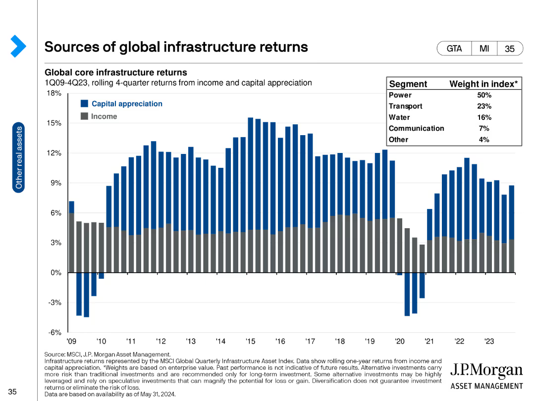
The slide has a column chart showing global core infrastructure returns split between capital appreciation and income from 1Q09 to 4Q23.
Financial Performance
Real Estate & Construction
It provides data on infrastructure returns, segmented by capital appreciation and income, highlighting sector contributions to index weight.
infrastructure, returns, capital appreciation, income, index weight, power, transport, water
Single Chart
JP Morgan
Saved
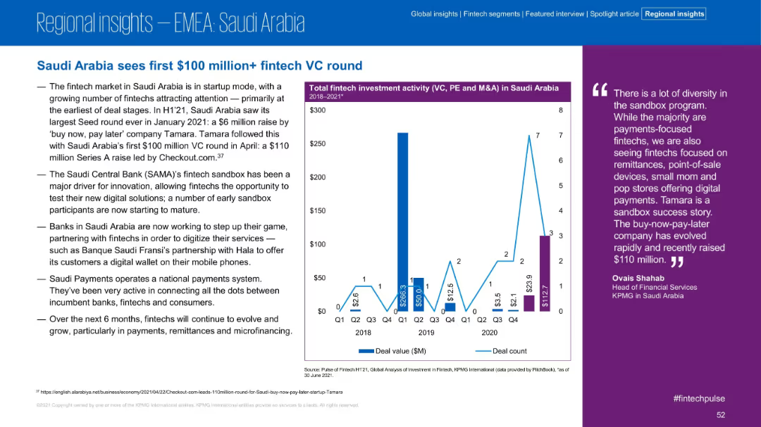
Structure includes left-side summary, chart in middle, and quote on right. Blue and purple tones. Minimalist yet data-rich visual layout.
Investment Analysis
Financial Services
Saudi Arabia’s fintech sector saw its first $100M+ VC round in H1 2021, with Tamara leading the wave. The slide discusses sandbox program support, bank partnerships, and increased fintech interest in payments and remittances.
Saudi Arabia, Tamara, VC Round, Sandbox, Fintech, Investment, Payments, Remittances
Mixed Chart
KPMG
Saved
Gradient pink-purple background with white text; icons and labeled segments describing drivers; bottom section outlines research methodology
Strategic Planning
Financial Services
Identifies four main drivers of customer advocacy—Reassure me, Remember me, Delight me, Reward me—based on global banking study findings. Describes methodology used (49,300 surveyed, 194 variables analyzed) to derive 21 significant variables into 4 key groups.
Pillar
Accenture
Saved
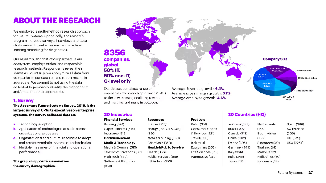
The slide includes text, a world map, and a pie chart showing company size distribution. It provides an overview of the research methodology and demographics.
Market Analysis and Trends
Technology & Software
The slide details the research methodology, demographics, and industry focus of the surveyed companies, highlighting key statistics and geographic distribution.
research, methodology, demographics, market analysis, trends, company size, technology
Mixed Chart
Accenture
Saved
Features a comparative design with a pie chart and textual analysis side-by-side, effectively using space to discuss key global economic concerns.
Market Analysis and Trends
Financial Services
Compares business leader insights on global uncertainties and their expected impact on company performance.
economic, global shocks, uncertainty, risks
Mixed Chart
BCG
Saved
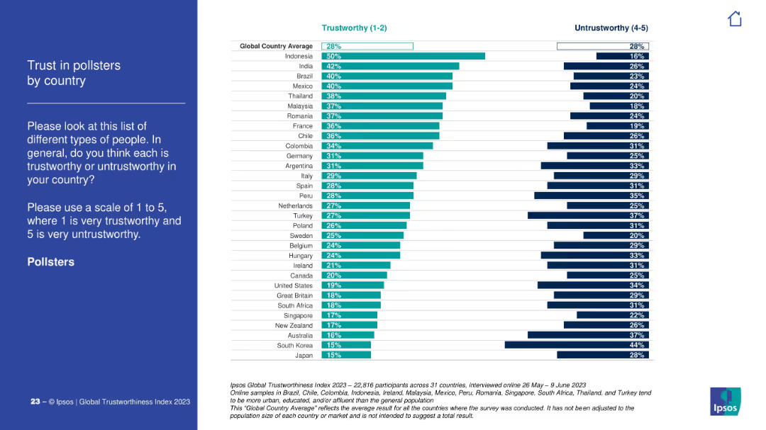
Left panel with title and description in white on blue. Right panel is a horizontal bar chart comparing "Trustworthy" vs. "Untrustworthy" by country.
Market Analysis and Trends
Media & Entertainment
The slide shows public trust levels in pollsters across countries based on Ipsos' 2023 global survey. It compares ratings on a 1–5 scale, highlighting notable disparities.
trust, pollsters, perception, global, country, Ipsos, bar chart, opinion, media, rating
Mixed Chart
IPSOS
Saved
Comparative column chart with additional highlighted focus on environmental harm reduction.
Strategic Planning
Environmental Services & Sustainability
Same as previous with an emphasis circle on the importance of reducing harm to the environment.
business, opportunity, taxes, environment, global
Multiple Chart
IPSOS
Saved
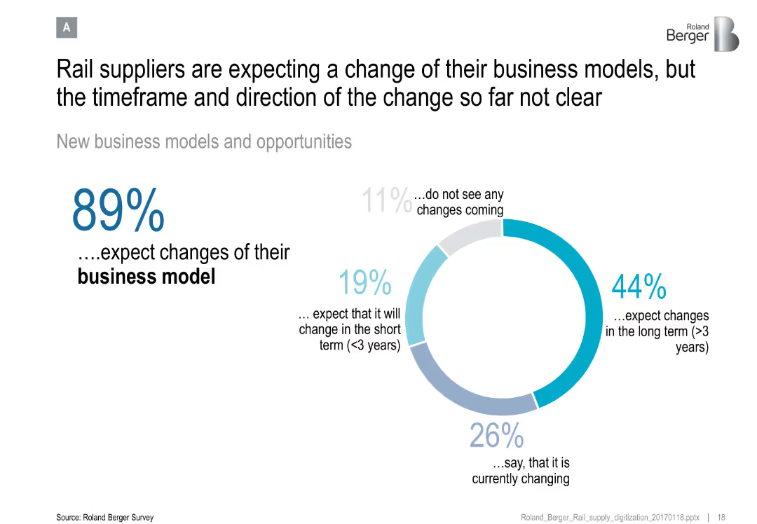
Donut chart showing supplier expectations for business model change, with segmented outlook (short/long term, current)
Organizational Structure and Change
Transportation & Logistics
Reveals that the majority of rail suppliers anticipate changes to their business models, though the timing and direction remain uncertain.
business model, rail suppliers, industry change, organizational strategy, transformation timeline
Mixed Chart
Roland Berger
Saved
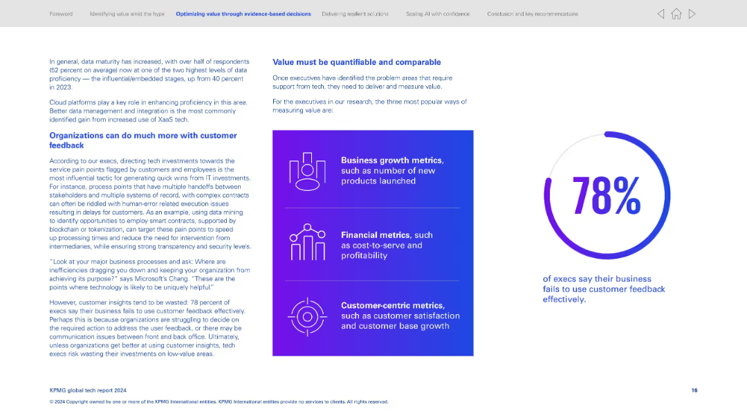
Two-column design; left side has textual insights, right features three metric types in a purple gradient box and a large stat circle.
Customer and Market Segmentation
Technology & Software
Explains the gap in using customer feedback effectively—78% of execs acknowledge the shortfall. Encourages using data and smart contracts to target customer pain points. Identifies how value is commonly measured via business, financial, and customer metrics.
Customer feedback, value metrics, smart contracts, process improvement, data utilization, business impact, satisfaction, ROI
Mixed Chart
KPMG
Saved
Contains a column chart comparing digital payment adoption across regions. Uses purple tones and is text-heavy with statistical data highlighted.
Market Analysis and Trends
Telecommunications
Compares the speed of technology adoption and investment diversification in high-growth regions like Asia-Pacific, Middle East, Africa, and Latin America. Useful for analyzing regional technology trends and investment opportunities.
technology adoption, high-growth markets, Asia-Pacific, digital payments, investment
Mixed Chart
Accenture
Saved
This slide features a column chart showing projected declines in general fund receipts for New York from 2020 to 2024, due to COVID-19. The charts use different shades of green to represent original budget gaps versus the impact of COVID-19.
Financial Performance
Government & Public Sector
Analyzes the fiscal impact of COVID-19 on New York’s budget, highlighting changes in fund receipts and total budget gaps. Useful for financial and governmental presentations on managing budget shortfalls during pandemics.
COVID-19, budget, New York, fund receipts, fiscal impact, projections, government finance
Single Chart
BCG
Saved
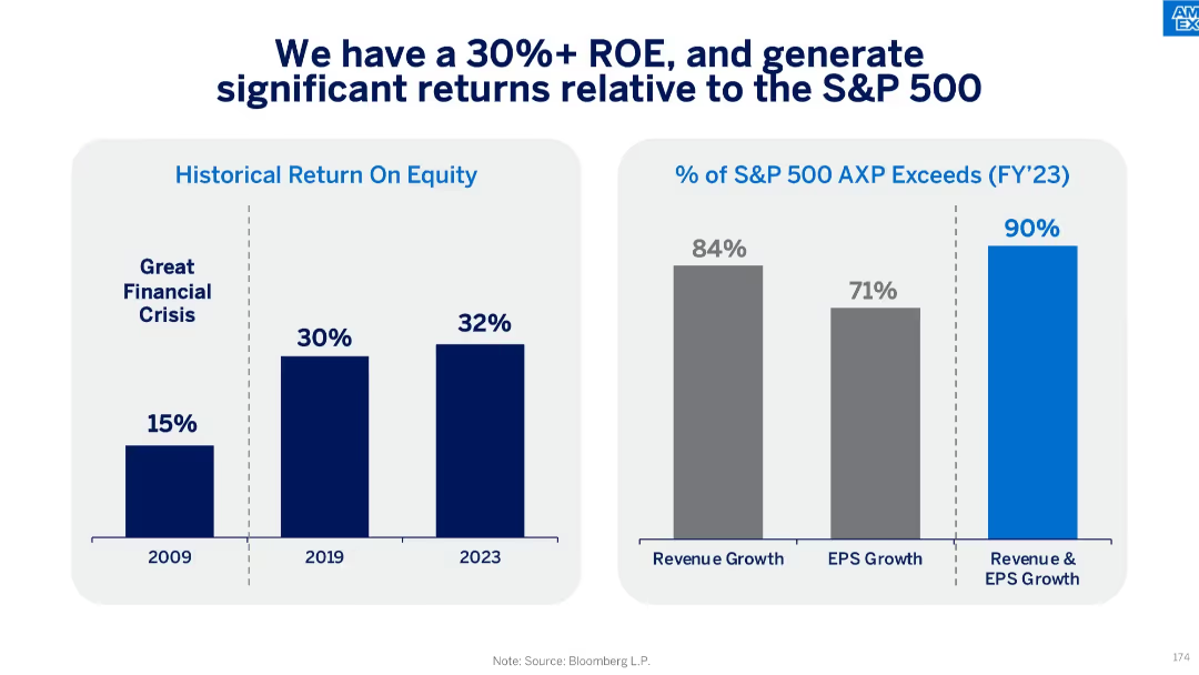
Two bar charts: ROE over time (2009–2023) and percent of S&P 500 companies exceeded in revenue/EPS growth
Financial Performance
Financial Services
The slide emphasizes American Express’s strong return on equity (32% in 2023), consistently exceeding most of the S&P 500 in both revenue and earnings growth. This performance signals robust value creation.
return on equity, S&P 500, revenue growth, EPS growth, shareholder returns, performance comparison
Multiple Chart
McKinsey
Saved
Previous
Next
If nothing, comes up, please save your slides first
Create a FREE account to continue browsing
Receive Instant Access to 1,000+ slides from companies like McKinsey, Google, and Goldman Sachs
First Name
Last Name
Email
Password
I agree to all
Terms & Privacy Policy
Thank you! Your submission has been received!
Oops! Something went wrong while submitting the form.
Have an account?
Sign in
Column Chart
Heatmap
Chevron
Org Chart
Infographic
Callouts
Timeline
List
Graphic
Picture
Process Flow
Diagram
Paragraph
Map
Table
Framework
Subtitle
Takeaway Box
Icon
Other Chart
Radar Chart
Waterfall Chart
Mekko Chart
Pie Chart
Scatter Plot
Line Chart
Bar chart
Bullet points