Create a FREE Account
Instant access to 1,000+ real slides from top companies like McKinsey, BCG, Goldman Sachs, Google and many more!
First Name
Last Name
Email
Password
I agree to all
Terms & Privacy Policy
Thank you! Your submission has been received!
Oops! Something went wrong while submitting the form.
Have an account?
Sign in
Library
Templates
Courses
Pricing
My Account
My Slides
My Templates
✦ AI
AI Prompt Library
AI Search
Sign in
Start Here
Logout
My Saved Slides
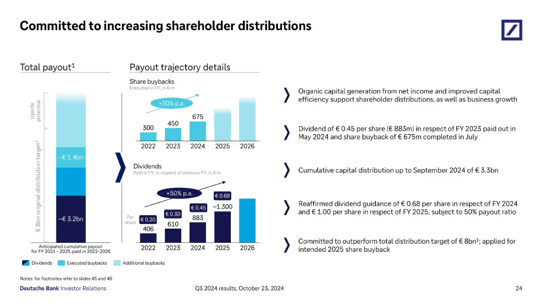
Visual presentation with vertical bar stacks showing total payout targets and historical/future dividends & buybacks, paired with key textual commentary on the right.
Strategic Planning
Financial Services
This slide outlines Deutsche Bank’s strategy for increasing shareholder returns via dividends and buybacks. It shows annual payout progression through 2026 and reaffirms guidance for 2024–2025. A €3.3bn distribution by Q3 2024 is reported, aiming to exceed the €8bn target.
dividends, buybacks, shareholder, payout, capital, return, Q3 2024
Multiple Chart
Deutsche Bank
Saved
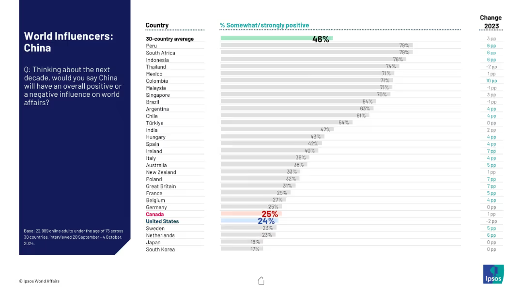
Left-hand context section and right-side horizontal bar chart comparing nations' views.
Market Analysis and Trends
Government & Public Sector
The slide summarizes global attitudes toward China’s future role in world affairs. The data show a polarized view, with some countries more favorable than others, and general sentiment still low.
China, influence perception, global opinion, Ipsos, international relations, approval ratings, sentiment data, 2024 survey, comparison chart
Mixed Chart
IPSOS
Saved
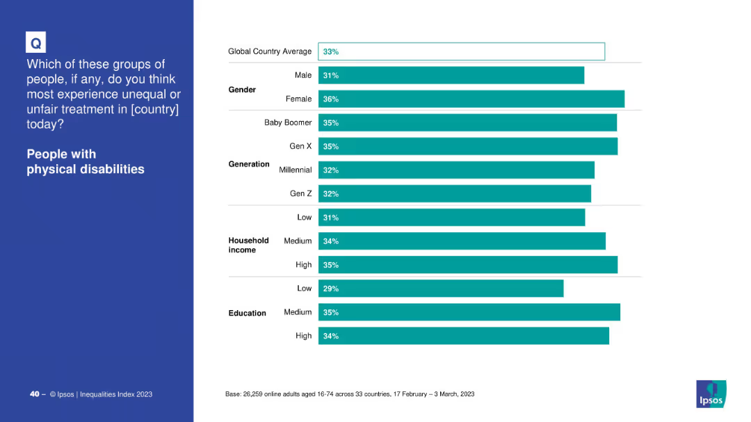
Split layout with left text and right demographic breakdown via horizontal bar chart.
Market Analysis and Trends
Government & Public Sector
Details global survey data by gender, age group, income, and education on perceptions of unfair treatment of people with physical disabilities.
disability, gender, education, age, income, perception, inequality, global average
Mixed Chart
IPSOS
Saved
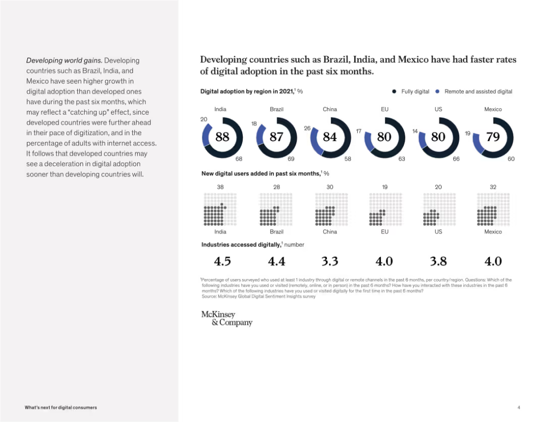
Circular progress charts and grids display digital adoption levels, new digital users, and industries accessed across countries.
Industry Overview
Telecommunications
The slide compares digital adoption across developed and developing countries, showing that emerging markets like India and Brazil are growing faster in adoption and new user generation, though this may be a catch-up effect.
digital adoption, emerging markets, Brazil, India, Mexico, remote access, industry engagement, technology growth, McKinsey
Multiple Chart
McKinsey
Saved
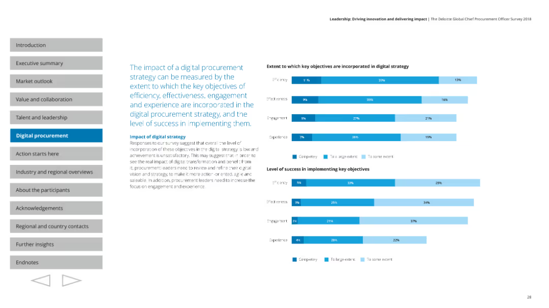
Features multiple column charts showing the extent to which key objectives are incorporated into digital strategy and the success level of implementation.
Technology and Digital Transformation
Professional Services
Measures the impact of digital procurement strategy, covering efficiency, effectiveness, engagement, and experience in implementation success.
Digital strategy, impact, objectives, efficiency, success
Multiple Chart
Deloitte
Saved
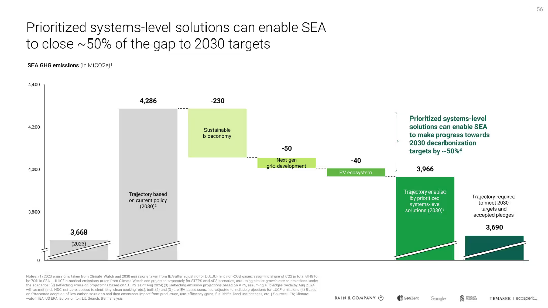
Waterfall bar chart with color-coded reductions, textual callouts, and emissions trajectory lines
Risk Assessment and Management
Environmental Services & Sustainability
Demonstrates the emission reduction potential of prioritized solutions, projecting that SEA could reduce emissions by ~320 MtCO2e by 2030, closing about half the gap to target levels. Contributions by bioeconomy, grid, and EV ecosystem are quantified.
emissions reduction, GHG, 2030 targets, SEA, climate strategy, systems-level solutions, sustainability
Single Chart
Bain
Saved
Detailed slide with column charts depicting deposit balances over quarters and net interest margin (NIM) movements, illustrating financial trends.
Financial Performance
Financial Services
Discusses improvements in deposit trends and their impact on net interest margins, showing strategic financial management over the fiscal year.
deposit trends, net interest margin, NIM, FY23, financial trends, Barclays, banking
Multiple Chart
Barclays
Saved
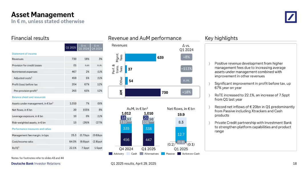
Three-part layout with financials, detailed revenue and AuM performance charts, and key highlights.
Financial Performance
Financial Services
Asset Management reported strong results for Q1 2025 with an 18% revenue increase, 67% higher profit before tax, and €20B in net inflows. Growth was driven by management fees and passive investment products like Xtrackers and Cash.
asset management, net inflows, passive funds, management fees, revenue growth, RoTE, Q1 2025
Multiple Chart
Deutsche Bank
Saved
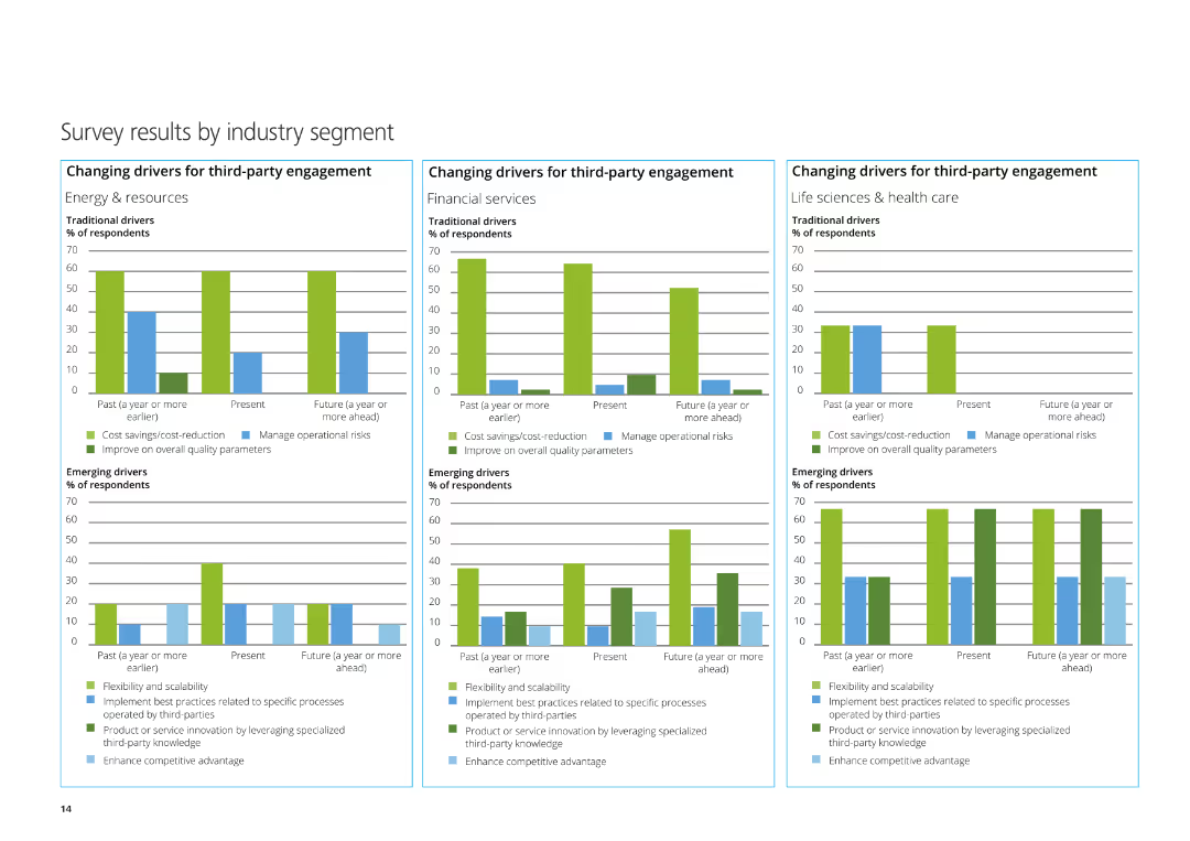
The slide features three column charts depicting the changing drivers for third-party engagement in Energy & Resources, Financial Services, and Life Sciences & Healthcare.
Market Analysis and Trends
Professional Services
This slide presents survey results by industry segment, focusing on traditional and emerging drivers for third-party engagement in various sectors.
Energy & Resources, Financial Services, Life Sciences, third-party engagement, survey
Multiple Chart
Deloitte
Saved
The slide features a large triangle diagram with six layers, each representing a different aspect of best practices in a company’s operations, with text explanations on the left. The color scheme is blue and teal with white text.
Organizational Structure and Change
Professional Services
This slide outlines the six fundamental aspects of best practices within an organization, likely to be discussed in detail in subsequent slides. It is useful for organizational strategy and planning.
culture, talent, compensation, acquisition, enablement, retainment, practices, organizational, strategy, planning
Framework
Kearney
Saved
Displays a line chart showing the Japan Specific Health Adjustment Factor (SMR) over time, with text detailing the proposed factor for 2023.
Market Analysis and Trends
Financial Services
This slide proposes a Japan Specific Health Adjustment Factor for 2023, using a rolling 3-year weighted average, showing the historical data trend.
Japan, health adjustment, SMR, financial services, market trends
Mixed Chart
Oliver Wyman
Saved
A line chart on the right side displays the 5-Year Equal Weight Sovereign Spread from 2008 to 2023. The left side of the slide includes bullet points summarizing key credit spread insights.
Risk Assessment and Management
Financial Services
The slide discusses the performance of sovereign spreads, noting their tightening and the bifurcation in market performance. Critical for understanding credit risk in various countries.
sovereign spreads, credit, risk, EM, analysis
Mixed Chart
Morgan Stanley
Saved
Column chart depicting changes in CET1 capital from 2Q22 to 3Q22. Visuals include net profit, repurchase, dividend, currency effects, and others.
Financial Performance
Financial Services
Shows the progression of CET1 capital across different periods, highlighting the contributions and deductions leading to the final 3Q22 figure.
CET1, capital, net profit, dividend, currency
Single Chart
UBS
Saved
The slide features two column charts showing the Net Promoter Score, cross-selling of products to mortgage customers, and the benefits of Chase deposit customers opening a mortgage. Text and legends explain the charts.
Customer and Market Segmentation
Financial Services
It discusses customer engagement strategies, depicted by net promoter scores, product cross-selling, and customer loyalty benefits. Such data help in understanding customer satisfaction and cross-sell success rates in mortgage and banking services.
customer engagement, net promoter, cross-selling, mortgage, loyalty
Multiple Chart
JP Morgan
Saved
The slide features a central title, a portrait of a woman to the left, and two sets of column charts on the right displaying percentages.
Market Analysis and Trends
Professional Services
The slide depicts anticipated changes in customer demand and company profits over a series of months in 2020, highlighting trends in economic sentiments derived from survey data.
Survey, Economic, Demand, Profits, Trends
Multiple Chart
McKinsey
Saved
Slide includes a large header and a grouped bar chart with percentages indicating people's responses about changes in healthcare access during the COVID-19 pandemic. It features images of diverse individuals, possibly representing different demographics affected by the pandemic.
Industry Overview
Healthcare & Pharmaceuticals
This slide offers insights into how healthcare access was perceived to have changed during the pandemic, with a majority reporting no change or improvement. It is relevant for discussions on the resilience of healthcare systems in crises and can be used in healthcare policy and planning discussions to highlight areas of strength and potential improvement.
healthcare access, COVID-19 impact, system resilience, patient experiences, demographic analysis
Mixed Chart
Accenture
Saved
The slide uses a horizontal bar chart to compare CO2 emissions for different hydrogen production methods from various primary sources, with color coding for clarity.
Regulatory and Compliance
Energy & Utilities
The slide examines CO2 emissions from hydrogen production using different primary energy sources, such as coal, natural gas, nuclear fuel, solar, and wind, emphasizing the environmental impact of each method.
CO2 emissions, hydrogen, production, pathways, environment
Mixed Chart
Kearney
Saved
The slide features a timeline table format, showcasing key educational developments during COVID-19 across various countries. It uses shades of blue for emphasis and has a clear header.
Regulatory and Compliance
Education & Training
It displays the educational response to COVID-19 in Southeast Asia, with timelines for school closures and alternative educational arrangements, demonstrating the shift towards online learning solutions.
COVID-19, Education, Response, SEA, School Closures, Online Learning, Alternatives, Timelines, Developments, Shift
Mixed Chart
Bain
Saved
The slide contains a mix of text, pie charts, and infographics. The layout is structured into sections including an analysis of business cases, development sources, and risks.
Strategic Planning
Government & Public Sector
This slide presents a case study for Indonesia’s planned new capital, using a five-case model to analyze its strategic, financial, commercial, economic, and management cases.
Case study, green city, inclusive, smart, capital, strategic planning, Indonesia, development, financial, risks
Single Chart
BCG
Saved
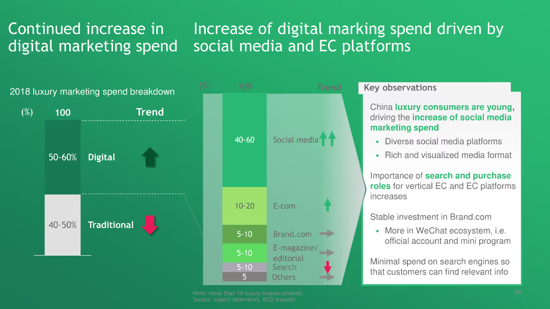
The slide includes a bar chart showing the breakdown of luxury marketing spend, highlighting the increase in digital marketing driven by social media and E-commerce platforms.
Technology and Digital Transformation
Media & Entertainment
The slide highlights a continued increase in digital marketing spend, particularly driven by social media and E-commerce platforms, showcasing the shift from traditional to digital marketing methods in the luxury industry.
digital marketing, social media, E-commerce platforms, luxury marketing, marketing spend
Multiple Chart
BCG
Saved
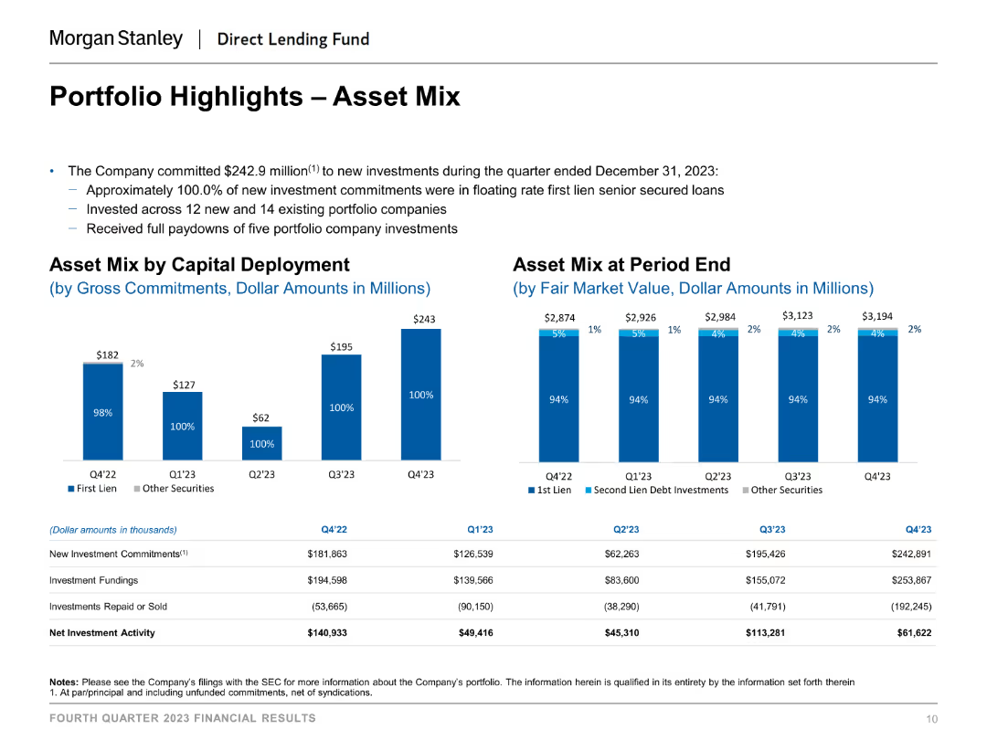
The slide includes column charts that depict the asset mix by capital deployment and at period end. Each chart uses distinct colors to differentiate between types of investments, such as first lien, second lien debt investments, and other securities.
Investment Analysis
Financial Services
The slide provides an overview of the portfolio's asset mix, showing how capital is deployed and the composition of assets at the end of different periods, aiding in investment analysis and portfolio management.
asset mix, capital deployment, investment analysis, financial services, portfolio management, period end asset composition
Multiple Chart
Morgan Stanley
Saved
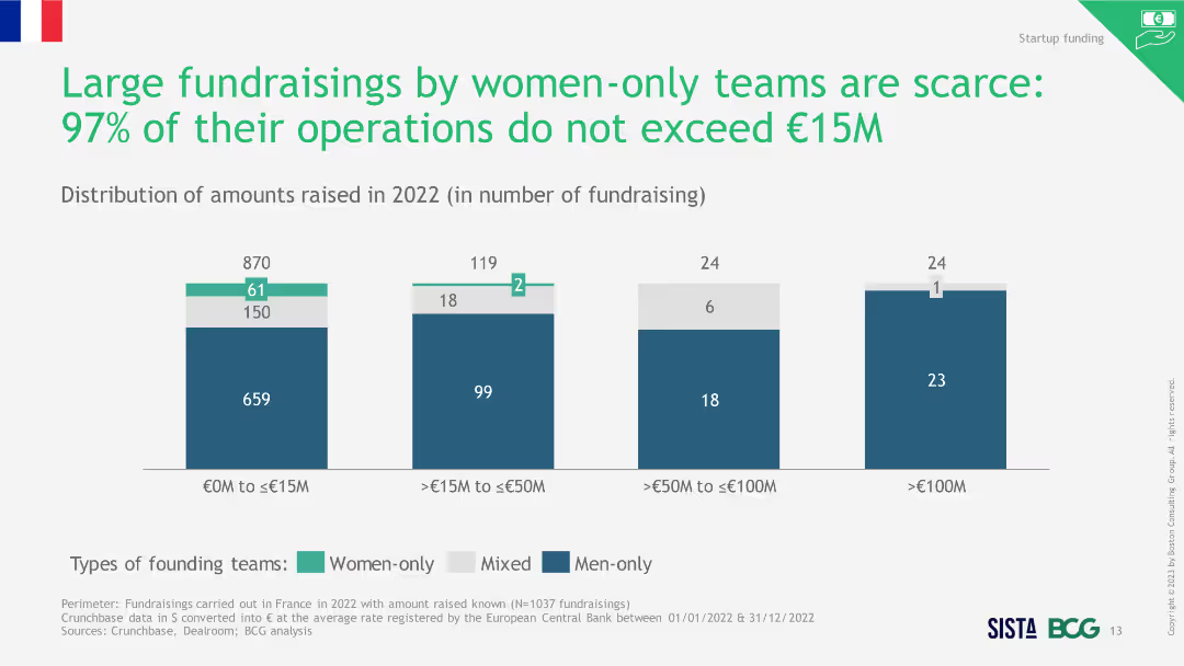
Column chart showing the distribution of amounts raised in 2022 by different founding teams, highlighting the scarcity of large fundraisings by women.
Investment Analysis
Financial Services
The slide emphasizes that large fundraisings by women-only teams are rare, with most fundraisings not exceeding €15M in 2022.
large fundraisings, women-only teams, scarcity, 2022
Single Chart
BCG
Saved
A bar graph illustrates the retention rate of new digital service users, with consistent high percentages across multiple service categories.
Market Analysis and Trends
Technology & Software
Illustrates the longevity of digital service adoption among new users, indicating a low likelihood of market retraction post-pandemic.
digital services, long-term adoption, user retention, market stability, service categories, post-pandemic
Single Chart
Bain
Saved
The slide displays a combination of text and a column chart. The chart illustrates the job loyalty trend from 2016 to 2021, highlighting differences between millennials and Gen Z with green and blue bars respectively. The slide is clean and uses color effectively to differentiate data points.
Human Resources and Talent Management
Technology & Software
The slide investigates job loyalty trends among millennials and Gen Z, noting a peak in 2020 and subsequent decline. A bar chart compares the percentage of those likely to stay with their current employer versus seeking new opportunities, shedding light on workforce dynamics and talent retention strategies.
Job Loyalty, Millennials, Gen Z, Trends, Workforce Dynamics, Bar Chart, Talent Retention, Employment Trends
Mixed Chart
Deloitte
Saved
This slide showcases a series of images representing various media sources with dates, signifying the ongoing discussion about innovation in the global context. Each image is a snapshot of a news headline from different prominent publications, with the background remaining consistently black. The slide layout is a montage of images, with clear captions underneath each to indicate the source and content relevance.
Product and Service Analysis
Technology & Software
The slide collates global news headlines that highlight innovation's role in the current global challenges and its presence on the global agenda. It is potentially used to emphasize the ubiquity of innovation in discussions across various sectors and to showcase the commitment of different sectors to innovative practices. This could be useful in a discussion on the pervasive nature of innovation and its importance across different domains.
global innovation, news headlines, media sources, COVID-19, sector commitment
Boxed
BCG
Saved
Previous
Next
If nothing, comes up, please save your slides first
Create a FREE account to continue browsing
Receive Instant Access to 1,000+ slides from companies like McKinsey, Google, and Goldman Sachs
First Name
Last Name
Email
Password
I agree to all
Terms & Privacy Policy
Thank you! Your submission has been received!
Oops! Something went wrong while submitting the form.
Have an account?
Sign in
Column Chart
Heatmap
Chevron
Org Chart
Infographic
Callouts
Timeline
List
Graphic
Picture
Process Flow
Diagram
Paragraph
Map
Table
Framework
Subtitle
Takeaway Box
Icon
Other Chart
Radar Chart
Waterfall Chart
Mekko Chart
Pie Chart
Scatter Plot
Line Chart
Bar chart
Bullet points