Create a FREE Account
Instant access to 1,000+ real slides from top companies like McKinsey, BCG, Goldman Sachs, Google and many more!
First Name
Last Name
Email
Password
I agree to all
Terms & Privacy Policy
Thank you! Your submission has been received!
Oops! Something went wrong while submitting the form.
Have an account?
Sign in
Library
Templates
Courses
Pricing
My Account
My Slides
My Templates
✦ AI
AI Prompt Library
AI Search
Sign in
Start Here
Logout
My Saved Slides
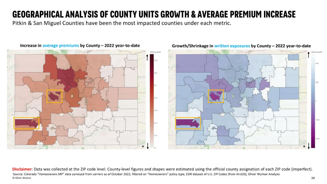
Side-by-side maps with county boundaries; left shows premium increases using a red heatmap, right shows growth/shrinkage in exposures with a blue/purple color scheme. Highlighted counties are boxed in yellow.
Market Analysis and Trends
Financial Services
This slide presents a county-level geographical comparison in Colorado, showing average premium increases and written exposure changes for 2022 YTD. Pitkin and San Miguel counties are highlighted as the most impacted. Visual heatmaps help emphasize regional differences in insurance metrics across ZIP codes mapped to counties.
geographic, premium increase, insurance, county analysis, written exposures, ZIP code, heatmap, Colorado
Multiple Chart
Oliver Wyman
Saved
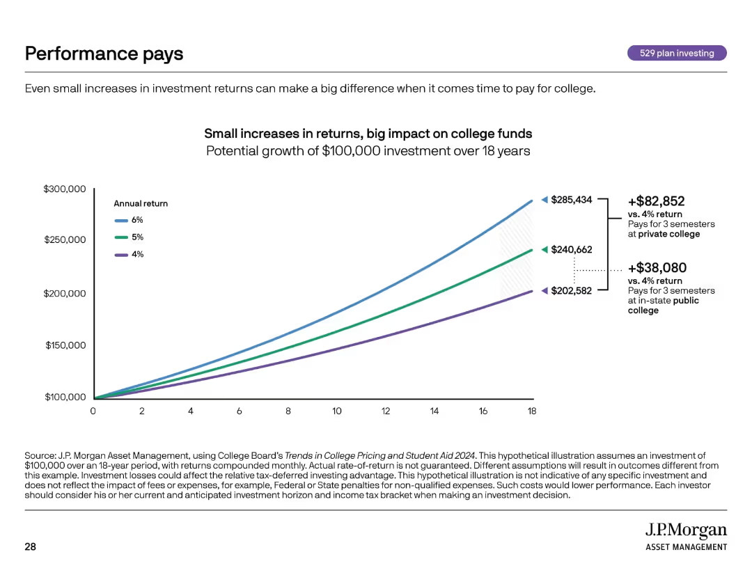
Line graph visual with growth projections for different return rates over time. Clean, minimal design.
Investment Analysis
Financial Services
Shows how small differences in annual return rates (4%, 5%, 6%) significantly affect the total value of a $100,000 college fund over 18 years. Demonstrates the power of compounding and return performance in long-term investing.
compound interest, investment returns, college savings, 529 plan, ROI
Single Chart
JP Morgan
Saved
Combines column charts and illustrations depicting accommodation situations of refugees.
Operational Efficiency
Government & Public Sector
Discusses current accommodation status and future expectations of refugees.
refugees, accommodation, Poland, future outlook
Mixed Chart
Deloitte
Saved
Two column charts comparing bank-wide market and credit risk RWA for 1Q21 and 1Q22. Text boxes outline recalibrated risk profiles and strategic areas of reinvestment.
Risk Assessment and Management
Financial Services
This slide shows the recalibration of the aggregate risk profile, including the reduction in risk-weighted assets (RWA) and leverage exposure, managed reductions, and strategic reinvestment in specific areas.
risk profile, recalibrated, strategic areas, RWA, leverage exposure
Mixed Chart
Credit Suisse
Saved
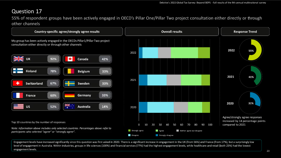
The slide contains bar charts for country-specific results and a column chart for overall results, with a donut chart for response trends.
Risk Assessment and Management
Financial Services
The slide displays survey findings on engagement in OECD’s Pillar One/Pillar Two project consultations. It includes country-specific and overall responses, highlighting trends from 2020 to 2022.
OECD, Pillar One, Pillar Two, engagement, survey
Multiple Chart
Deloitte
Saved
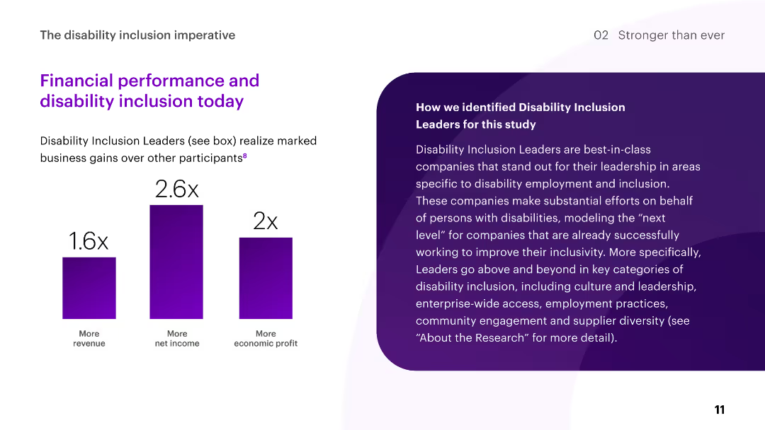
The slide includes column charts showing the financial performance of Disability Inclusion Leaders compared to other participants, highlighting revenue, net income, and economic profit.
Human Resources and Talent Management
Professional Services
The slide illustrates the business gains realized by Disability Inclusion Leaders, emphasizing higher revenue, net income, and economic profit compared to other participants.
disability inclusion, financial performance, revenue, net income, profit
Mixed Chart
Accenture
Saved
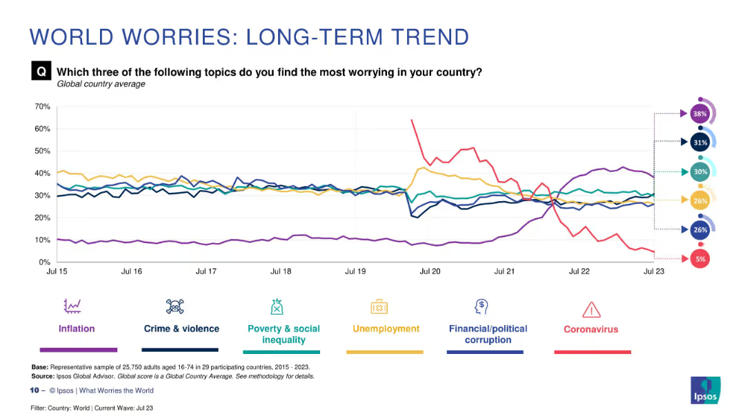
Line chart with six colored trend lines and circular percentage indicators on the right. Includes icons and legend.
Market Analysis and Trends
Professional Services
This slide visualizes global concerns over time, showing how major worries such as inflation, crime, poverty, unemployment, corruption, and coronavirus have fluctuated from 2015 to 2023 based on Ipsos survey data.
global concerns, trend analysis, Ipsos, inflation, crime, unemployment, poverty, coronavirus, corruption, survey
Multiple Chart
IPSOS
Saved
Features six hexagonal icons representing different global megatrends.
Industry Overview
Professional Services
Provides an overview of six megatrends projected to impact global development until 2050, including population dynamics, healthcare evolution, and technological advancements, serving as a strategic tool for future-oriented business and policy planning.
megatrends, global impact, strategic planning, future outlook, societal development
Pillar
Roland Berger
Saved
This slide includes two line graphs showing the transmission and distribution LCOH for different hydrogen carriers over various distances.
Market Analysis and Trends
Energy & Utilities
The slide analyzes how transportation costs vary based on hydrogen form, carrier, and distance traveled, with data visualized in the line graphs.
LCOH, transportation costs, hydrogen carriers, distance, cost analysis
Multiple Chart
Kearney
Saved
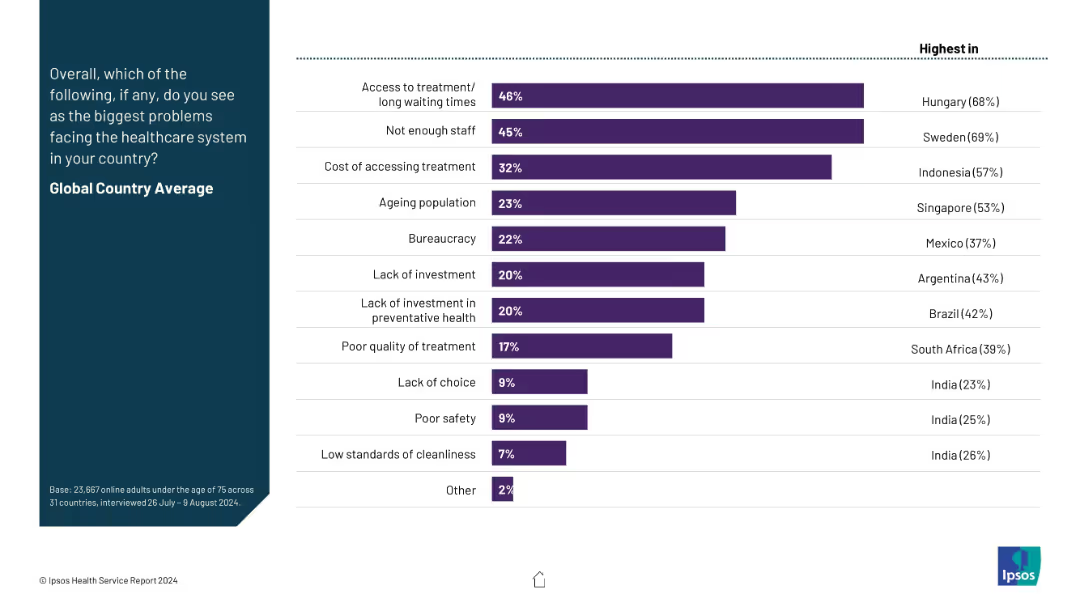
Horizontal bar chart on the right with ranked global country average issues; no yearly data trend. Left side contains a title and brief explanation.
Risk Assessment and Management
Healthcare & Pharmaceuticals
This slide summarizes the top healthcare system challenges globally, such as long wait times, staff shortages, treatment costs, bureaucracy, and lack of investment. The chart highlights both global averages and countries with the highest concern levels for each problem.
healthcare issues, access, staffing, cost, bureaucracy, public concerns, global average, Ipsos, investment, wait times
Mixed Chart
IPSOS
Saved
The slide presents two complex scatter plots comparing industry performance and stability. It uses color-coded dots for different industries and banks.
Competitive Landscape
Financial Services
This visual comparison is used to showcase long-term earnings growth and stability within the banking sector, highlighting the company's superior performance.
earnings growth, stability, industry comparison, banks
Multiple Chart
JP Morgan
Saved
Presents a blue column chart with amounts of cash returned to shareholders over four fiscal years, highlighting a significant share repurchase initiative.
Financial Performance
Consumer Goods
Reviews the substantial amounts returned to shareholders through dividends and share repurchases, underscoring the company's commitment to shareholder returns.
shareholder return, dividends, share repurchase, fiscal years, investment
Single Chart
Barclays
Saved
Donut charts showing economic value generated and distributed in FY22 and FY23 across different industry sectors
Financial Performance
Financial Services
This slide displays economic value generated and distributed at the group level, with comparisons between FY22 and FY23, highlighting various industry sectors such as automotive, healthcare, and technology
economic performance, value distribution, industry sectors, FY22, FY23
Multiple Chart
PwC/Strategy&
Saved
This slide features a flowchart with color-coded sections indicating different stages of a family law case process, accompanied by icons and a timeline.
Strategic Planning
Government & Public Sector
The slide outlines a future case management system for family law, suggesting improvements in process flow, aiming to expedite resolution and reduce litigation costs.
case management, family law, process improvement, timeline, flowchart, mediation, adjudication
Diagram
PwC/Strategy&
Saved
Slide features a large pie chart illustrating credit exposure, complemented by smaller column and pie charts detailing the breakdown by subsegment and rating, and exposure by business area.
Investment Analysis
Financial Services
Examines BBVA's credit exposure to the oil and gas sector, showcasing limited risk and investment grade focus. Suitable for evaluating sector-specific credit risk and investment strategies.
Credit Exposure, Oil and Gas, Investment Grade, Risk Assessment, Business Areas, Credit Risk
Multiple Chart
Morgan Stanley
Saved
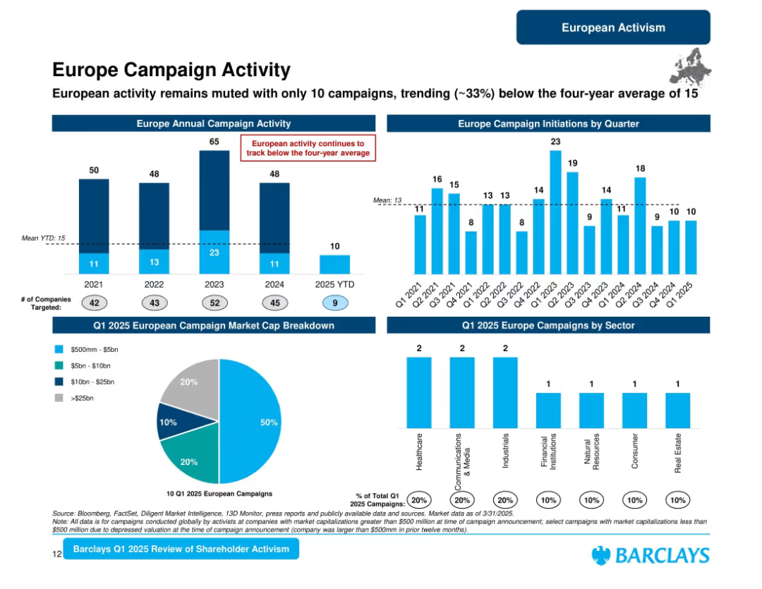
Multi-panel slide with bar charts, pie chart, and a small map. Predominantly blue color scheme. Structured in horizontal sections with clear headers.
Market Analysis and Trends
Financial Services
This slide tracks shareholder activism campaigns in Europe from 2021 to Q1 2025, noting a muted start to 2025 with activity down ~33% from the four-year average. It also breaks down market cap and sector data for Q1 2025.
Europe, Campaigns, Market Cap, Activism, Trends, Sectors, Shareholder, Quarterly, 2025, Barclays
Multiple Chart
Barclays
Saved
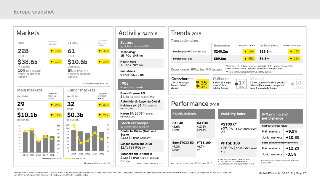
The slide provides a comprehensive snapshot of the European IPO market, divided into sections such as markets, activity, trends, and performance. It uses column charts and data tables to present information clearly. The layout is moderately complex, designed to offer detailed insights into market trends and activities.
Market Analysis and Trends
Financial Services
Offers a detailed overview of the European IPO market for 2018, including market performance, activity data, trends, and key metrics. It is useful for understanding the European market dynamics and making strategic decisions.
Europe, IPO, market snapshot, performance, trends
Multiple Chart
EY
Saved
The slide features multiple bar graphs and line charts showing percentage changes in IT costs over time. It uses a clean, professional layout with color differentiation for various data points.
Market Analysis and Trends
Technology & Software
The slide analyzes IT cost changes in the technology sector, showing trends in TCO, Opex, and Capex from 2021 to 2026. It indicates how costs are projected to change over time.
IT, TCO, Opex, Capex, technology costs, financial trends
Multiple Chart
Accenture
Saved
Displays column charts comparing the importance of analytical versus creative skills among marketing leaders.
Operational Efficiency
Professional Services
Analyzes trends in the prioritization of analytical skills over creative expertise in marketing, driven by data-intense market demands.
marketing, analytics, creative, skills, leadership, technology, efficiency
Mixed Chart
Deloitte
Saved
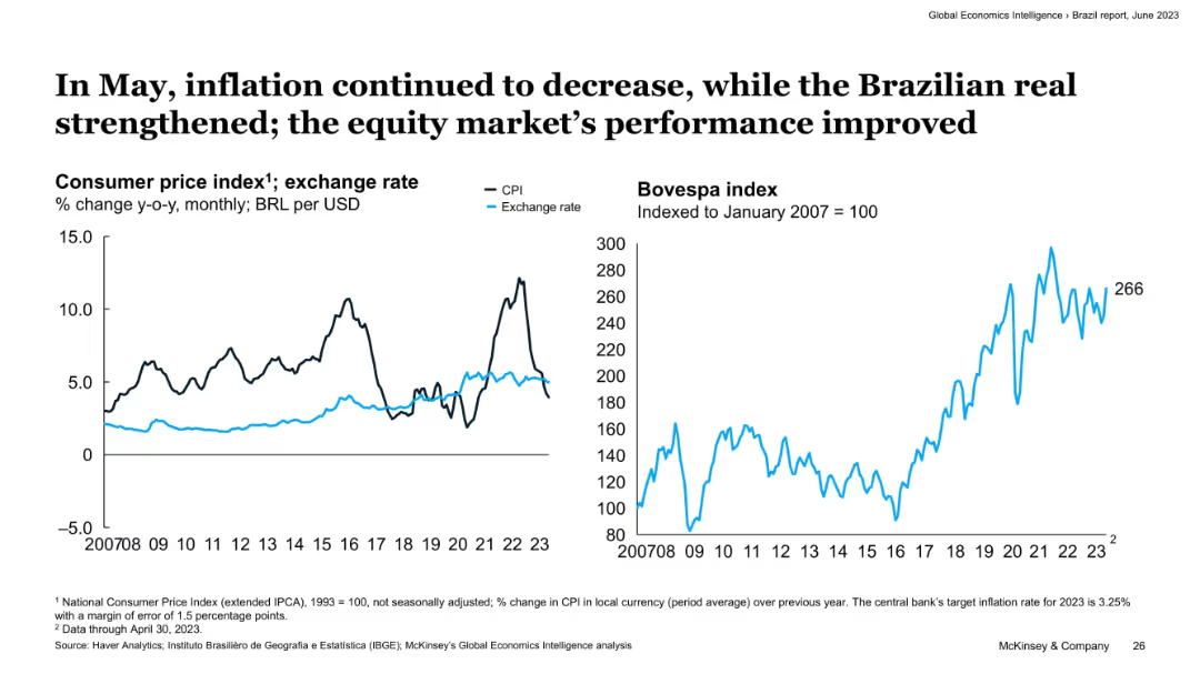
Two-panel layout with line charts; left shows CPI and exchange rate over time, right shows Bovespa index trend. Minimalist design with emphasis on data visualization.
Market Analysis and Trends
Financial Services
This slide highlights the economic performance in Brazil as of May 2023. It shows a decline in inflation, a strengthening Brazilian real, and an improved equity market, illustrated by CPI, exchange rate, and Bovespa index trends.
inflation, Brazil, Bovespa, CPI, exchange rate, equity market, economic performance, 2023, trends, financial
Multiple Chart
McKinsey
Saved
Uses pie charts to show CRE loan exposure by type and region, with a central focus on the large proportion of warehouse facilities.
Risk Assessment and Management
Financial Services
Provides insights into the composition and regional spread of CRE loan exposure, emphasizing the significance of warehouse facilities. Useful for discussions on risk exposure and investment decisions in the real estate sector.
Credit Risk, CRE, Loan Exposure, Warehouse Facilities, Regional Spread, Americas, EMEA, Asia, Distressed Properties, Healthcare, Residential Property
Multiple Chart
Goldman Sachs
Saved
Features pie charts comparing revenue segments from 2018, 2022, and 2027, alongside a column for contextual data. The pie charts display proportions in distinct colors for different segments, and the slide is text-heavy, providing detailed contextual information about the impact of the COVID-19 pandemic and recovery predictions.
Market Analysis and Trends
Media & Entertainment
Discusses the segment distribution of the business-to-business market in Hong Kong, focusing on the major hit from COVID-19 and recovery projections. Useful for business planning and analysis in post-pandemic market scenarios.
Hong Kong, trade shows, business-to-business, market distribution, COVID-19 impact, recovery prediction
Multiple Chart
PwC/Strategy&
Saved
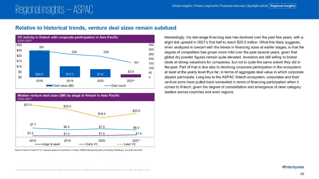
Two graphs (bar and line, plus line chart) on VC activity with corporate participation and median deal size.
Investment Analysis
Financial Services
This slide shows the reduced size and frequency of corporate VC participation in fintech and declining median venture deal sizes across stages from 2018 to 2021. The accompanying text discusses consolidation trends and cautious late-stage financing.
Venture Capital, Corporate VC, Deal Size, Asia Pacific, Fintech, Trends
Multiple Chart
KPMG
Saved
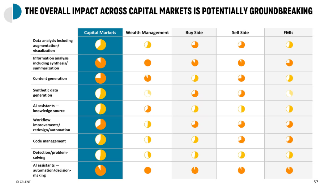
Heatmap-style summary table with use cases on Y-axis and market segments on X-axis; colored circles indicate impact
Performance Metrics and KPIs
Financial Services
Summary matrix showing cross-segment impact of GenAI use cases across capital markets participants. Measures impact level for each use case type in wealth management, buy side, sell side, and FMIs, highlighting where GenAI adds most value.
capital markets summary, KPI impact, GenAI matrix, cross-sector use, impact overview
Single Chart
Oliver Wyman
Saved
This slide presents a central circle diagram surrounded by associated elements in a balanced layout with red and gray color accents.
Market Analysis and Trends
Financial Services
Discusses the importance of a reliable equity story in IPOs, focusing on investor considerations and integrating business strategy with reproducible data and KPIs.
IPO, equity story, investors, KPIs, business strategy, data reliability
Linear Flow
PwC/Strategy&
Saved
Previous
Next
If nothing, comes up, please save your slides first
Create a FREE account to continue browsing
Receive Instant Access to 1,000+ slides from companies like McKinsey, Google, and Goldman Sachs
First Name
Last Name
Email
Password
I agree to all
Terms & Privacy Policy
Thank you! Your submission has been received!
Oops! Something went wrong while submitting the form.
Have an account?
Sign in
Column Chart
Heatmap
Chevron
Org Chart
Infographic
Callouts
Timeline
List
Graphic
Picture
Process Flow
Diagram
Paragraph
Map
Table
Framework
Subtitle
Takeaway Box
Icon
Other Chart
Radar Chart
Waterfall Chart
Mekko Chart
Pie Chart
Scatter Plot
Line Chart
Bar chart
Bullet points