Create a FREE Account
Instant access to 1,000+ real slides from top companies like McKinsey, BCG, Goldman Sachs, Google and many more!
First Name
Last Name
Email
Password
I agree to all
Terms & Privacy Policy
Thank you! Your submission has been received!
Oops! Something went wrong while submitting the form.
Have an account?
Sign in
Library
Templates
Courses
Pricing
My Account
My Slides
My Templates
✦ AI
AI Prompt Library
AI Search
Sign in
Start Here
Logout
My Saved Slides
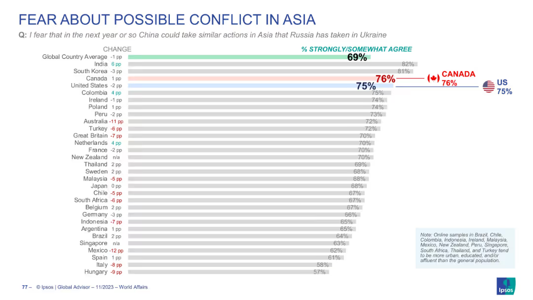
Bar chart on fear of China taking Ukraine-like actions in Asia; Canada and US highlighted; global average included.
Risk Assessment and Management
Government & Public Sector
Addresses concern over potential aggression by China in Asia. Globally, 69% agree they fear this, while US and Canada register even higher at 75% and 76%. Slide tracks geopolitical anxieties shifting toward Asia.
China, Asia conflict, geopolitical fear, public sentiment, Ipsos
Single Chart
IPSOS
Saved
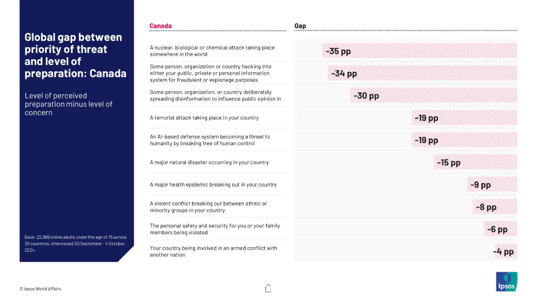
Same structure as 18836 but specific to Canada. Red-striped bars and values illustrate larger negative gaps compared to global averages.
Risk Assessment and Management
Government & Public Sector
Canadian-specific data revealing stark differences between perceived threat levels and government readiness. Largest gaps are seen in cyber threats and NBC events, indicating significant public skepticism.
Canada, threat perception, preparedness gap, hacking, disinformation, crisis readiness
Mixed Chart
IPSOS
Saved
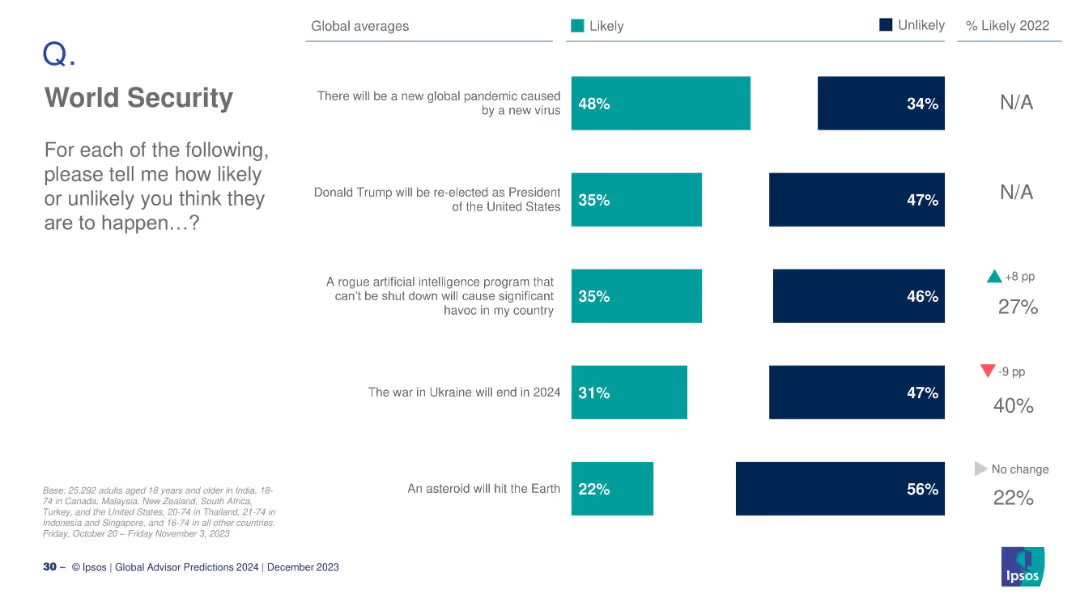
Vertical bar chart with teal and navy bars showing global averages of likelihood; minimalistic layout.
Strategic Planning
Government & Public Sector
This slide summarizes global perceptions on the likelihood of several world security events happening, such as a new pandemic, AI risks, war resolution, and asteroid impact. Percentages reflect perceived likelihoods across categories, with some showing year-over-year change indicators.
world security, predictions, AI, pandemic, Ukraine war, asteroid, Trump, global risk, Ipsos, 2024 survey
Mixed Chart
IPSOS
Saved
The slide features multiple pie charts and percentage statistics showcasing the positive impact of the nbn network on various aspects of wellbeing like employment, health, and social connections.
Market Analysis and Trends
Telecommunications
Explores the positive effects of the nbn network on users' wellbeing across several domains, indicating substantial benefits in employment, health, education, and community connectivity.
nbn, Wellbeing, Impact, Satisfaction, Positive
Multiple Chart
Accenture
Saved
The slide includes line graphs representing occupancy rates by country and a bar chart showing portfolio weighting by country. It uses a palette of blue, teal, and dark green for the graphs, which are set against a white background for contrast.
Performance Metrics and KPIs
Transportation & Logistics
It highlights the stable occupancy rates in the light industrial and logistics sector across various countries and the corresponding portfolio weightings. This slide could be pivotal for logistics companies assessing market stability, portfolio managers strategizing on asset allocation, or investors looking for robust sectors with stable yields.
industrial, logistics, occupancy rates, portfolio weighting, market stability
Multiple Chart
Morgan Stanley
Saved
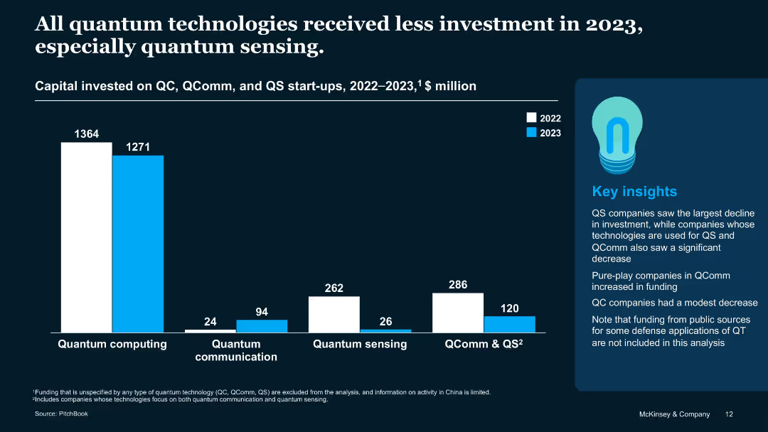
Bar chart comparing QC, QComm, and QS funding across 2022 and 2023 with a sidebar for insights
Investment Analysis
Artificial Intelligence
Visualizes declining investments in all QT segments, with QS experiencing the steepest drop. Also notes that QC saw only a modest decline, and QComm firms with a single focus saw funding increase. Public-sector defense applications are not included.
QS decline, quantum communication, QC funding, capital trends, 2023
Mixed Chart
McKinsey
Saved
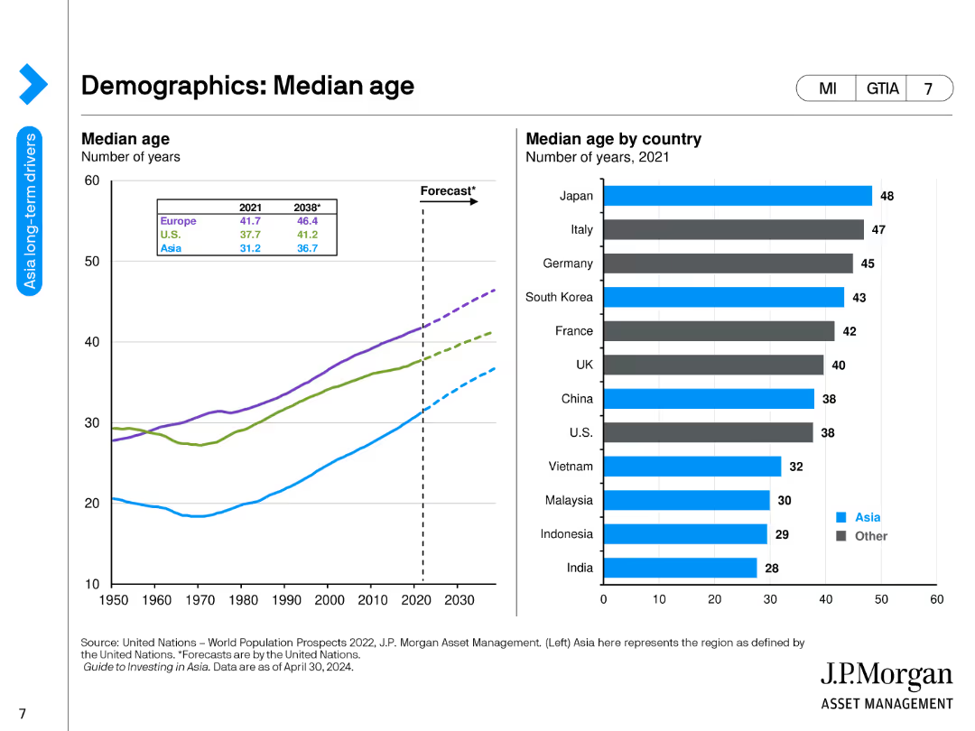
The slide contains a line chart showing the median age of various regions from 1950 to 2030, and a bar chart listing the median age by country in 2021.
Market Analysis and Trends
Financial Services
This slide provides an analysis of median age trends across different regions and countries, highlighting demographic shifts and their potential impact on economic and social structures.
Median Age, Demographics, Regions, Countries, Trends
Multiple Chart
JP Morgan
Saved
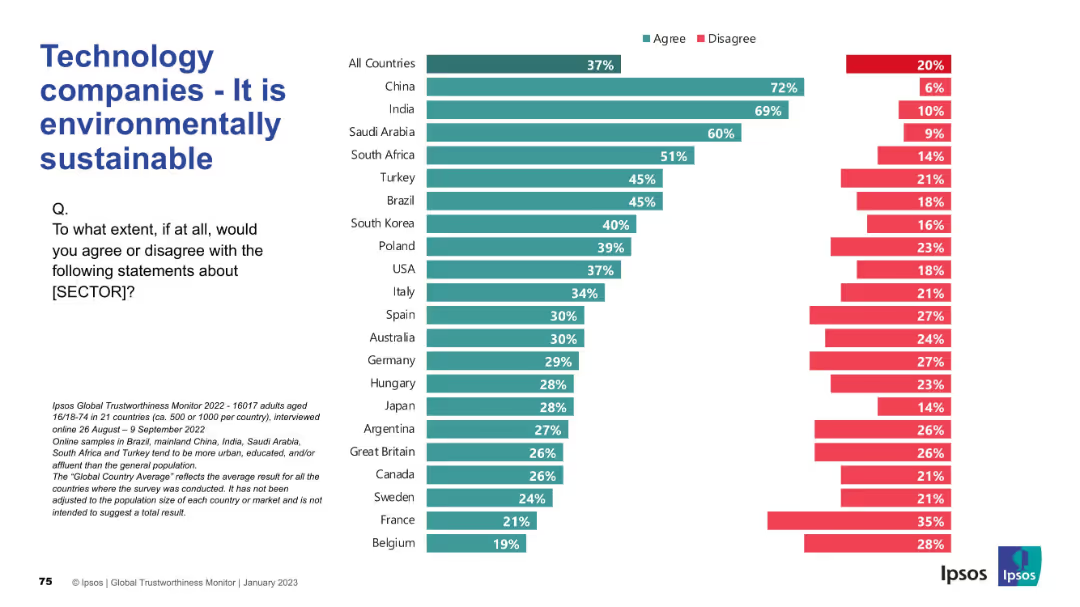
Horizontal bar chart on the right; title and survey prompt on left, consistent with other slides.
Market Analysis and Trends
Technology & Software
The slide reveals global views on whether technology companies are seen as environmentally sustainable, presenting survey data by country.
sustainability, environment, tech companies, Ipsos, corporate responsibility, green practices, global opinion, ESG, survey, public sentiment
Mixed Chart
IPSOS
Saved
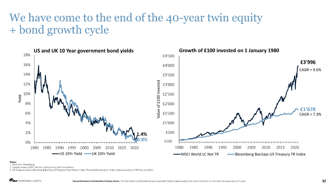
Column chart on the left shows US and UK 10-year government bond yields, line chart on the right shows investment growth.
Market Analysis and Trends
Financial Services
The slide analyzes the end of the 40-year growth cycle in equity and bonds, showing historical yields and investment growth.
bond yields, investment growth, market analysis, equity, bonds, financial cycle
Multiple Chart
Deloitte
Saved
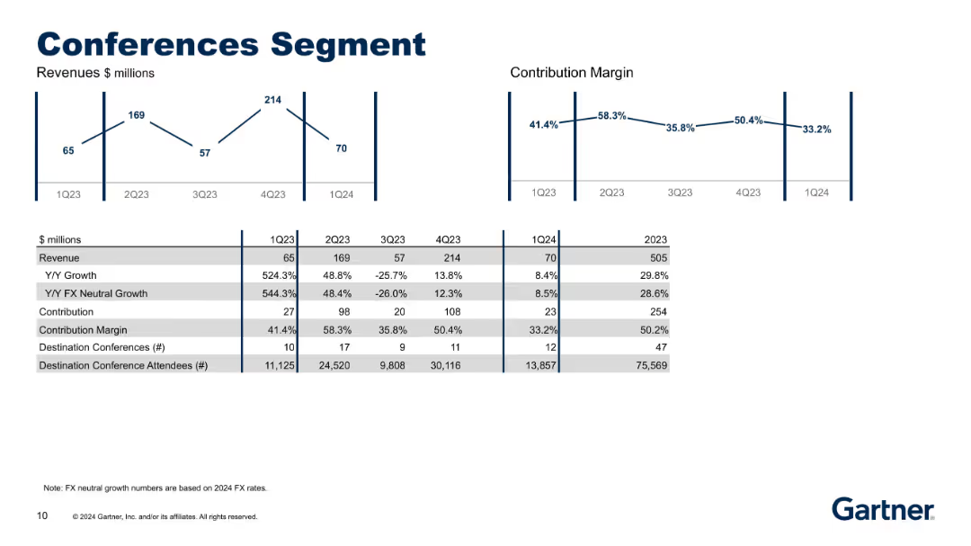
The slide is divided into two main data visualizations: a line graph showing quarterly revenue in millions and another showing contribution margin. Below these graphs is a detailed table comparing five quarters (1Q23 to 1Q24) and annual data for 2023. Metrics include revenue, Y/Y growth, FX neutral growth, contribution, margin, number of conferences, and attendees. Uses corporate color scheme with clean layout and precise labeling.
Financial Performance
Professional Services
This slide provides a performance summary of Gartner's Conferences Segment over five quarters and the 2023 fiscal year. It shows quarterly revenue and contribution margin trends, with notable spikes in Q4 2023. The table includes key metrics such as growth rates, number of destination conferences, and attendees. The analysis highlights volatility in quarterly performance, while maintaining strong annual results with a 29.8% year-over-year revenue growth.
revenue trends, contribution margin, quarterly performance, destination conferences, Gartner, financial analysis, professional services, attendees growth, FX-neutral growth, event metrics
Multiple Chart
Gartner
Saved
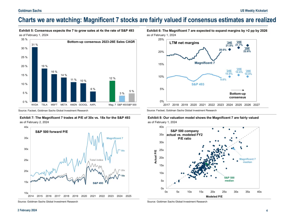
Four-panel chart layout showing growth estimates, valuation metrics, and modeled P/E ratios for the Mag 7 vs. the rest of the S&P 500.
Investment Analysis
Technology & Software
This slide justifies the current valuations of the Magnificent 7 by comparing their projected sales growth and margin expansion to the broader market. It concludes they are fairly valued given consensus estimates. P/E comparisons and a modeled valuation chart reinforce the analytical viewpoint.
valuation, Magnificent 7, sales growth, P/E ratio, consensus, margin expansion, fair value
Multiple Chart
Goldman Sachs
Saved
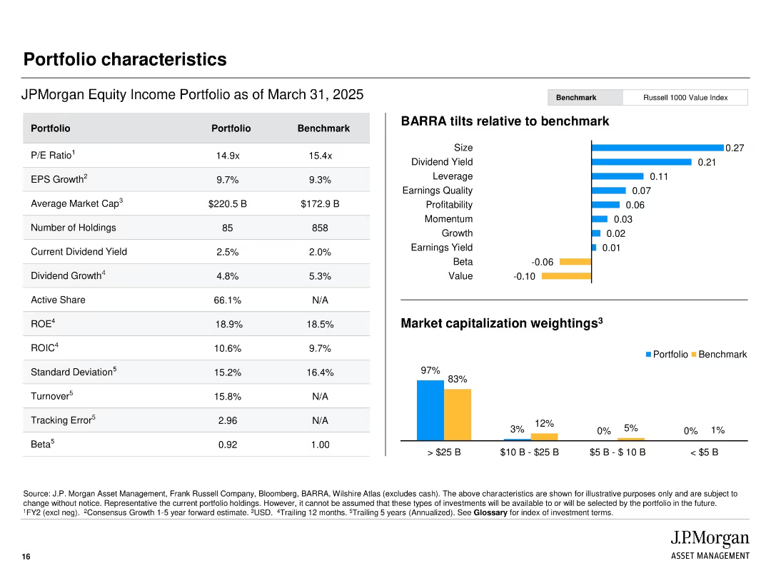
Side-by-side comparison table of portfolio vs benchmark; right section shows BARRA factor tilts and market cap breakdown.
Financial Performance
Financial Services
Compares JPMorgan’s Equity Income Portfolio with the Russell 1000 Value Index on metrics such as P/E, ROE, and dividend yield. BARRA tilts show factor exposures. A bar chart visualizes market cap breakdown, showing a bias toward large-cap holdings.
portfolio comparison, BARRA tilts, market cap, dividend yield, PE ratio, financial metrics, benchmark
Multiple Chart
JP Morgan
Saved
A split design with infographics and key statistics.
Technology and Digital Transformation
Professional Services
The slide presents a comparative analysis of how technology is changing work practices and the implications for organizations.
Future of Work, Technology, Organizations, Change, Comparative Analysis
Framework
Deloitte
Saved
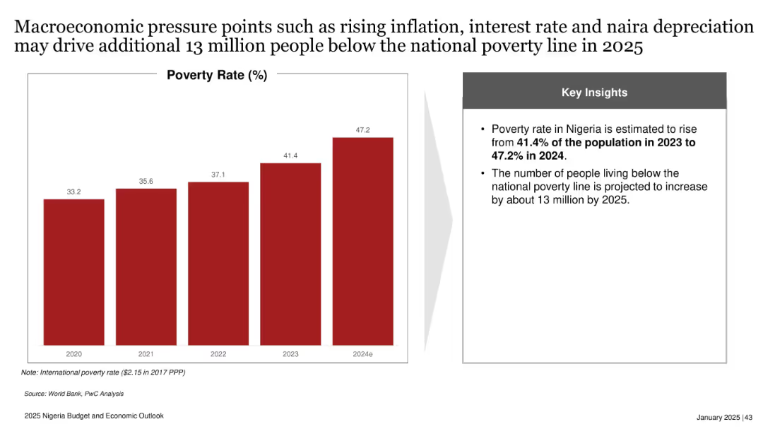
Bar chart showing poverty rate from 2020 to 2024e; side box with key insights; red and gray design.
Risk Assessment and Management
Government & Public Sector
Projects Nigeria’s poverty rate will rise to 47.2% in 2024, with 13 million more people expected to fall below the poverty line by 2025. Highlights inflation, interest rate hikes, and naira depreciation as key contributing macroeconomic pressures.
poverty rate, inflation, naira depreciation, interest rate, Nigeria, 2025, economic stress, social impact
Mixed Chart
PwC/Strategy&
Saved
The slide features multiple bar charts and a bar chart, detailing changes in DE&I spending by company size, sales, and economic sectors. Colors are red and grey.
Market Analysis and Trends
Professional Services
Details DE&I spending trends across various company sizes and sectors, highlighting significant increases in B2C sectors and larger firms.
DE&I, marketing, trends, B2C, spending, company size, retail, communications, real estate, economic sector
Multiple Chart
Deloitte
Saved
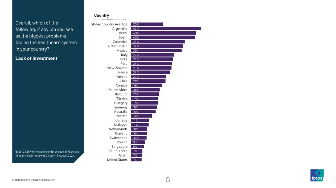
Horizontal bar chart showing public concern about healthcare investment levels; ranked country data displayed.
Investment Analysis
Healthcare & Pharmaceuticals
This slide reveals which countries perceive underinvestment in healthcare as a major issue. Argentina and Brazil rank highest. The global average concern is 20%, highlighting regional disparities.
healthcare funding, investment, infrastructure, public opinion, economic concern, survey insight, country rankings
Mixed Chart
IPSOS
Saved
Slide with a timeline showing the growth in internet users over three years. Each year is represented by a different size and colored circle, with numbers indicating user growth.
Market Analysis and Trends
Technology & Software
Provides a visual representation of internet user growth in Southeast Asia, showing the year-over-year increase. Used for discussing trends in digital adoption and the expanding internet user base.
Internet Users, Growth, SEA
Single Chart
Bain
Saved
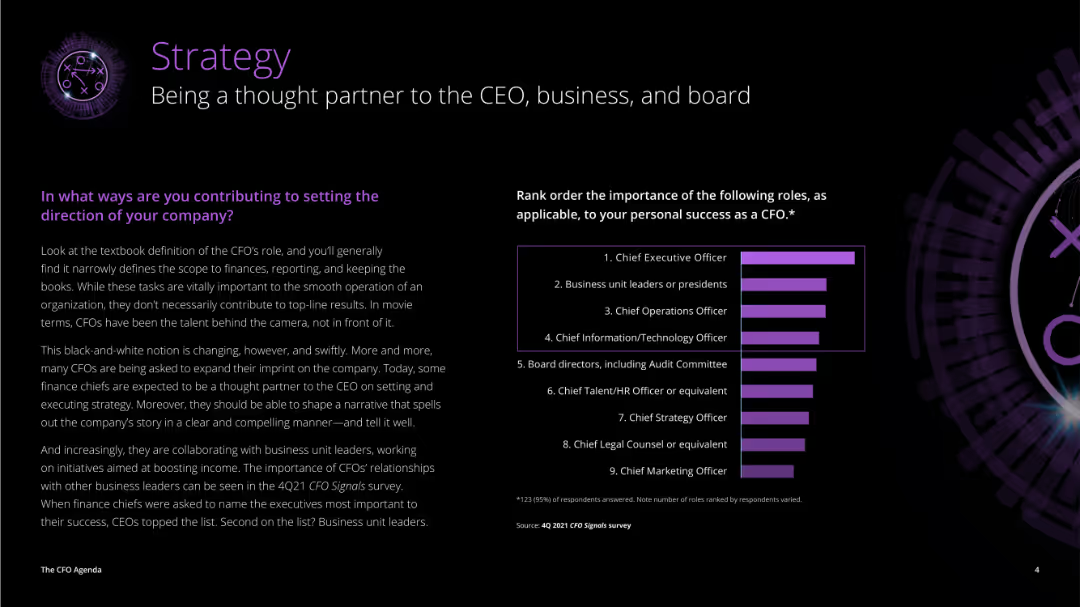
The slide is divided into two sections: a detailed text on the left discussing CFO roles, and a column chart on the right showing the importance of various roles to CFOs' success.
Strategic Planning
Professional Services
The slide highlights the evolving role of CFOs as strategic partners, detailing how they contribute to setting company direction and the importance of their relationships with other business leaders.
strategy, CFO, CEO, business, board, roles, importance, success, direction, strategic partner
Mixed Chart
Deloitte
Saved
This slide features a table with green and grey bars representing the percentage of respondents for different departments recovered to pre-COVID-19 levels.
Operational Efficiency
Healthcare & Pharmaceuticals
This slide shows the recovery of various hospital departments to pre-COVID-19 levels, with a focus on elective procedures across different regions.
department recovery, pre-COVID-19 levels, elective procedures, hospital departments, regional comparison
Multiple Chart
LEK
Saved
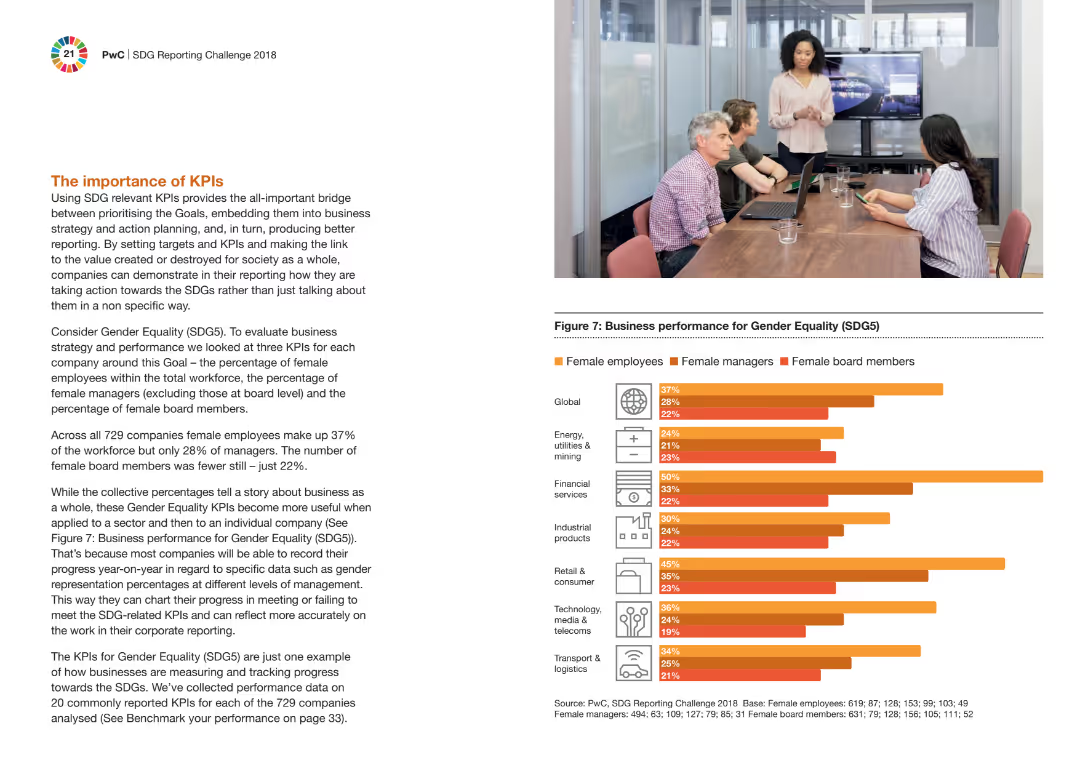
The slide features a column chart comparing the performance on gender equality (SDG5) across different industries. It includes a picture of a meeting with four people, one presenting, and text explaining the importance of KPIs.
Performance Metrics and KPIs
Professional Services
The slide explains the significance of using SDG-related KPIs to bridge business strategy and societal value creation. It highlights gender equality KPIs, showing the percentage of female employees, managers, and board members in various industries.
KPIs, gender equality, SDG5, performance, business strategy, industries, professional services, column chart, meeting
Mixed Chart
PwC/Strategy&
Saved
Column chart showing growth metrics for client relationships, net new assets, fee-based flows, and asset management revenues from 2019 to 2023.
Strategic Planning
Financial Services
Highlights significant growth in Morgan Stanley's Path to Advice program, illustrating metrics for client relationships, new assets, fee-based accounts, and revenues.
Morgan Stanley, growth, client relationships, assets, fee-based
Multiple Chart
Morgan Stanley
Saved
Slide features multiple column charts and textual information outlining financial targets and historical data. Layout is clear with a direct comparison of yearly data.
Financial Performance
Financial Services
This slide presents a financial overview, showing RoTE, total income, net interest income, cost:income ratio, and other financial metrics from 2021 to projections for 2026. Each financial aspect is broken down by year with targets for 2026 clearly highlighted.
financials, RoTE, income, cost, 2026 targets, banking
Multiple Chart
Barclays
Saved
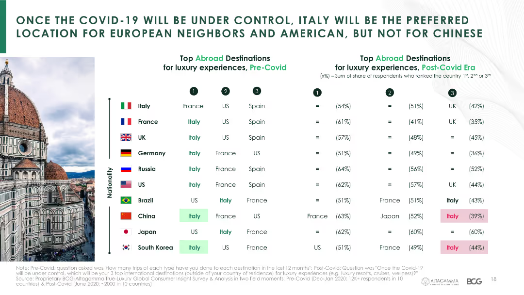
The slide presents a table comparing pre- and post-COVID-19 preferred luxury travel destinations among consumers from various countries.
Market Analysis and Trends
Hospitality & Tourism
It analyzes the shifts in preferred luxury travel destinations for various nationalities before and after the pandemic, with a focus on Italy's popularity.
travel destinations, luxury travel, consumer preferences, COVID-19, Italy, country comparison
Header Horizontal
BCG
Saved
This slide features a tripartite layout with three content blocks, each with an icon, title, and bullet points describing strategies for increasing recurring revenues. The layout is balanced with equal spacing and a minimalist design.
Strategic Planning
Financial Services
The slide details strategies to increase recurring revenues, focusing on property management business, global corporate services, and investing in predictable businesses. It's aimed at stakeholders interested in understanding and evaluating the company's growth strategies and potential for scaling.
Recurring Revenues, Strategy, Property Management, Global Services, Investment
Pillar
Goldman Sachs
Saved
The slide contains text discussing the effectiveness of spending less than competitors, accompanied by a doughnut chart on the right. The chart compares the percentage of entrants, finalists, and winners who spend less than their competition.
Financial Performance
Media & Entertainment
This slide argues that spending less than competitors can be an effective strategy, supported by data showing the proportion of entrants, finalists, and winners who adopt this approach.
spending strategy, competition, cost efficiency, doughnut chart, marketing
Mixed Chart
IPSOS
Saved
Previous
Next
If nothing, comes up, please save your slides first
Create a FREE account to continue browsing
Receive Instant Access to 1,000+ slides from companies like McKinsey, Google, and Goldman Sachs
First Name
Last Name
Email
Password
I agree to all
Terms & Privacy Policy
Thank you! Your submission has been received!
Oops! Something went wrong while submitting the form.
Have an account?
Sign in
Column Chart
Heatmap
Chevron
Org Chart
Infographic
Callouts
Timeline
List
Graphic
Picture
Process Flow
Diagram
Paragraph
Map
Table
Framework
Subtitle
Takeaway Box
Icon
Other Chart
Radar Chart
Waterfall Chart
Mekko Chart
Pie Chart
Scatter Plot
Line Chart
Bar chart
Bullet points