Create a FREE Account
Instant access to 1,000+ real slides from top companies like McKinsey, BCG, Goldman Sachs, Google and many more!
First Name
Last Name
Email
Password
I agree to all
Terms & Privacy Policy
Thank you! Your submission has been received!
Oops! Something went wrong while submitting the form.
Have an account?
Sign in
Library
Templates
Courses
Pricing
My Account
My Slides
My Templates
✦ AI
AI Prompt Library
AI Search
Sign in
Start Here
Logout
My Saved Slides
Contains icons and short text sections outlining strategies for future readiness.
Strategic Planning
Financial Services
Details five critical strategies for wealth management firms to stay competitive in the digital era.
wealth management, strategies, future readiness, competitive, financial services
Linear Flow
Deloitte
Saved
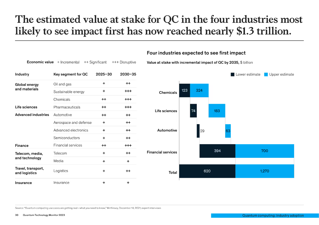
The slide features a table showing economic value segments for QC across different industries and a bar chart detailing the incremental impact value of QC in chemicals, life sciences, automotive, and financial services by 2035.
Market Analysis and Trends
Financial Services
This slide estimates the potential economic impact of QC across four key industries, projecting a nearly $1.3 trillion value at stake, with detailed breakdowns by industry segment.
QC impact, economic value, industry analysis, financial projections, market trends
Mixed Chart
McKinsey
Saved
This slide is filled with textual content and data-centric elements, including a column chart with red annotations and a table with numeric values. The use of blue color coding organizes the information into three sections, highlighting key business metrics from 2014 to 2019.
Financial Performance
Financial Services
It demonstrates the momentum across key business drivers, with comparisons of year-over-year and compound annual growth rates in consumer and business banking. The included data elements and textual descriptions suggest that the slide is used to convey the financial strength and growth within the banking sector, specifically focusing on JPMorgan Chase & Co.'s performance.
Consumer Banking, Business Banking, Growth, Deposits, Investments, CAGR, Financial Strength, JPMorgan Chase & Co.
Table
JP Morgan
Saved
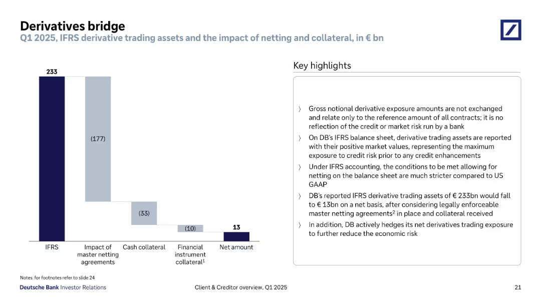
Waterfall chart showing IFRS gross to net amount reconciliation with right-aligned key highlights box. Clean layout with descending bars and annotations.
Risk Assessment and Management
Financial Services
Outlines Deutsche Bank’s derivative trading exposure under IFRS accounting rules. Highlights the effects of netting agreements and collateral on reducing the gross €233bn exposure to €13bn net, emphasizing reduced economic and credit risk.
derivatives, IFRS, netting, exposure, collateral, risk mitigation
Mixed Chart
Deutsche Bank
Saved
This slide features a line chart comparing the likelihood of homeowners listing their homes for sale over several years. It uses two lines: one for very/somewhat likely (purple) and another for very likely (orange).
Market Analysis and Trends
Real Estate & Construction
The slide analyzes survey data on the likelihood of homeowners listing their homes for sale, indicating trends in seller behavior and market sentiment.
likelihood, listing home, survey, seller behavior, market sentiment
Single Chart
IPSOS
Saved
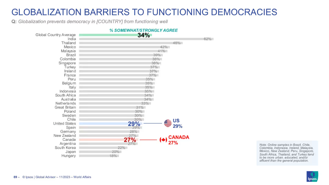
Horizontal bar chart with global and country-specific agreement percentages
Regulatory and Compliance
Government & Public Sector
The data explores how globalization might hinder democratic function. The global average is 34%, with the US at 29% and Canada at 27%, indicating moderate concern.
democracy, globalization, governance, public trust, political systems
Single Chart
IPSOS
Saved
Incorporates multiple bubble charts showing the value at stake by digital initiatives in the automotive industry. Uses color coding to differentiate between types of value and initiatives.
Market Analysis and Trends
Transportation & Logistics
Details the $2 trillion potential from digital initiatives in the automotive sector, emphasizing multimodal integration and digital enterprise.
Automotive, Digital Transformation, Industry Value, Societal Impact, Efficiency
Mixed Chart
Accenture
Saved
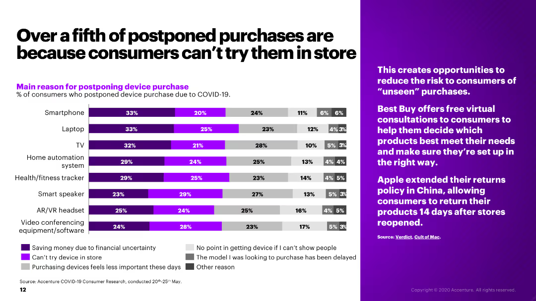
The slide presents a bar chart showing the main reasons for postponing device purchases due to COVID-19, alongside a sidebar with relevant industry insights.
Market Analysis and Trends
Retail & E-commerce
The slide examines the reasons for postponing electronic device purchases during COVID-19, such as financial uncertainty and inability to try products in-store.
postponed purchases, COVID-19, consumer behavior, electronics, retail
Mixed Chart
Accenture
Saved
The slide presents a complex, color-coded matrix graph showing the frequency of deployment versus complexity of operational value creation levers.
Operational Efficiency
Professional Services
This slide details various operational value creation levers, categorized by complexity and deployment frequency, suggesting strategic focus areas for business partnerships.
operational, value, complexity, deployment, strategy
Single Chart
Accenture
Saved
The slide showcases hexagonal shapes arranged in a honeycomb pattern, each containing a different aspect of sustainable finance such as "Clean Energy" and "Financial Inclusion." The layout is clean and visually focuses on the concept of "Climate Transition."
Investment Analysis
Government & Public Sector
It discusses Goldman Sachs' approach to sustainable finance, with a goal of $750 billion by 2030. This slide is ideal for discussing environmental, social, and governance (ESG) investment strategies, highlighting how finance can support inclusive growth and climate transition.
sustainable finance, ESG, Goldman Sachs, climate transition, inclusion
Text Only
Goldman Sachs
Saved
Displays a comparison of H2 vessel types by application and geography for 2023 and 2030, highlighting the expected dominance of Type IV vessels.
Technology and Digital Transformation
Energy & Utilities
Discusses the anticipated dominance of Type IV H2 vessels by 2030, focusing on their application in mobility and infrastructure and various pressure levels.
Type IV vessels, H2 storage, dominance, application, geography, mobility, infrastructure, pressure levels, 2030
Table
Roland Berger
Saved
Three pie charts showing the composition change of the MSCI Emerging Markets Index over time, from 2004 to 2024.
Market Analysis and Trends
Financial Services
Displays the changes in the composition of the MSCI Emerging Markets Index, illustrating shifts in regional market shares over 20 years.
emerging markets, index composition, MSCI, pie charts, market analysis, regional shifts, historical data, projections
Multiple Chart
JP Morgan
Saved
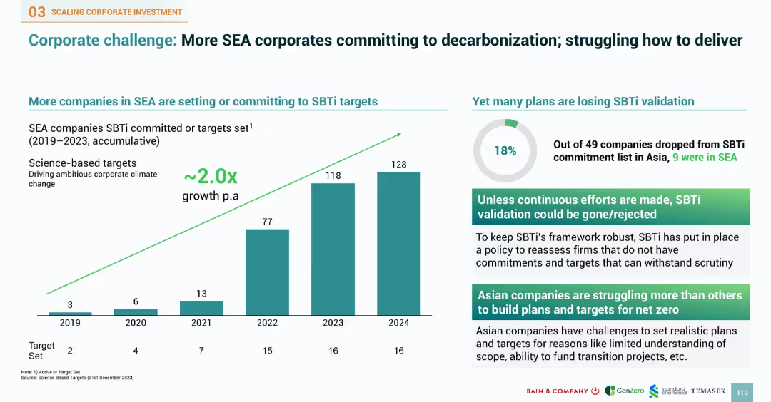
Bar chart of SBTi commitments over years and pie chart of validation loss. Right side provides insights into corporate struggles and requirements for target credibility.
Performance Metrics and KPIs
Industrial & Manufacturing
Reviews the increase in SEA companies committing to SBTi targets, with commitments doubling annually. Notes 18% failure rate in maintaining validation. Points to challenges such as plan credibility, funding gaps, and target scope issues. Underscores the need for continuous efforts to meet stringent validation frameworks and credibility in climate goal setting.
SBTi, SEA corporates, decarbonization, validation, climate targets, science-based targets, KPI, commitment, emissions
Multiple Chart
Bain
Saved
Presents a column chart showing the growth in commercial banking gross investment banking revenue over five years, with annotations and icons indicating key growth areas.
Financial Performance
Financial Services
Explains JPMC's success in delivering top-tier investment banking services to commercial banking clients, highlighting consistent revenue growth and strategic expansion in targeted sectors.
investment banking, commercial banking, revenue growth, JPMC, strategic expansion, middle market, private capital
Mixed Chart
JP Morgan
Saved
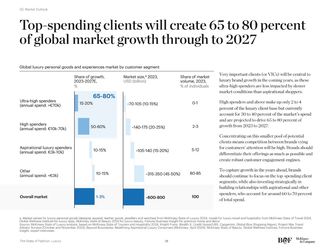
Split layout: bar chart on the left shows market segmentation by spend level and growth share; text on the right provides contextual analysis. Clean design with blue bars and categories clearly separated by spend tiers.
Customer and Market Segmentation
Consumer Goods
The slide highlights that ultra-high and high spenders will drive 65–80% of luxury market growth by 2027, despite representing a small share of consumers. Emphasis is placed on targeting these valuable segments for strategic growth.
VICs, high spenders, market segmentation, luxury growth, forecast 2027, consumer behavior, market share
Mixed Chart
McKinsey
Saved
White background with multiple text sections and bar charts showing credit cost distribution over time. Important quotes highlighted.
Market Analysis and Trends
Environmental Services & Sustainability
Analyzes the increasing demand for carbon credits, rising costs, and the implications for future pricing and supply dynamics.
demand increase, carbon credits, supply costs
Multiple Chart
EY
Saved
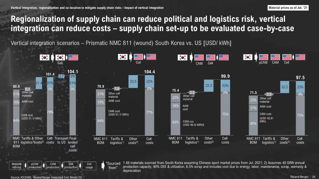
Comparative bar graphs of cost scenarios for various supply chains (South Korea vs. US); icons and flags used to denote material flow; breakdown by cost components
Operational Efficiency
Industrial & Manufacturing
The slide compares costs of vertical integration and regionalization of the battery supply chain across different configurations. It shows cost advantages of localized U.S. supply chains and how material origin affects final cell costs.
Supply Chain, Vertical Integration, Logistics, Battery Production, Cost Analysis, South Korea, U.S.
Multiple Chart
Roland Berger
Saved
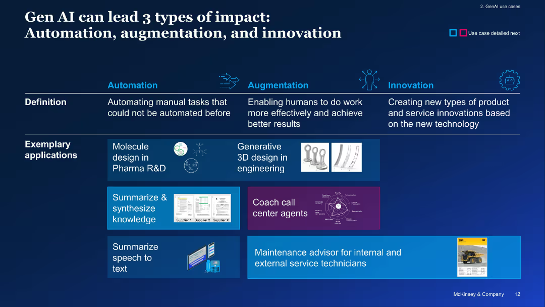
Horizontal layout with three segments (Automation, Augmentation, Innovation), with example applications shown
Technology and Digital Transformation
Artificial Intelligence
The slide categorizes GenAI's impact into automation, augmentation, and innovation, providing use cases like molecule design, 3D modeling, and coaching. It visually connects capabilities to real-world applications.
automation, augmentation, innovation, GenAI impact, use cases, transformation
Linear Flow
McKinsey
Saved
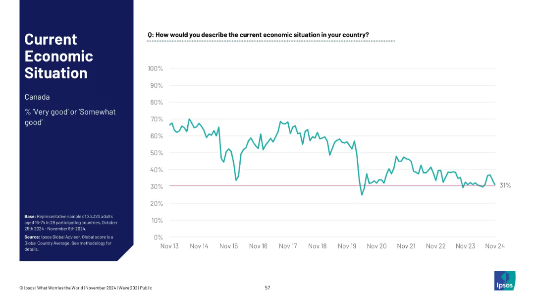
Single-country (Canada) line chart tracking positive economic sentiment since 2013; ends at 31%.
Financial Performance
Financial Services
Tracks Canadian public sentiment on the economy from 2013–2024. After high early optimism, sentiment declines and stabilizes below 40%, reflecting shifting economic realities such as inflation, housing, and employment factors.
Canada, economic trend, financial sentiment, Ipsos, time series, public opinion, macroeconomy, national outlook
Single Chart
IPSOS
Saved
Multiple charts showing various economic indicators, including restructuring cases, profit warnings, volatility, and early warning indicators.
Market Analysis and Trends
Financial Services
The slide presents the initial consequences of a fragile economic environment, using various indicators to highlight trends in restructuring, profit warnings, market volatility, and early warning signals. It emphasizes the impact of these factors on the overall economic outlook and business climate.
Economic Indicators, Fragile Environment, Market Volatility
Multiple Chart
Roland Berger
Saved
Features a heat map-like graphic illustrating the varied impact of tech trends across sectors. The design is data-centric, color-coded for ease of interpretation.
Technology and Digital Transformation
Technology & Software
This data-rich slide compares the influence of various technology trends across multiple sectors, essential for industry analysis sessions where strategic decisions are based on tech trend impacts. It visually communicates where businesses should focus their technological advancements and R&D efforts.
Technology Trends, Impact, Heat Map, Sectors, Analysis, Data Visualization, R&D, Strategic Focus
Single Chart
McKinsey
Saved
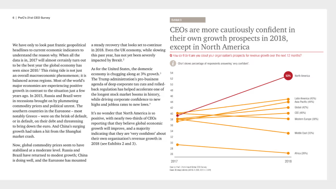
This slide includes a line chart that tracks CEO confidence in their organization's growth prospects from 2017 to 2018, with lines representing different regions.
Strategic Planning
Financial Services
The slide highlights CEO confidence levels regarding their own growth prospects for 2018 compared to 2017, emphasizing caution in most regions except North America.
CEO confidence, growth prospects, 2018, strategic planning, regional comparison, line chart, PwC, CEO Survey, cautious optimism
Mixed Chart
PwC/Strategy&
Saved
A line graph showing the top 10 minutes viewed by P2+ in 2020 versus 2021, with lines representing each year and a noticeable decline in 2021.
Market Analysis and Trends
Media & Entertainment
The slide compares the top 10 minutes viewed in 2020 and 2021, showing a 9% year-over-year decline, reflecting changing viewer engagement patterns.
minutes viewed, comparison, 2020, 2021, decline
Single Chart
Nielsen
Saved
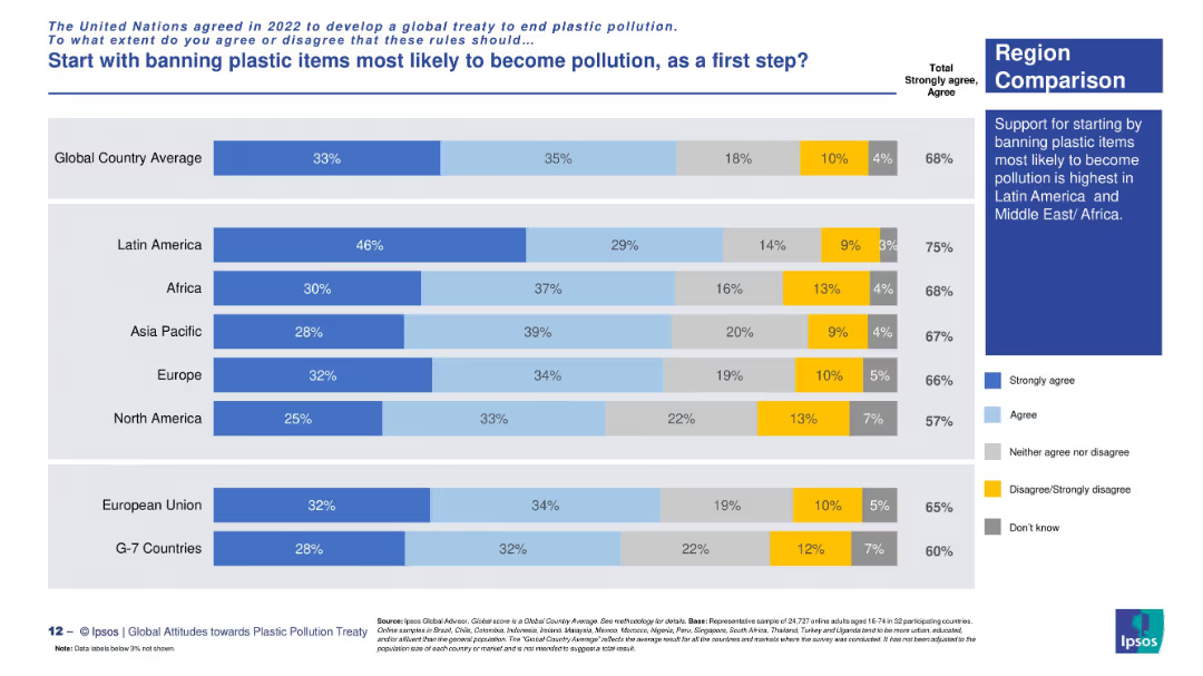
Regional view using a consistent stacked bar chart layout with commentary in a right-aligned box.
Regulatory and Compliance
Environmental Services & Sustainability
Regional analysis of support for initial bans on likely pollutive plastics. Latin America has the strongest support (75%), followed by Africa and Asia Pacific. G7 countries show the lowest backing.
treaty phases, regional policy, plastic waste, first-step strategy, Ipsos data, environmental concern, ban support, public opinion
Mixed Chart
IPSOS
Saved
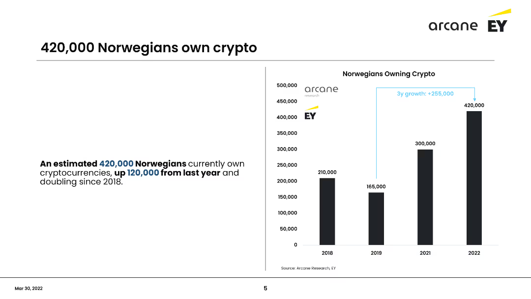
This slide includes a column chart showing the number of Norwegians owning cryptocurrency from 2018 to 2022. It emphasizes the growth in crypto ownership, with an increase of 120,000 owners from the previous year, totaling 420,000 in 2022.
Market Analysis and Trends
Financial Services
Shows the significant increase in cryptocurrency ownership among Norwegians, doubling since 2018 to 420,000 in 2022. Highlights the annual growth and demographic changes, focusing on the increase from the previous year.
Cryptocurrency, Norway, Growth, Ownership, Trends
Mixed Chart
EY
Saved
Previous
Next
If nothing, comes up, please save your slides first
Create a FREE account to continue browsing
Receive Instant Access to 1,000+ slides from companies like McKinsey, Google, and Goldman Sachs
First Name
Last Name
Email
Password
I agree to all
Terms & Privacy Policy
Thank you! Your submission has been received!
Oops! Something went wrong while submitting the form.
Have an account?
Sign in
Column Chart
Heatmap
Chevron
Org Chart
Infographic
Callouts
Timeline
List
Graphic
Picture
Process Flow
Diagram
Paragraph
Map
Table
Framework
Subtitle
Takeaway Box
Icon
Other Chart
Radar Chart
Waterfall Chart
Mekko Chart
Pie Chart
Scatter Plot
Line Chart
Bar chart
Bullet points