Create a FREE Account
Instant access to 1,000+ real slides from top companies like McKinsey, BCG, Goldman Sachs, Google and many more!
First Name
Last Name
Email
Password
I agree to all
Terms & Privacy Policy
Thank you! Your submission has been received!
Oops! Something went wrong while submitting the form.
Have an account?
Sign in
Library
Templates
Courses
Pricing
My Account
My Slides
My Templates
✦ AI
AI Prompt Library
AI Search
Sign in
Start Here
Logout
My Saved Slides
Comprises of column charts with future projections for online travel subcategories, and bullet points explaining the data.
Market Analysis and Trends
Hospitality & Tourism
Provides a detailed outlook on the online travel industry, including expectations for recovery and growth post-pandemic. This slide is pertinent for travel industry professionals and investors for planning and strategizing around the anticipated market changes.
Online Travel, Forecast, Pandemic
Mixed Chart
Bain
Saved
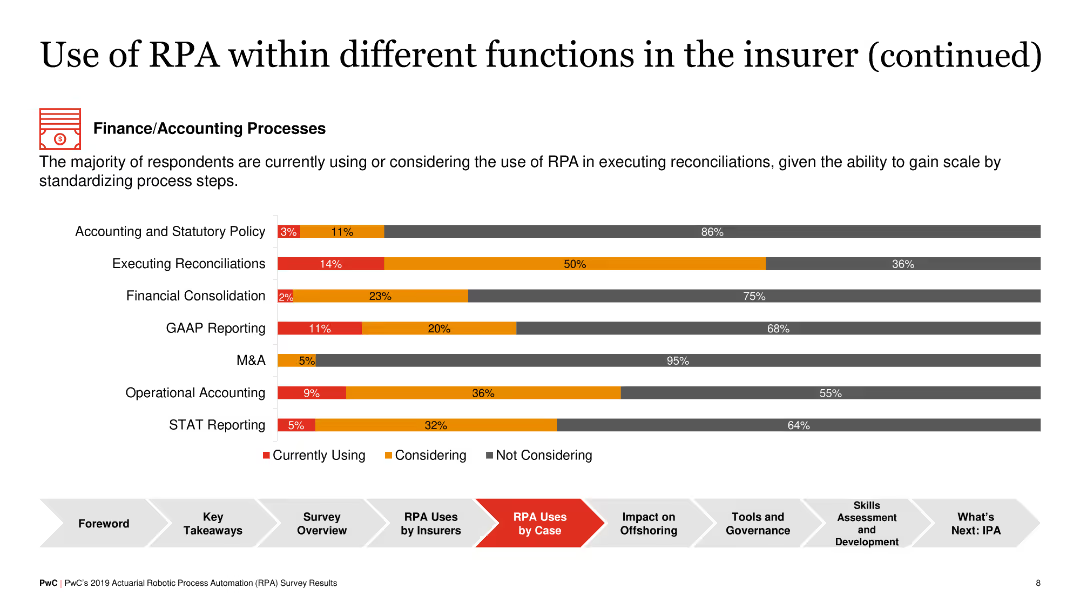
Another horizontal bar chart presenting RPA adoption in finance/accounting processes such as reconciliations, GAAP reporting, and STAT reporting, with levels indicated by colors.
Operational Efficiency
Financial Services
The slide outlines RPA usage in finance and accounting within insurance, showing that tasks like reconciliations and GAAP reporting are increasingly automated, providing efficiencies and standardization benefits.
RPA, Finance, Accounting, Insurance, Reconciliation
Single Chart
PwC/Strategy&
Saved
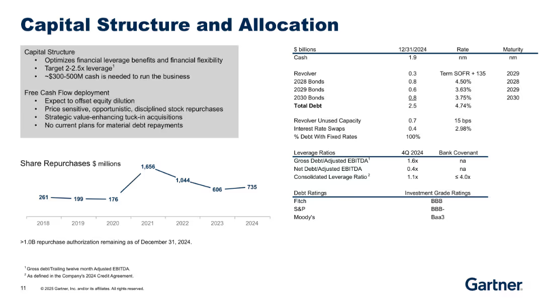
Split layout: Left side outlines strategy in bullet points; right side shows financial stats. Bottom line chart of share repurchases over time (2018–2024).
Corporate Finance and Valuation
Financial Services
Describes Gartner's capital allocation strategy including leverage targets, debt structure, and share repurchases. Emphasizes disciplined use of free cash flow, debt profile, and equity dilution considerations.
capital structure, leverage, repurchase, debt, cash flow, allocation
Mixed Chart
Gartner
Saved
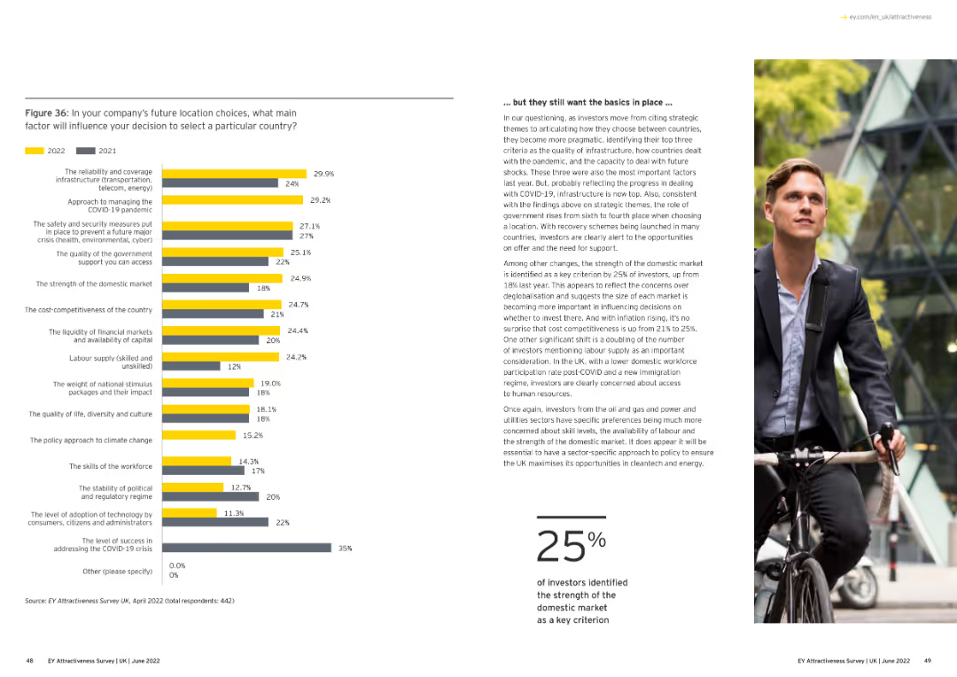
Text with a bar chart. The chart compares factors influencing future location choices for companies in 2021 and 2022.
Market Analysis and Trends
Financial Services
The slide details key factors influencing company location choices post-COVID, focusing on infrastructure, safety, and government support.
location choices, post-COVID, company decisions, column chart, infrastructure
Mixed Chart
EY
Saved
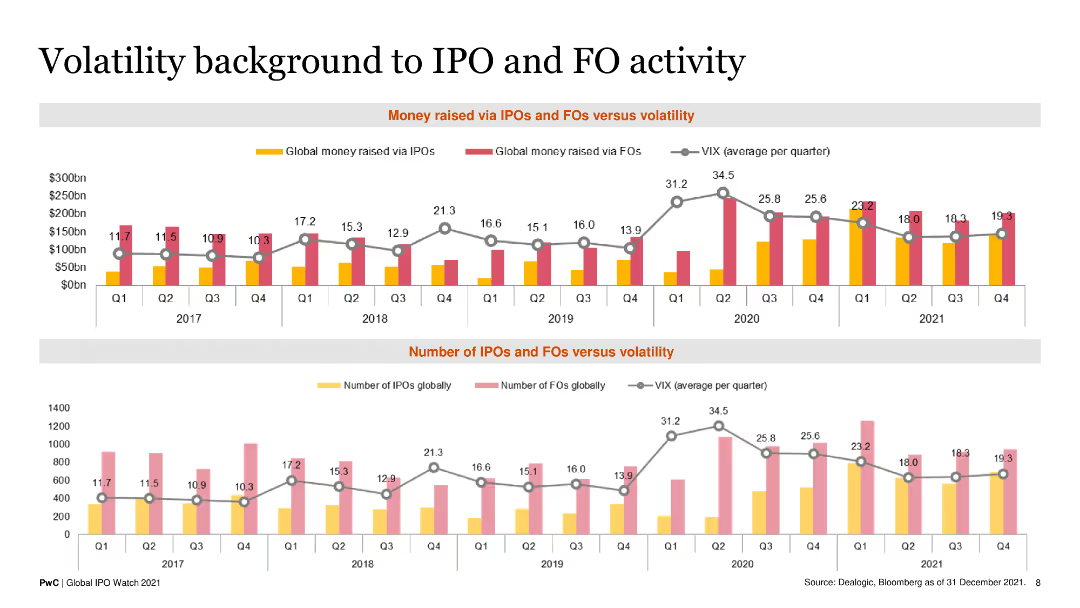
The slide features two line and column combination charts showing global money raised via IPOs and FOs against the VIX index from Q1 2017 to Q4 2021.
Risk Assessment and Management
Financial Services
This slide correlates the volatility index (VIX) with the number of IPOs and FOs, providing insights into market stability and investment trends.
IPOs, FOs, VIX index, market volatility, financial performance
Multiple Chart
PwC/Strategy&
Saved
Flowchart depicting the traditional procurement technology flow, labeled from strategic planning to operational procurement.
Operational Efficiency
Professional Services
Illustrates a comprehensive flowchart of the procurement process, detailing stages from strategic planning to compliance management.
procurement, process, flowchart, operational, strategic
Linear Flow
Kearney
Saved
Contains a timeline and structured text boxes outlining strategic priorities and goals from 2023 to 2028.
Strategic Planning
Financial Services
The slide outlines strategic priorities over time, focusing on sustainable growth and value creation through 2028.
priorities, strategic planning, sustainable growth, timeline, goals
Linear Flow
UBS
Saved
The slide contains a V-shaped line chart illustrating EBITA over time, two text boxes for past results and forecasts, and a section for quarterly results. Red is used for emphasis.
Market Analysis and Trends
Industrial & Manufacturing
Offers insights into the Space sector's performance, showcasing EBITA trends, with a focus on the manufacturing recovery and satellite service performance.
space, EBITA, manufacturing recovery, satellite services, financial performance, telecommunication business
Single Chart
Goldman Sachs
Saved
The left side of the slide has a table outlining the "Average Capital Structure for U.S. CLOs" with credit ratings and corresponding data. The right side features two line charts titled "CLO Tranche Support," depicting "Loss Rate" and "Default Rate."
Investment Analysis
Financial Services
Analyzing the structure and performance of U.S. CLOs, this slide contrasts various credit ratings with tranche support data. It's utilized for evaluating investment risk and potential yield advantages in portfolio management.
CLO, yield, tranche support, credit ratings
Multiple Chart
Morgan Stanley
Saved
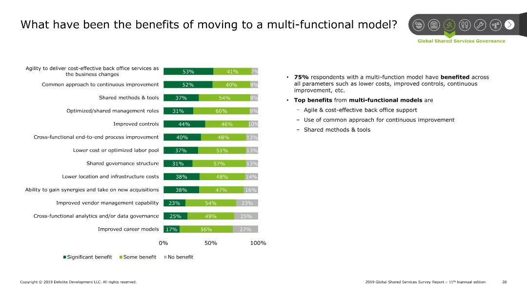
The slide contains a column chart showing the benefits of moving to a multi-functional model. There are three categories in the chart: Significant benefit, Some benefit, No benefit.
Operational Efficiency
Professional Services
This slide presents data on the benefits of adopting a multi-functional model in organizations. Key benefits include cost-effectiveness, improved controls, and shared methods.
Benefits, multi-functional model, cost savings, improvement, controls
Mixed Chart
Deloitte
Saved
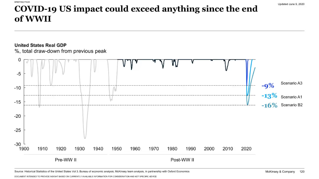
Full-width historical line chart showing draw-downs in US GDP from 1900 to 2020. Highlights three modern COVID-19 scenarios.
Risk Assessment and Management
Financial Services
Illustrates that potential GDP drawdowns from COVID-19 in the US could exceed post-WWII recessions. Visualizes historical drawdowns vs. estimated drawdowns from scenarios A3, A1, and B2.
historical GDP, recession, COVID-19 impact, US economy, draw-down
Single Chart
McKinsey
Saved
Features column charts and pie charts on bank's funding and liquidity status, depicting diverse deposit bases and liquidity ratios with target comparisons.
Investment Analysis
Financial Services
Evaluates the bank's liquidity management and funding diversity, critical for understanding its capacity to meet financial obligations and investment needs.
Liquidity, funding, ratios, financial health
Multiple Chart
Deutsche Bank
Saved
A pie chart on the left showing the proportion of passive and active investors, with another smaller pie chart on the right detailing net buyer, net zero, and net seller percentages.
Market Analysis and Trends
Financial Services
This slide compares passive and active investors during the pandemic, detailing the percentage of net buyers, net zero, and net sellers among active investors.
investors, passive, active, pandemic, comparison
Multiple Chart
IPSOS
Saved
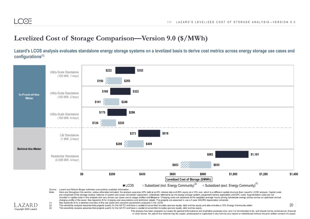
Bar chart with grouped columns showing cost ranges for various energy storage setups, with three cost scenarios.
Technology and Digital Transformation
Energy & Utilities
Displays cost ranges for energy storage systems based on use case (in-front vs. behind-the-meter) and duration. It compares unsubsidized and subsidized costs, illustrating that storage costs vary widely depending on configuration and subsidy structure.
energy storage, LCOS, MWh, utility-scale, C&I, residential, subsidy, cost comparison
Single Chart
Roland Berger
Saved
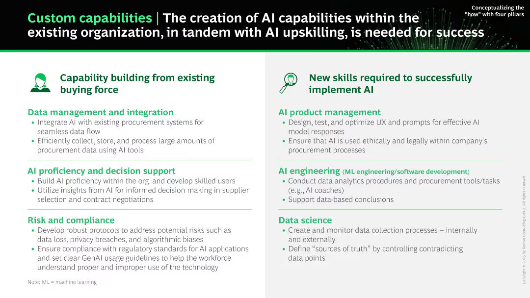
Split-panel layout with two main sections: “Capability building” and “New skills.” Bullet points under each category with icons and bolded headers.
Human Resources and Talent Management
Technology & Software
This slide outlines how AI capabilities can be built within a company by leveraging existing teams and adding new AI-specific roles. It highlights skills in data management, compliance, AI product management, engineering, and data science.
AI skills, upskilling, procurement, AI engineering, compliance, data integration, decision support
Boxed
BCG
Saved
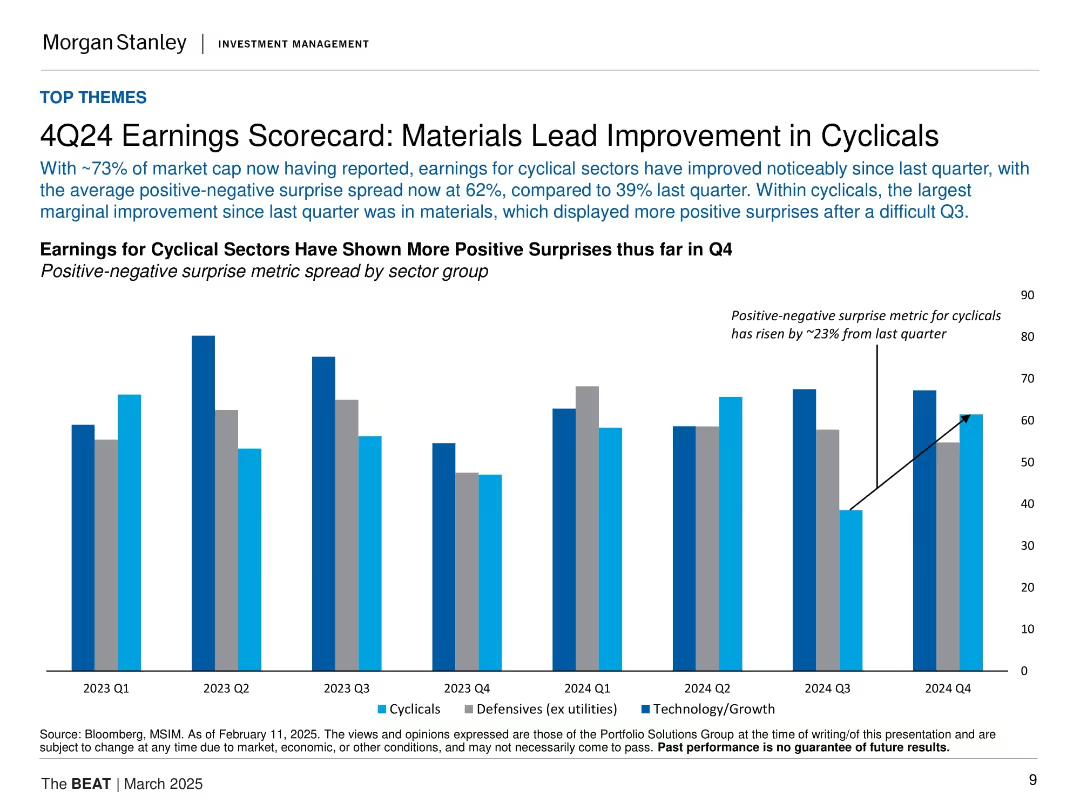
Vertical bar chart comparing cyclical, defensive, and tech earnings surprises by quarter. Blue tones for different sectors.
Financial Performance
Financial Services
The slide details Q4 2024 earnings, showing a notable rise in positive earnings surprises, particularly in cyclical sectors like materials. The spread between positive and negative earnings surprises has widened significantly from the previous quarter.
earnings, Q4, cyclical sectors, materials, positive surprise, defensives, technology, growth
Single Chart
Morgan Stanley
Saved
Features two column charts side by side comparing Gen Zs’ and millennials’ satisfaction with their organizations' societal impact, diversity and inclusion efforts, and sustainability commitments.
Human Resources and Talent Management
Professional Services
The slide examines the correlation between job loyalty and satisfaction with companies' commitments to societal impact, diversity, and sustainability among Gen Zs and millennials. It includes data visuals comparing satisfaction levels and job loyalty metrics.
Job loyalty, societal impact, diversity, inclusion, sustainability
Multiple Chart
Deloitte
Saved
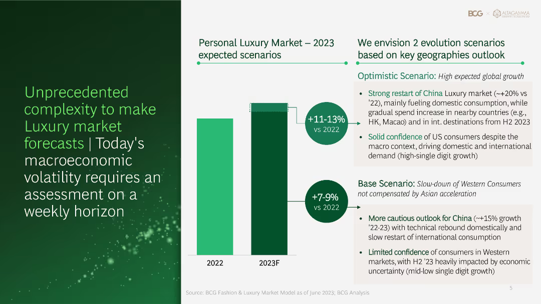
Column chart and text showing different growth scenarios for the personal luxury market in 2023, highlighting optimistic and base scenarios based on geographical outlooks.
Risk Assessment and Management
Financial Services
Discusses the complexities in forecasting the luxury market, presenting optimistic and base scenarios for 2023 growth based on geographical trends and macroeconomic factors.
luxury market, forecast, growth scenarios, geographical outlooks, macroeconomic
Mixed Chart
BCG
Saved
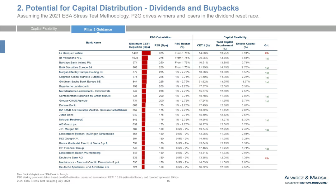
Tabular layout with detailed rows per bank, showing CET1 depletion, P2G, CET1%, total capital requirement, excess capital, and quartile ranking.
Regulatory and Compliance
Financial Services
This table quantifies individual bank performance under EBA stress testing, detailing CET1 depletion and assigned P2G buckets. It ranks banks by capital flexibility and provides quartile rankings. The focus is on differentiating capital capacity for dividends or buybacks, guiding regulatory interpretation of stress test results.
CET1, P2G, bank performance, capital requirement, dividend flexibility, EBA stress test, regulatory assessment, bucket ranking
Single Chart
Alvarez & Marsal
Saved
Featuring two line charts, the slide compares budget trends for new product and service introductions post-COVID, with annotations detailing significant changes and projections.
Product and Service Analysis
Professional Services
Discusses trends in budgets allocated to new product and service introductions in the post-COVID era, providing insights for strategic planning and investment.
new products, services, budgets, COVID, trends
Single Chart
Deloitte
Saved
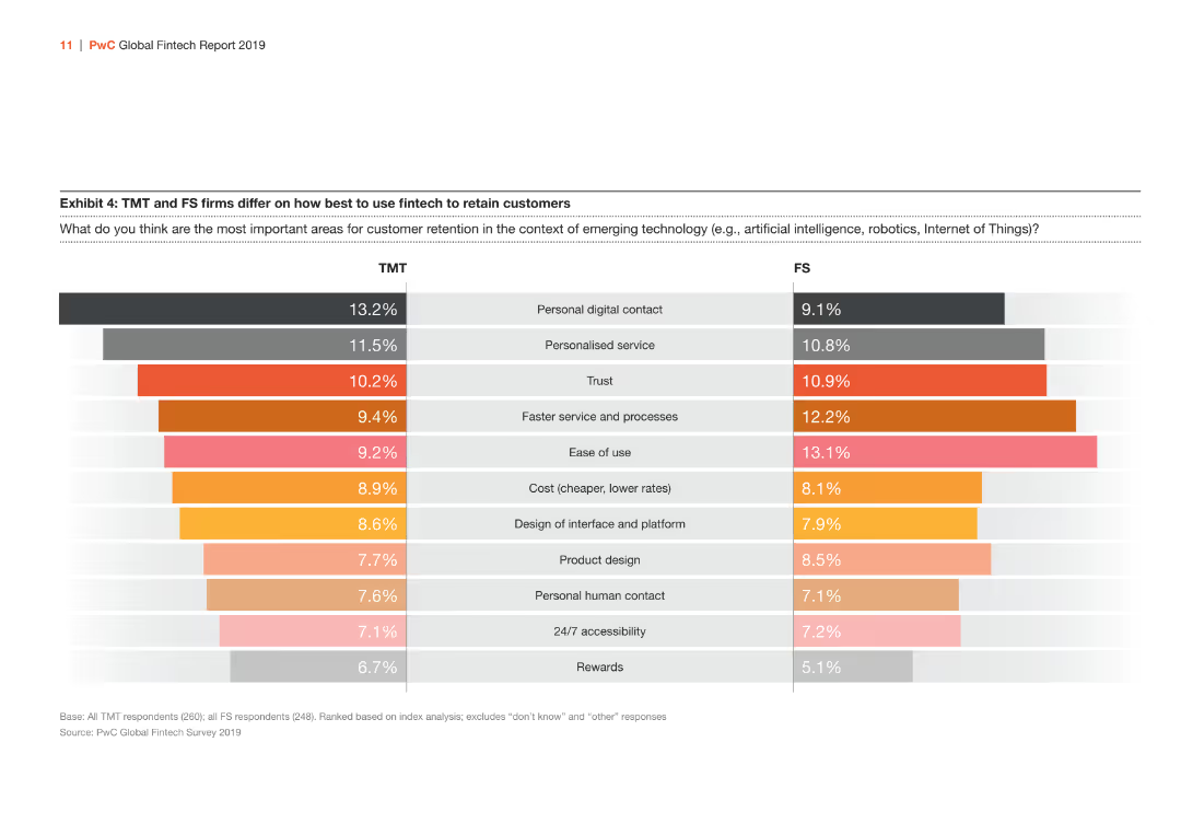
The slide features a bar chart comparing TMT and FS firms on important areas for customer retention through fintech. The bars are orange, red, and gray.
Market Analysis and Trends
Financial Services
Comparison of TMT and FS firms on the importance of various factors like personal digital contact, personalized service, and trust in retaining customers through fintech.
fintech, customer retention, TMT, FS, comparison
Multiple Chart
PwC/Strategy&
Saved
This slide features no visual data but offers a text-heavy approach with bulleted lists for clarity on recommendations related to gender equality in the workplace.
Strategic Planning
Professional Services
Provides a summary of recommendations for organizations to improve gender equality, focusing on core enablers. It could be used as a closing slide in strategic meetings focused on diversity and inclusion or as a standalone reference in educational settings on corporate governance.
recommendations, gender equality, workplace, strategy
Multiple Chart
Deloitte
Saved
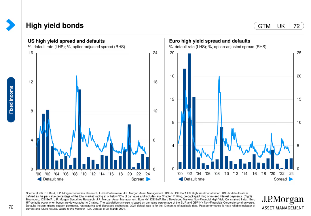
Features two column charts comparing US and Euro high yield spread and defaults over time, with default rates and option-adjusted spreads.
Financial Performance
Financial Services
This slide analyzes high yield bonds in the US and Europe, focusing on spread and default rates to assess the risk and performance of these bonds.
high yield bonds, spreads, defaults, US, Euro
Multiple Chart
JP Morgan
Saved
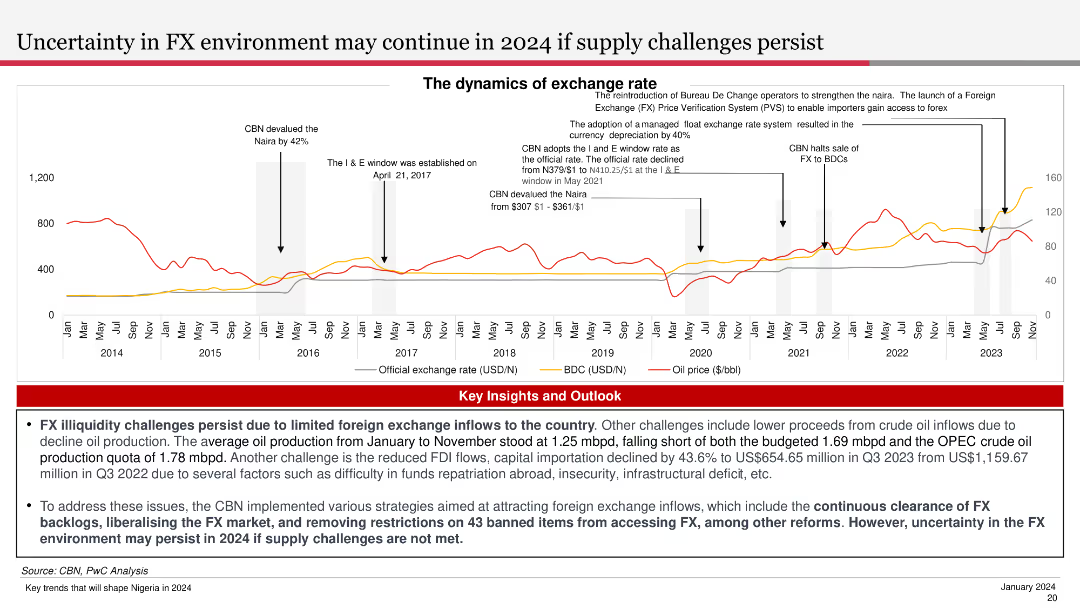
The slide features a line chart showing the exchange rate trends and oil price over time. It is visually complex, designed to provide a clear comparative analysis of key financial metrics.
Market Analysis and Trends
Financial Services
The slide discusses the dynamics of the exchange rate environment, highlighting challenges due to limited foreign exchange inflows and the impact of oil production and other factors.
FX, Exchange Rate, Oil Price, Trends, Dynamics
Mixed Chart
PwC/Strategy&
Saved
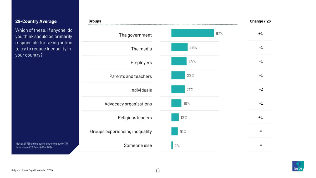
Bar chart with solid teal bars showing different groups and their responsibility percentages. Right-aligned bars with a “Change from 2023” column. Simple, grid-like layout.
Strategic Planning
Government & Public Sector
This slide presents public opinion on which entities should take the lead in reducing inequality, with a strong majority assigning responsibility to the government (67%). Other actors like media, employers, and advocacy groups have significantly lower perceived responsibility. Change from previous year is minimal.
government responsibility, inequality, policy, media, employers, advocacy, survey, Ipsos, change
Mixed Chart
IPSOS
Saved
Previous
Next
If nothing, comes up, please save your slides first
Create a FREE account to continue browsing
Receive Instant Access to 1,000+ slides from companies like McKinsey, Google, and Goldman Sachs
First Name
Last Name
Email
Password
I agree to all
Terms & Privacy Policy
Thank you! Your submission has been received!
Oops! Something went wrong while submitting the form.
Have an account?
Sign in
Column Chart
Heatmap
Chevron
Org Chart
Infographic
Callouts
Timeline
List
Graphic
Picture
Process Flow
Diagram
Paragraph
Map
Table
Framework
Subtitle
Takeaway Box
Icon
Other Chart
Radar Chart
Waterfall Chart
Mekko Chart
Pie Chart
Scatter Plot
Line Chart
Bar chart
Bullet points