Create a FREE Account
Instant access to 1,000+ real slides from top companies like McKinsey, BCG, Goldman Sachs, Google and many more!
First Name
Last Name
Email
Password
I agree to all
Terms & Privacy Policy
Thank you! Your submission has been received!
Oops! Something went wrong while submitting the form.
Have an account?
Sign in
Library
Templates
Courses
Pricing
My Account
My Slides
My Templates
✦ AI
AI Prompt Library
AI Search
Sign in
Start Here
Logout
My Saved Slides
The slide contains an explanatory text about the survey, a world map showing survey participant locations, and pie charts representing company sizes and sectors.
Market Analysis and Trends
Professional Services
Overview of the survey methodology, participant demographics, and data collection timeline.
Survey, methodology, demographics, data collection, participant locations
Mixed Chart
EY
Saved
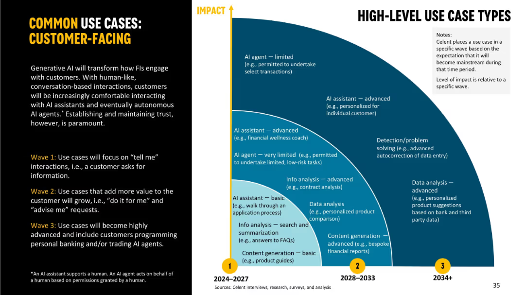
Split-screen layout with explanatory text on left and curved arc diagram on right showing use case progression over time.
Strategic Planning
Financial Services
Highlights how GenAI will change customer engagement in financial institutions over three waves. Shows the transition from simple FAQ bots to advanced AI agents managing financial interactions, improving trust and personalization.
customer-facing, GenAI, AI assistant, personalization, financial services, roadmap
Mixed Chart
Oliver Wyman
Saved
Features line graphs comparing the sex ratio at birth (SRB) across various countries from 1970 to 2017, highlighting trends and disparities.
Market Analysis and Trends
Government & Public Sector
Discusses the implications of gender ratio imbalances in selected countries, exploring the causes and long-term impacts of skewed sex ratios. It provides a historical perspective on how policies and cultural factors have shaped these trends.
gender ratio, demographics, policy, cultural impact, trends
Mixed Chart
Roland Berger
Saved
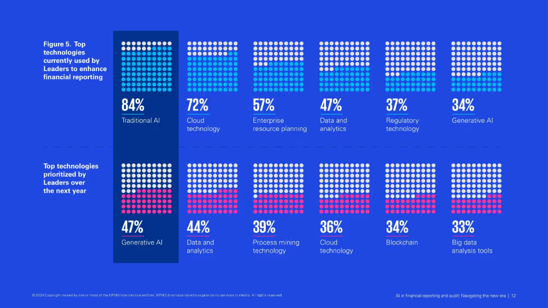
Grid of dotted square visuals showing adoption percentages of various technologies, split by current use and future priorities.
Product and Service Analysis
Financial Services
Visualizes technologies currently used and prioritized by AI Leaders in financial reporting. Traditional AI and cloud dominate current use, while generative AI and data analytics top future priorities.
traditional AI, generative AI, cloud tech, financial reporting, future priorities, ERP, blockchain
Single Chart
KPMG
Saved
Contains column charts, textual information, and bullet points highlighting key metrics, with a dashed outline box.
Financial Performance
Financial Services
Slide shows strong performance and inflows in asset and wealth management, with a focus on alternatives fundraising surpassing targets. Likely used in investor relations or financial strategy meetings.
Fundraising, Asset Management, Performance, Inflows
Mixed Chart
Goldman Sachs
Saved
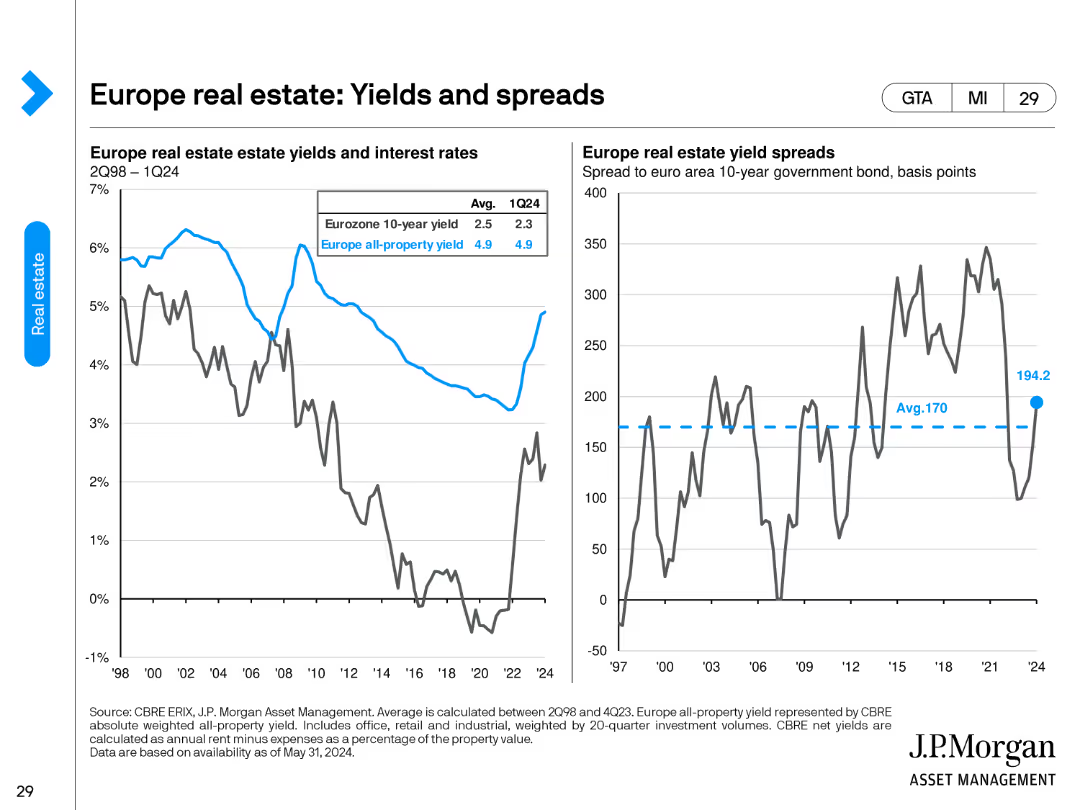
This slide features two column charts. The left chart compares Eurozone 10-year yield with all-property yield, while the right chart shows yield spreads.
Financial Performance
Real Estate & Construction
It compares Eurozone 10-year government bond yields with all-property yields, highlighting trends from 2Q98 to 1Q24, useful for investment analysis.
real estate, yields, spreads, Eurozone, investment, property, trends, analysis
Multiple Chart
JP Morgan
Saved
The slide displays multiple graphs: column charts showing expected investment areas and deal completions, and pie charts for planned divestments and competition expectations. It highlights key sectors like energy and transportation for future investments.
Market Analysis and Trends
Real Estate & Construction
This slide forecasts the outlook for the Italian infrastructure sector, including areas of expected investment, anticipated deal completions, and competition trends, focusing on energy and transportation as key investment sectors.
Infrastructure, Italy, investment outlook, energy, transportation
Multiple Chart
EY
Saved
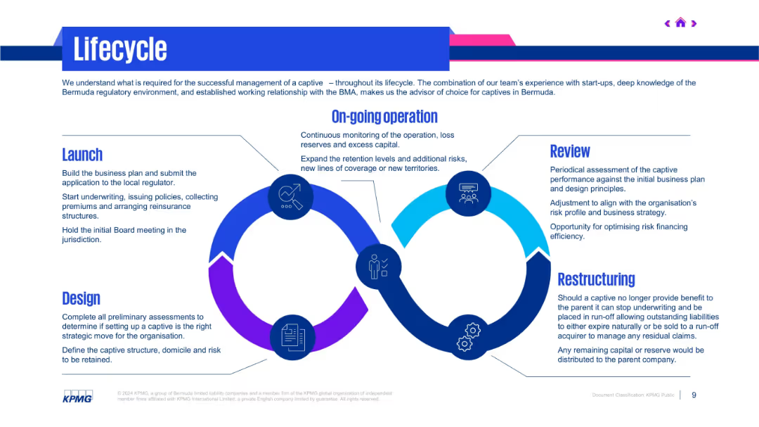
Circular flowchart showing five lifecycle stages with icons and text around it. Modern blue and purple tones.
Operational Efficiency
Professional Services
Illustrates the full lifecycle of managing a captive—from design and launch to ongoing operations, review, and potential restructuring. It emphasizes monitoring, strategic alignment, and regulatory requirements in Bermuda.
captive lifecycle, design, launch, review, restructuring, KPMG
Vertical Flow
KPMG
Saved
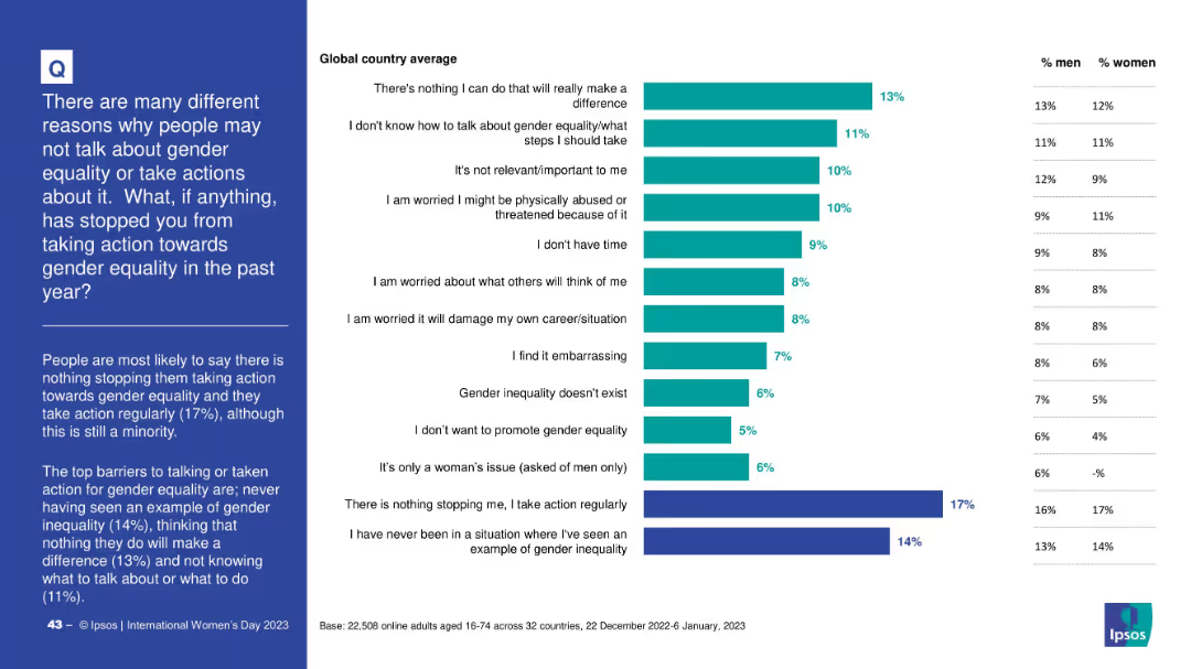
Horizontal bar chart listing reasons with percentages; includes gender-specific columns
Risk Assessment and Management
Government & Public Sector
The slide outlines reasons why people did not take action toward gender equality, with top responses including “nothing I can do” and lack of knowledge. It shows relative importance and gender differences in each reason.
barriers, gender equality, inaction, awareness, psychological barriers, Ipsos, public opinion
Mixed Chart
IPSOS
Saved
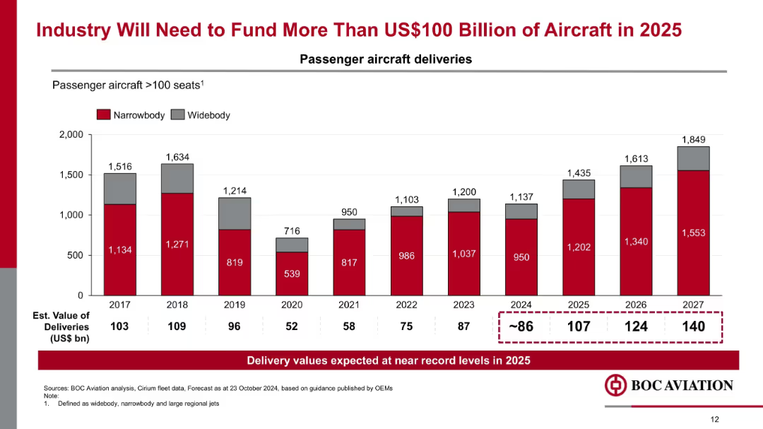
Vertical bar chart tracking narrowbody and widebody aircraft deliveries (2017–2027), with estimated delivery values noted.
Market Analysis and Trends
Transportation & Logistics
The chart forecasts record aircraft deliveries in 2025 and beyond, exceeding $100 billion in estimated value. It emphasizes increased funding needs for new passenger aircraft and strong demand in the aerospace industry.
aircraft funding, delivery forecast, narrowbody, widebody, OEM guidance, aviation demand
Mixed Chart
Goldman Sachs
Saved
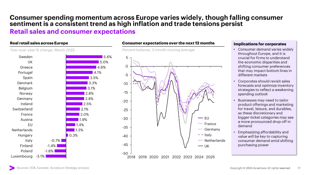
Split panel layout with a bar chart (left) for retail sales growth by country and a line chart (right) for consumer expectations; side box outlines business implications.
Market Analysis and Trends
Retail & E-commerce
This slide contrasts consumer spending momentum and sentiment across European countries. While retail sales vary widely (Sweden, UK lead; Italy, Poland lag), sentiment is generally declining. Corporates are advised to revisit sales strategies and tailor offerings to local economic conditions.
retail sales, consumer sentiment, Europe, spending trends, inflation, economic disparity
Multiple Chart
Accenture
Saved
The slide features a bar charts with percentage labels, a map highlighting geographic regions, and text blocks. It visually contrasts broadband impact across different socioeconomic areas.
Market Analysis and Trends
Telecommunications
The slide discusses how increased broadband speeds have lifted GDP in lower socioeconomic areas, with a focus on Greater Melbourne, showing that faster broadband access can drive economic growth.
Broadband, GDP, Socioeconomic, Melbourne, Impact
Multiple Chart
Accenture
Saved
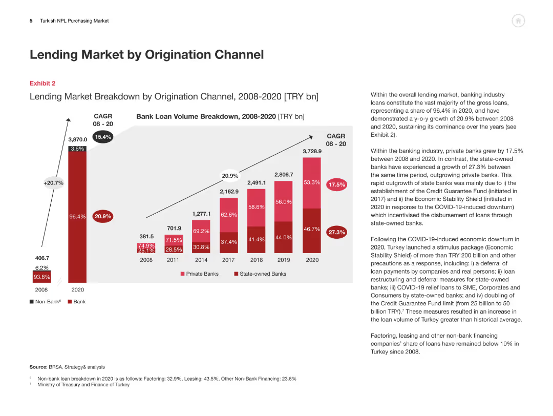
This slide includes a column chart breaking down the lending market by origination channel from 2008 to 2020, with an accompanying explanation of trends and growth rates.
Market Analysis and Trends
Financial Services
The slide analyzes the breakdown of the Turkish lending market by origination channel, highlighting the growth of private and state-owned banks and overall market dynamics.
Lending Market, Origination Channel, Turkey, Private Banks, State-owned Banks
Multiple Chart
PwC/Strategy&
Saved
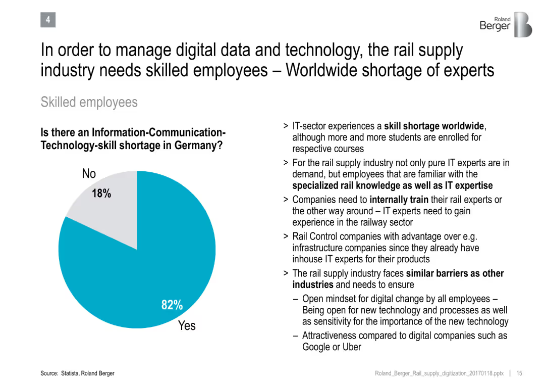
Pie chart on ICT-skill shortage and bullet points discussing talent challenges in rail and IT sectors
Human Resources and Talent Management
Transportation & Logistics
Emphasizes the critical shortage of ICT-skilled workers in Germany's rail industry, citing the need for specialized training and sector-specific expertise.
skill shortage, ICT, workforce development, rail supply, digital transformation, employee training
Mixed Chart
Roland Berger
Saved
A three-part image showing the U.S. map in red, blue, and dark blue, highlighting different business regions. The right side lists key company data points in a clear font.
Industry Overview
Financial Services
Offers an overview of U.S. Bancorp's key statistics, including founding year, market value, and services across regional, national, and international spectrums. Intended for corporate profiling.
Banking, Market Value, Branches, Assets
Graphic
Goldman Sachs
Saved
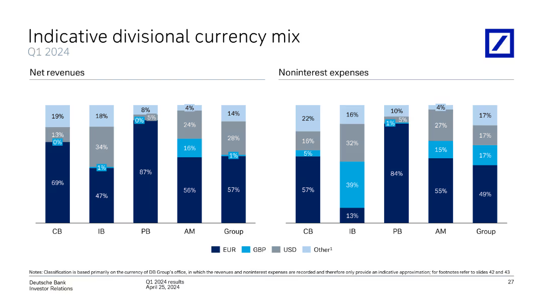
This slide contains two column charts, one for net revenues and the other for noninterest expenses, divided by currency mix (EUR, GBP, USD, Other) and business divisions (CB, IB, PB, AM, Group).
Market Analysis and Trends
Financial Services
The slide provides an analysis of Deutsche Bank's divisional currency mix for Q1 2024, showing net revenues and noninterest expenses by currency and business division. It highlights the distribution and significance of different currencies.
currency mix, net revenues, noninterest expenses, business divisions, Deutsche Bank, Q1 2024, analysis
Multiple Chart
Deutsche Bank
Saved
This slide presents a line chart showing unemployment rates from 2000 to 2030 under four scenarios: early adoption, mid adoption, late adoption, and baseline. The chart is annotated with assumptions about re-employment rates and historical context for comparison.
Risk Assessment and Management
Industrial & Manufacturing
Analyzing projected unemployment trends under different automation adoption scenarios, this slide helps in understanding the temporal dynamics of job market disruptions and recoveries. It provides a statistical foundation for discussing policy measures and planning in anticipation of economic shifts caused by automation.
unemployment, trends, automation, policy, scenarios
Single Chart
McKinsey
Saved
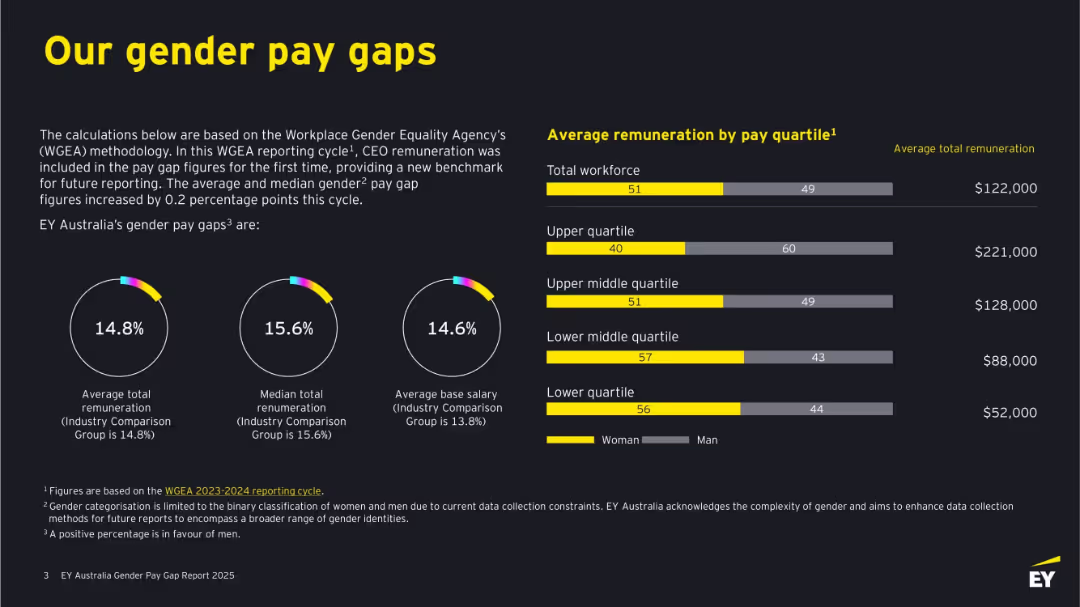
Dark background with bold yellow and white text. Features circular graphs, bar charts, and figures. Clearly divided into left-side text explanations and right-side remuneration bars by quartile.
Human Resources and Talent Management
Professional Services
This slide outlines EY Australia's gender pay gaps based on WGEA methodology, including total and median remuneration and base salary differences. It shows visual comparisons by gender across pay quartiles, revealing gaps in compensation and detailing where discrepancies occur. It emphasizes benchmarking against industry standards.
gender pay gap, remuneration, WGEA, EY Australia, salary, pay quartiles, workforce, diversity, women, equality
Multiple Chart
EY
Saved
The slide features a large image of a cargo ship loaded with containers, with text blocks overlaying the image and a column chart below. The column chart has six categories with different colors.
Market Analysis and Trends
Transportation & Logistics
The slide discusses the focus of investors on business services and logistics in Greece, providing survey data on expected investment changes in various sectors over the next three years.
investors, business services, logistics, Greece, investment
Mixed Chart
EY
Saved
Utilizes a bar chart and pie chart, display sector distribution and pie charts for business stage distribution.
Strategic Planning
Technology & Software
Analyzes the sector and development stage distribution of applications, focusing on agriculture, ICT, and education as key sectors.
sector, distribution, applications, stage, analysis
Multiple Chart
Accenture
Saved
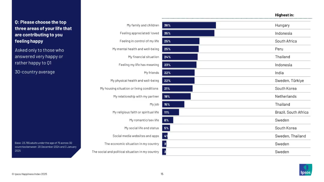
Horizontal bar chart showing top happiness drivers; includes right column listing countries with highest mentions per factor; clean layout with dark blue sidebar.
Customer and Market Segmentation
Professional Services
This slide lists the top life factors that contribute to happiness, based on survey respondents who felt happy. Family and feeling appreciated are top across countries, with South Africa, Indonesia, and Hungary showing unique peaks in some categories. It provides a comparative view of emotional contributors across regions.
happiness drivers, relationships, well-being, life factors, Ipsos, country comparison, 2025, global study
Mixed Chart
IPSOS
Saved
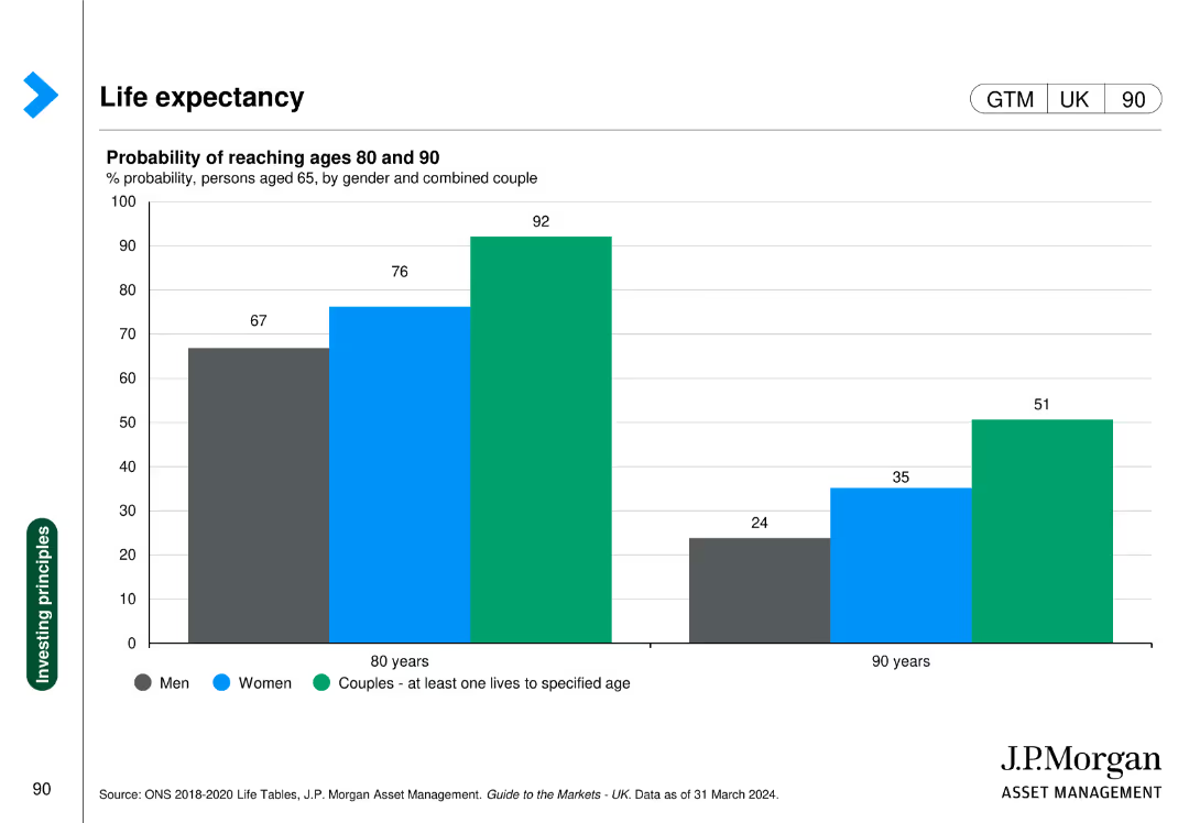
The slide contains a column chart showing the probability of reaching ages 80 and 90 for men, women, and couples. The chart is color-coded and includes percentages for each category.
Market Analysis and Trends
Healthcare & Pharmaceuticals
This slide provides statistical insights into life expectancy probabilities for different demographics, useful for healthcare planning and actuarial analysis.
life expectancy, healthcare, demographics, aging, actuarial analysis
Single Chart
JP Morgan
Saved
This slide features a series of column charts against a blue and white background, illustrating the steep growth projections for digital financial services in the Philippines across four categories: digital payments, digital lending, digital insurance, and digital wealth. The layout is clean, with each category distinctly separated and annotated to show the projected growth rate from 2021 to 2030.
Investment Analysis
Financial Services
The slide outlines the projections for steep growth in digital financial services in the Philippines, indicating significant opportunities for investment and development within digital payments, lending, insurance, and wealth sectors. It is intended for financial service professionals, investors, and market analysts to gauge the potential for expansion in the Philippines' digital finance sector.
DFS, Philippines, Digital Payments, Lending, Insurance, Wealth, Growth, Projections, Investment, Analysis
Multiple Chart
Bain
Saved
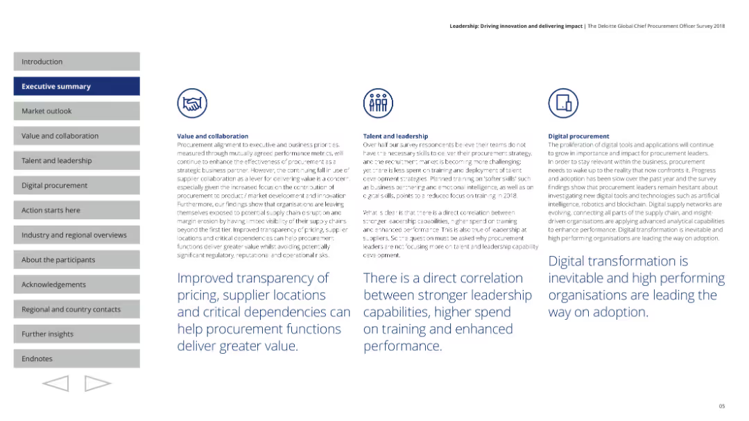
Includes circular charts showing prioritization of business strategies and a narrative on the global economic outlook.
Market Analysis and Trends
Professional Services
Provides an overview of the economic outlook for 2018, focusing on key business strategies and priorities among procurement leaders.
market outlook, business strategies, economic trends, procurement
Pillar
Deloitte
Saved
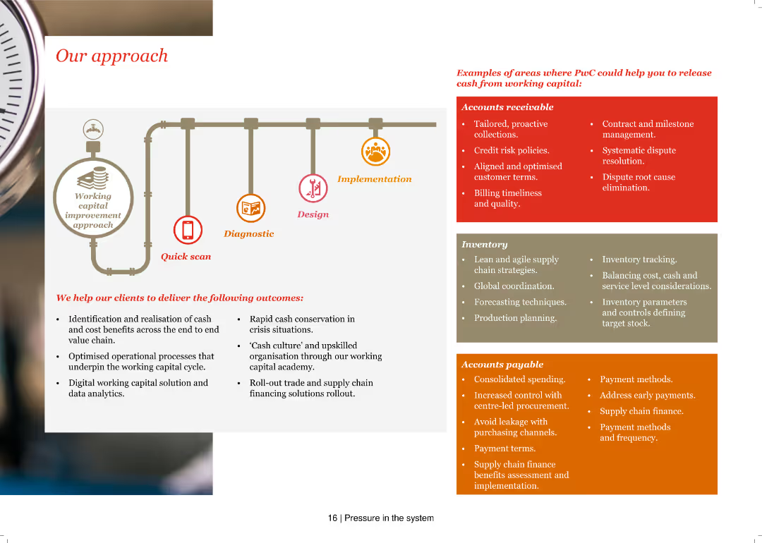
A pipeline diagram illustrating a working capital improvement approach with phases: Quick scan, Diagnostic, Design, and Implementation, accompanied by lists of specific actions and outcomes.
Operational Efficiency
Financial Services
The slide explains PwC's approach to improving working capital, detailing steps and examples in accounts receivable, inventory, and accounts payable.
Working capital, Quick scan, Diagnostic, Design, Implementation, Accounts receivable, Inventory, Accounts payable, Outcomes, Efficiency
Header Vertical
PwC/Strategy&
Saved
Previous
Next
If nothing, comes up, please save your slides first
Create a FREE account to continue browsing
Receive Instant Access to 1,000+ slides from companies like McKinsey, Google, and Goldman Sachs
First Name
Last Name
Email
Password
I agree to all
Terms & Privacy Policy
Thank you! Your submission has been received!
Oops! Something went wrong while submitting the form.
Have an account?
Sign in
Column Chart
Heatmap
Chevron
Org Chart
Infographic
Callouts
Timeline
List
Graphic
Picture
Process Flow
Diagram
Paragraph
Map
Table
Framework
Subtitle
Takeaway Box
Icon
Other Chart
Radar Chart
Waterfall Chart
Mekko Chart
Pie Chart
Scatter Plot
Line Chart
Bar chart
Bullet points