Create a FREE Account
Instant access to 1,000+ real slides from top companies like McKinsey, BCG, Goldman Sachs, Google and many more!
First Name
Last Name
Email
Password
I agree to all
Terms & Privacy Policy
Thank you! Your submission has been received!
Oops! Something went wrong while submitting the form.
Have an account?
Sign in
Library
Templates
Courses
Pricing
My Account
My Slides
My Templates
✦ AI
AI Prompt Library
AI Search
Sign in
Start Here
Logout
My Saved Slides
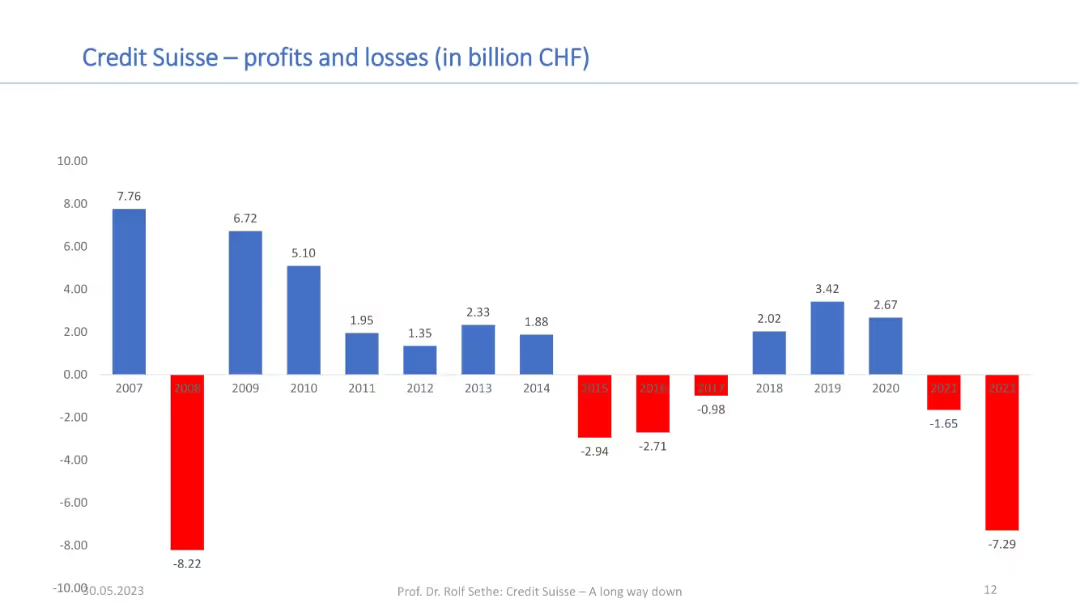
Bar chart showing annual profits and losses from 2007–2022; red bars for losses and blue for profits; financial axis in CHF.
Financial Performance
Financial Services
This chart tracks Credit Suisse’s profitability over 15 years, illustrating sharp fluctuations and sustained losses in recent years. It provides context for the bank’s financial instability and contributes to understanding its acquisition by UBS.
profits, losses, Credit Suisse, annual results, financial performance, CHF, long-term trend, UBS acquisition
Single Chart
Credit Suisse
Saved
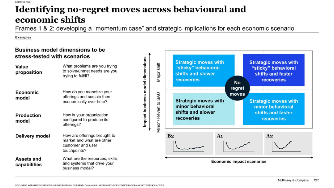
Left side: list of business model questions. Right side: 2x2 matrix aligning strategy to behavioral/economic shifts. Includes recovery paths by scenario.
Strategic Planning
Professional Services
Recommends strategic responses (no-regret moves) for different economic and behavioral shift combinations. Encourages stress-testing business model dimensions (value proposition, production, delivery, etc.) against multiple recovery scenarios.
strategy, recovery planning, business model, no-regret moves, COVID-19
Mixed Chart
McKinsey
Saved
The slide consists of a large green column chart showing the growth of the UK platform market from FY15 to FY18, accompanied by a key trends list and a forecast column chart for global asset management flows. It uses shades of green, white, and black for clear differentiation between sections. Visual elements include column charts, with corresponding annotations for clarity. The layout is clean and allows each section to stand out individually.
Market Analysis and Trends
Financial Services
The slide details the growth of the UK platform market driven by structural trends and projects the composition of global asset management flows. This would be useful in financial market trend analyses or investment strategy presentations.
Market Trends, Platform Growth, Asset Management, UK Financial Market, Investment Forecast, Pension Consolidation, Financial Planning
Multiple Chart
Morgan Stanley
Saved
The slide has two sections. The first discusses 'Earthshots' with a chart on capital shift, the second, 'Downround IPOs' with a scatter graph showing cost of capital and deal growth. There are links to additional reports.
Investment Analysis
Financial Services
Highlights sustainable investment opportunities termed 'Earthshots' and the trend of downround IPOs, offering strategic insights for investments in sustainability and the tech market landscape.
Sustainable investment, Earthshots, downround IPOs, capital growth, investment trends, technology market, strategic insights, capital shifts, deal growth, sustainability
Multiple Chart
Morgan Stanley
Saved
Features a flowchart with steps from identifying a partner to closing a deal, described through different stages. Uses blue and gray colors for background and text emphasis.
Strategic Planning
Professional Services
Describes the detailed process of a SPAC from the initial stages through to the finalization, akin to an IPO process. Emphasizes the steps and duration involved.
SPAC, process, flowchart, IPO, strategic planning, timeline, partnership
Linear Flow
PwC/Strategy&
Saved
This slide contains two column charts showing the growth of branch count and deposits per branch from 2017 to 2022, with comparative data points.
Operational Efficiency
Financial Services
Highlights the growth strategy of the branch network with data on branch counts and deposit per branch, indicating operational expansion and optimization.
branch growth, deposits, network optimization, banking, financial services, CAGR, market expansion, operational efficiency, Chase
Multiple Chart
JP Morgan
Saved
The slide includes three charts: a line chart of unemployment rates, a column chart of employment cost index and private average hourly earnings growth, and a line chart of labor demand versus supply. The layout is clean with a blue and white color scheme, and key points are highlighted.
Market Analysis and Trends
Professional Services
The slide discusses the challenges of a tight labor market, rising compensation costs, and shifting employee expectations, supported by data on unemployment rates, employment costs, and labor supply versus demand.
labor market, employment, compensation, mobility, talent
Multiple Chart
EY
Saved
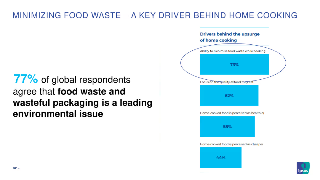
Simple bar chart highlighting key drivers for minimizing food waste while cooking.
Market Analysis and Trends
Environmental Services & Sustainability
Highlights the importance of minimizing food waste as a leading environmental issue.
food waste, cooking, environmental, global, drivers
Mixed Chart
IPSOS
Saved
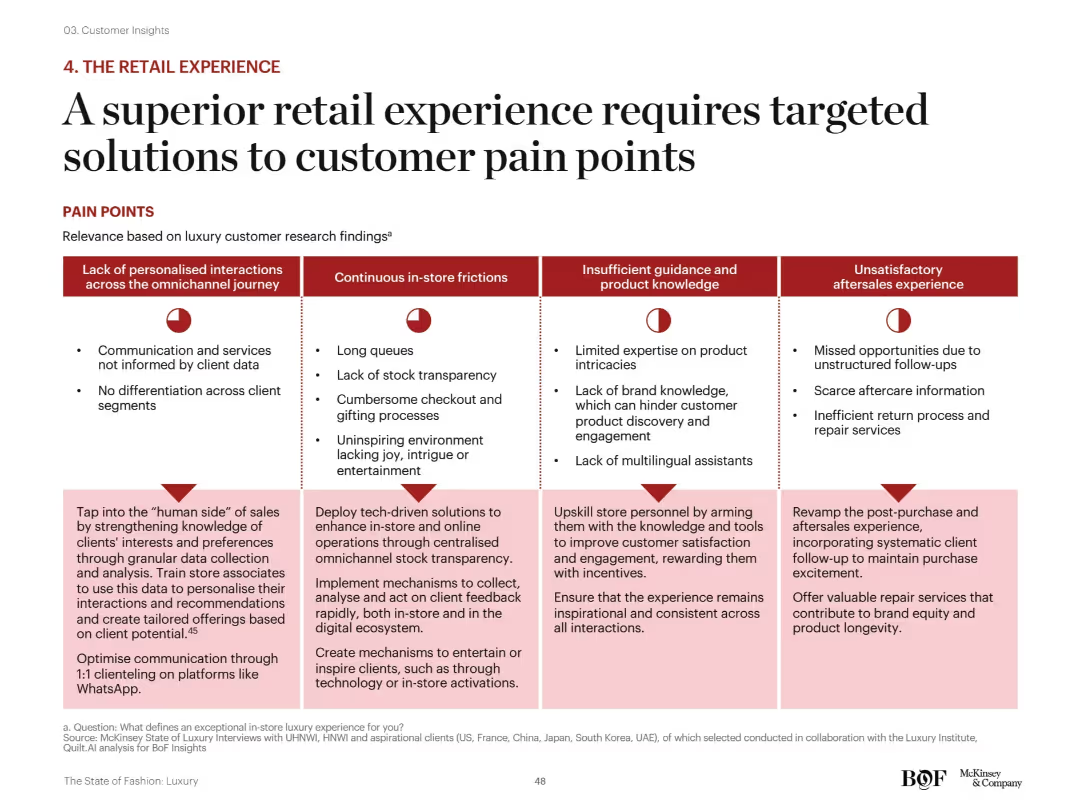
Matrix layout: four major pain point categories across top, each with corresponding red icons and bulleted descriptions below. Solutions for each category are outlined at the bottom of the slide in light pink boxes.
Customer and Market Segmentation
Consumer Goods
This slide offers a structured framework to address luxury retail pain points across personalization, in-store friction, staff expertise, and aftersales. Suggested solutions include tech integration, training, communication improvements, and enhanced service standards.
omnichannel, customer service, personalization, staff training, luxury retail, tech-driven solutions, aftersales
Mixed Chart
McKinsey
Saved
The slide presents three bar charts, showing the share of NY employees, payroll, and small businesses across six key industries, each represented with its respective color and percentage.
Market Analysis and Trends
Financial Services
This slide provides an overview of six major industries in New York State, showing their share in terms of employees, payroll, and small business ownership, illustrating the sectors' sizes and economic weight.
NY State, industries, employees, payroll, small businesses, economic overview, column chart
Multiple Chart
BCG
Saved
Showcases column chart and quotes within a visual narrative, using green tones to emphasize the thematic focus on 'green' investments.
Investment Analysis
Financial Services
Discusses the acceleration of green capital in Southeast Asia, identifying patterns and challenges in investment scalability.
green capital, SEA, investment trends, scalability, capital flow
Mixed Chart
Bain
Saved
The slide has a two-column layout with a title and text explaining the importance of holistic risk management practices and a column chart listing actions taken to enhance these practices.
Operational Efficiency
Financial Services
The slide emphasizes the importance of comprehensive risk management practices, including capital planning and contingency measures, to strengthen operational resilience.
risk management, operational resilience, holistic practices, capital planning, contingency measures
Multiple Chart
EY
Saved
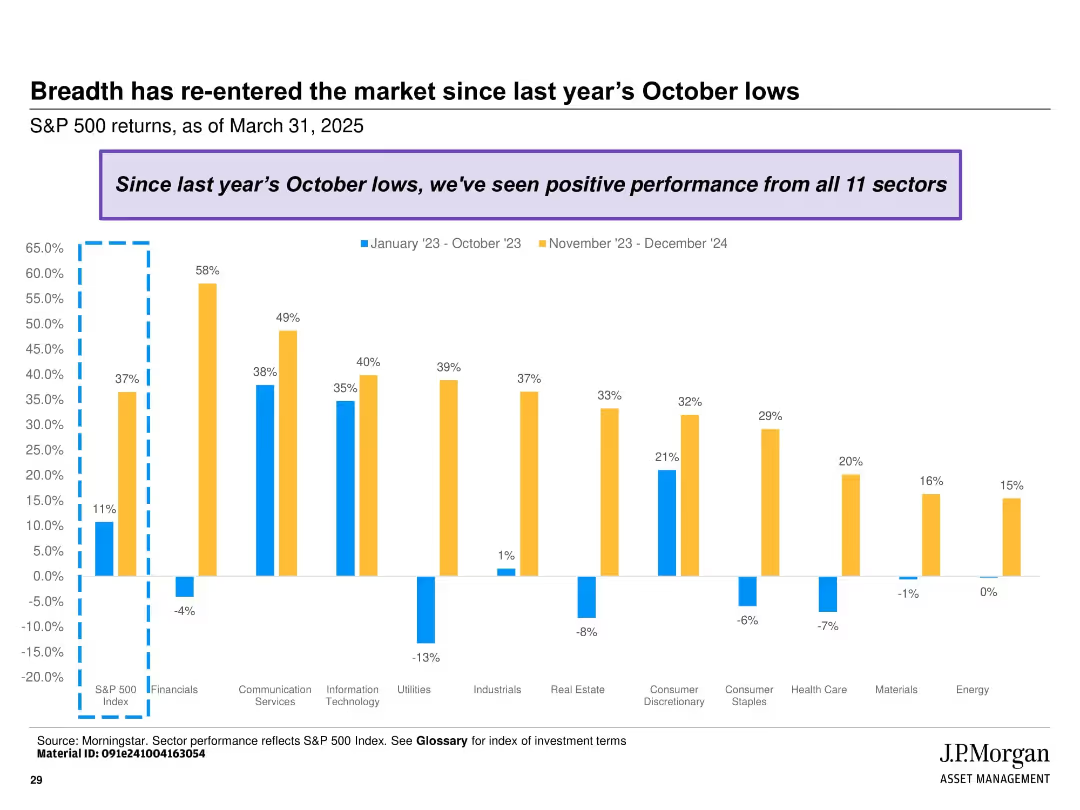
Clustered bar chart showing sectoral returns across two periods (Jan-Oct 2023 and Nov 2023-Dec 2024); color-coded with annotation box at top.
Market Analysis and Trends
Financial Services
Highlights the broad-based recovery of the S&P 500 with all 11 sectors showing positive performance since October 2023. Contrasts performance between early and late periods across various industries.
market breadth, S&P 500, sector performance, recovery, returns, 2023, 2024, equity sectors, rebound, financial analysis
Single Chart
JP Morgan
Saved
Column charts showing percentages of company performance indicators like sales, customer retention, and profits.
Market Analysis and Trends
Professional Services
Compares company performance metrics across B2B and B2C sectors, noting particularly strong performance in B2B services.
B2B, B2C, company performance, sales, profits
Mixed Chart
Deloitte
Saved
The slide contains multiple charts: column charts for profit before tax, operating income, cost/income ratio, mandate volume, loans, and invested assets.
Financial Performance
Financial Services
The slide presents various financial metrics for Global Wealth Management, comparing data from multiple quarters to 1Q20.
wealth management, profit, operating income, cost ratio, loans
Multiple Chart
UBS
Saved
The slide features a pie chart with three sections: 32% won’t impact plans, 26% have tenants rent, and 40% sell property.
Regulatory and Compliance
Real Estate & Construction
This slide examines the effect of short-term rental regulations on investors' decisions regarding their properties, indicating a significant portion may sell.
regulations, short-term rentals, investment, decision making, pie chart, property sale
Single Chart
IPSOS
Saved
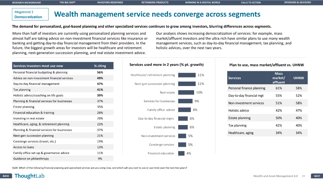
The slide features a column chart of services investors use now vs. in 2 years and a comparison table for mass market vs. UHNW plans.
Customer and Market Segmentation
Financial Services
The slide explores the convergence of wealth management services across different investor segments, highlighting growing demands for personalized services.
Wealth management, Service convergence, Financial Services, Segmentation, Personalized services
Mixed Chart
Deloitte
Saved
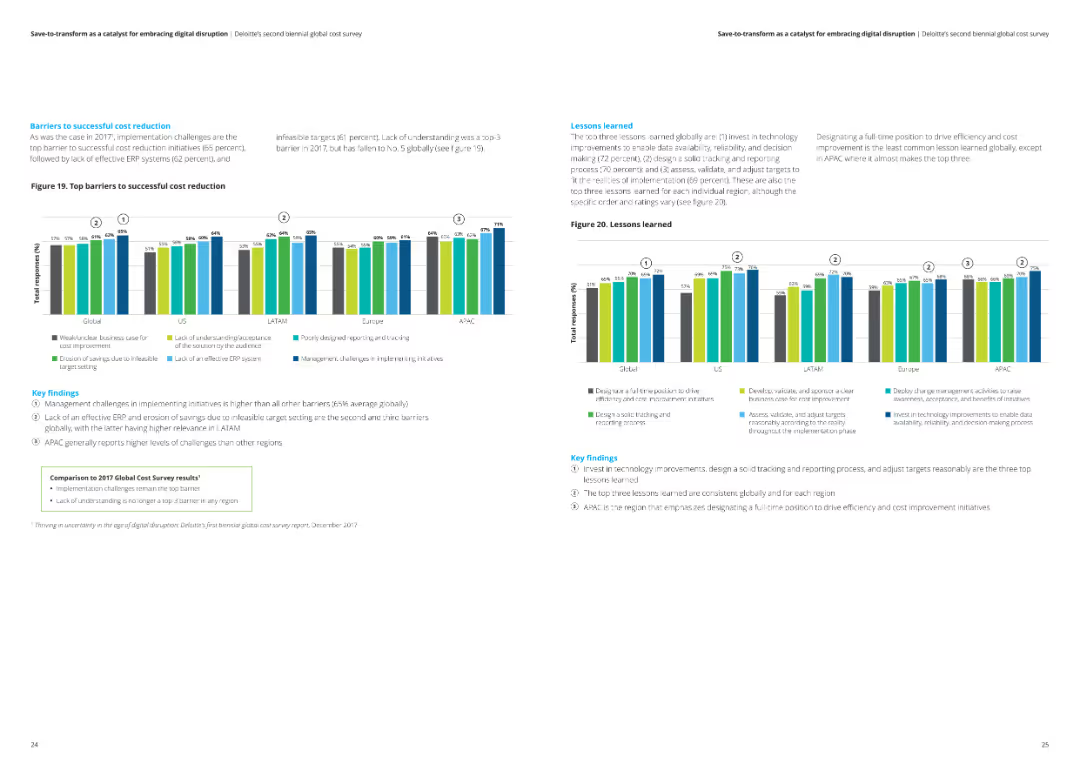
This slide includes a column chart illustrating the top barriers to successful cost reduction globally and regionally. Key findings are summarized in text boxes.
Risk Assessment and Management
Financial Services
The slide highlights the key barriers to successful cost reduction, including management challenges and ineffective ERP systems, with a comparison to the 2017 survey results.
Cost reduction, barriers, challenges, analysis, financial services
Multiple Chart
Deloitte
Saved
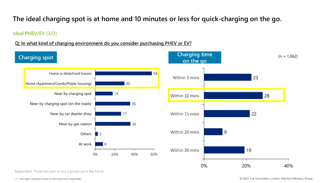
The slide features a bar chart on the left showing preferred charging spots, and a column chart on the right showing preferred charging times on the go. Color coding differentiates the data.
Market Analysis and Trends
Transportation & Logistics
The slide highlights the preferred charging locations for PHEV/EV and the desired charging times, with the most preferred location being at home and the preferred charging time within 10 mins.
PHEV, EV, charging spot, charging time, consumer preferences
Multiple Chart
Deloitte
Saved
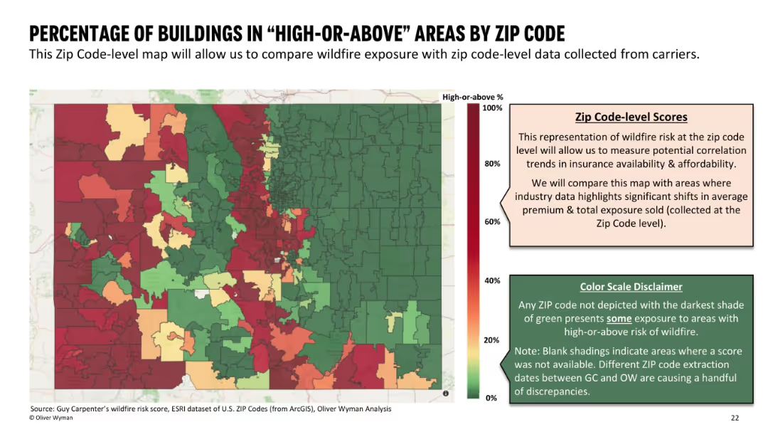
Color-coded map segmented by ZIP code, with gradient scale and side notes explaining methodology and limitations.
Risk Assessment and Management
Environmental Services & Sustainability
A ZIP code-level map depicting the percentage of buildings located in "High-or-Above" wildfire risk areas. The slide enables comparisons for insurance availability and affordability, with disclaimers on data accuracy.
wildfire exposure, ZIP code, building risk, high risk, insurance data
Mixed Chart
Oliver Wyman
Saved
Contains column charts detailing the adoption of diversity and inclusion practices by high-growth companies.
Strategic Planning
Professional Services
Evaluates the prevalence of DEI objectives in high-growth brands and their impact on corporate and social strategies.
DEI, marketing, high-growth, brands, diversity, inclusion, corporate strategy
Mixed Chart
Deloitte
Saved
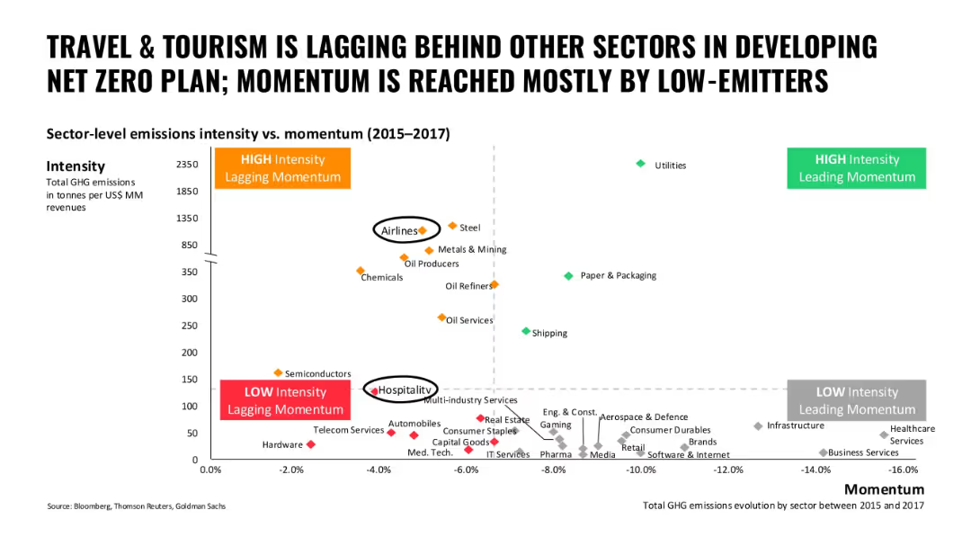
Scatter plot of sectors comparing GHG emissions intensity to momentum; color-coded sectors; high and low quadrants marked
Performance Metrics and KPIs
Hospitality & Tourism
This slide compares travel and tourism sectors to others in terms of carbon intensity and decarbonization momentum, showing airlines and hospitality as lagging in progress.
travel, tourism, emissions, momentum, lagging sectors, airlines, hospitality
Single Chart
Oliver Wyman
Saved
The slide is visually dense, with a combination of column charts and extensive textual information. It analyzes the financial results of platform solutions, using color highlights to denote statistical changes and contrasts.
Operational Efficiency
Financial Services
Targeting decision-makers in financial services, the slide compares platform solutions' financial metrics, highlighting net revenues, losses, and consumer platform metrics to evaluate operational performance and strategic planning.
platform solutions, financial analysis, operational performance, net revenues, consumer platforms
Mixed Chart
Goldman Sachs
Saved
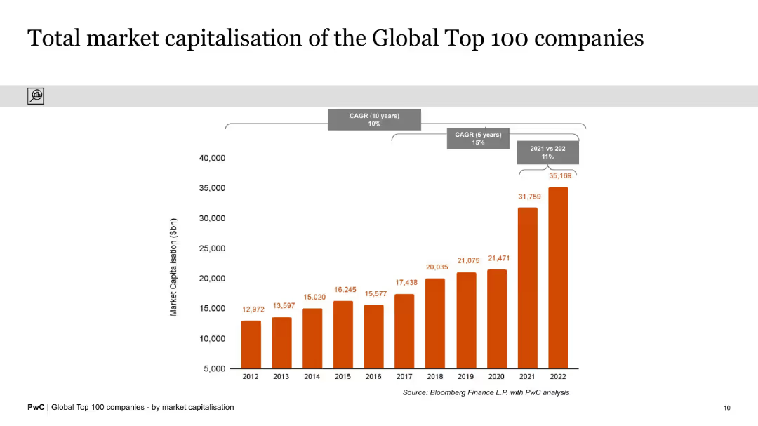
The slide features a column chart displaying the total market capitalization of the Global Top 100 companies from 2012 to 2022. The chart highlights significant growth over the period, with key CAGR figures noted.
Market Analysis and Trends
Financial Services
This slide illustrates the substantial increase in the total market capitalization of the Global Top 100 companies over a decade, emphasizing a 10-year CAGR of 10% and a 5-year CAGR of 15%. It provides a clear historical growth perspective.
Market Capitalization, Global Top 100, Growth, Historical Data, CAGR, Financial Analysis, Column Chart, Trends, Decade, Performance
Single Chart
PwC/Strategy&
Saved
Contains a prioritization matrix with bubbles representing market potential, plotted against uncertainty and cost evolution from 2025 to 2035.
Strategic Planning
Energy & Utilities
Predicts the economic timeline for hydrogen applications in transport and industry, focusing on domestic and export markets.
hydrogen, breakeven, ammonia, FCEV, export, domestic, market
Mixed Chart
McKinsey
Saved
Previous
Next
If nothing, comes up, please save your slides first
Create a FREE account to continue browsing
Receive Instant Access to 1,000+ slides from companies like McKinsey, Google, and Goldman Sachs
First Name
Last Name
Email
Password
I agree to all
Terms & Privacy Policy
Thank you! Your submission has been received!
Oops! Something went wrong while submitting the form.
Have an account?
Sign in
Column Chart
Heatmap
Chevron
Org Chart
Infographic
Callouts
Timeline
List
Graphic
Picture
Process Flow
Diagram
Paragraph
Map
Table
Framework
Subtitle
Takeaway Box
Icon
Other Chart
Radar Chart
Waterfall Chart
Mekko Chart
Pie Chart
Scatter Plot
Line Chart
Bar chart
Bullet points