Create a FREE Account
Instant access to 1,000+ real slides from top companies like McKinsey, BCG, Goldman Sachs, Google and many more!
First Name
Last Name
Email
Password
I agree to all
Terms & Privacy Policy
Thank you! Your submission has been received!
Oops! Something went wrong while submitting the form.
Have an account?
Sign in
Library
Templates
Courses
Pricing
My Account
My Slides
My Templates
✦ AI
AI Prompt Library
AI Search
Sign in
Start Here
Logout
My Saved Slides
Features a column chart depicting the deployment of risk-weighted assets (RWA) across various divisions within the bank from 2023 to 2026.
Financial Performance
Financial Services
This slide shows the strategic allocation of approximately £30 billion in risk-weighted assets across different banking divisions to bolster market presence and share, particularly focusing on competitive pricing and enhanced decision-making. Essential for understanding strategic financial allocation.
RWA, Allocation, Banking, Market Share, Strategy
Mixed Chart
Barclays
Saved
Two column charts depict volatility comparisons, complemented by a bullet-point list of expense management strategies.
Risk Assessment and Management
Financial Services
Analyzes how dynamic expense management can stabilize earnings, aimed at financial risk management or operational planning sessions.
Expense Management, Earnings Stability, Volatility, Risk Management, Operational Planning
Multiple Chart
Goldman Sachs
Saved
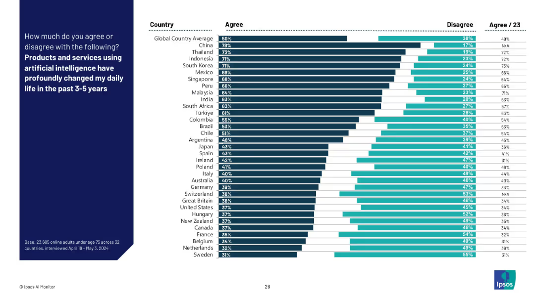
Vertical bar chart ranking agreement by country. Dark bars show agreement; adjacent lighter bars show disagreement. Country names listed left, percentages right.
Market Analysis and Trends
Artificial Intelligence
This slide shows country-by-country agreement on whether AI products and services have significantly impacted daily life in the past 3–5 years. Agreement is highest in China, Southeast Asia, and South Korea, while Western countries show lower agreement.
AI impact, country comparison, user experience, global sentiment, lifestyle change, technology adoption, daily life, survey results, Ipsos
Mixed Chart
IPSOS
Saved
This slide compares the percentage of respondents engaging in online activities before and after COVID-19 with bar graphs and a textual summary.
Market Analysis and Trends
Technology & Software
It shows how the pandemic increased online engagement and awareness, crucial for understanding consumer behavior changes and market opportunities.
COVID-19, digital adoption, online activities, market analysis, consumer behavior, awareness, engagement, pandemic
Multiple Chart
Kearney
Saved
A Venn diagram centralizes the slide, flanked by bulleted text that presents the bank's criteria, competitive advantages, and value proposition. The layout is engaging, using color to differentiate between elements.
Technology and Digital Transformation
Financial Services
The slide provides insights into the firm's vision and strategic criteria for establishing a leading digital consumer bank, emphasizing its strengths and customer-centric value proposition.
digital banking, consumer finance, strategy, value proposition
Table
Goldman Sachs
Saved
The slide showcases infographics with a mood index scorecard, pie charts, and a brief textual explanation on the left side.
Market Analysis and Trends
Professional Services
Provides an annual snapshot of the sentiment and optimism levels of Millennials and Gen Z regarding different aspects of life and business.
Mood, Millennials, Gen Z, Index, Survey, Optimism, Business Impact, Environment
Mixed Chart
Deloitte
Saved
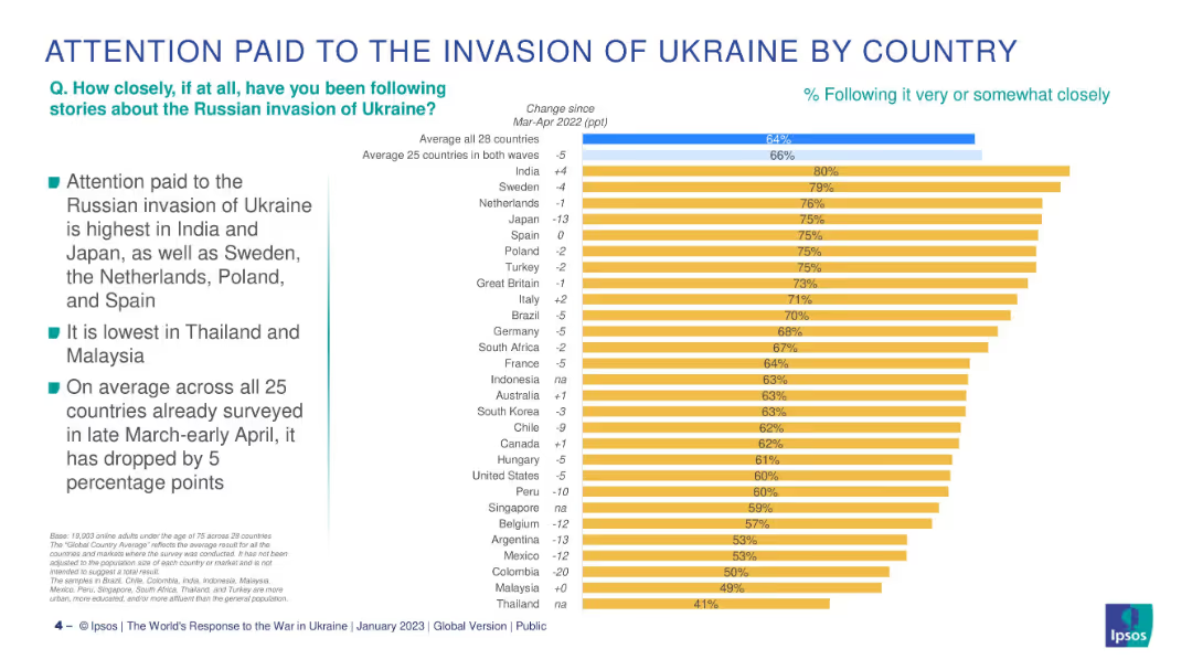
Bar chart of 28 countries, ranked by % following Ukraine war, with change vs Mar-Apr 2022.
Market Analysis and Trends
Government & Public Sector
This slide breaks down how attentively people in different countries follow the Ukraine conflict, showing the highest attention in India and Japan and the largest drop in Colombia and Argentina.
Ukraine war, public attention, international survey, Ipsos, by country, geopolitical awareness, year-on-year change, global concerns
Mixed Chart
IPSOS
Saved
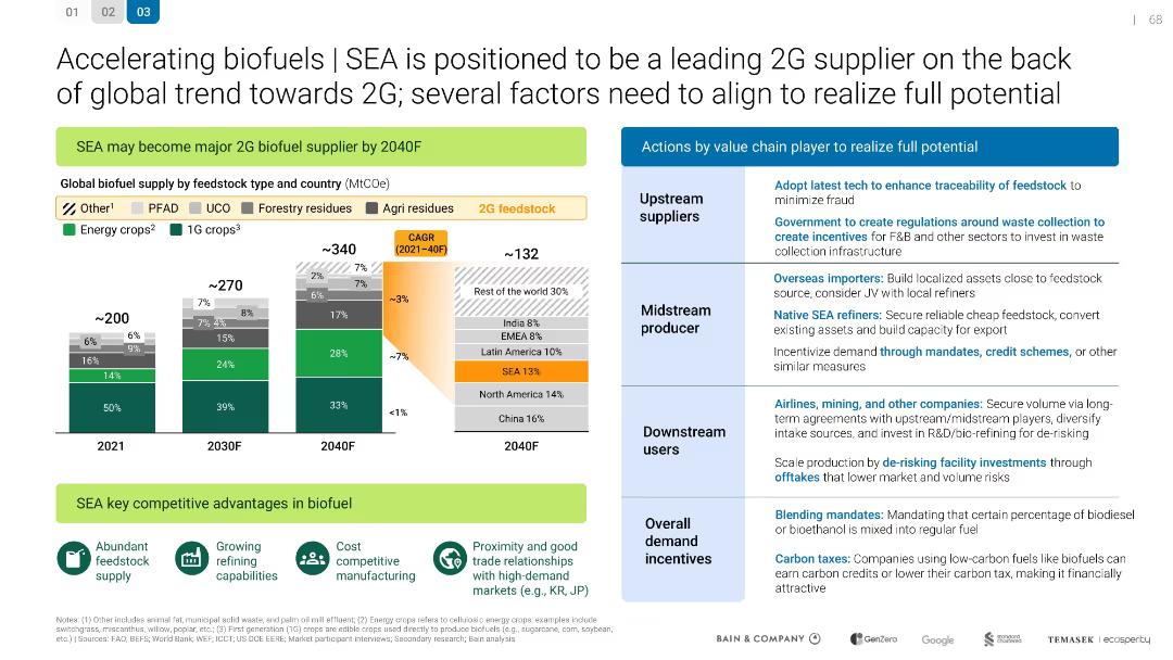
SEA is positioned to be a leading 2G supplier
Technology and Digital Transformation
Energy & Utilities
Technology and Digital Transformation
Describes how SEA can become a major 2G biofuel supplier by 2040. Details feedstock supply projections and value chain actions needed for success, including regulations, investment, and market development.
Mixed Chart
Bain
Saved
Slide presents bar charts and descriptive text on a gradient background. The chart illustrates responses regarding speed, scope, and scale of transformation during uncertain times.
Operational Efficiency
Technology & Software
Discusses how companies in Growth Markets adapt to rapid changes and manage multiple transformations simultaneously. Useful for operational strategy sessions and discussions on business agility.
agility, transformation, Growth Markets, business strategy, operations management
Mixed Chart
Accenture
Saved
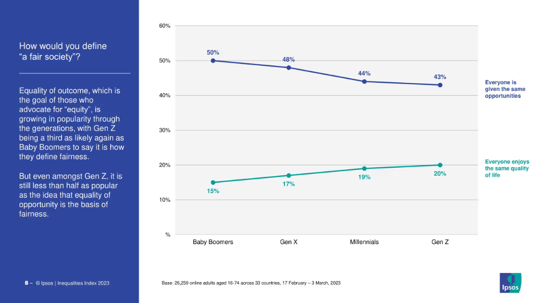
Dual-line chart comparing definitions: “same opportunity” vs. “same quality of life.” Left-aligned narrative and title.
Market Analysis and Trends
Government & Public Sector
The slide contrasts generational views on fairness. While most still define fairness as equal opportunity, support for equal outcome is rising, especially among Gen Z, who show the highest support for equity.
fairness, equity, opportunity, Gen Z, definitions, values
Mixed Chart
IPSOS
Saved
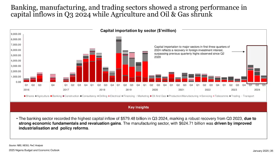
Stacked bar chart by sector for capital importation from 2016–Q3 2024; emphasis box highlighting sectoral trends.
Industry Overview
Financial Services
Illustrates sector-specific capital inflows, with banking and manufacturing sectors showing strongest growth in Q3 2024. Attributes recovery to economic fundamentals and policy reforms, while agriculture and oil & gas recorded weaker performance.
capital inflows, banking, manufacturing, trading, oil & gas, Nigeria, sectoral investment, Q3 2024, economic recovery
Mixed Chart
PwC/Strategy&
Saved
This slide features a green and white line chart against a black background, showing the performance of the "50 Most Innovative Companies of 2021." The slide is labeled with key percentages in bold green, providing a visual comparison to the "MSCI World Index." The data is clearly depicted for easy comparison, and the slide's overall design is straightforward, emphasizing the financial data presented.
Investment Analysis
Financial Services
The slide provides evidence of the financial performance of innovative companies, illustrating their continued outperformance during the COVID-19 crisis. It could be used by financial analysts or investment strategists to evaluate the merits of investing in innovative companies, demonstrating their potential for resilience and growth. The inclusion of an index comparison provides a benchmark for assessing the relative success of innovation-led strategies.
financial performance, innovative companies, COVID-19, MSCI World Index, investment strategy
Single Chart
BCG
Saved
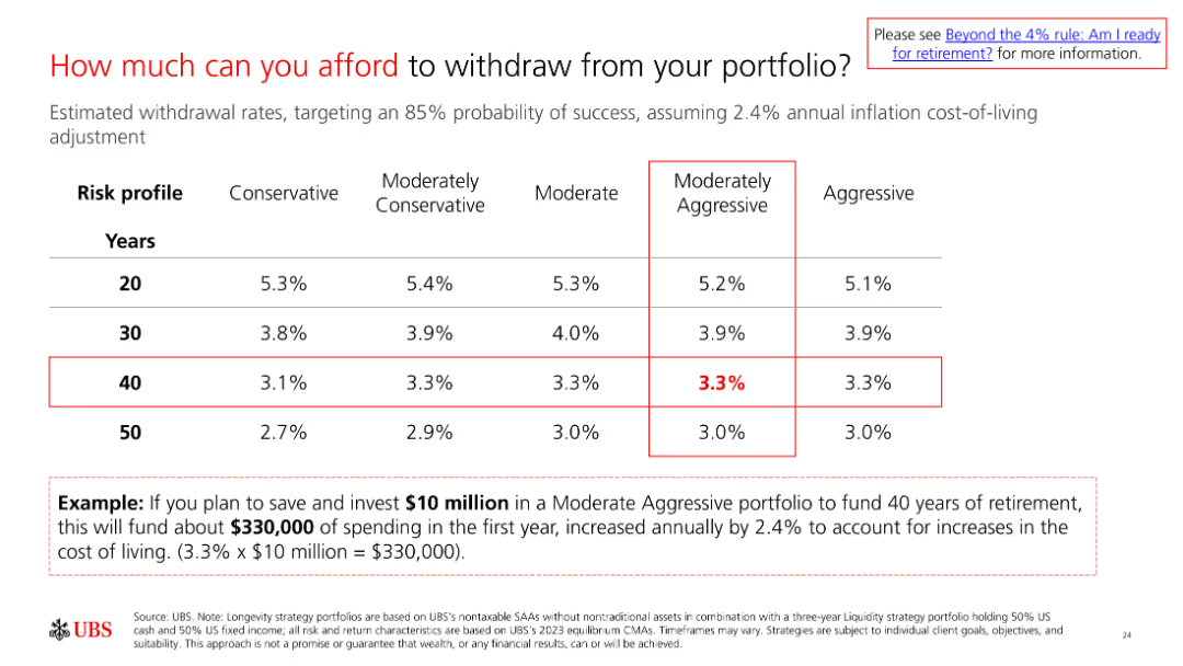
A slide with a table showing withdrawal rates for different risk profiles and time horizons. The example at the bottom illustrates how to apply the rates to determine affordable withdrawals.
Financial Performance
Financial Services
The slide explains how much individuals can afford to withdraw from their portfolios based on their risk profile and time horizon, with an example for clarity.
withdrawal rates, portfolio management, retirement planning, financial strategy, risk management
Table
UBS
Saved
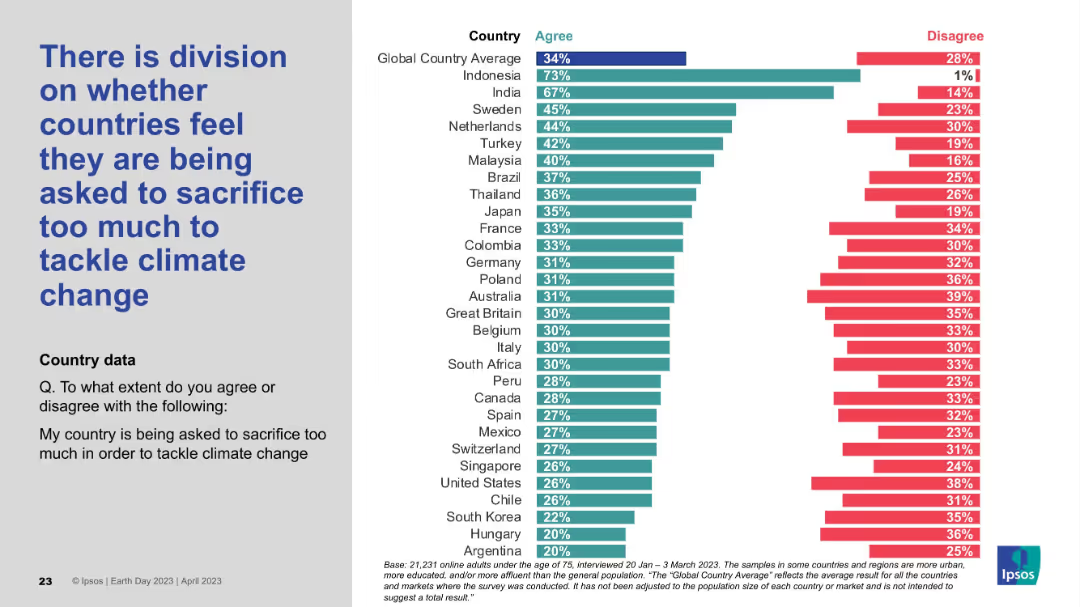
Standard visual layout: left-aligned text and a detailed bar chart ranking country responses by level of agreement/disagreement.
Risk Assessment and Management
Environmental Services & Sustainability
The slide explores perceived fairness in climate efforts, showing varied opinions on whether nations feel overburdened in tackling climate change. Countries like Indonesia express strong agreement, while others like Argentina show minimal concern, revealing a split sentiment globally.
sacrifice, fairness, climate burden, national opinion, policy reception, Ipsos data, environmental responsibility
Mixed Chart
IPSOS
Saved
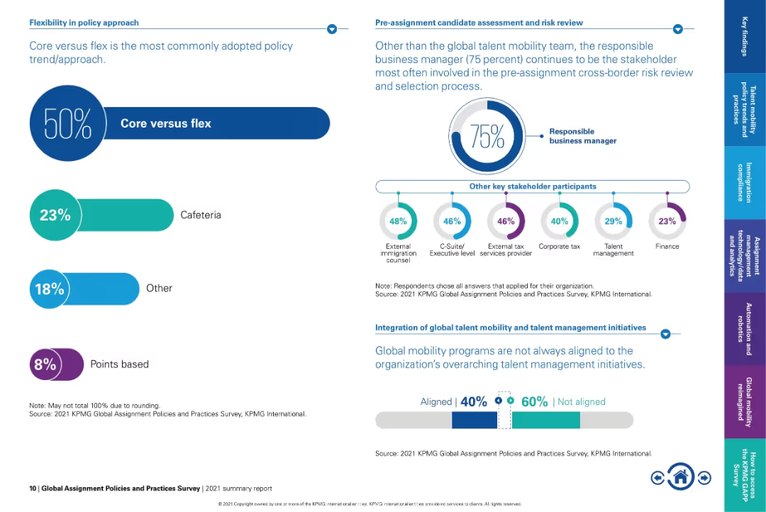
Dual-panel layout: left side uses percentage bars, right side uses circular infographic and icon chart.
Organizational Structure and Change
Professional Services
Highlights the growing preference for the "core versus flex" approach in mobility policy, with 50% of organizations adopting it. Also shows stakeholder involvement in risk review and notes the lack of integration between mobility and talent management initiatives.
core vs flex, stakeholder roles, mobility policy, risk review, talent alignment, global mobility strategy, executive involvement
Multiple Chart
KPMG
Saved
Features a column chart listing reasons for purchasing crypto investment funds, including safety and diversification.
Market Analysis and Trends
Financial Services
The slide outlines reasons Canadians purchase crypto investment funds, emphasizing financial motivations like safety, diversification, and speculative investment, and notes demographic differences in these reasons.
Crypto funds, purchase reasons, investment
Multiple Chart
IPSOS
Saved
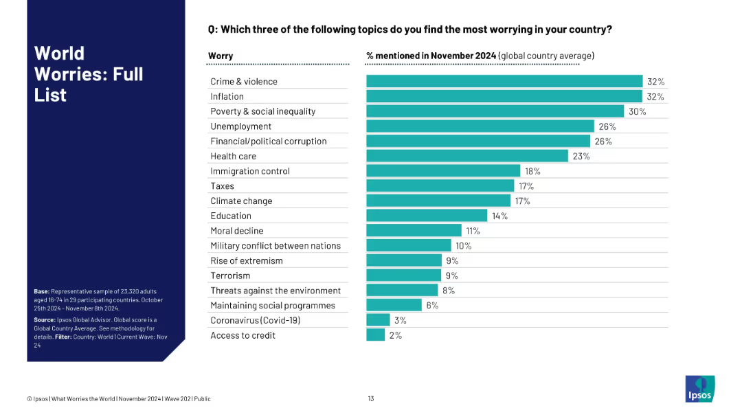
Horizontal bar chart with ranked list of global worries and their respective mention percentages.
Market Analysis and Trends
Professional Services
This slide ranks 20 different global concerns based on the percentage of respondents mentioning each as a top worry in November 2024. Crime, inflation, and inequality top the list, while access to credit and Covid-19 are of least concern.
top worries, global issues, ranking, Ipsos, crime, inflation, social inequality, public priorities
Single Chart
IPSOS
Saved
The slide contains a table comparing dividend, net income, payout ratio, and return over multiple years, with highlighted projections for the year 2022. It includes a sidebar with dividend and share buy-back policy details and targets. The visual elements are supported by the brand color scheme and include the Michelin logo at the bottom left.
Financial Performance
Financial Services
Detailing the shareholder return policy with a focus on dividends and share buy-backs, this slide outlines Michelin's financial commitment towards its shareholders. It is likely used in annual general meetings or investor briefings to discuss shareholder value and financial strategies.
shareholder, return, policy, dividend, Michelin, net income, payout ratio, investment, finance, strategy
Table
Morgan Stanley
Saved
Includes a line graph and a pie chart showing market share and revenue mix with institutional and corporate clients from 2014 to 2018.
Financial Performance
Financial Services
Analyzes JP Morgan's market share growth with institutional and corporate clients, showing sustained growth and client diversity.
market growth, institutional clients, corporate clients, revenue
Multiple Chart
JP Morgan
Saved
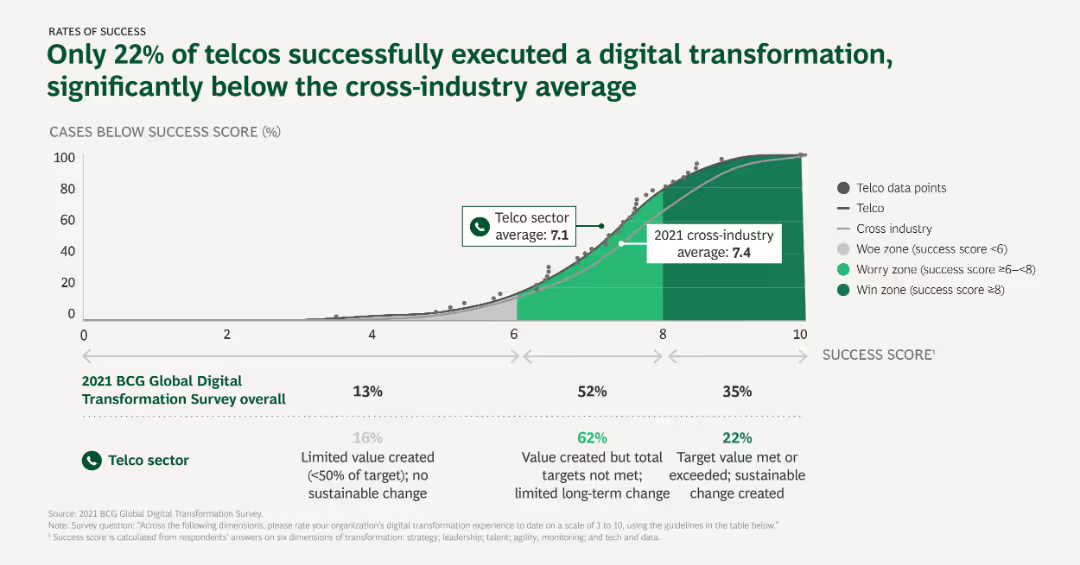
The slide presents a line graph comparing success scores of digital transformation across the telco sector and cross-industry, with annotations for worry, win, and average zones.
Performance Metrics and KPIs
Telecommunications
This slide illustrates the success rates of digital transformation initiatives in the telco sector compared to the cross-industry average, highlighting the low success rate among telcos.
Success rates, Digital transformation, Telcos, Cross-industry, Performance metrics
Mixed Chart
BCG
Saved
The slide presents tables and bullet points to illustrate financial data, with contrasting colors for different categories and emphasis on key figures.
Financial Performance
Financial Services
Outlines the financial results of Macquarie Asset Management, detailing various income and expense categories, and highlighting performance fee contributions.
Asset Management, Income, Fees, AUM, Profit
Table
Morgan Stanley
Saved
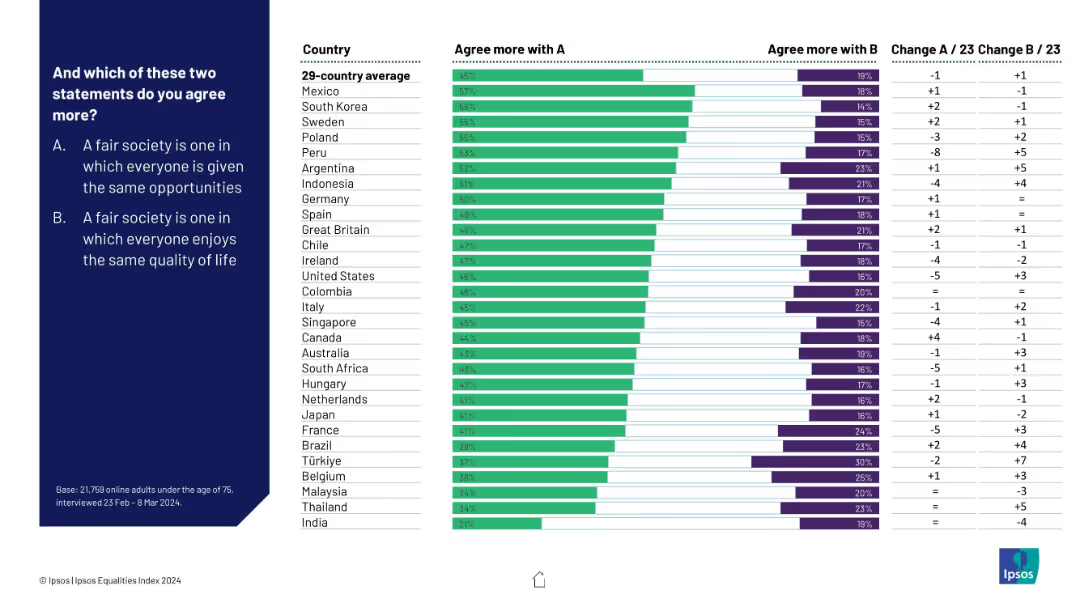
Comparative bar chart on fairness definitions—equal opportunity vs equal quality of life—broken down by country
Market Analysis and Trends
Education & Training
Respondents were asked whether fairness means equal opportunities or equal outcomes. Most countries leaned toward opportunity. India and Thailand were outliers, favoring quality of life. Change from 2023 to 2024 is also shown.
fairness, equality, public opinion, opportunity vs outcome, Ipsos, international views, societal values, 2024 trends
Mixed Chart
IPSOS
Saved
The slide features comparative column charts detailing the fleet size and average age of Seadrill and its competitors. It uses a dual-axis format to display numbers of rigs and fleet age, making direct comparisons straightforward. The color palette is consistent with Seadrill's branding, and each graph is clearly labeled to ensure viewer understanding. The overall design is sleek and professional, emphasizing key data points through effective visual contrast.
Competitive Landscape
Energy & Utilities
The slide compares Seadrill's fleet size and age with those of its competitors, highlighting its position in the market. It serves as a competitive analysis tool in investor briefings or strategic meetings, arguing Seadrill's advantages in terms of a newer, more technologically advanced fleet. The presentation of this data aims to convey Seadrill's industry standing and readiness for future market demands, supporting arguments for investment or strategic shifts based on fleet composition and age.
competitive analysis, fleet size, age, Seadrill, bar graphs, market position, strategic meetings, technology, investment, industry standing
Multiple Chart
Barclays
Saved
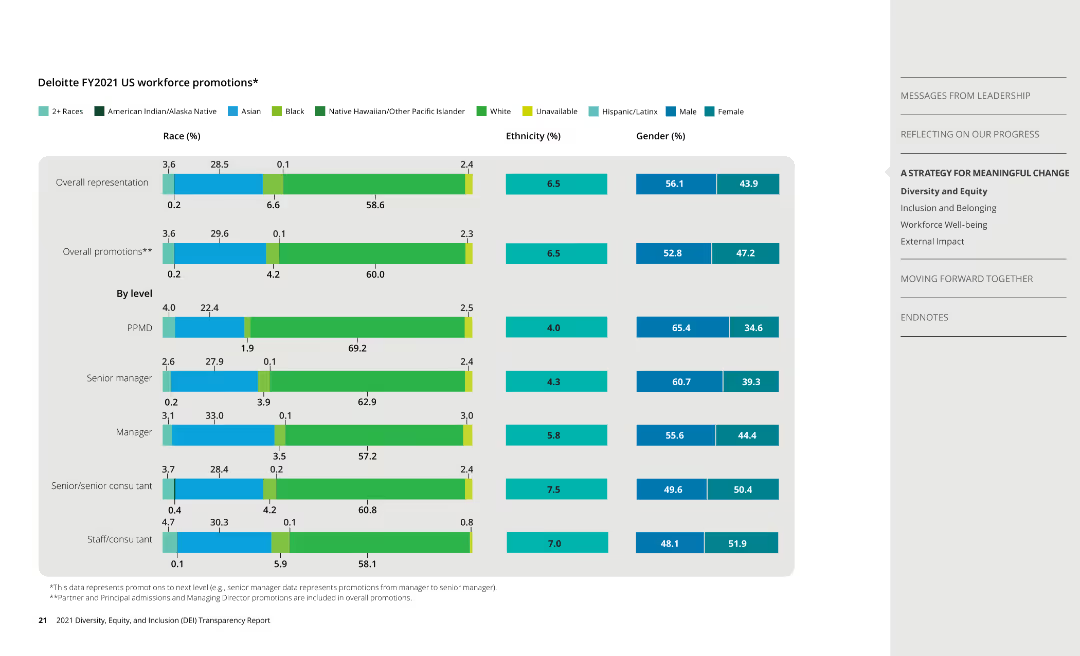
Column charts display promotion data by race, ethnicity, and gender, along with overall representation data.
Human Resources and Talent Management
Professional Services
Presents promotion statistics at Deloitte, analyzing diversity in career advancement opportunities.
promotions, diversity, race, ethnicity, gender
Single Chart
Deloitte
Saved
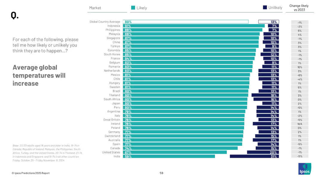
Horizontal bar chart with teal bars per country; ordered from highest to lowest; change from 2023 shown on right
Market Analysis and Trends
Environmental Services & Sustainability
This slide shows country-wise belief in the likelihood of rising average global temperatures. It emphasizes high consensus in most countries and displays comparative differences between regions alongside past year data.
temperature rise, climate change, environment, global warming, survey, public opinion, Ipsos
Mixed Chart
IPSOS
Saved
Previous
Next
If nothing, comes up, please save your slides first
Create a FREE account to continue browsing
Receive Instant Access to 1,000+ slides from companies like McKinsey, Google, and Goldman Sachs
First Name
Last Name
Email
Password
I agree to all
Terms & Privacy Policy
Thank you! Your submission has been received!
Oops! Something went wrong while submitting the form.
Have an account?
Sign in
Column Chart
Heatmap
Chevron
Org Chart
Infographic
Callouts
Timeline
List
Graphic
Picture
Process Flow
Diagram
Paragraph
Map
Table
Framework
Subtitle
Takeaway Box
Icon
Other Chart
Radar Chart
Waterfall Chart
Mekko Chart
Pie Chart
Scatter Plot
Line Chart
Bar chart
Bullet points