Create a FREE Account
Instant access to 1,000+ real slides from top companies like McKinsey, BCG, Goldman Sachs, Google and many more!
First Name
Last Name
Email
Password
I agree to all
Terms & Privacy Policy
Thank you! Your submission has been received!
Oops! Something went wrong while submitting the form.
Have an account?
Sign in
Library
Templates
Courses
Pricing
My Account
My Slides
My Templates
✦ AI
AI Prompt Library
AI Search
Sign in
Start Here
Logout
My Saved Slides
The slide shows a line graph of COVID-19 test results in Ontario, indicating the waves of the pandemic.
Risk Assessment and Management
Healthcare & Pharmaceuticals
It presents data on the fluctuating positive COVID-19 test results over time, highlighting key dates and events.
COVID-19, test results, waves, Ontario, line graph, pandemic, positive, data, key dates, events
Single Chart
IPSOS
Saved
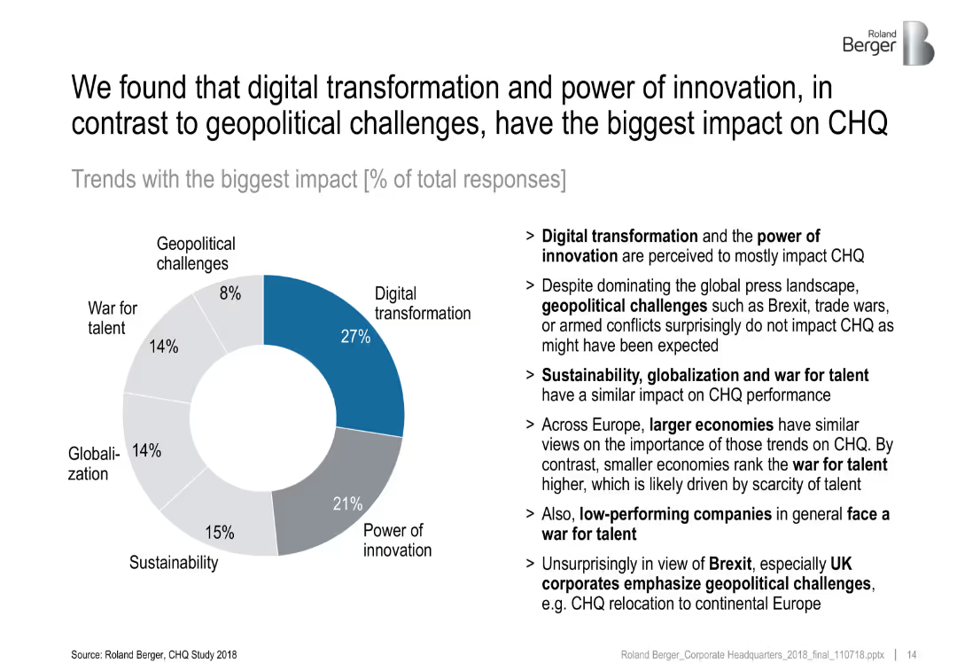
Donut chart with percentage shares of six megatrends; bullet points on the right provide insights
Market Analysis and Trends
Professional Services
This slide reveals survey results on which megatrends most impact CHQ. Digital transformation (27%) and innovation (21%) are dominant, while geopolitical issues score lowest (8%). Text insights interpret regional differences and performance-level correlations.
digital transformation, innovation, impact analysis, geopolitics, survey, CHQ
Mixed Chart
Roland Berger
Saved
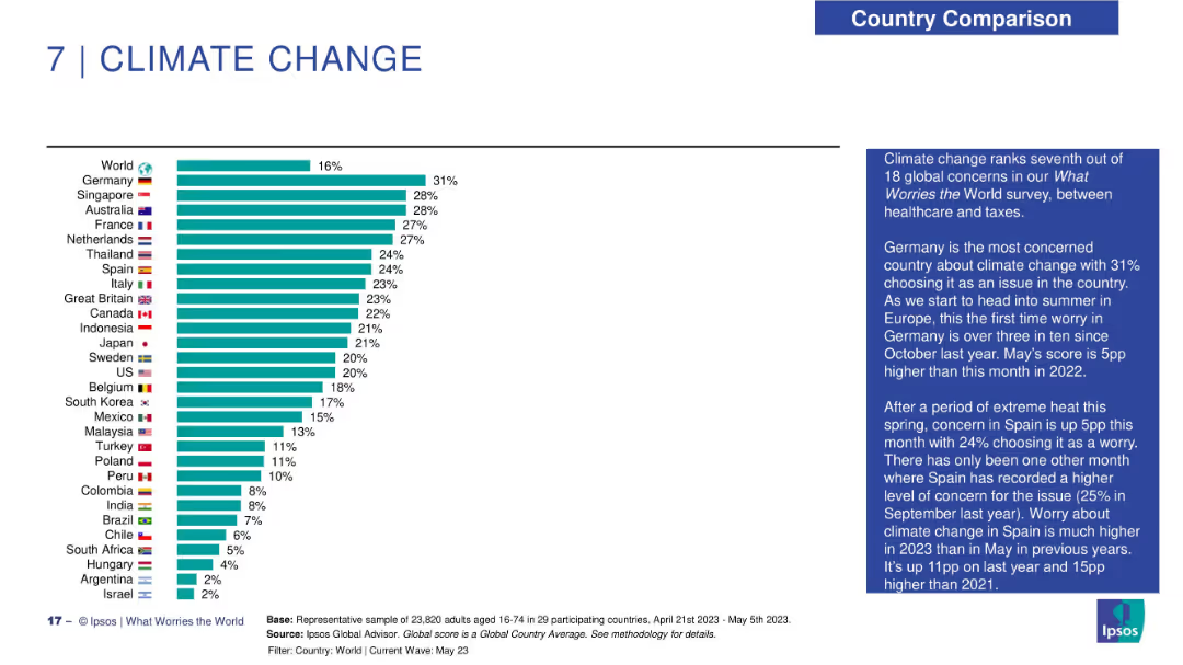
Horizontal bar chart of climate concern by country; narrative summary in blue text box at right.
Market Analysis and Trends
Environmental Services & Sustainability
The chart shows climate change concern with Germany topping the list at 31%. European countries dominate the upper half, while Latin America and parts of Asia rank lower. Global concern is 16%. Text notes increasing seasonal worry in Spain and Germany as summer approaches.
climate change, public opinion, Ipsos, Germany, environment, seasonal variation, global ranking, sustainability
Mixed Chart
IPSOS
Saved
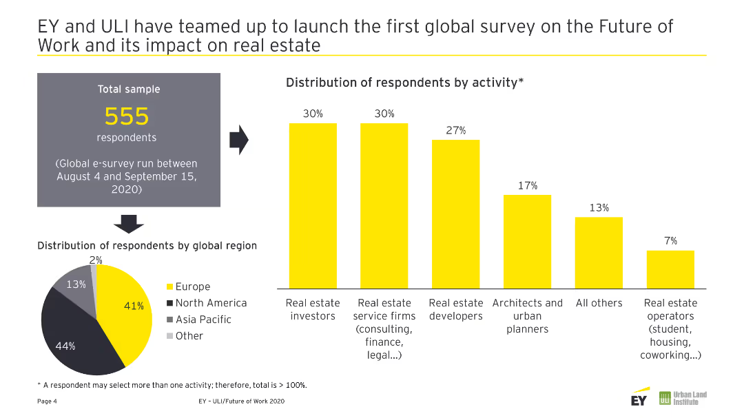
A pie chart showing the global distribution of respondents and a column chart showing respondents' activities.
Market Analysis and Trends
Real Estate & Construction
This slide presents the global distribution and activity breakdown of respondents in a survey on the future of work and its impact on real estate.
Future of Work, Real Estate, Survey, Respondents, Global Distribution
Multiple Chart
EY
Saved
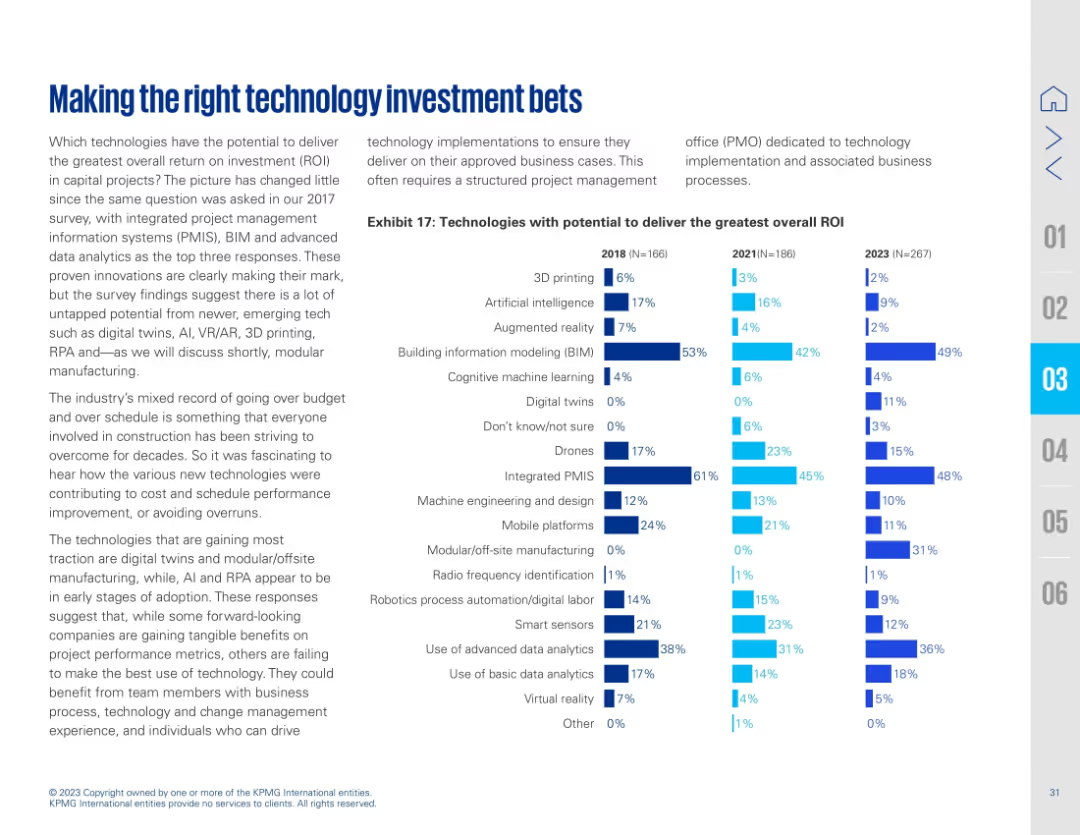
Full-width layout with a bar chart on the right showing ROI potential of technologies from 2018 to 2023. Left-aligned text describes changes in ROI perception. Technology types are listed vertically with horizontal comparison bars across years.
Investment Analysis
Real Estate & Construction
Tracks the technologies with the greatest perceived ROI in capital projects over three years. PMIS, BIM, and advanced data analytics consistently rank high, while AI and modular/offsite manufacturing show growing recognition.
ROI, technology investment, PMIS, BIM, analytics, AI, modular manufacturing, construction
Mixed Chart
KPMG
Saved
A bar chart depicting the perceived effectiveness of digital paid channels like email, search, and social media. Each bar is segmented by confidence levels among marketers, similar to the previous slide.
Market Analysis and Trends
Media & Entertainment
This slide provides insights into marketers' confidence in the effectiveness of various digital paid media channels. It includes data on channels like email, search, and social media, showing how marketers rate their effectiveness.
Digital, Media, Effectiveness, Channels, Confidence
Mixed Chart
Nielsen
Saved
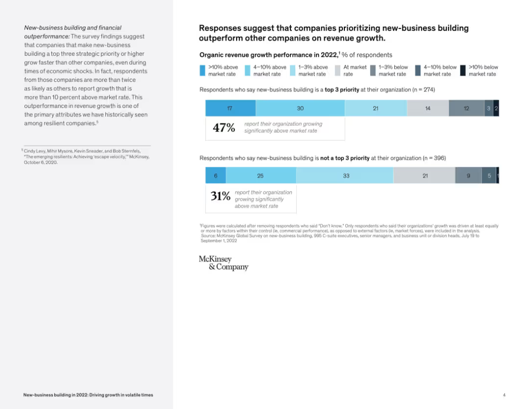
Stacked bar charts comparing revenue growth with and without prioritization of new-business building; paired with summary text.
Performance Metrics and KPIs
Professional Services
The slide presents data showing that companies making new-business building a top priority report significantly higher revenue growth than those that do not, supporting the link between strategic prioritization and performance.
revenue growth, new-business building, performance, strategic priority, survey results, market rate
Mixed Chart
McKinsey
Saved
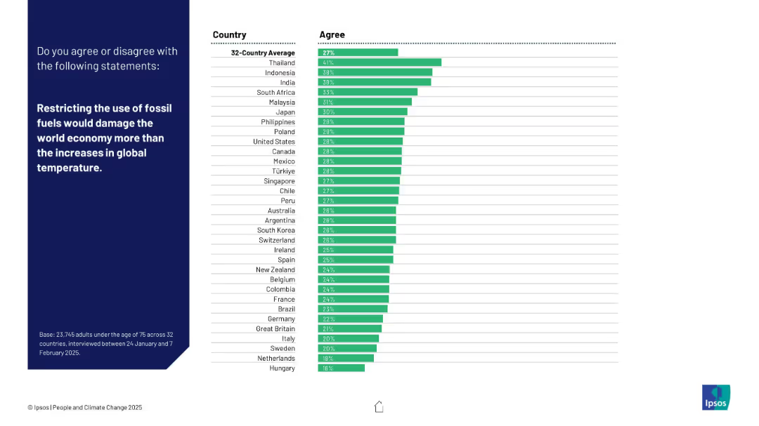
Standard layout with a horizontal bar chart showing agreement by country.
Strategic Planning
Environmental Services & Sustainability
Respondents were asked whether limiting fossil fuels would hurt the economy more than climate change. Thailand leads in agreement; Western countries show low support.
fossil fuels, economic impact, climate policy, temperature rise, global economy, Ipsos, energy strategy, environment vs economy, public opinion, international survey
Mixed Chart
IPSOS
Saved
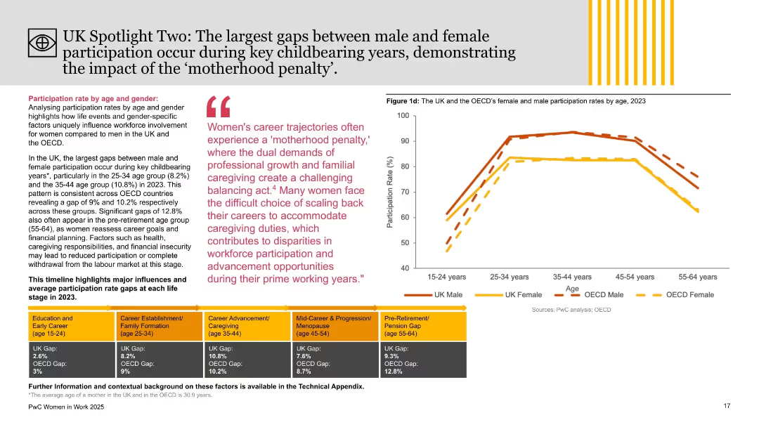
Right side features age-segmented participation chart; left side includes thematic analysis with colored blocks and quote on ‘motherhood penalty.’
Market Analysis and Trends
Government & Public Sector
This slide explores age-related gender participation gaps in the UK and OECD, emphasizing childbearing years (25–44) as periods with the widest disparities. It links challenges like caregiving and career progression with reduced female workforce involvement, using the “motherhood penalty” concept.
motherhood penalty, gender gap, age analysis, workforce participation, UK, OECD, PwC, employment trends, caregiving, labor market
Mixed Chart
PwC/Strategy&
Saved
Includes line graphs and trend analysis with annotations. Visual focus on historical and forecasted data with a red highlight on recent trends.
Risk Assessment and Management
Energy & Utilities
Focuses on the economic ramifications of the Ukraine conflict, analyzing inflation, commodity prices, and potential slowdowns in green investments.
Ukraine conflict, inflation, commodity prices, economic impact, green investment
Multiple Chart
Bain
Saved
Column charts illustrating investment categories over years and a graphical representation of risk management capabilities.
Risk Assessment and Management
Financial Services
This slide highlights advanced risk management capabilities and delivery approach, with strategic investments and technology platforms.
Risk management, technology platform, investment categories, strategic investments, delivery approach
Multiple Chart
Credit Suisse
Saved
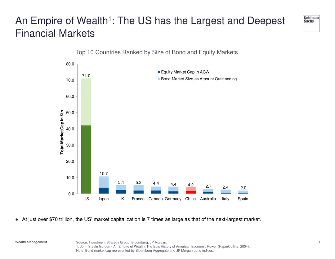
The slide features a column chart ranking countries by the size of their bond and equity markets, with the US market significantly larger than others.
Market Analysis and Trends
Financial Services
The slide emphasizes the scale of the US financial markets, with a total market cap far exceeding that of other countries, illustrating the depth and size of US bond and equity markets.
Financial Markets, US, Market Cap, Comparison, Scale
Single Chart
Goldman Sachs
Saved
The slide features a bar chart showing different types of fees associated with crypto trading platforms, with corresponding percentages. The layout is moderately complex.
Market Analysis and Trends
Financial Services
This slide details the various fees charged by crypto trading platforms, such as spread fees and commission disclosures. It aims to inform about the cost structure of trading on these platforms.
crypto trading, platform fees, costs, structure, information
Single Chart
IPSOS
Saved
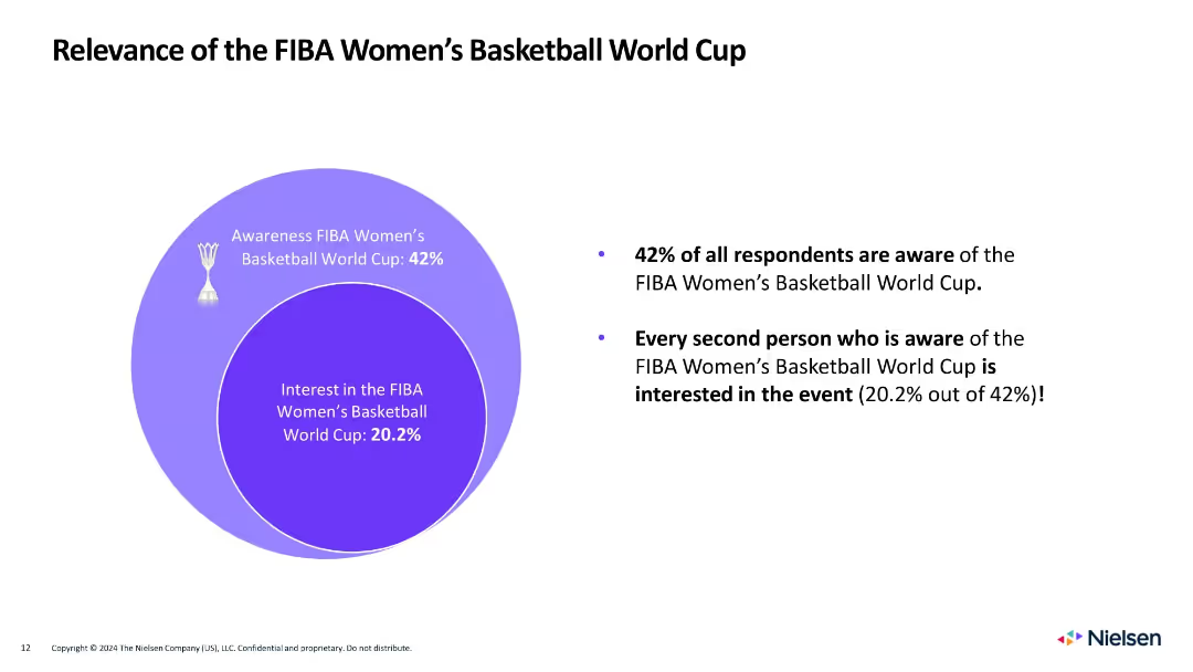
Circle diagram on left showing awareness and interest, with bulleted summary on the right
Market Analysis and Trends
Media & Entertainment
Shows that 42% are aware of the Women's World Cup, and 20.2% are interested, with half of those aware expressing engagement.
women's basketball, awareness, interest, FIBA, gender, sports engagement, fan behavior, Venn diagram, Nielsen
Mixed Chart
Nielsen
Saved
Slide shows stacked column charts comparing regional market outlooks.
Market Analysis and Trends
Financial Services
Compares executive views on market stability in North America, Europe, and Asia from 2023 to 2024, showing increased optimism in Asia and shifts in Europe.
market stability, optimism, executive views, regional comparison
Multiple Chart
BCG
Saved
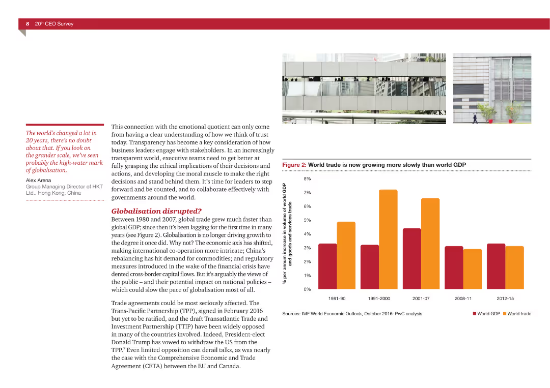
A mix of text and a bar chart comparing world trade growth to global GDP growth over different periods.
Market Analysis and Trends
Professional Services
The slide explores changes in global trade patterns and their implications for globalization, using data from IMF and PwC analysis.
globalization, trade, GDP, economic trends, disruption
Mixed Chart
PwC/Strategy&
Saved
Bar graphs showing profitability and capital accumulation rates
Financial Performance
Financial Services
Santander's profitability leading to capital accumulation
Profitability, Capital Accumulation, CET1, Banking, Growth
Single Chart
Morgan Stanley
Saved
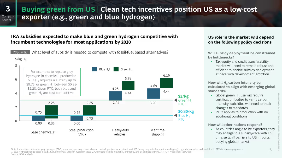
The slide uses a series of bar charts to depict the subsidy levels needed to make green and blue hydrogen competitive by 2030. The charts are color-coded to distinguish between green and blue hydrogen, and the layout is balanced with explanatory text on the side.
Strategic Planning
Energy & Utilities
This slide outlines the expected subsidy levels required for green and blue hydrogen to compete with fossil fuels by 2030, discussing the potential role of the US in the global market and the impact of various policy decisions on subsidy deployment.
hydrogen, subsidies, green, blue, competitive
Mixed Chart
BCG
Saved
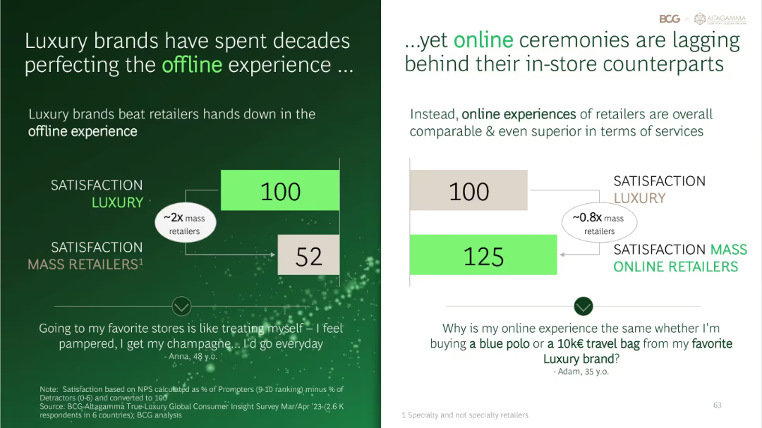
Two-panel layout comparing satisfaction scores for offline (left) and online (right) luxury vs. mass retailers using simplified bar graphics.
Performance Metrics and KPIs
Retail & E-commerce
Contrasts luxury vs. mass retailer satisfaction across offline and online experiences. Offline luxury retail scores very high, but online luxury satisfaction lags behind mass online retailers, suggesting a digital experience gap.
offline vs online, luxury retail, mass retailers, satisfaction gap, NPS
Multiple Chart
BCG
Saved
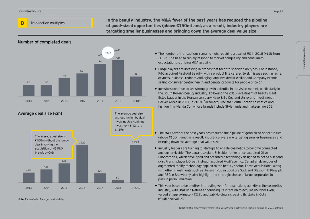
The slide contains column charts depicting the number of completed deals and average deal sizes from 2013 to 1H2019. The text discusses the reduction in large M&A opportunities and the focus on smaller, specialized beauty brands.
Mergers and Acquisitions
Consumer Goods
The slide discusses the trends in M&A activity within the beauty industry, noting a high number of transactions in recent years but a decline in large deal sizes. It highlights the strategic shift towards acquiring smaller, niche beauty brands and the potential for future growth in the sector.
M&A, Beauty, Deals, Acquisitions, Industry Trends
Multiple Chart
EY
Saved
This slide displays a grid of colored boxes representing the growth of retail goods sales excluding auto and fuel across multiple countries (China, Japan, US, UK, Italy, Sweden). Each box corresponds to a month from January to July, color-coded based on the percentage change in sales compared to the previous year. The slide is visually organized to allow quick scanning of data across different months and countries, providing a snapshot of the retail sector's performance during the pandemic.
Market Analysis and Trends
Retail & E-commerce
The slide provides a visual summary of how retail sectors in various countries are recovering from the impacts of COVID-19, highlighting fluctuations in consumer spending and economic recovery. It is particularly useful for retailers and e-commerce platforms to analyze market conditions and consumer behavior trends, assisting in inventory and marketing strategies. This overview supports strategic decisions by showing which markets are rebounding and which remain subdued, enabling better resource allocation and promotional planning.
retail sales, COVID-19, economic recovery, consumer behavior, market analysis, e-commerce, strategic planning
Table
BCG
Saved
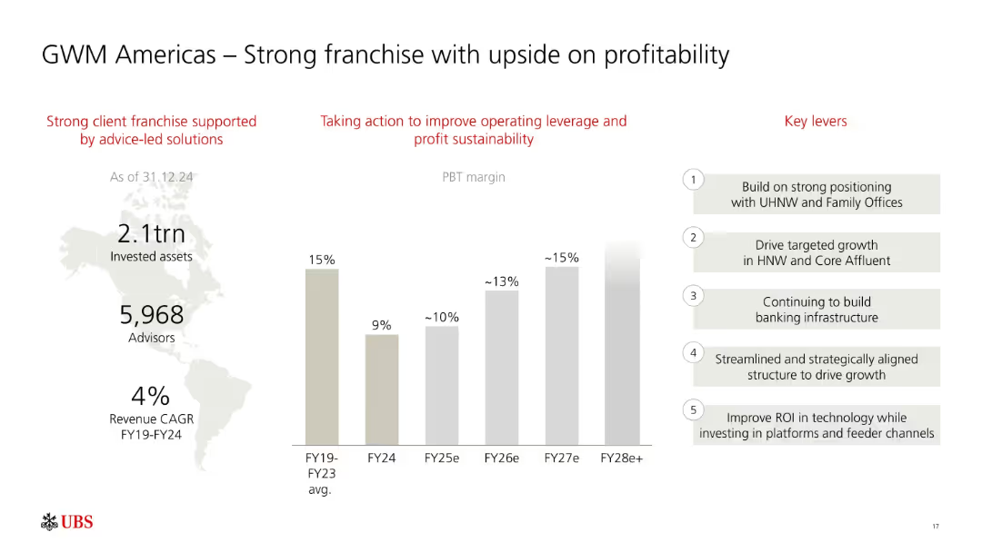
Three-column layout: infographic on left, PBT margin bar chart in center, and key levers on right. Red headings and grayscale bars.
Sales and Business Development
Financial Services
Focuses on UBS’s GWM Americas business, showing consistent PBT margin growth potential from FY24 to FY28e. Lists key strategic levers like HNW growth, infrastructure, and ROI-driven tech investments.
UBS, GWM Americas, profitability, PBT margin, high-net-worth, growth strategy, advisory, assets, FY28
Mixed Chart
UBS
Saved
Features several column charts illustrating the percentage of deficient ratings in talent management by line of business. The charts are color-coded by business line, with detailed legends and labels to clarify the data.
Human Resources and Talent Management
Financial Services
This slide provides insights into areas where talent management is lacking within various lines of underwriting business, such as recruitment and training. Useful for targeted improvement initiatives in HR practices within the financial sector.
deficient, talent management, underwriting, HR, recruitment, training, financial services
Mixed Chart
Accenture
Saved
The slide is segmented into two vertical sections, each with blue-toned headers and a list of bullet points with subtext. It features no charts or graphs but uses bold text and strategic use of whitespace for emphasis.
Client Case Studies
Financial Services
This slide provides insights into client engagement and execution metrics, highlighting increased digital engagement and robust trading volumes. It might be used in stakeholder meetings to discuss client relationship management.
client engagement, digital engagement, trading volumes, risk intermediation, asset inflows, customer service, disruption management, Goldman Sachs, performance metrics
Table
Goldman Sachs
Saved
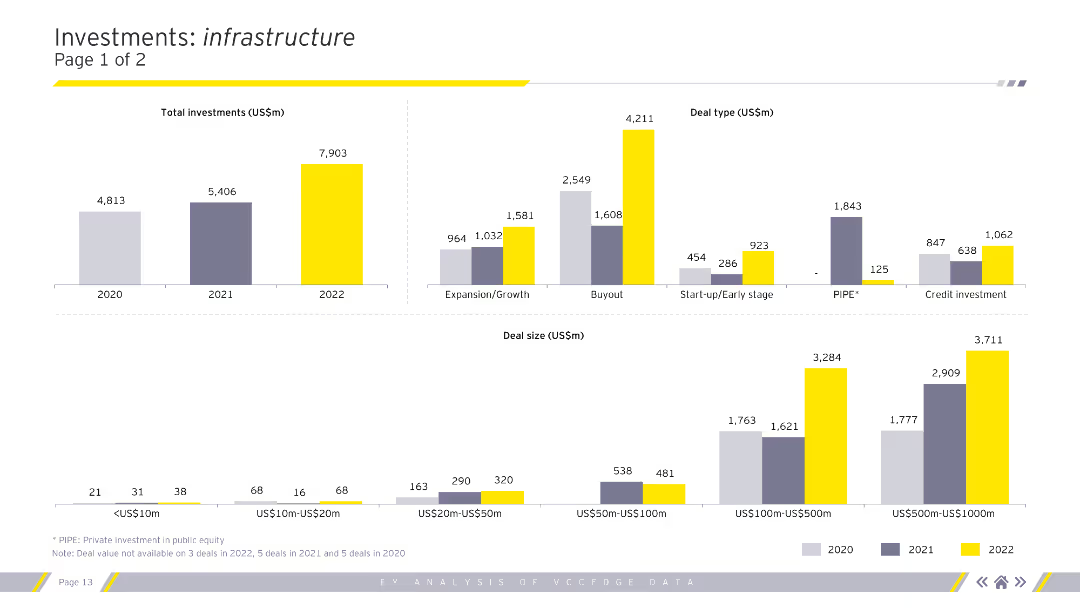
Column charts showing total investments, deal types, and deal sizes in the infrastructure sector for 2020-2022.
Market Analysis and Trends
Real Estate & Construction
Analysis of investment types, sizes, and segments within the infrastructure sector.
infrastructure, investments, deal types, deal sizes, analysis
Multiple Chart
EY
Saved
Previous
Next
If nothing, comes up, please save your slides first
Create a FREE account to continue browsing
Receive Instant Access to 1,000+ slides from companies like McKinsey, Google, and Goldman Sachs
First Name
Last Name
Email
Password
I agree to all
Terms & Privacy Policy
Thank you! Your submission has been received!
Oops! Something went wrong while submitting the form.
Have an account?
Sign in
Column Chart
Heatmap
Chevron
Org Chart
Infographic
Callouts
Timeline
List
Graphic
Picture
Process Flow
Diagram
Paragraph
Map
Table
Framework
Subtitle
Takeaway Box
Icon
Other Chart
Radar Chart
Waterfall Chart
Mekko Chart
Pie Chart
Scatter Plot
Line Chart
Bar chart
Bullet points