Create a FREE Account
Instant access to 1,000+ real slides from top companies like McKinsey, BCG, Goldman Sachs, Google and many more!
First Name
Last Name
Email
Password
I agree to all
Terms & Privacy Policy
Thank you! Your submission has been received!
Oops! Something went wrong while submitting the form.
Have an account?
Sign in
Library
Templates
Courses
Pricing
My Account
My Slides
My Templates
✦ AI
AI Prompt Library
AI Search
Sign in
Start Here
Logout
My Saved Slides
The slide uses imagery of smartphones and a desktop to showcase digital banking tools, along with checklists and icons for services offered. It has a blue and white corporate design.
Product and Service Analysis
Financial Services
Details Chase's array of financial products and services tailored for small businesses, highlighting banking and cash management, lending, and merchant services. The slide is designed to analyze product offerings and digital banking services.
Financial products, Services, SMB, Chase, Digital banking, Cash management, Lending, Merchant services, Business tools, Analysis
Table
JP Morgan
Saved
Slide contains a large, colorful multi-line chart comparing foundational, programmatic, strategic, and integrated & sustainable D&I targets across industries. Icons and a strategic intent note are placed at the top. Line colors are distinct for each sector.
Strategic Planning
Retail & E-commerce
This slide analyzes how the retail sector compares with others like CGS, Auto/IE, LS/Pharma/Biotech, and Travel/Hospitality in establishing Diversity and Inclusion targets across four categories: Foundational, Programmatic, Strategic, and Integrated & Sustainable.
Retail, Diversity, Inclusion, Comparison, Sector, Targets, Performance, Strategic, Programmatic, Integrated
Mixed Chart
Accenture
Saved
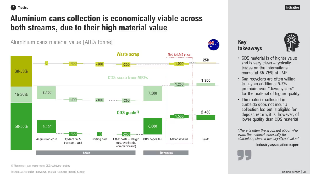
Horizontal bar-flow layout showing costs and revenues across three scrap types. Includes financial data, profit calculation, and bullet-point takeaways on right.
Investment Analysis
Industrial & Manufacturing
The slide evaluates the economic feasibility of collecting aluminium cans via CDS and MRFs. It compares acquisition and processing costs with potential revenues, showing that high-grade CDS material offers better profitability due to cleanliness and deposit returns.
aluminium, CDS, profitability, recycling, MRFs, costs, revenues, scrap, value chain, investment
Mixed Chart
Roland Berger
Saved
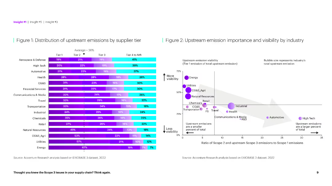
The slide features a horizontal bar chart on the left showing emission distribution by tier and a scatter plot on the right comparing emission importance.
Market Analysis and Trends
Environmental Services & Sustainability
This slide provides a detailed analysis of upstream emissions across different supplier tiers and their visibility by industry, highlighting key emission sources.
Emissions, supplier tier, distribution, visibility, industry, analysis, environmental impact, upstream, importance, sustainability
Multiple Chart
Accenture
Saved
An interface screenshot of a blockchain visualization tool with key features listed: block explorer, data visualization, and exportable data. The slide describes how the tool enhances visibility across complex networks and supports various assets.
Technology and Digital Transformation
Technology & Software
Introduces a new tool for visualizing blockchain transactions, aimed at improving global visibility and data analysis capabilities for audit and forensics teams.
Visualization tool, blockchain, audit, forensics, global visibility, data visualization, exportable data, complex networks
Mixed Chart
EY
Saved
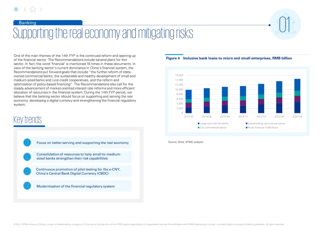
Left-aligned title with blue accents. Includes descriptive text, a list of key trends, and a bar chart of inclusive loans over time. Right section features the chart with multi-color bars by bank type.
Regulatory and Compliance
Financial Services
Discusses goals under China’s 14th FYP to support small and medium banks, improve credit access, and advance digital currency (e-CNY). Inclusive loan trends from 2019–2020 are shown by bank type.
banking, inclusive finance, e-CNY, microloans, regulatory reform, small banks, FYP
Mixed Chart
KPMG
Saved
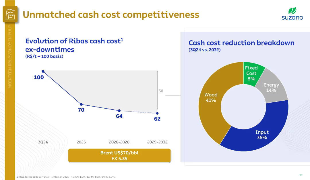
Left side features a downward cost trend graph; right side has a doughnut chart on cost breakdown. Professional, minimalistic design.
Financial Performance
Industrial & Manufacturing
The slide illustrates a projected reduction in Ribas mill cash costs, from 100 in 3Q24 to 62 by 2029–2032. A cost breakdown pie chart highlights wood (41%) and input (36%) as major contributors.
cash cost, Ribas mill, Suzano, wood, input, energy, cost breakdown, competitiveness
Multiple Chart
Goldman Sachs
Saved
Column charts and tables presenting total revenues, profit before tax, and cost/income ratios for different periods.
Financial Performance
Financial Services
Shows total revenues and profit before tax for asset management, highlighting key performance metrics for Q3 2022.
Asset management, revenues, profit, cost/income ratio, UBS, financial performance, Q3 2022, net management fees
Multiple Chart
UBS
Saved
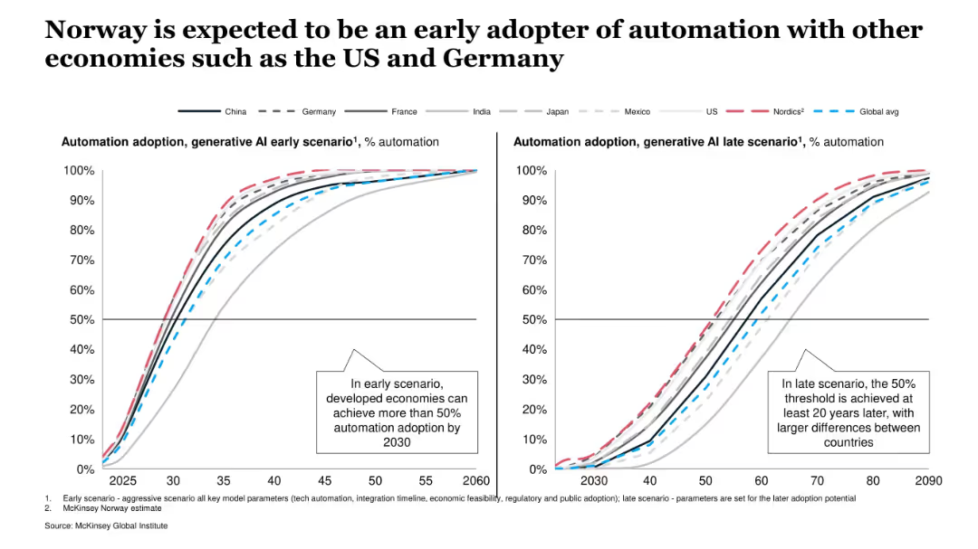
Side-by-side line charts showing AI adoption trajectories under early and late scenarios for various countries. Clear legend and scenario-based comparison.
Technology and Digital Transformation
Artificial Intelligence
This slide compares expected automation adoption under GenAI across multiple countries, showing that Norway and other developed nations are projected to lead adoption under both early and late scenarios.
GenAI, automation, adoption, Norway, early scenario, late scenario, global comparison, productivity
Multiple Chart
McKinsey
Saved
The slide features multiple tables, bar graphs and column charts, detailing quarterly financial metrics like revenues, assets under management, and net flows. The layout is clean with clearly labeled sections and contrasting colors to distinguish different data points.
Financial Performance
Financial Services
This slide presents Q4 2023 financial results for a private banking division, highlighting revenue growth and net asset flows. It is used to analyze financial health and performance trends.
banking, financial results, revenue growth, asset management, Q4 2023
Multiple Chart
Deutsche Bank
Saved
The slide is split into two line charts. The left chart shows CPI inflation rates for developed markets (Eurozone, U.S., Australia, Japan), while the right chart depicts CPI inflation for emerging markets (Brazil, India, Korea, China) from 2018 to 2024.
Market Analysis and Trends
Financial Services
This slide compares year-over-year CPI inflation rates between developed and emerging markets, providing insights into inflation trends across different economies. It is useful for economic analysis and policy assessment.
Inflation, CPI, Developed, Emerging, Markets
Multiple Chart
JP Morgan
Saved
This slide contains two sets of column charts comparing the 1-month, YTD, and 1-year returns of the S&P 500 and MSCI World index sectors. Colors blue, red, and purple are used to differentiate the time frames, with labels for each sector at the base.
Financial Performance
Financial Services
Evaluates the performance returns of various sectors within the S&P 500 and MSCI World indices over multiple time frames, useful for sector-specific investment strategy development.
S&P 500, MSCI World, sector returns, performance analysis, investment strategy, time frame comparison, index analysis
Multiple Chart
Morgan Stanley
Saved
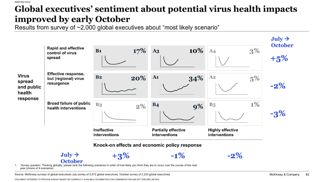
Matrix chart similar to slide 17431, displaying October survey results of ~2,000 executives across nine virus/economic scenarios. Percentages indicate perceived likelihood. Delta from July shown in blue on the right.
Strategic Planning
Professional Services
Presents October sentiment from executives on the most likely virus and economic response scenarios. Scenario A1 (recurring virus, partial economic intervention) is seen as most likely (34%). Compares shifts in opinion from July to October.
executive opinion, survey results, scenario analysis, virus impact, economic intervention, business outlook, trend shift, October update, strategic expectations
Single Chart
McKinsey
Saved
Slide features image-focused layout discussing the importance of personalization in consumer interactions, with a timeline of increasing trend relevance.
Product and Service Analysis
Retail & E-commerce
Analyzes how personalization in digital spaces is shaping consumer experiences, appealing strongly to Gen X and Millennials.
personalization, consumer experiences, Gen X, Millennials, digital
Multiple Chart
Bain
Saved
This slide displays a world map highlighting various countries with specific projects labeled, alongside a list of project details, using color codes for integration level and project phase.
Strategic Planning
Energy & Utilities
Discusses upcoming SURF projects worldwide, indicating the company's global reach and strategic engagements in various stages of development, which are crucial for understanding market opportunities and planning.
SURF projects, global, strategy, market opportunities
Graphic
Barclays
Saved
Slide is laid out in two columns, featuring a mix of text and round diagrams in red and white colors. Descriptions of PwC's audit and valuation approaches are provided alongside key audit matters.
Financial Performance
Professional Services
Discusses PwC's valuation practices during audits, highlighting the importance of accurate valuations in financial reporting and decision-making. It's intended for professionals involved in finance and accounting, particularly in understanding audit complexities.
valuation, audit, financial reporting, PwC, practices
Multiple Chart
PwC/Strategy&
Saved
Contains two gauge charts comparing views between HR Managers and CEOs/GMs. Each chart uses a gradient color scheme to show agreement levels, focusing on managerial perspectives.
Human Resources and Talent Management
Professional Services
Compares HR Managers and CEOs/GMs opinions on certain company policies, useful for understanding different internal viewpoints and fostering discussion on alignment and policy adjustments.
HR, CEO, perspectives, gauge chart
Multiple Chart
PwC/Strategy&
Saved
The slide features a dark background, a quote in a yellow text box, and a question followed by a bar chart showing performance ratings of healthcare system aspects.
Customer and Market Segmentation
Healthcare & Pharmaceuticals
This slide presents Canadian consumers' ratings of the healthcare system's performance in optimizing experiences regardless of personal circumstances.
Healthcare experience, performance, consumer ratings, equitable treatment, Canada
Mixed Chart
EY
Saved
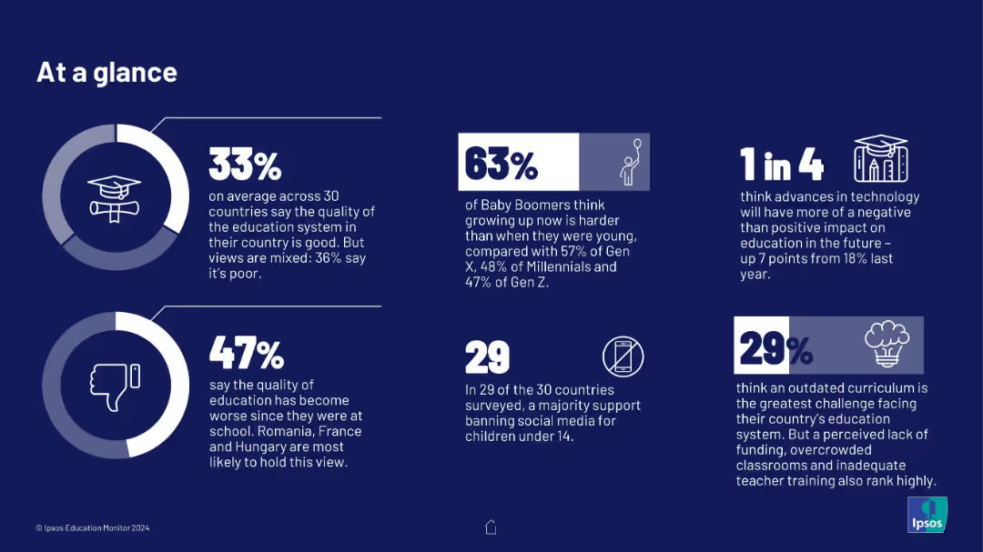
Grid of six statistic-based info-boxes on a dark blue background, each containing a percentage figure and icon, with minimal text explaining educational attitudes and perceptions.
Industry Overview
Education & Training
The slide provides a snapshot of global perceptions of education systems, tech’s impact, and social media concerns. It shows generational and geographic variances in confidence in education, curriculum quality, and views on childhood challenges.
education, perception, curriculum, technology, social media, quality, generational views
Multiple Chart
IPSOS
Saved
Displays line charts tracing the growth of major religious groups globally, with clear annotations and a blue monochrome color scheme for visual distinction.
Market Analysis and Trends
Education & Training
Examines the projected growth and demographic shifts among the world's major religious groups, offering insights into future religious and social dynamics.
religion, demographics, growth, global, trends, Christianity, Islam, data, future, society
Multiple Chart
Roland Berger
Saved
Contains multiple horizontal bar charts showing the percentage of respondents engaging in various business functions like Finance, HR, IT, and more. There is also a comparative analysis of these functions over the years 2019, 2021, and 2023.
Market Analysis and Trends
Professional Services
Presents a breakdown of key functions within GBS organizations, tracking changes in function focus and importance over time.
GBS, functions, finance, HR, IT, trend analysis
Mixed Chart
Deloitte
Saved
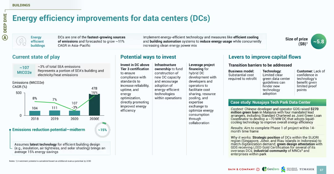
Follows the energy slide design with sections for emissions, investment, challenges, and a green-shaded case study. Focus on energy-efficient buildings.
Investment Analysis
Technology & Software
Focuses on energy consumption by data centers, one of SEA’s fastest-growing sources of emissions. Shows 15% midterm reduction potential with efficient cooling, automation, and green design. Investment opportunities include infrastructure ownership and Tier 3+ certification. Case study highlights GDS’s $270M green loan to develop a Malaysia-based DC using liquid cooling and green certification strategies.
data centers, energy efficiency, emissions, GDS, Malaysia, DCs, cooling, green loans
Multiple Chart
Bain
Saved
The slide presents bar charts comparing demographics and mobility preferences of EV prospects across APAC, EMEA, and North America. Key metrics include annual gross income, age, gender, urban living, and private parking availability.
Market Analysis and Trends
Transportation & Logistics
The slide provides a comparison of demographic and mobility factors for EV prospects in different regions, highlighting differences in income, age, gender, urban living, and private parking. It helps understand regional consumer profiles.
EV prospects, demographics, mobility, regional differences, income, urban living
Multiple Chart
PwC/Strategy&
Saved
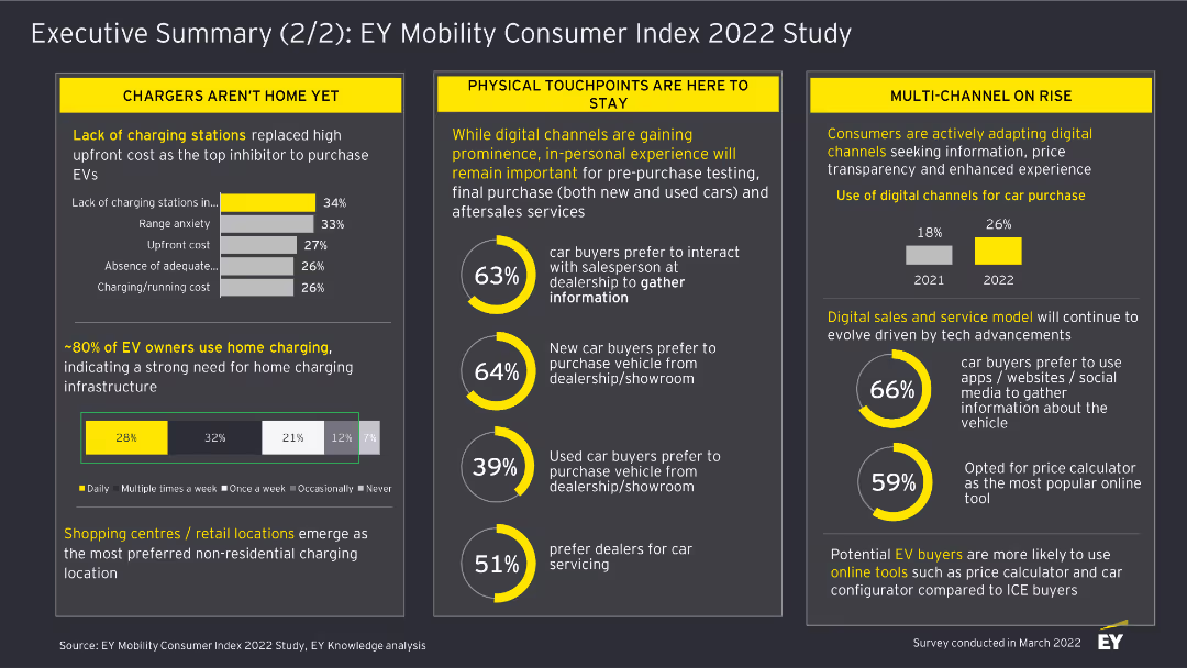
This slide includes column charts and textual highlights. It discusses the challenges in EV adoption, the importance of physical touchpoints, and the rise of digital channels for car purchases.
Market Analysis and Trends
Transportation & Logistics
The slide summarizes findings from the EY Mobility Consumer Index 2022 Study, focusing on barriers to EV adoption, the role of physical touchpoints, and the increasing use of digital channels in car buying.
EV Adoption, Physical Touchpoints, Digital Channels, Car Buying, Transportation, Market Analysis, 2022, Survey, Consumer Trends
Multiple Chart
EY
Saved
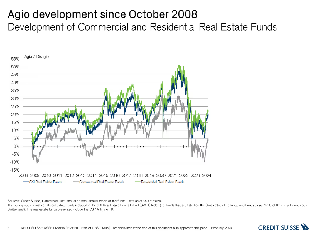
Line chart showing the development of commercial and residential real estate funds' agio/disagio since 2008.
Market Analysis and Trends
Real Estate & Construction
Illustrates the trends in agio/disagio for commercial and residential real estate funds post-2008 financial crisis.
real estate, agio, disagio, commercial, residential, 2008
Single Chart
Credit Suisse
Saved
Previous
Next
If nothing, comes up, please save your slides first
Create a FREE account to continue browsing
Receive Instant Access to 1,000+ slides from companies like McKinsey, Google, and Goldman Sachs
First Name
Last Name
Email
Password
I agree to all
Terms & Privacy Policy
Thank you! Your submission has been received!
Oops! Something went wrong while submitting the form.
Have an account?
Sign in
Column Chart
Heatmap
Chevron
Org Chart
Infographic
Callouts
Timeline
List
Graphic
Picture
Process Flow
Diagram
Paragraph
Map
Table
Framework
Subtitle
Takeaway Box
Icon
Other Chart
Radar Chart
Waterfall Chart
Mekko Chart
Pie Chart
Scatter Plot
Line Chart
Bar chart
Bullet points