Create a FREE Account
Instant access to 1,000+ real slides from top companies like McKinsey, BCG, Goldman Sachs, Google and many more!
First Name
Last Name
Email
Password
I agree to all
Terms & Privacy Policy
Thank you! Your submission has been received!
Oops! Something went wrong while submitting the form.
Have an account?
Sign in
Library
Templates
Courses
Pricing
My Account
My Slides
My Templates
✦ AI
AI Prompt Library
AI Search
Sign in
Start Here
Logout
My Saved Slides
Includes a grid analysis of different sectors based on carbon abatement potential and various investment criteria like economics and public sentiment.
Risk Assessment and Management
Environmental Services & Sustainability
Evaluates sectors for investment based on carbon abatement potential and attractiveness up to 2030.
carbon abatement, investment attractiveness, sector analysis, SEA
Table
Bain
Saved
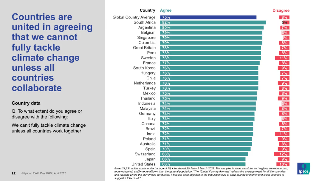
Layout consistent with others: statement on the left, bar chart showing agreement and disagreement levels by country on the right.
Strategic Planning
Environmental Services & Sustainability
The slide conveys a strong global belief that climate change cannot be addressed unilaterally and that international collaboration is essential. The agreement levels are high across most countries, reinforcing the shared view that climate action must be a global effort.
global cooperation, climate policy, collaboration, international unity, environmental challenge, Earth Day survey, Ipsos
Mixed Chart
IPSOS
Saved
Slide includes a bar chart comparing perceived benefits of sustainability efforts between leaders and laggards in various business aspects, using green and lighter green bars, with percentages and annotations.
Market Analysis and Trends
Environmental Services & Sustainability
The slide outlines perceived business impacts of environmental sustainability efforts, comparing leaders to laggards across several operational and strategic metrics.
Sustainability, Business Impact, Leaders vs. Laggards, Environmental Strategies, Operational Impact, Strategic Impact
Mixed Chart
Deloitte
Saved
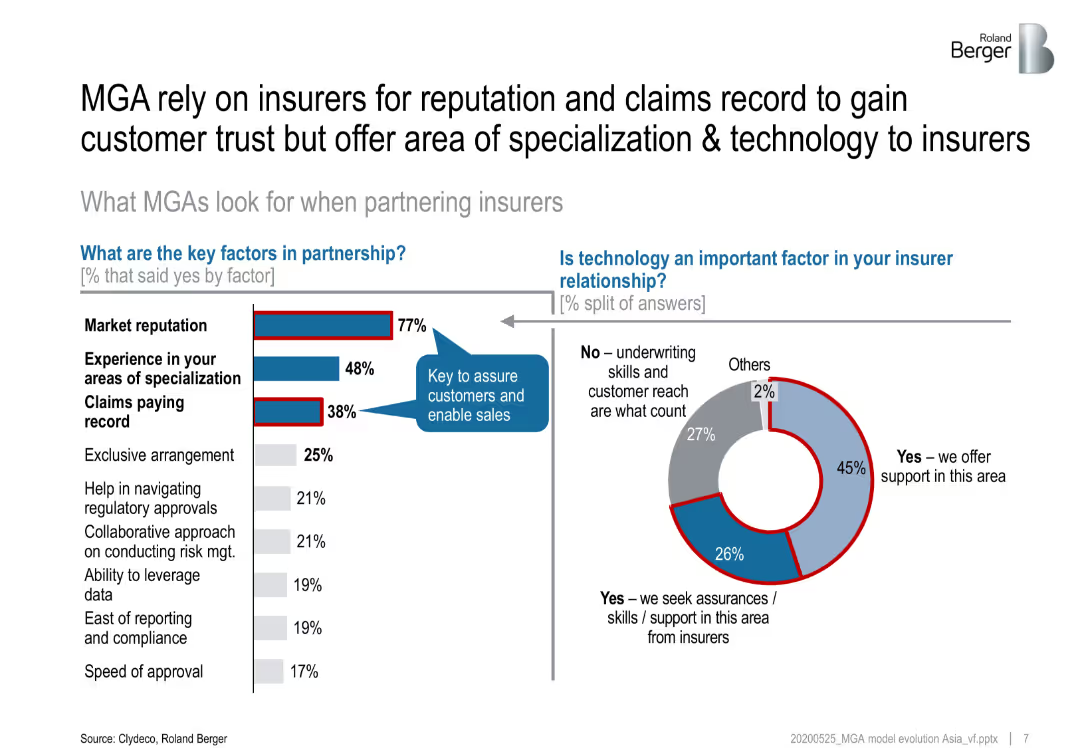
Bar chart and pie chart showing the key factors insurers consider when partnering with MGAs and the importance of technology in these partnerships.
Strategic Planning
Financial Services
Discusses the key factors insurers value when partnering with MGAs, including efficiency, customer service, and market access, and the role of technology in these partnerships.
MGAs, insurers, partnerships, key factors, technology
Multiple Chart
Roland Berger
Saved
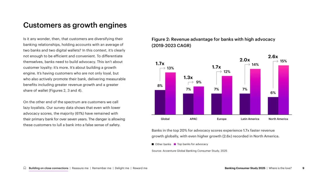
Left-side text and right-side vertical bar chart comparing revenue growth by region for banks with high advocacy. Minimalist layout.
Market Analysis and Trends
Financial Services
Discusses the value of customer advocacy in driving revenue. Shows high-advocacy banks achieve significantly better growth, especially in North America. Encourages cultivating promoters over just retaining loyalists.
customer advocacy, growth, revenue, banking, loyalty, regions
Mixed Chart
Accenture
Saved
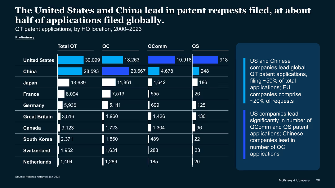
Similar structure to previous slide, showing bar chart of quantum patent applications (2000–2023) by country and QT type.
Strategic Planning
Technology & Software
Compares quantum tech patent filings, showing U.S. and China dominate with ~50% of global submissions. Breaks down QC, QComm, QS patent applications. Notes China leads QC filings; U.S. leads QComm and QS.
patent applications, QT, China, U.S., QC, QComm, QS, IP filings
Mixed Chart
McKinsey
Saved
The slide includes a column chart comparing the combined ratios for different insurance segments between 2017 and 2018. Color-coded for clarity.
Financial Performance
Financial Services
Analyzes profitability in insurance sectors, showing loss making trends despite rate increases. Focuses on segments like Reinsurance and Property for detailed assessment.
combined ratio, profitability, insurance segments, 2018, loss making
Mixed Chart
PwC/Strategy&
Saved
Slide contains data boxes, a pie chart and a table with key metrics highlighted.
Industry Overview
Financial Services
Overview of investment provider sectors by type and assets under management globally.
investment, sectors, assets, global, financial services
Multiple Chart
Deloitte
Saved
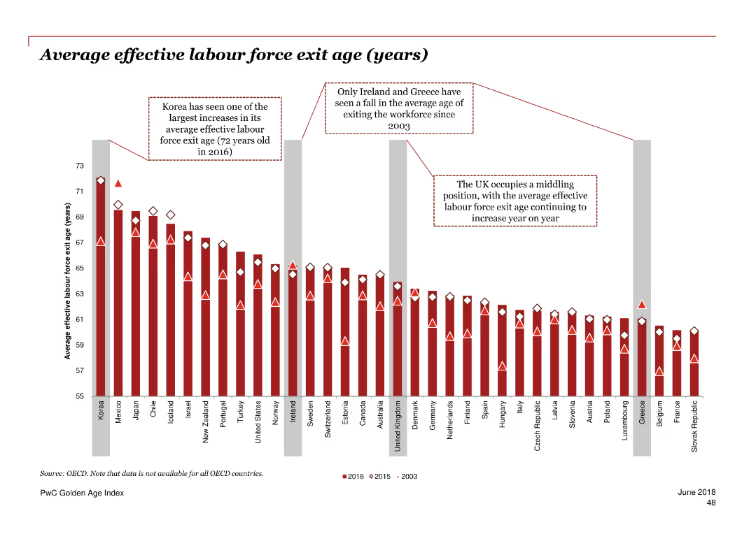
Column chart showing the average effective labour force exit age in years for various countries over three periods.
Market Analysis and Trends
Professional Services
The slide analyzes the average age at which people exit the labor force in different countries for 2003, 2015, and 2016.
labour force exit, age, employment, OECD, trend
Single Chart
PwC/Strategy&
Saved
The slide contrasts old and new organizational structures with visual elements like arrows and boxed text to emphasize changes.
Organizational Structure and Change
Consumer Goods
Discusses the organizational restructuring of Unilever to enhance focus on nutrition, increasing agility and market responsiveness.
organizational change, nutrition, agility, market responsiveness, restructuring
Header Horizontal
Deutsche Bank
Saved
Slide has a large title in bold at the top, a purple donut chart in the center showing percentages of change in work-from-home frequency, and a quote on the right side in a speech bubble.
Market Analysis and Trends
Professional Services
This slide presents data on changes in work-from-home practices post-outbreak and includes a personal testimonial to underscore the human aspect of the shift.
remote work, trends, COVID-19, work from home, data visualization, testimonial
Single Chart
Accenture
Saved
Bar graphs comparing credit ratings and CDS spreads
Risk Assessment and Management
Financial Services
Santander's credit profile in comparison to European peers
Credit Profile, CDS Spreads, Banking, Risk Management, Ratings
Multiple Chart
Morgan Stanley
Saved
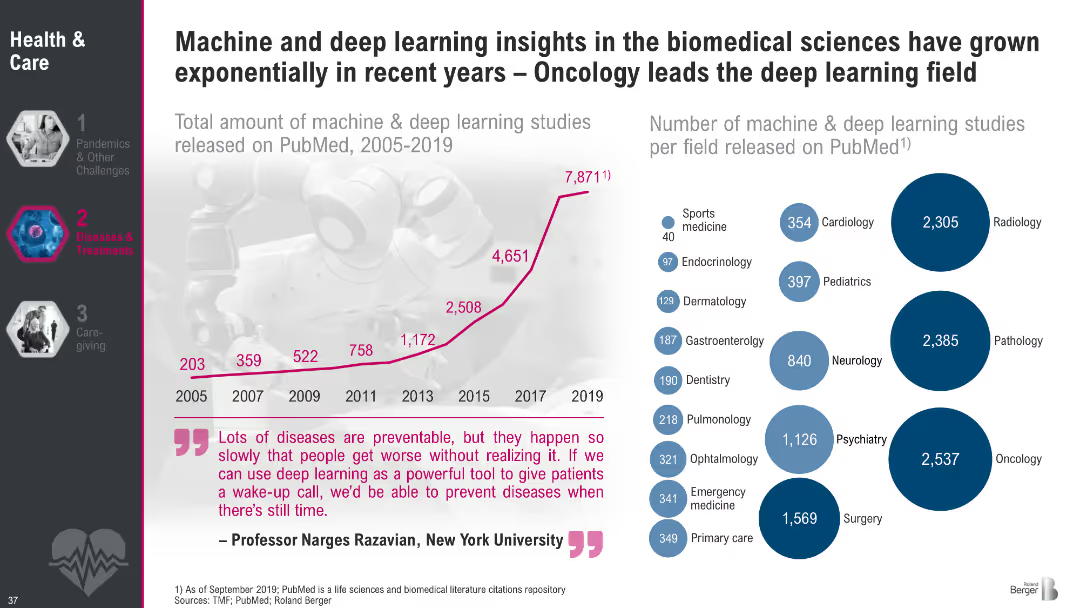
Left side shows a rising line graph of deep learning studies on PubMed (2005–2019); right side has a bubble chart of studies per medical field. Includes a prominent quote at the bottom.
Market Analysis and Trends
Artificial Intelligence
This slide demonstrates the exponential increase in machine and deep learning applications in biomedical research, particularly in oncology. It visualizes growth trends and fields most impacted, underscoring the transformative potential of AI in healthcare diagnostics and treatment.
deep learning, biomedical AI, oncology, PubMed, medical research, AI applications, machine learning, healthcare innovation
Multiple Chart
Roland Berger
Saved
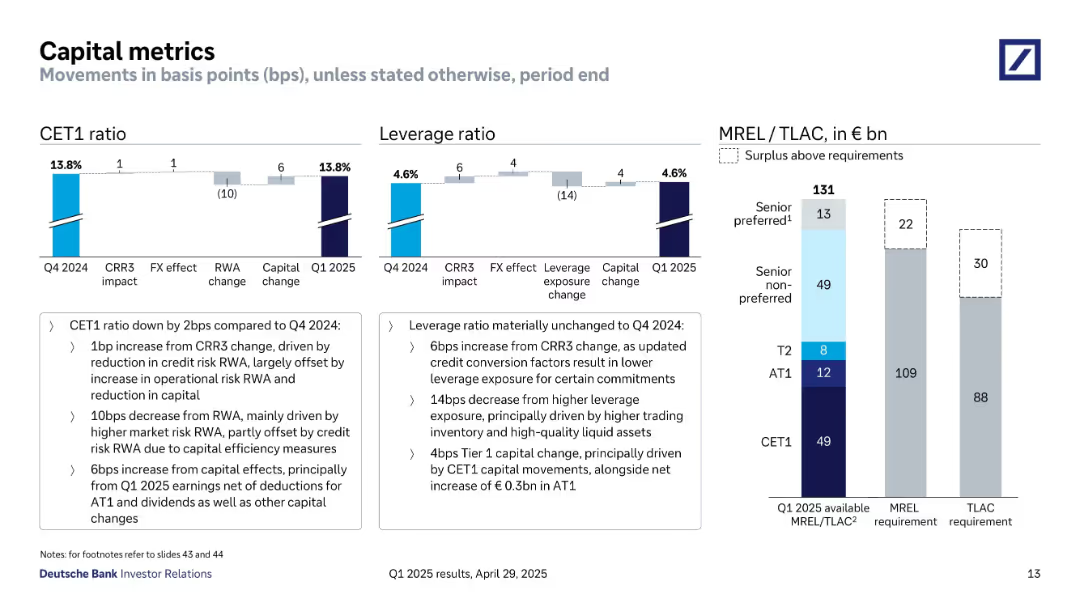
Bar and waterfall charts showing CET1 ratio, leverage ratio, and MREL/TLAC surplus; detailed annotations explain movements
Regulatory and Compliance
Financial Services
Provides a detailed overview of Deutsche Bank’s capital metrics as of Q1 2025. It includes movements in CET1 and leverage ratios and shows sufficient MREL/TLAC buffers above regulatory requirements.
CET1, leverage ratio, MREL, TLAC, regulatory capital, Deutsche Bank
Multiple Chart
Deutsche Bank
Saved
Contains a mix of text and a column chart titled 'Copernicus economic impact (2018)'. The layout is balanced with clear separation between textual information and visual data representation.
Market Analysis and Trends
Energy & Utilities
Discusses the economic impact of the oil and gas industry with a focus on the Copernicus program's contribution, highlighting sectors such as exploration and monitoring with benefits like cost savings and risk reduction.
Oil and Gas, Economic Impact, Exploration
Mixed Chart
PwC/Strategy&
Saved
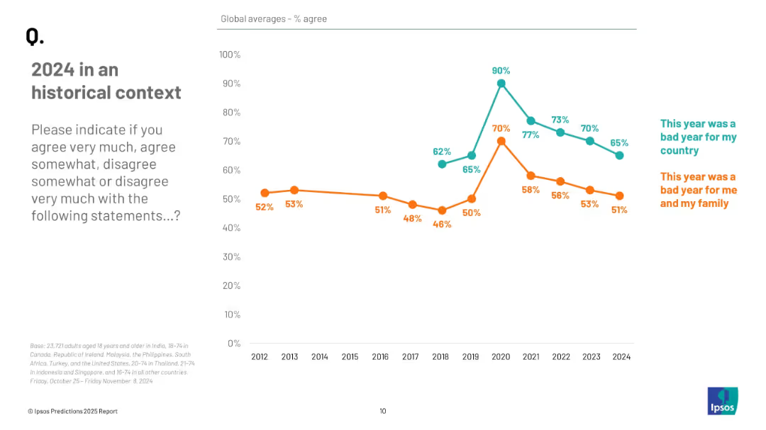
Line graph showing annual agreement trends from 2012 to 2024 for two statements, distinguished by color and labeled annotations.
Market Analysis and Trends
Professional Services
The slide shows longitudinal data on public agreement that 2024 was a bad year, both nationally and personally. Agreement levels have declined in recent years, peaking during 2020–2021, with 65% and 51% agreeing in 2024.
historical trends, public perception, 2024 reflection, sentiment analysis, Ipsos data, opinion tracking
Mixed Chart
IPSOS
Saved
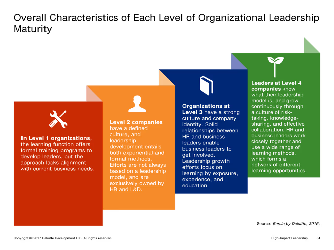
The slide shows a visual representation of different levels of organizational leadership maturity with distinct boxes for each level. Each box contains detailed text describing the characteristics of that level.
Market Analysis and Trends
Professional Services
It outlines the characteristics of organizations at different levels of leadership maturity, from Level 1 to Level 4. Each level's description highlights the leadership development approach and involvement of HR and business leaders.
Leadership, Organizational Maturity, Levels, Characteristics, Development
Pillar
Deloitte
Saved
The slide features a diagram with segments labeled and percentages indicating the distribution of assets between Seadrill's various entities. Adjacent to the chart, there's a list of bullet points detailing Seadrill's assets and partnerships. The overall color scheme is blue and yellow, reflecting the company branding, with the pie chart prominently positioned on the right, and text sections on the left. The chart's design is straightforward, with clear labels for each segment.
Industry Overview
Energy & Utilities
The slide provides a detailed overview of Seadrill's business structure, showing the breakdown of assets among its subsidiaries and partnerships. It lists specific figures, like the number of rigs and new builds, highlighting Seadrill's market presence and investment diversity. The slide aims to present a snapshot of the company’s core operations and strategic investments to stakeholders, possibly during an annual general meeting or investor briefing.
business, assets, Seadrill, partnerships, overview, investment, rigs, pie chart, structure, subsidiaries
Diagram
Barclays
Saved
Column chart showing the percentage of organizations currently using API management solutions, those planning to use, and those with no plans. The majority currently use API management solutions.
Operational Efficiency
Technology & Software
The slide presents statistics on the adoption of API management solutions by organizations, indicating that over two-thirds currently use these solutions, with a smaller percentage planning to adopt them in the future.
API management, adoption, organizations, statistics
Single Chart
Gartner
Saved
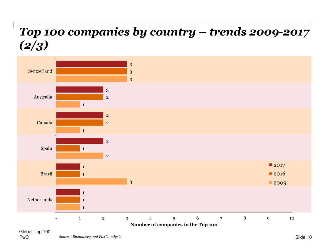
A bar chart showing the number of top 100 companies from Switzerland, Australia, Canada, Spain, Brazil, and Netherlands for the years 2009, 2016, and 2017. The bars are horizontal, indicating the companies’ counts per year per country.
Market Analysis and Trends
Financial Services
This slide displays the distribution of the top 100 companies by country over the years 2009, 2016, and 2017. It provides insights into the trends in different countries’ representation in the top 100 companies list, showing changes over time.
Top 100, companies, trends, countries, years, distribution, bar chart, financial analysis
Single Chart
PwC/Strategy&
Saved
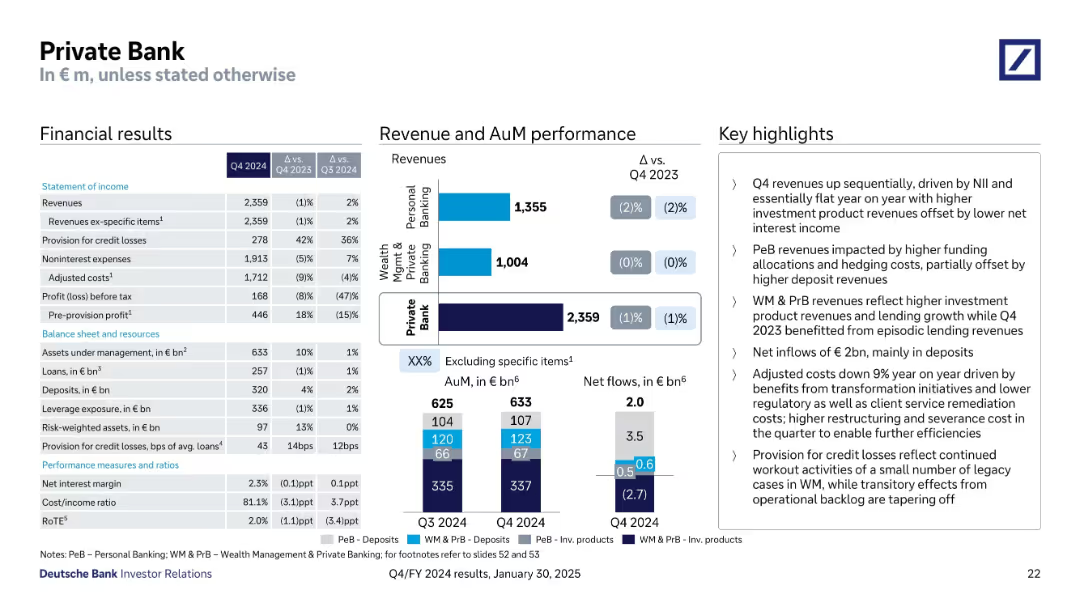
Layout includes financial tables, revenue performance bar charts, and AuM visuals with bullet-point notes
Financial Performance
Financial Services
This slide outlines the Private Bank’s Q4 2024 performance, indicating flat revenues YoY, net inflows of €2bn, and reduced adjusted costs. Revenue is broken down into Wealth Management and Personal Banking. Highlights mention higher deposit revenues, transformation benefits, and credit losses tied to legacy cases.
AuM, Revenues, Deposits, Credit Losses, Transformation, WM, PeB
Multiple Chart
Deutsche Bank
Saved
Column charts showing NPE ratios, NPE volumes, and loan loss provisions for top Greek banks.
Risk Assessment and Management
Financial Services
Details the progress of Greek banks in managing NPEs and loan loss provisions, focusing on financial stability and risk reduction.
Greece, banks, NPE, risk, management
Multiple Chart
Deloitte
Saved
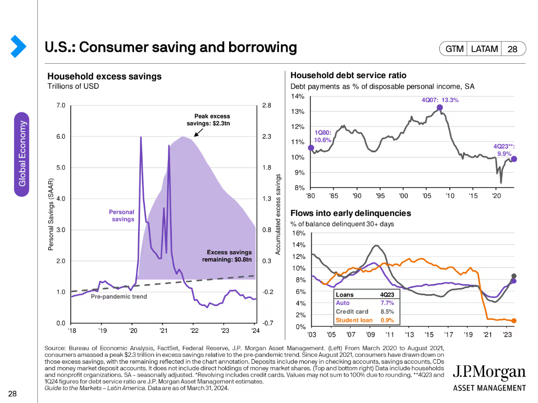
The slide contains three charts: a line chart showing household excess savings, another line chart depicting household debt service ratio, and a line chart for flows into early delinquencies for different loan types.
Market Analysis and Trends
Financial Services
This slide analyzes consumer savings and borrowing trends, highlighting excess savings, debt service ratios, and delinquency rates. Useful for understanding consumer financial health.
consumer savings, borrowing, debt service, delinquencies, financial health, household savings
Multiple Chart
JP Morgan
Saved
The slide contains two column charts. The first chart shows corporate cash as a percentage of current assets by sector. The second chart shows research & development and capital expenditure by sector.
Financial Performance
Financial Services
This slide details cash and capital expenditure in the United States by sector, focusing on corporate cash holdings and investment in research & development. It is used for financial performance analysis and strategic planning.
United States, cash, capital expenditure, sector, research & development, financial performance
Multiple Chart
JP Morgan
Saved
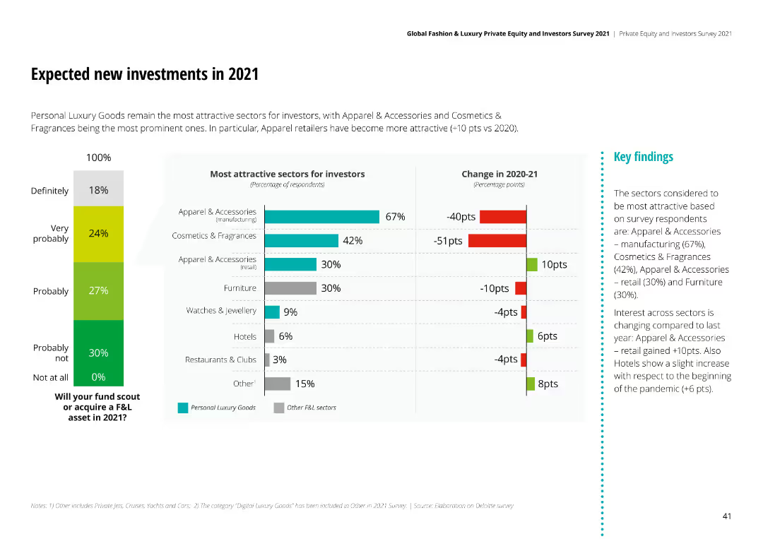
Column chart showing most attractive sectors for investors in 2021, with Apparel & Accessories and Cosmetics & Fragrances leading. Includes a change in 2020-21 sentiment chart.
Investment Analysis
Financial Services
Personal Luxury Goods sectors like Apparel & Accessories and Cosmetics & Fragrances are most attractive for 2021 investments, with significant sentiment changes from 2020.
new investments, 2021, sector attractiveness, investor perspective, sentiment change
Multiple Chart
Deloitte
Saved
Previous
Next
If nothing, comes up, please save your slides first
Create a FREE account to continue browsing
Receive Instant Access to 1,000+ slides from companies like McKinsey, Google, and Goldman Sachs
First Name
Last Name
Email
Password
I agree to all
Terms & Privacy Policy
Thank you! Your submission has been received!
Oops! Something went wrong while submitting the form.
Have an account?
Sign in
Column Chart
Heatmap
Chevron
Org Chart
Infographic
Callouts
Timeline
List
Graphic
Picture
Process Flow
Diagram
Paragraph
Map
Table
Framework
Subtitle
Takeaway Box
Icon
Other Chart
Radar Chart
Waterfall Chart
Mekko Chart
Pie Chart
Scatter Plot
Line Chart
Bar chart
Bullet points