Create a FREE Account
Instant access to 1,000+ real slides from top companies like McKinsey, BCG, Goldman Sachs, Google and many more!
First Name
Last Name
Email
Password
I agree to all
Terms & Privacy Policy
Thank you! Your submission has been received!
Oops! Something went wrong while submitting the form.
Have an account?
Sign in
Library
Templates
Courses
Pricing
My Account
My Slides
My Templates
✦ AI
AI Prompt Library
AI Search
Sign in
Start Here
Logout
My Saved Slides
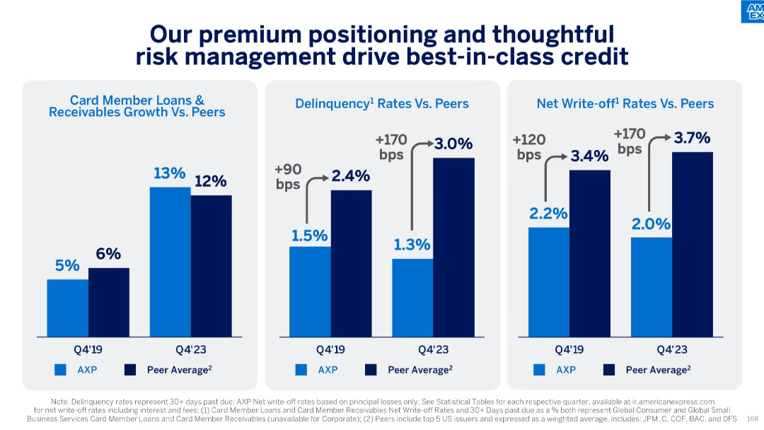
Three-panel bar chart comparing AXP vs peers in growth, delinquency, and write-off rates; Q4’19 vs Q4’23
Risk Assessment and Management
Financial Services
This slide shows American Express outperforming peers in card member loan growth while maintaining lower delinquency and write-off rates. It attributes success to superior credit risk management and premium customer base positioning.
credit risk, loan growth, delinquency, write-offs, peer comparison, premium strategy
Single Chart
McKinsey
Saved
This slide includes a column chart showing the CO2 capture rate per case, with three distinct bars (CO2 released, CO2 avoided, Extra CO2 captured).
Market Analysis and Trends
Energy & Utilities
The slide illustrates the CO2 capture rate and LCOH increase for brown H2 sources when coupled with CCS, highlighting the additional costs involved.
CO2 capture, LCOH, brown H2, CCS, emissions, costs
Single Chart
Kearney
Saved
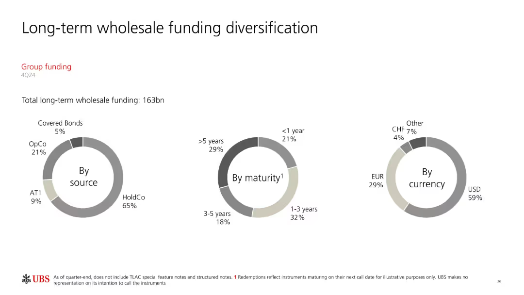
Three donut charts categorizing long-term funding (163bn) by source, maturity, and currency. Minimalist, data-centered layout.
Corporate Finance and Valuation
Financial Services
Visualizes the diversification of UBS’s long-term wholesale funding, identifying concentration by issuer type (e.g., HoldCo, OpCo), maturity horizon, and currency distribution. Highlights dependency on USD and long-term maturities.
wholesale funding, long-term debt, maturity, currency, HoldCo, UBS
Single Chart
UBS
Saved
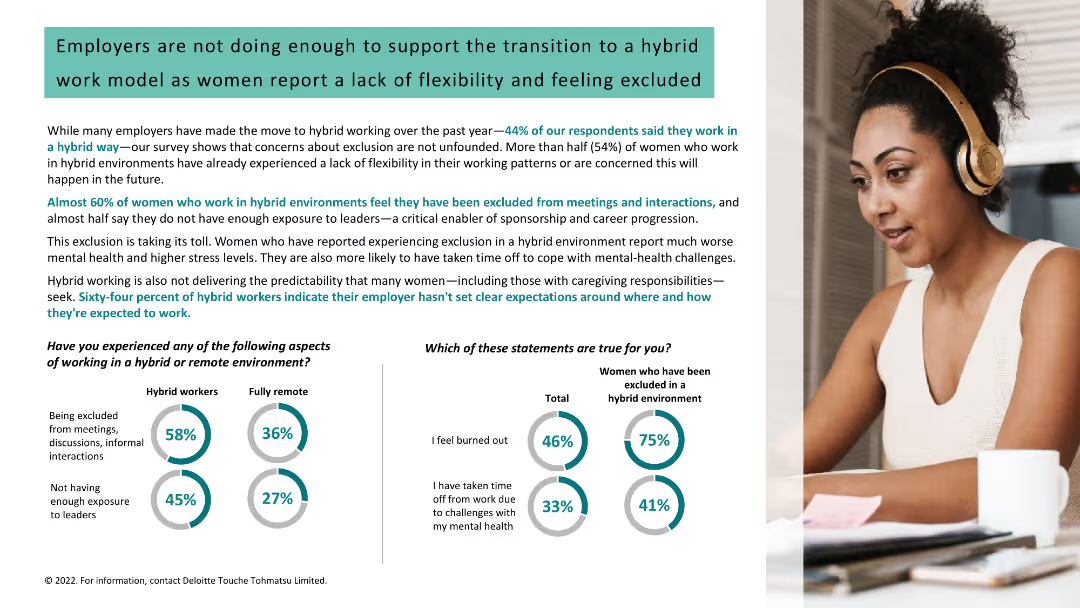
Column charts, text, and image of a woman with headphones. Data on exclusion, flexibility, mental health, and caregiving in hybrid vs. remote environments.
Human Resources and Talent Management
Professional Services
Discusses the exclusion and lack of flexibility for women in hybrid work environments and its impact on their mental health and stress levels.
hybrid work, flexibility, exclusion, mental health, stress, caregiving, women, support, employers
Multiple Chart
Deloitte
Saved
Contains a grid layout showing the maturity of loyalty programs across various industries with color-coded maturity levels.
Strategic Planning
Retail & E-commerce
Summarizes the state of loyalty programs in industries such as retail, CPG, and BFSI, suggesting potential for strategic improvements.
loyalty programs, industry comparison, strategic planning, maturity levels, grid
Table
BCG
Saved
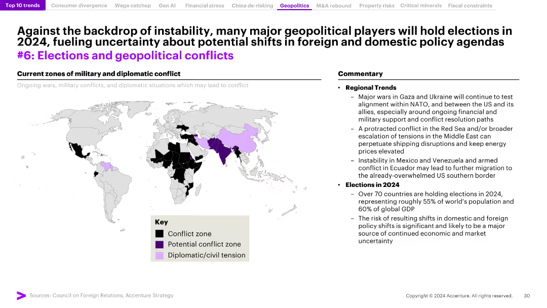
The slide features a world map highlighting zones of military and diplomatic conflict, and a commentary section detailing regional trends and upcoming elections.
Risk Assessment and Management
Government & Public Sector
The slide analyzes the impact of instability and elections on geopolitical conflicts, with a focus on regions experiencing conflict and the implications for 2024.
geopolitical conflicts, elections, instability, regional trends, conflict zones
Graphic
Accenture
Saved
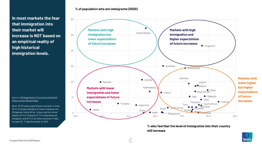
Scatterplot chart comparing % immigrants (X-axis) vs. % who expect increases (Y-axis); 4 labeled clusters of country groupings; bubble markers for countries.
Market Analysis and Trends
Government & Public Sector
The slide compares actual immigrant populations (2020 data) with public expectations of immigration increase. It highlights four quadrants, including countries with high/low immigration and high/low expectations. Main insight: fears about immigration aren't always aligned with data.
immigration reality, public fear, expectations, scatterplot, Ipsos, demographic comparison, market clusters, 2025 insights
Mixed Chart
IPSOS
Saved
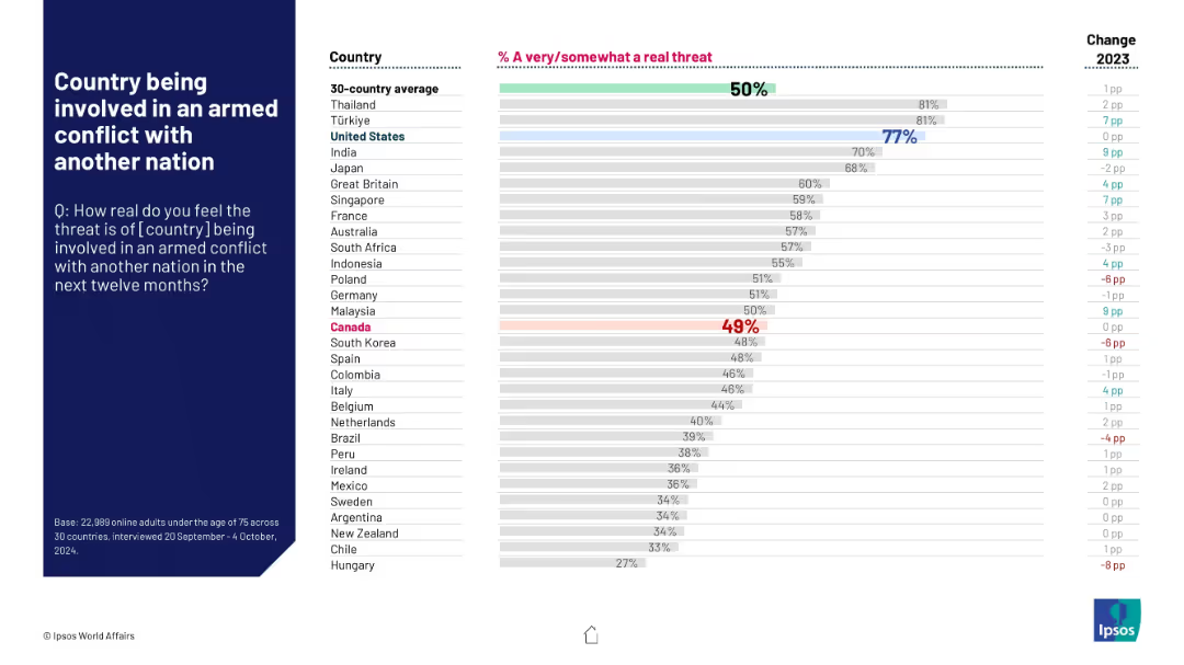
Horizontal bar graph showing public concern over potential armed conflicts; Canada slightly below average.
Risk Assessment and Management
Government & Public Sector
The slide ranks perceived threats of armed conflict across countries. The U.S. shows high concern (77%), contrasting with Canada’s 49%, which is marginally below the 50% global average.
armed conflict, international tensions, perception, Ipsos, 2024, survey, public opinion, Canada, U.S., war
Mixed Chart
IPSOS
Saved
This slide presents a straightforward column chart detailing the percentages of deskless workers feeling burned out and their job search intentions. The layout is minimalistic, focusing solely on the data presentation without extraneous visual elements, ensuring the statistics stand prominently against a clean background.
Human Resources and Talent Management
Professional Services
Provides a snapshot of the work-related burnout levels among deskless workers and their consequent job search behaviors. It highlights a significant issue within this workforce segment, stressing the need for corporate attention to employee well-being and job satisfaction to retain talent and maintain operational efficiency.
burnout, job satisfaction, deskless workers, employee retention, workforce management, job search behaviors
Multiple Chart
BCG
Saved
The slide features multiple bar charts comparing revenue impacts over two periods. Charts are color-coded and accompanied by insights and economic sector data.
Market Analysis and Trends
Professional Services
The slide analyzes revenue generated by business apps, highlighting variations across different sectors and revenue ranges, useful for assessing market impact and strategic planning.
revenue, apps, business impact, B2B, B2C, market analysis
Mixed Chart
Deloitte
Saved
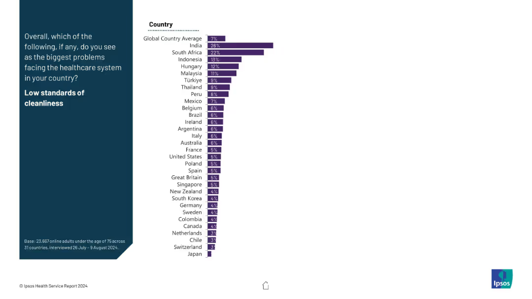
Two-column layout; left side features the question in white on dark blue background; right side has a horizontal bar chart ranking countries by percentage identifying low cleanliness standards as a major healthcare issue.
Risk Assessment and Management
Healthcare & Pharmaceuticals
This slide presents global public opinion on whether low cleanliness standards are a key healthcare issue. India (26%) and South Africa (22%) report the highest concern, far above the global average of 7%. Data is from a survey conducted across 31 countries.
healthcare, cleanliness, public opinion, global comparison, Ipsos, survey, healthcare issues, risk, standards
Mixed Chart
IPSOS
Saved
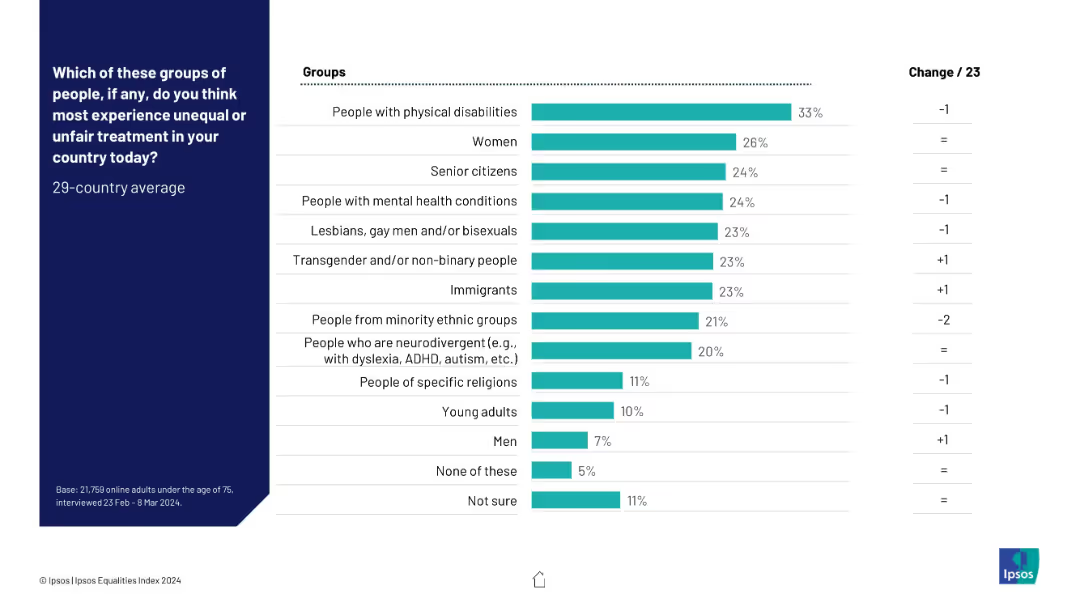
Horizontal bar chart ranking groups by perceived unfair treatment; turquoise bars; change column at right.
Risk Assessment and Management
Government & Public Sector
Respondents identified which groups they believe face the most unequal treatment in their country. People with physical disabilities, women, and senior citizens top the list, while men are seen as least affected.
discrimination, perceived inequality, vulnerable groups, Ipsos, fairness, treatment disparity
Mixed Chart
IPSOS
Saved
This slide features two pie charts illustrating different asset allocation strategies and a set of bar charts depicting their correlation with stocks and bonds.
Strategic Planning
Financial Services
Showcases alternative asset allocation models that balance performance with risk, pivotal for formulating a resilient investment strategy.
asset allocation, alternative investments, performance, risk management, pie charts, correlation analysis, strategy development
Multiple Chart
Morgan Stanley
Saved
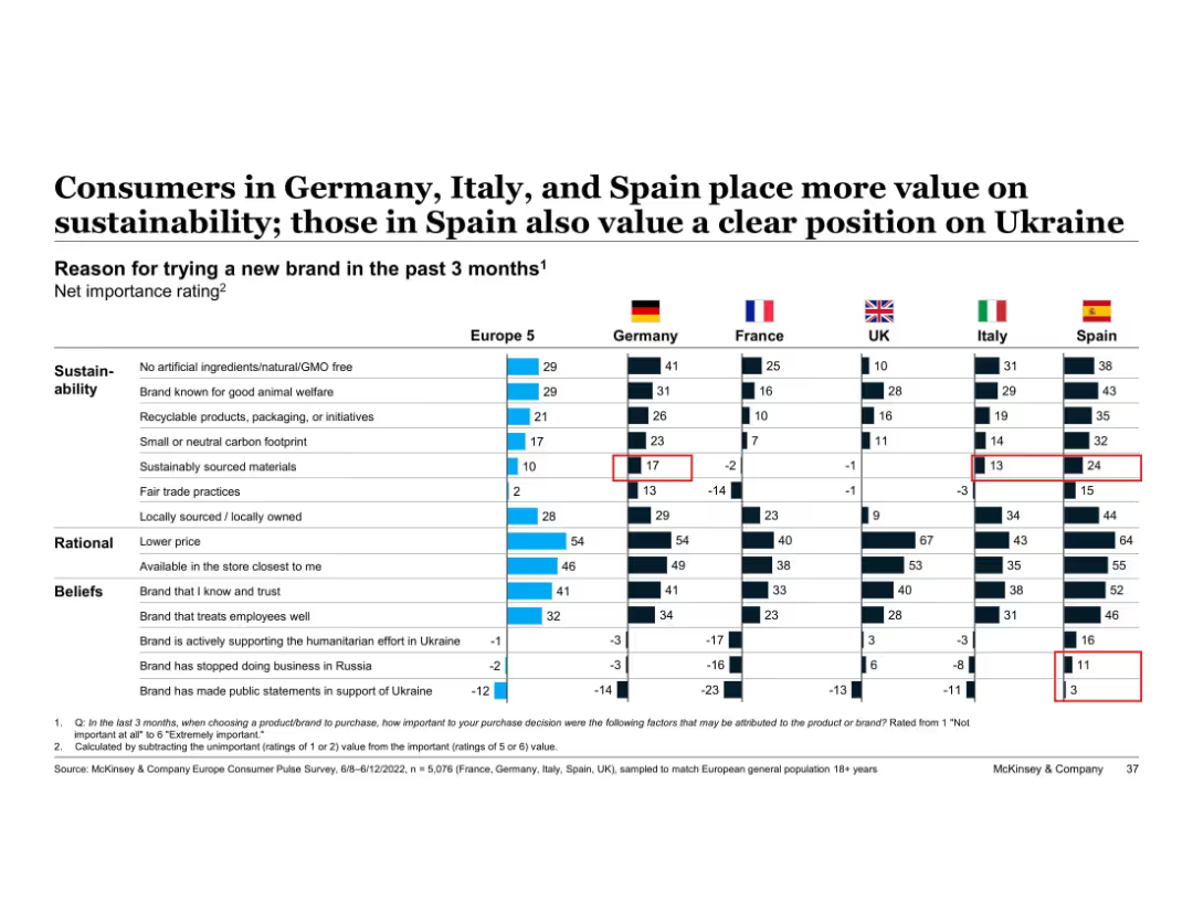
Table showing net importance ratings across five countries for brand trial reasons
Market Analysis and Trends
Consumer Goods
Shows comparative net importance ratings for why consumers tried new brands, across countries. Sustainability ranks high in Germany, Italy, and Spain; Spain also values brand stance on Ukraine.
sustainability, brand trial, international comparison, ethical values, Spain, Germany, consumer reasons, McKinsey
Single Chart
McKinsey
Saved
The slide is a mixture of column charts and color-coded segments, each representing a sector within Thailand's private funding landscape. It shows funding values from 2019 to H1 2023 and the number of deals, with a notable spike in H2 2022. The design employs a simple color scheme to differentiate sectors and effectively uses annotations to highlight key data points.
Investment Analysis
Financial Services
The content depicts the investment funding trends in Thailand, highlighting the return to typical levels after a substantial increase in the second half of 2022. It is useful for investors and financial analysts to assess the funding environment's normalcy and plan future investments in nascent sectors like travel, transport & food, digital media, e-commerce, and digital financial services (DFS).
Private Funding, Investment, Thailand, Trends, Sectors, E-commerce, DFS, Travel, Digital Media, Transport
Single Chart
Bain
Saved
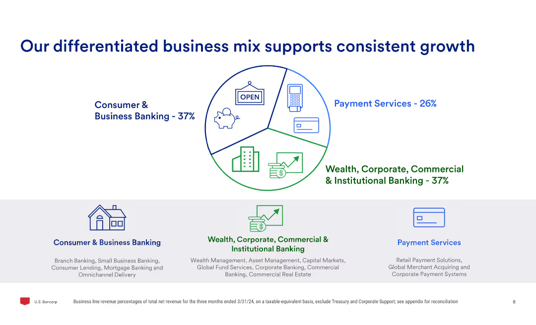
The slide uses a pie chart to show the business mix percentages and three sub-sections detailing consumer & business banking, payment services, and wealth, corporate, commercial & institutional banking.
Market Analysis and Trends
Financial Services
Highlights the company's diversified business model, showing the percentage contribution of different business segments and explaining the services offered in consumer & business banking, payment services, and institutional banking.
business mix, growth, banking, payment services, wealth, commercial, institutional, market analysis
Mixed Chart
Barclays
Saved
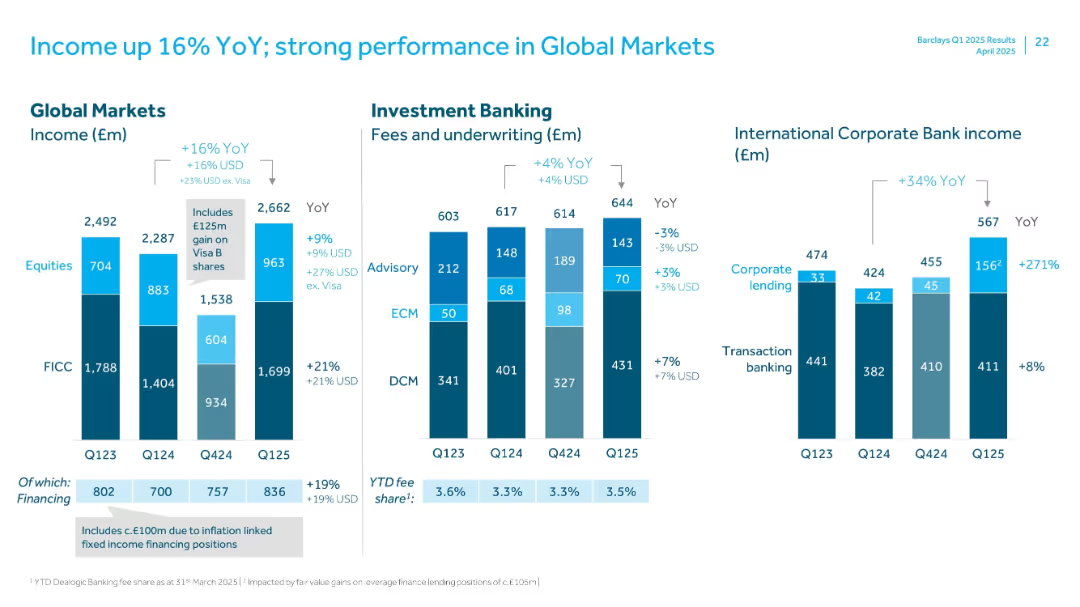
Detailed bar charts with segmented income by business lines including Global Markets and Investment Banking
Financial Performance
Financial Services
Illustrates strong income growth in Global Markets and Investment Banking with a 16% YoY rise. Highlights income sources (equities, FICC, advisory, ECM, DCM) and strong gains in International Corporate Bank.
Global Markets, YoY Income, Investment Banking, FICC, ECM, ICB, Equities, Q125
Multiple Chart
Barclays
Saved
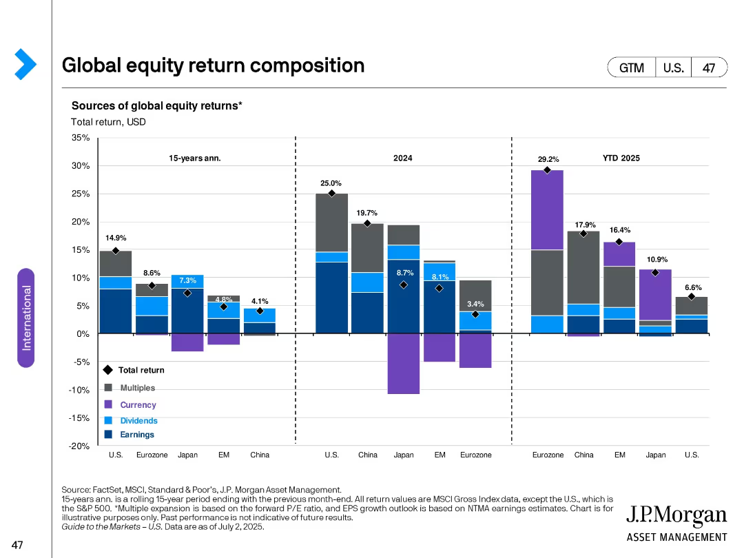
Stacked bar chart across three timeframes (15-yr avg, 2024, YTD 2025); segmented by region; color-coded by return type (multiples, currency, dividends, earnings).
Financial Performance
Financial Services
The slide analyzes sources of total global equity returns over different time periods and regions. It breaks down returns into components such as earnings, dividends, currency effects, and multiple expansions across major global markets.
equity returns, global markets, earnings, dividends, currency, valuations, historical performance, bar chart, international, U.S.
Single Chart
JP Morgan
Saved
The slide features a table ranking strategic priorities for hospitals over the next three years by importance. Each row represents a different priority, with columns showing responses from various countries and regions.
Strategic Planning
Healthcare & Pharmaceuticals
This slide outlines strategic priorities for hospitals in APAC over the next three years, ranked by importance. It highlights key areas such as healthcare worker safety, clinical outcomes, and labor efficiency.
strategic priorities, APAC, healthcare, hospitals, planning
Table
LEK
Saved
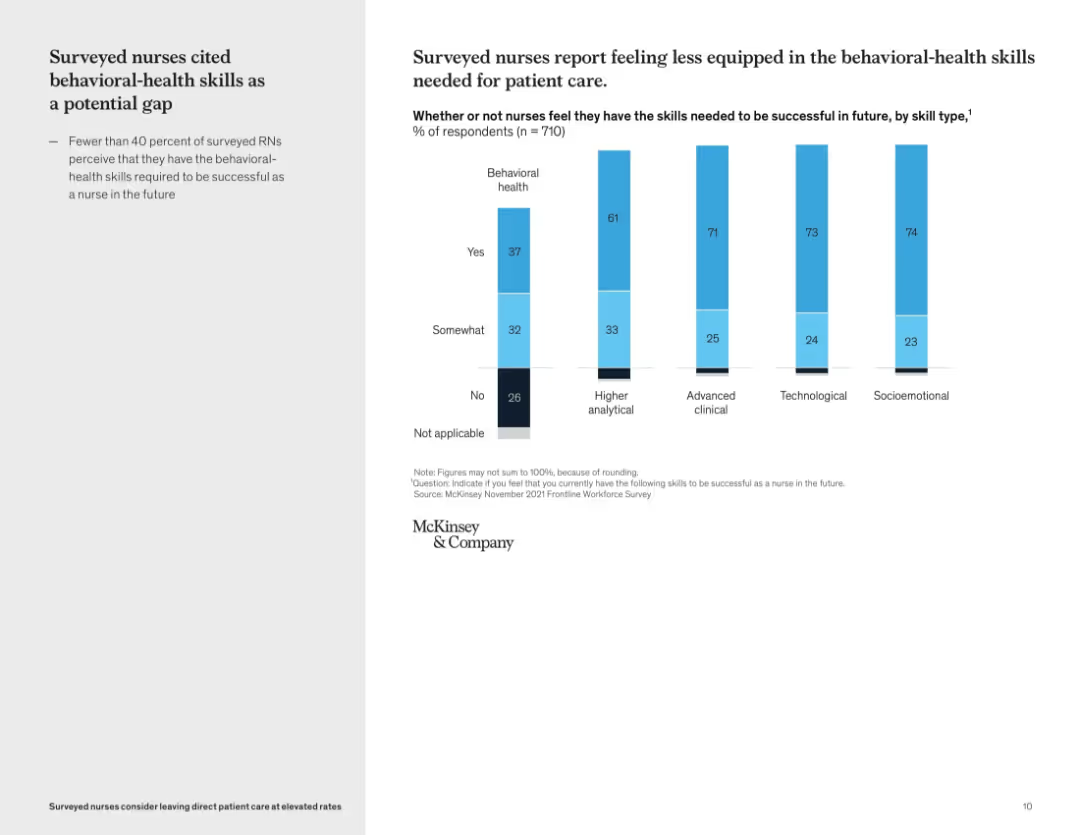
Vertical bar graph showing self-perceived skill gaps by skill type; left-side text summary
Organizational Structure and Change
Healthcare & Pharmaceuticals
This slide reveals that many nurses feel underprepared in behavioral-health skills compared to other domains like technological or clinical capabilities. Only 37% of nurses feel confident in their behavioral health skills, pointing to a critical development area for future readiness.
skills gap, behavioral health, workforce training, nursing education, competency assessment, professional development
Mixed Chart
McKinsey
Saved
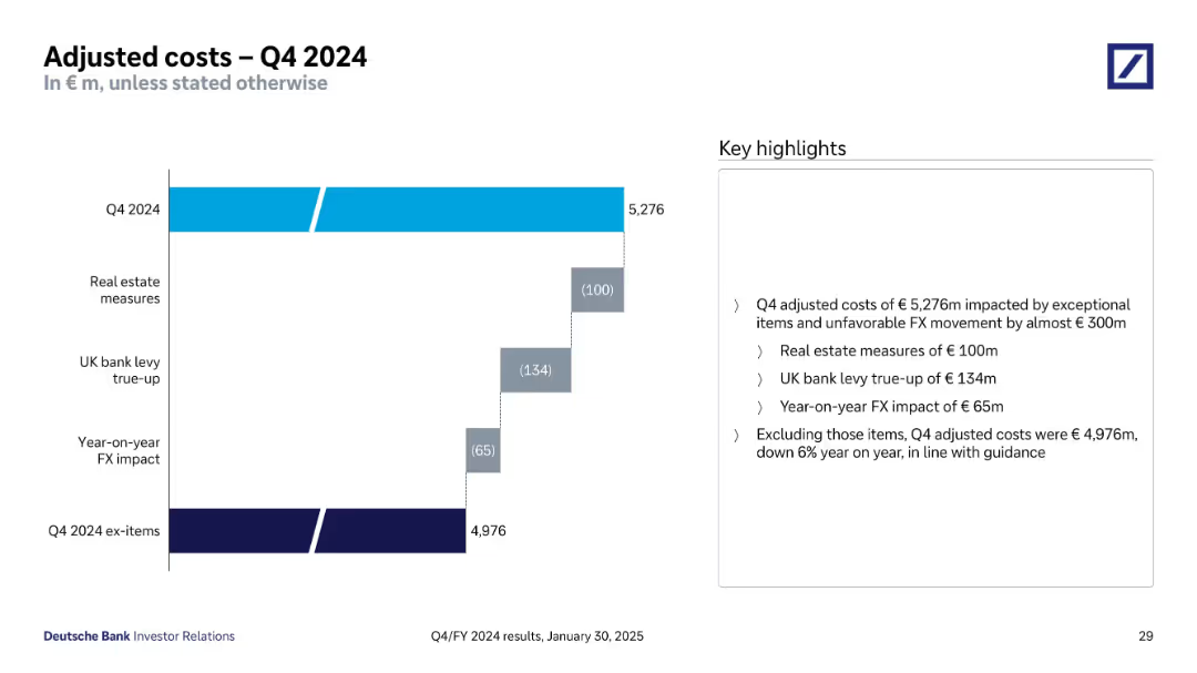
Waterfall chart showing Q4 2024 costs and exceptional item impacts; highlight bullets to the right
Operational Efficiency
Financial Services
This slide presents Q4 2024 adjusted costs of €5,276m, including exceptional items and FX impact totaling nearly €300m. A breakdown shows the impact of real estate measures, UK bank levy, and FX changes. Excluding these items, adjusted costs are €4,976m, down 6% YoY.
Adjusted Costs, Exceptional Items, FX Impact, Cost Reduction, Efficiency
Mixed Chart
Deutsche Bank
Saved
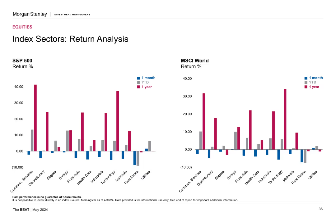
Two sets of bar charts comparing return percentages for the S&P 500 and MSCI World Index sectors over one month, YTD, and one year periods.
Financial Performance
Financial Services
The slide compares return analysis for sectors within the S&P 500 and MSCI World Index, showcasing performance over different time periods for comprehensive financial insights.
return, sectors, analysis, S&P 500, MSCI
Multiple Chart
Morgan Stanley
Saved
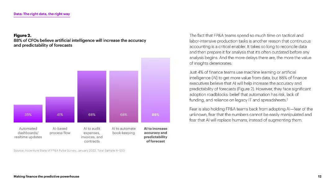
This slide features a column chart displaying the percentages of CFOs who believe AI will increase the accuracy and predictability of forecasts. The chart is presented in various shades of purple. The layout includes a paragraph of text explaining the implications of the chart.
Strategic Planning
Financial Services
The slide indicates that 88% of CFOs believe AI will improve forecast accuracy and predictability. It highlights the adoption roadblocks for AI in finance, such as risk and reliance on legacy systems.
AI, forecasts, CFOs, predictability, accuracy
Mixed Chart
Accenture
Saved
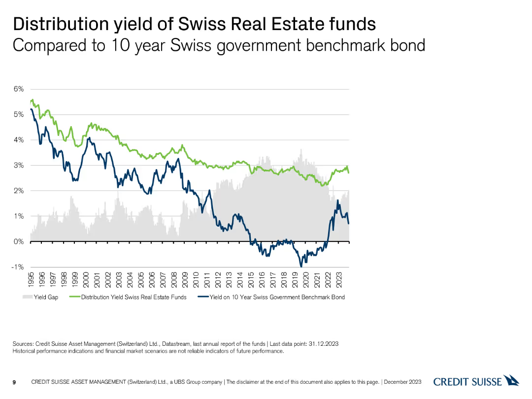
A line chart comparing the distribution yield of Swiss real estate funds to the 10-year Swiss government benchmark bond yield, with a highlighted yield gap.
Financial Performance
Financial Services
This slide analyzes the distribution yield of Swiss real estate funds in comparison to the 10-year Swiss government benchmark bond, highlighting the yield gap over time.
Distribution Yield, Government Bond, Yield Gap, Comparison
Single Chart
Credit Suisse
Saved
Features a timeline of major mergers, acquisitions, joint ventures, and partnerships in hydrogen technology from 2016 to 2019. Key events are highlighted with brief descriptions.
Mergers and Acquisitions
Energy & Utilities
Details the increasing interest of large corporations in hydrogen technology through various strategic partnerships and acquisitions over the years.
Hydrogen, M&A, joint ventures, partnerships, timeline, corporations, interest, technology
Linear Flow
Kearney
Saved
Previous
Next
If nothing, comes up, please save your slides first
Create a FREE account to continue browsing
Receive Instant Access to 1,000+ slides from companies like McKinsey, Google, and Goldman Sachs
First Name
Last Name
Email
Password
I agree to all
Terms & Privacy Policy
Thank you! Your submission has been received!
Oops! Something went wrong while submitting the form.
Have an account?
Sign in
Column Chart
Heatmap
Chevron
Org Chart
Infographic
Callouts
Timeline
List
Graphic
Picture
Process Flow
Diagram
Paragraph
Map
Table
Framework
Subtitle
Takeaway Box
Icon
Other Chart
Radar Chart
Waterfall Chart
Mekko Chart
Pie Chart
Scatter Plot
Line Chart
Bar chart
Bullet points