Create a FREE Account
Instant access to 1,000+ real slides from top companies like McKinsey, BCG, Goldman Sachs, Google and many more!
First Name
Last Name
Email
Password
I agree to all
Terms & Privacy Policy
Thank you! Your submission has been received!
Oops! Something went wrong while submitting the form.
Have an account?
Sign in
Library
Templates
Courses
Pricing
My Account
My Slides
My Templates
✦ AI
AI Prompt Library
AI Search
Sign in
Start Here
Logout
My Saved Slides
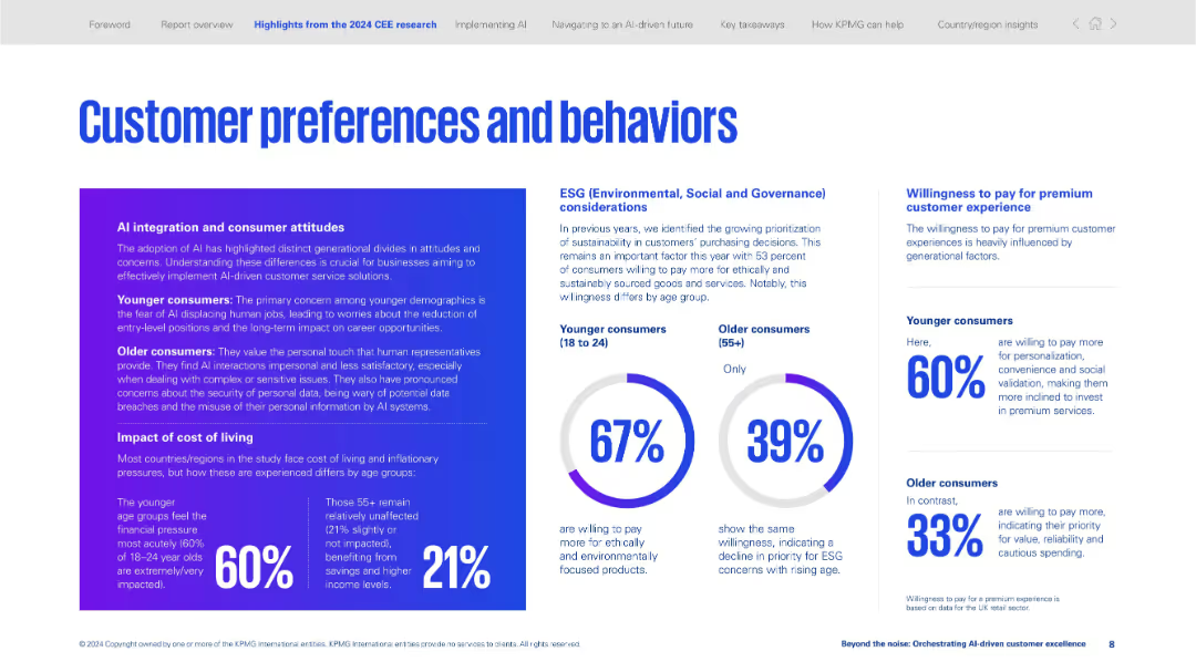
Three-column layout with infographics, text boxes, and circular data visualizations on ESG and cost-of-living impact.
Customer and Market Segmentation
Professional Services
Examines generational attitudes toward AI, cost-of-living sensitivity, and ESG preferences. Younger consumers are more impacted and more willing to pay for personalization and sustainability.
AI attitudes, ESG, generational segmentation, personalization, premium experience, cost of living, consumer behavior, sustainability
Mixed Chart
KPMG
Saved
The slide has a balanced composition with text on the left and logos of strategic acquisitions on the right, along with additional descriptive details below.
Strategic Planning
Environmental Services & Sustainability
This McKinsey slide highlights their investments and innovations aimed at achieving net-zero emissions. It outlines the firm's strategic moves, including partnerships and acquisitions, to lead in sustainability consulting and transformation services.
Net Zero, Sustainability, Investments, McKinsey, Climate Change
Text Only
McKinsey
Saved
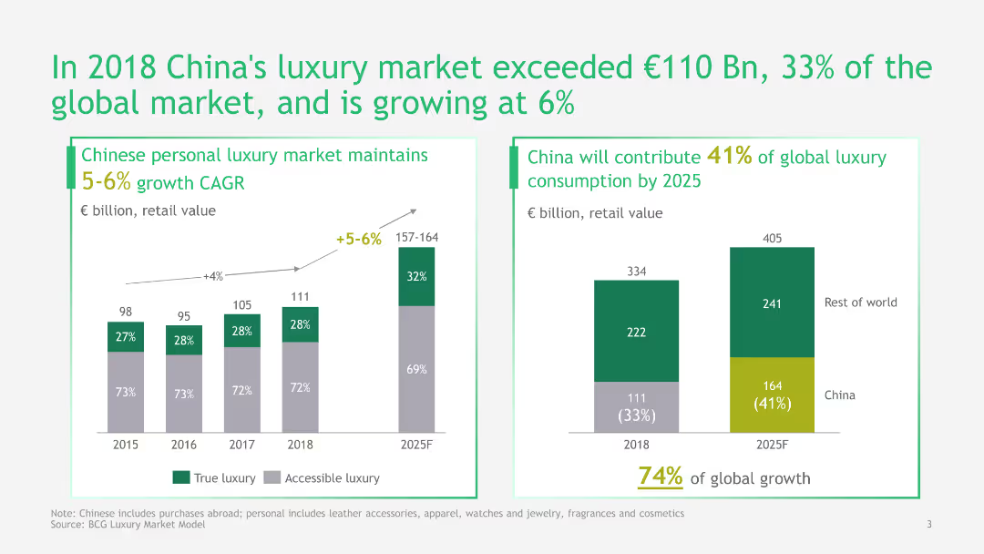
This slide features a column chart and a pie chart to illustrate China's growth in the luxury market. It uses green and gray colors and includes detailed data points and projections.
Market Analysis and Trends
Consumer Goods
The slide provides an analysis of China's luxury market growth, its contribution to the global market, and future projections, highlighting significant market trends and growth rates.
Luxury Market, China, Growth, Global Market, Projections, Data, Analysis, Trends, Retail
Multiple Chart
BCG
Saved
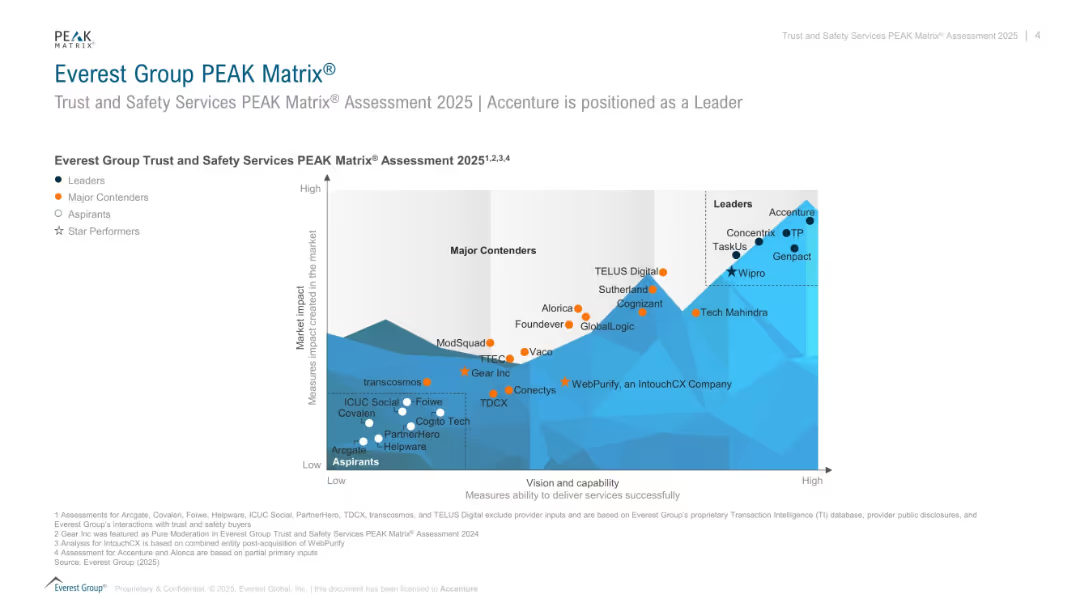
Scatterplot matrix comparing companies on “vision and capability” vs. “market impact” in trust & safety services; color-coded by tier.
Competitive Landscape
Technology & Software
Shows the positioning of companies offering trust and safety services in the 2025 PEAK Matrix. Leaders like Accenture and Concentrix score high in both capability and impact. Includes Major Contenders, Aspirants, and Star Performers.
PEAK Matrix, trust and safety, service providers, Accenture, capability, market impact, rankings
Single Chart
Accenture
Saved
Three sections comparing historical growth, IRA impact, and forecast growth for solar energy
Market Analysis and Trends
Energy & Utilities
Analyzes the growth of solar energy despite challenges in 2022, emphasizing the impact of the IRA and future forecast
solar energy, growth, IRA, historical dynamics, forecast
Multiple Chart
LEK
Saved
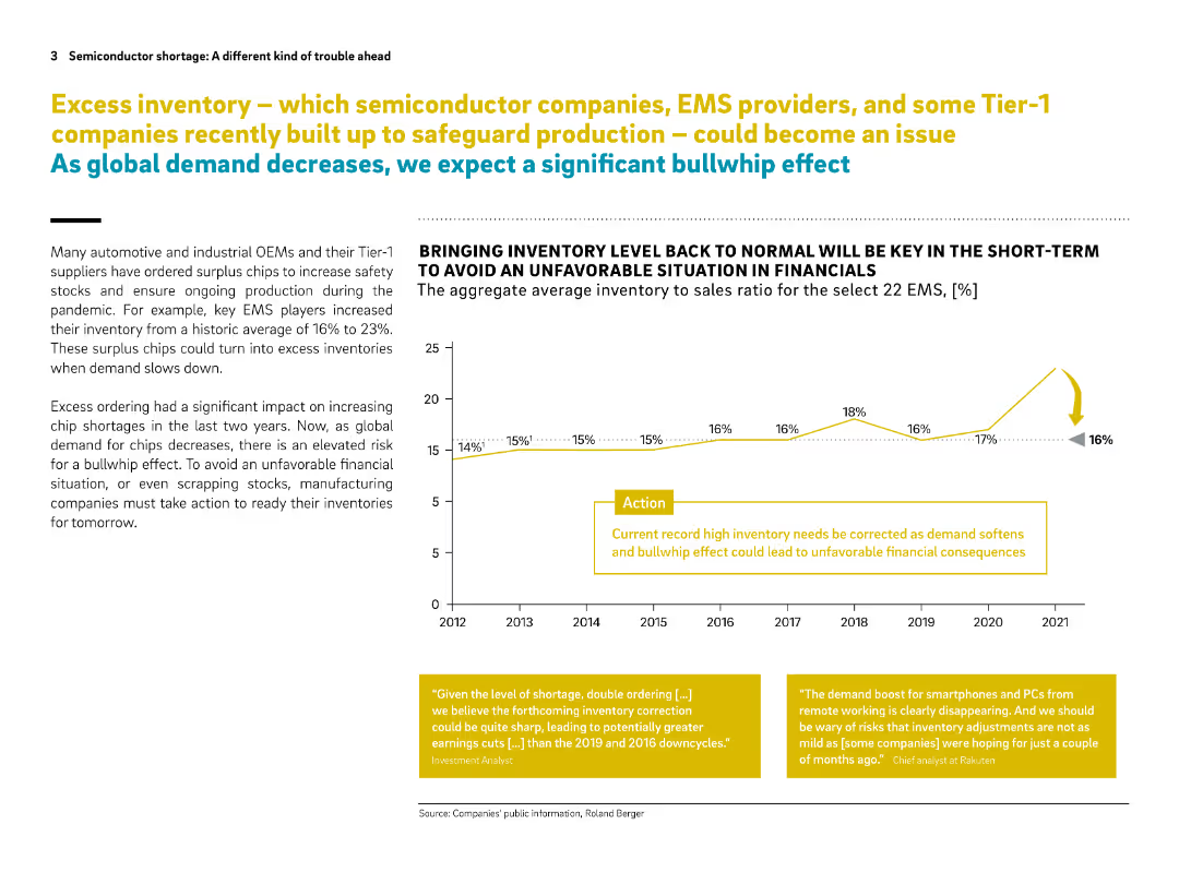
Two-column layout with a line chart on the right, text on the left, and yellow highlight boxes. Clean design with strong visual cues.
Risk Assessment and Management
Technology & Software
The slide discusses how excess inventory of semiconductor chips—accumulated by EMS and Tier-1 suppliers during the pandemic—could lead to financial trouble as demand drops. A "bullwhip effect" is predicted unless inventory levels are corrected. A chart shows inventory to sales ratio trends.
semiconductor, EMS, inventory, bullwhip effect, chip shortage, demand drop, financial risk, OEMs, pandemic, surplus chips
Mixed Chart
Roland Berger
Saved
Pie charts and statistic blocks highlighting customer data interaction and trust issues.
Strategic Planning
Professional Services
Discusses how strategic data use can improve customer relations and retention, focusing on trust and personalization in business approaches.
data use, customer trust, strategic plan
Multiple Chart
BCG
Saved
Three vertical column charts showing CET1 capital development, risk-weighted assets, and leverage ratio denominator for Q3-Q4 2023.
Financial Performance
Financial Services
Analyzes UBS Group AG's CET1 capital changes, risk-weighted assets, and leverage ratio denominator, providing insights into financial health.
UBS, CET1, capital, RWA, LRD, risk-weighted assets, leverage ratio, financial health, analysis
Multiple Chart
UBS
Saved
This slide contains column charts of tax-equivalent yields for various bonds and a second chart for the 5-year correlation with municipal bonds, highlighting investment attractiveness.
Investment Analysis
Financial Services
The slide provides a tax-equivalent yield analysis for various bonds and their correlation, offering insights for tax planning and investment attractiveness in municipal bonds.
tax-equivalent yield, bonds, investment analysis, tax planning, 5-year correlation, municipal bonds, finance
Multiple Chart
Morgan Stanley
Saved
Circular graphs, column chart, minimalistic design with green and blue tones. Clear visual hierarchy.
Customer and Market Segmentation
Telecommunications
Focuses on employee satisfaction surveys and their correlation to customer satisfaction across different regions.
employee satisfaction, surveys, customer service, regions
Multiple Chart
Deloitte
Saved
A pie chart labeled "2018 Sales Mix" showing Eaton's business divisions and sales distribution among different sectors such as vehicle, aerospace, and electrical products.
Market Analysis and Trends
Industrial & Manufacturing
Showcases the sales distribution across Eaton's diverse business units, aligning with market trends and highlighting Eaton's strategic positions in multiple sectors.
sales distribution, Eaton, market trends, business units
Mixed Chart
Deutsche Bank
Saved
A three-column layout with a circular flow chart in the center, bullet lists, and numerical data points. Each column corresponds to clients, businesses, and performance metrics, respectively. The design is clean with a mix of icons and text.
Industry Overview
Financial Services
Showcasing the scope of JPMorgan's Securities Services, the slide details the client types, services offered, and significant numerical achievements like revenue and market reach. It's aimed at providing a quick, comprehensive look at the strategic position and success of the division within the CIB.
securities, clients, businesses, performance, revenue, market, custody, management
Diagram
JP Morgan
Saved
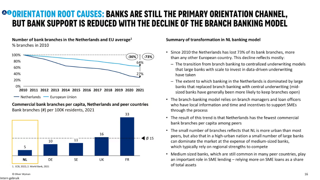
Line chart showing decline of bank branches, bar chart on branches per capita, and bullet insights explaining shifts in NL banking model.
Strategic Planning
Financial Services
The slide analyzes the structural change in the Dutch banking system, noting a 73% decline in bank branches since 2010. It explores how centralized underwriting by large banks has replaced local branch models, limiting SME support.
banking model, NL, branch decline, underwriting, orientation, support
Mixed Chart
Oliver Wyman
Saved
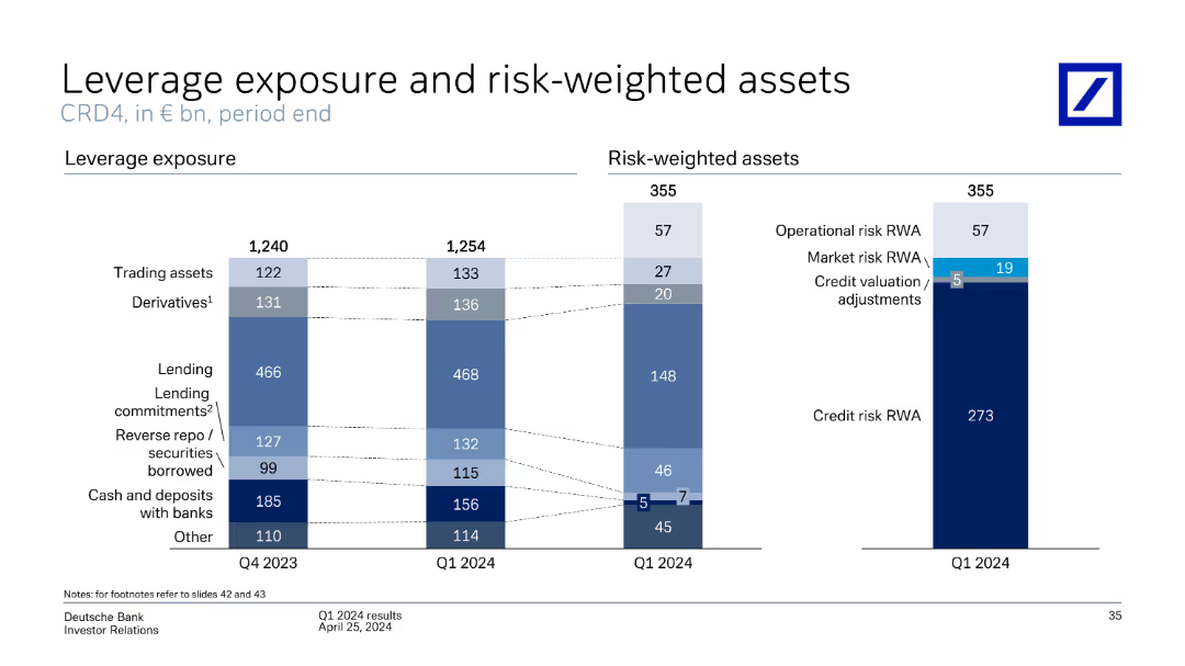
The slide contains two column charts comparing leverage exposure and risk-weighted assets for Q4 2023 and Q1 2024, broken down by categories like trading assets, derivatives, lending, etc.
Financial Performance
Financial Services
Compares leverage exposure and risk-weighted assets over two quarters, highlighting changes in various asset categories, and includes credit risk evaluation.
leverage, exposure, risk-weighted, assets, derivatives, lending, credit risk, trading assets
Multiple Chart
Deutsche Bank
Saved
Compares the weekly study hours before and after solar power adoption in Nigerian boarding schools, using column charts to visualize the data.
Strategic Planning
Education & Training
Highlights the effectiveness of solar power in increasing study hours at night, presenting data that shows enhanced educational outcomes and improved academic performance among students.
education, solar power, Nigeria, boarding schools, study hours, night studies, academic improvement
Mixed Chart
BCG
Saved
A dense, color-coded table displays annual asset performance from 1999 to 2023. Various asset classes are represented in colored squares, forming a grid that provides a visual performance history. Below, the source information is cited.
Investment Analysis
Financial Services
The slide is a comprehensive visual representation of the relative performance of various asset classes over a 25-year period, serving as a valuable tool for investment analysis and understanding market trends.
Asset performance, investment analysis, market trends, historical data, annual comparison, asset classes, financial history, relative performance, market research, data visualization
Table
Morgan Stanley
Saved
The slide features two column charts comparing the number and proceeds of IPOs across various sectors for Q1 2023 and Q1 2022. Colors differentiate the years, with specific focus on technology and energy sectors.
Market Analysis and Trends
Financial Services
The slide presents a comparison of IPO activities across different sectors in Q1 2023 versus Q1 2022, highlighting the dominance of the energy sector in proceeds despite fewer deals.
IPOs, sectors, technology, energy, Q1 2023, column charts, market trends, financial services, comparison, proceeds
Multiple Chart
EY
Saved
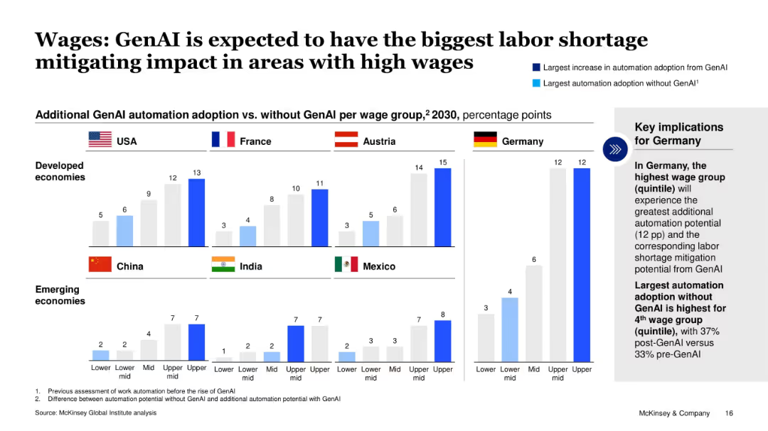
Comparative bar charts showing GenAI-driven automation adoption by wage group and country; includes key takeaway box for Germany.
Strategic Planning
Artificial Intelligence
The slide illustrates how GenAI adoption will disproportionately impact high-wage groups across various developed and emerging economies, particularly in Germany, by mitigating labor shortages. It contrasts automation potential with and without GenAI, showing significant gains in higher wage quintiles.
GenAI, labor shortage, automation, wage groups, Germany, high-income, workforce, 2030, impact
Mixed Chart
McKinsey
Saved
The slide has two distinct sections: on the left, a vertical list of competitive advantages with dark blue horizontal bars; on the right, future goals with numeric rankings and bullet points.
Strategic Planning
Financial Services
The slide presents key advantages that position the company for future growth and outlines specific forward goals with rankings in various financial sectors.
competitive, advantages, growth, financial, banking, market share, execution, global reach, trusted advisor
Table
Goldman Sachs
Saved
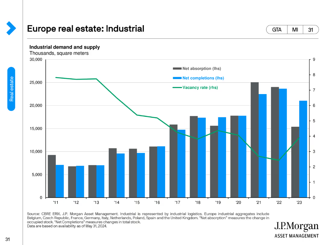
The slide includes a column chart showing net absorption, net completions, and vacancy rate trends in thousands of square meters for industrial demand.
Market Analysis and Trends
Real Estate & Construction
It examines industrial demand and supply metrics, illustrating trends in net absorption, net completions, and vacancy rates, useful for market trends.
real estate, industrial, demand, supply, net absorption, completions, vacancy rate, trends
Single Chart
JP Morgan
Saved
Consists of dense texts and pie charts in blue and green, summarizing AI's impact on various financial processes.
Operational Efficiency
Financial Services
Reviews the application of AI in financial services, emphasizing its role in improving customer experience and optimizing operational and financial processes, particularly highlighting trends in automation and data privacy.
AI, financial services, customer experience, operations, optimization
Multiple Chart
Deloitte
Saved
The slide is divided into three main sections. The left side shows key financial targets, the middle provides strategic directives, and the right side features a circular diagram of business areas.
Strategic Planning
Financial Services
Focuses on Deutsche Bank's strategy to strengthen its position as a Global Hausbank by managing resources effectively, with a forecast on capital and future growth areas.
strategy, capital management, growth, banking, global
Linear Flow
Deutsche Bank
Saved
The slide features a flowchart diagram that outlines the main pathways of CCUS technologies, including both utilization (CCU) and storage (CCS) processes. Different applications and processes are clearly labeled.
Technology and Digital Transformation
Energy & Utilities
This slide provides a comprehensive overview of the various pathways through which CCUS technologies can either utilize or store carbon dioxide, illustrating the diversity and complexity of these technologies.
CCUS, carbon utilization, carbon storage, pathways, technology overview
Diagram
Kearney
Saved
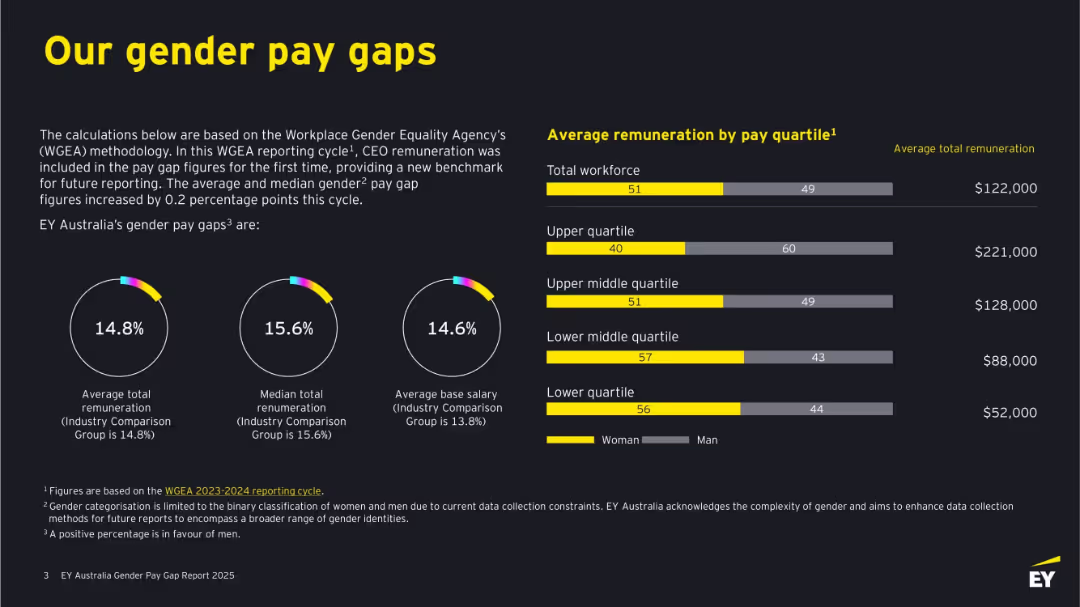
Dark background with bold yellow and white text. Features circular graphs, bar charts, and figures. Clearly divided into left-side text explanations and right-side remuneration bars by quartile.
Human Resources and Talent Management
Professional Services
This slide outlines EY Australia's gender pay gaps based on WGEA methodology, including total and median remuneration and base salary differences. It shows visual comparisons by gender across pay quartiles, revealing gaps in compensation and detailing where discrepancies occur. It emphasizes benchmarking against industry standards.
gender pay gap, remuneration, WGEA, EY Australia, salary, pay quartiles, workforce, diversity, women, equality
Multiple Chart
EY
Saved
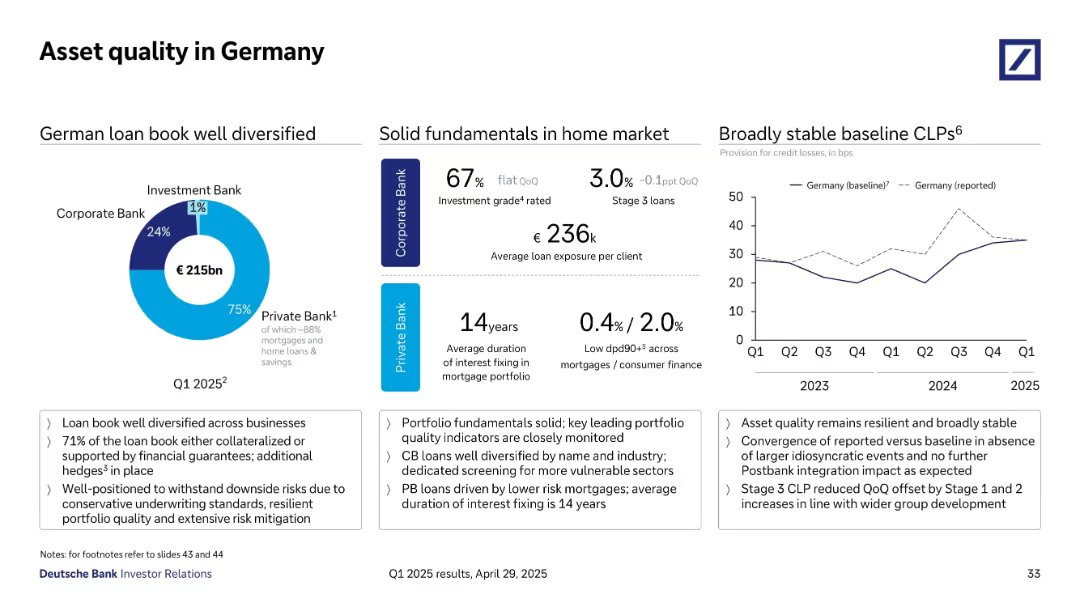
Divided layout with pie chart (loan distribution), data points (ratings, durations), and a line graph showing credit loss trends over time.
Risk Assessment and Management
Financial Services
The slide assesses German asset quality, emphasizing a well-diversified loan book totaling €215bn, predominantly in the Private Bank. Key indicators such as investment grade share, average loan size, and Stage 3 loan percentages are presented, alongside a trend graph showing stable provision for credit losses since 2023.
asset quality, Germany, diversification, CLP trends, loan performance
Multiple Chart
Deutsche Bank
Saved
Previous
Next
If nothing, comes up, please save your slides first
Create a FREE account to continue browsing
Receive Instant Access to 1,000+ slides from companies like McKinsey, Google, and Goldman Sachs
First Name
Last Name
Email
Password
I agree to all
Terms & Privacy Policy
Thank you! Your submission has been received!
Oops! Something went wrong while submitting the form.
Have an account?
Sign in
Column Chart
Heatmap
Chevron
Org Chart
Infographic
Callouts
Timeline
List
Graphic
Picture
Process Flow
Diagram
Paragraph
Map
Table
Framework
Subtitle
Takeaway Box
Icon
Other Chart
Radar Chart
Waterfall Chart
Mekko Chart
Pie Chart
Scatter Plot
Line Chart
Bar chart
Bullet points