Create a FREE Account
Instant access to 1,000+ real slides from top companies like McKinsey, BCG, Goldman Sachs, Google and many more!
First Name
Last Name
Email
Password
I agree to all
Terms & Privacy Policy
Thank you! Your submission has been received!
Oops! Something went wrong while submitting the form.
Have an account?
Sign in
Library
Templates
Courses
Pricing
My Account
My Slides
My Templates
✦ AI
AI Prompt Library
AI Search
Sign in
Start Here
Logout
My Saved Slides
Column charts showing car-buying intent and timing; segmented by new and used cars
Market Analysis and Trends
Consumer Goods
Analyzes the intent to buy cars among respondents, highlighting trends and timelines for new and used cars
Car-buying, intent, new cars, used cars, trends
Multiple Chart
EY
Saved
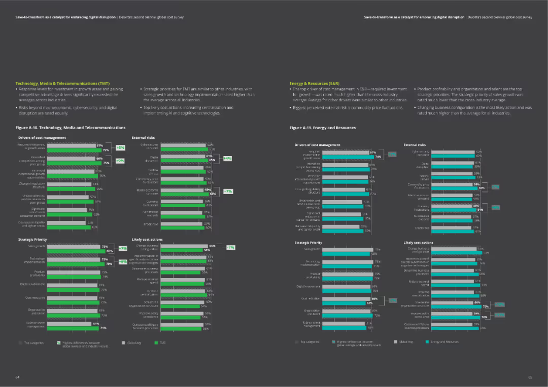
The slide includes two column charts comparing drivers of cost management, external risks, strategic priorities, and likely cost actions for Technology, Media & Telecommunications, and Energy & Resources.
Market Analysis and Trends
Professional Services
Provides detailed comparisons of cost management factors in TMT and Energy sectors. Useful for identifying key areas of focus and potential actions.
TMT, energy, cost drivers, risks, actions, priorities
Multiple Chart
Deloitte
Saved
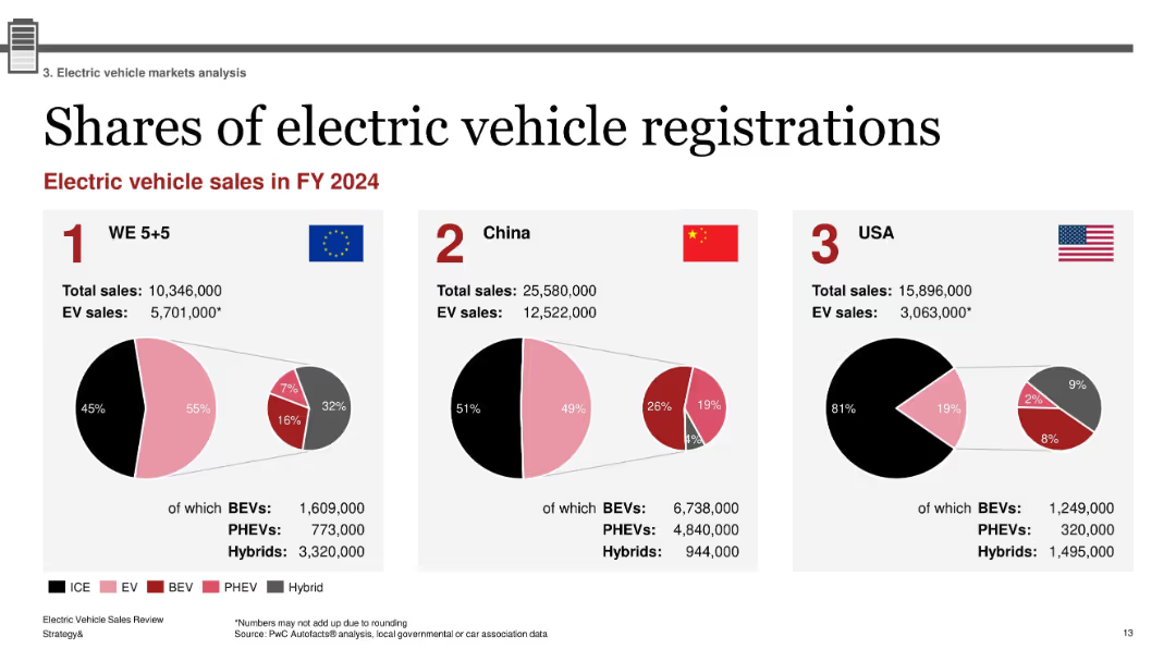
Three-part layout with pie charts for WE 5+5, China, and USA; flags and national data; red-pink-black hybrid color scheme with category breakout
Market Analysis and Trends
Industrial & Manufacturing
This slide compares electric vehicle registrations in FY2024 across Western Europe, China, and the USA. Each region’s total and EV sales are provided, with breakdowns into BEVs, PHEVs, and Hybrids. China leads in absolute numbers, while Western Europe shows the highest EV share percentage. The visualization highlights regional market penetration and composition.
EV registrations, BEV, PHEV, hybrid market, regional comparison, 2024 sales, WE5+5, China, USA
Single Chart
PwC/Strategy&
Saved
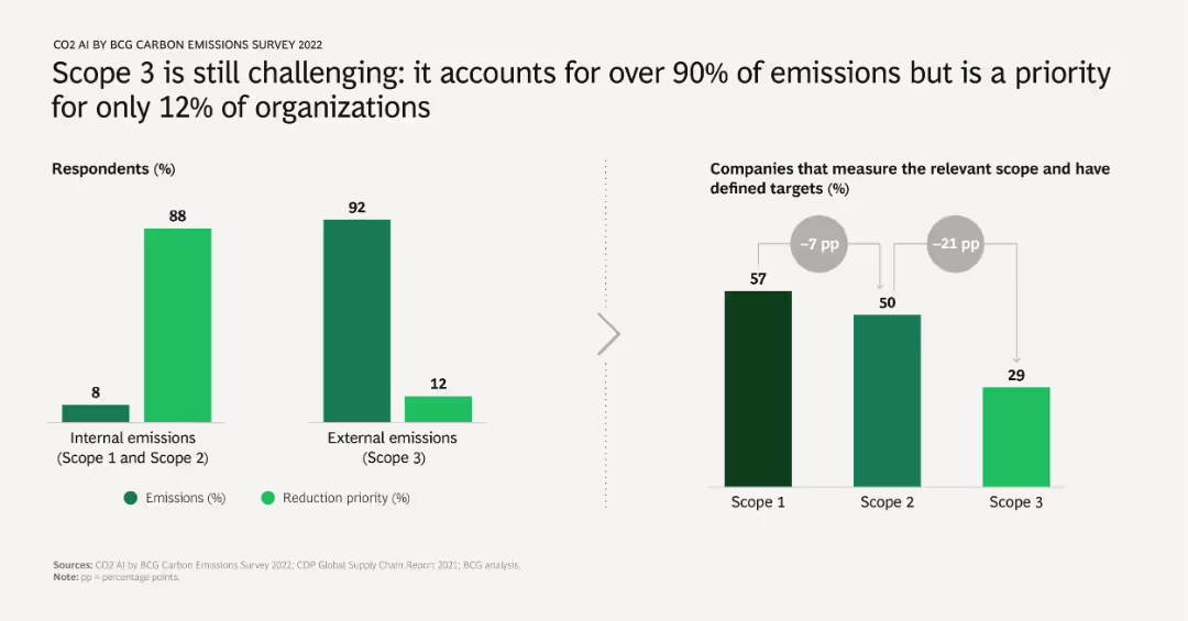
The slide has two bar charts: one showing the distribution of emissions between internal (Scope 1 and 2) and external (Scope 3), and the other showing the prioritization of reduction efforts. Highlights the significant challenge of addressing Scope 3 emissions.
Risk Assessment and Management
Environmental Services & Sustainability
Addresses the difficulty organizations face in managing Scope 3 emissions, which make up the majority of total emissions but are prioritized by a minority of companies. Stresses the importance of focusing on these external emissions.
Scope 3, emissions, internal, external, reduction priority, survey results
Multiple Chart
BCG
Saved
The slide includes multiple pie charts and bar graphs showing various factors causing supply chain disruptions, such as logistics delays and input cost increases.
Operational Efficiency
Transportation & Logistics
The slide analyzes the significant supply chain disruptions faced by local organizations due to logistics delays, input cost increases, and labor shortages.
supply chain, logistics delays, input costs, disruptions, local organizations
Mixed Chart
EY
Saved
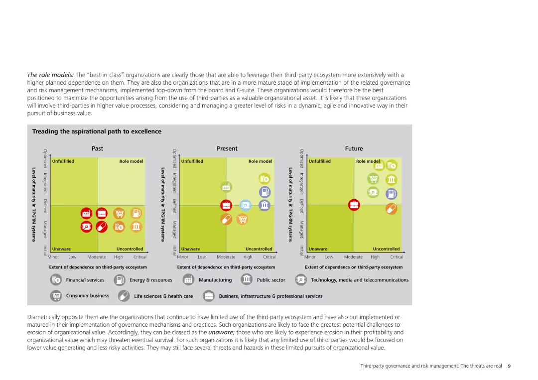
The slide contains a detailed text description and charts illustrating the role models in third-party risk management, highlighting organizations that effectively leverage their third-party ecosystems.
Strategic Planning
Professional Services
This slide identifies organizations that serve as role models in third-party risk management, emphasizing their effective use of third-party ecosystems and mature governance processes. It includes visual grids and charts to support these findings.
role models, third-party risk, governance, risk management, professional services, organizational strategy, best practices
Diagram
Deloitte
Saved
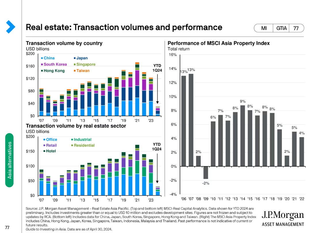
The slide has column charts showing transaction volumes by country and sector and a performance chart of the MSCI Asia Property Index.
Market Analysis and Trends
Real Estate & Construction
Examines real estate transaction volumes across countries and sectors and tracks the performance of the MSCI Asia Property Index.
real estate, transaction, volumes, performance, sectors
Multiple Chart
JP Morgan
Saved
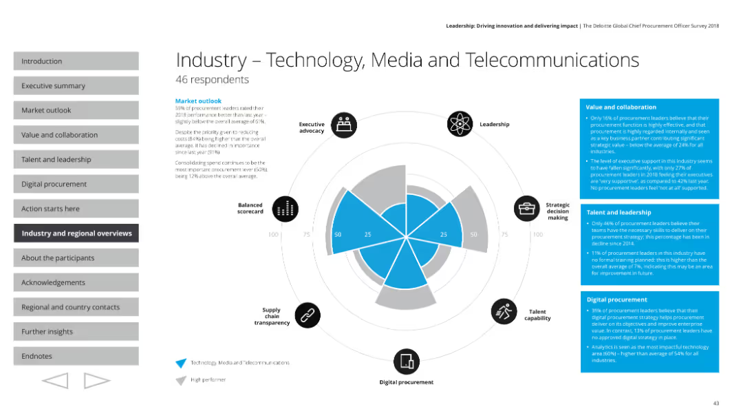
This slide features a radar chart with various performance metrics, accompanied by text boxes containing survey results and small icons for different performance aspects.
Industry Overview
Technology & Software
The slide provides an overview of the technology, media, and telecommunications industry's procurement performance from a survey. It covers executive advocacy, leadership, strategic decision making, talent capability, digital procurement, and supply chain transparency, with a market outlook and specific metrics on value, collaboration, talent, and leadership.
Technology, media, telecommunications, procurement, radar chart
Mixed Chart
Deloitte
Saved
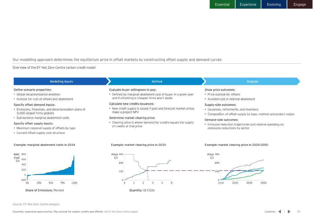
White background with a flowchart explaining the modelling approach, including inputs, methods, and outputs. Charts illustrate key concepts.
Strategic Planning
Environmental Services & Sustainability
Details the modelling approach used to determine the equilibrium price in offset markets, covering inputs, methods, and expected outputs.
equilibrium price, offset markets, modelling approach
Multiple Chart
EY
Saved
Contains bullet points and iconography. It features a high-level summary of Western Australia's LNG industry, economic contributions, and impact metrics like $220 billion added and 57,000 workers.
Industry Overview
Energy & Utilities
Highlights Western Australia's significant role in the LNG industry, mentioning major projects, economic contributions, and employment impact over the last decade.
LNG, Economic Impact, Western Australia, Energy Industry, Employment, Major Projects, Investment, Tax Revenue
Header Horizontal
EY
Saved
Bar chart showing the estimated time for financial recovery among households post-COVID-19. Categories range from one year to more than five years.
Risk Assessment and Management
Financial Services
The slide details the estimated time for Canadian households to recover financially from COVID-19, with responses indicating a range from one year to more than five years. It also notes a small percentage of respondents who feel their finances were not significantly impacted.
COVID-19, Financial Recovery, Canadian, Households, Pandemic
Mixed Chart
IPSOS
Saved
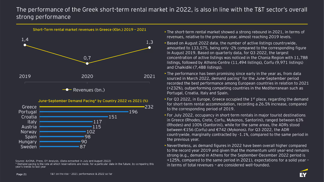
The slide features a line chart showing short-term rental market revenues in Greece from 2019 to 2021 and a column chart showing June-September demand pacing by country in 2022 vs 2021. There are accompanying text explanations and data insights.
Market Analysis and Trends
Hospitality & Tourism
Shows the strong performance of the Greek short-term rental market in 2022, including a revenue rebound in 2021 and demand pacing by country for the June-September period. It discusses occupancy rates and trends across various Greek destinations.
Short-term rental, Greece, Revenue, Demand, Trends
Multiple Chart
EY
Saved
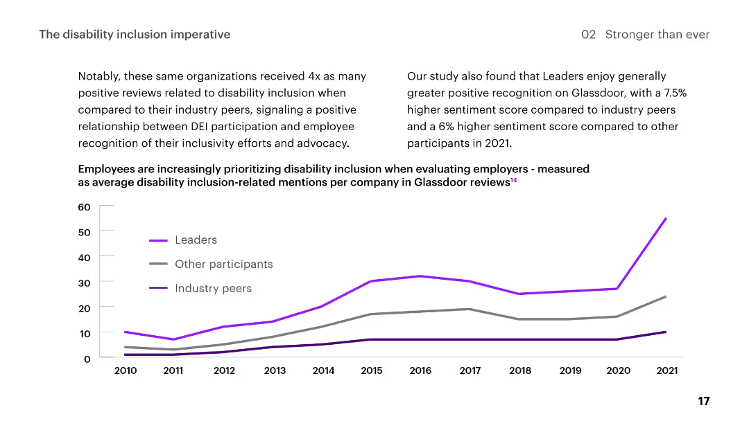
Line chart showing trends in disability inclusion-related mentions on Glassdoor from 2010 to 2021, comparing leaders, other participants, and industry peers.
Regulatory and Compliance
Professional Services
Describes positive recognition for organizations' disability inclusion efforts, showing a relationship between DEI participation and employee sentiment.
disability, inclusion, DEI, employee, recognition, trends, Glassdoor, positive reviews, leaders, participants
Mixed Chart
Accenture
Saved
The slide features a flow chart with icons and arrows detailing steps from 'Insight Generation' to 'New Product/Offerings Development' including intermediary processes.
Operational Efficiency
Professional Services
This slide outlines an operational framework for sustaining and scaling value creation in organizations through various phases like insight generation, concept creation, and portfolio management.
operations, innovation, management, strategy, process, portfolio, development, concept, insight, value
Linear Flow
McKinsey
Saved
This slide features a bar chart with horizontal bars showing the percentage of Millennials and Gen Z who agree with various statements about the pandemic's impact on their sense of responsibility. It includes text analysis on the left side.
Market Analysis and Trends
Environmental Services & Sustainability
The slide discusses how the pandemic has increased Millennials' and Gen Z's empathy and eagerness to positively impact their communities. The bar chart visualizes the survey responses, showing high levels of agreement on increased individual responsibility and community-focused actions post-pandemic.
Responsibility, Pandemic, Community, Empathy, Survey
Mixed Chart
Deloitte
Saved
The slide features a donut chart showing responses to a question about the relationship between interest rates and bond prices, with breakdowns of correct and incorrect answers. The layout is moderately complex.
Performance Metrics and KPIs
Financial Services
This slide assesses knowledge about the impact of interest rates on bond prices, showing mixed understanding among Canadians. It aims to evaluate public knowledge on financial concepts.
interest rates, bond prices, knowledge, financial, Canadians
Single Chart
IPSOS
Saved
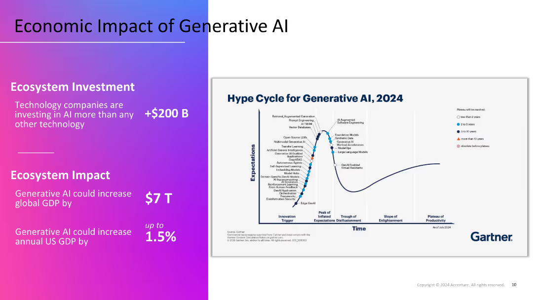
Split layout: left section with gradient background and key economic figures in white text; right section features Gartner's 2024 hype cycle graph on a white background.
Market Analysis and Trends
Artificial Intelligence
Highlights the economic potential of Generative AI, with over $200B in investments and a projected $7T boost to global GDP. The Gartner hype cycle visualizes the maturity of various GenAI technologies, indicating current expectations and future productivity.
GDP impact, investment, hype cycle, GenAI, Gartner, technology trends
Mixed Chart
Accenture
Saved
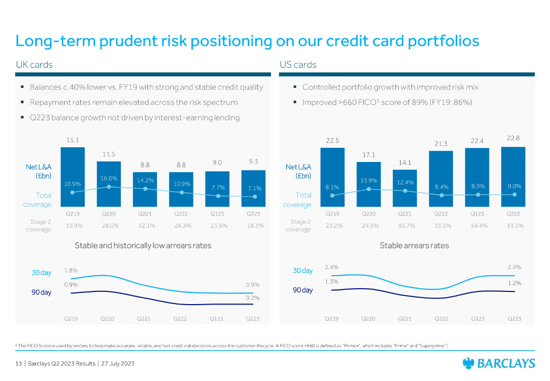
The slide contains two column charts showing net loans and advances, along with coverage rates and arrears rates for UK and US cards.
Risk Assessment and Management
Financial Services
The slide presents data on credit card portfolio risk positions for both UK and US markets, highlighting net loans, advances, and arrears rates, indicating stable risk management.
credit card, risk, portfolio, net loans, advances, arrears, UK, US, column chart, financial
Multiple Chart
Barclays
Saved
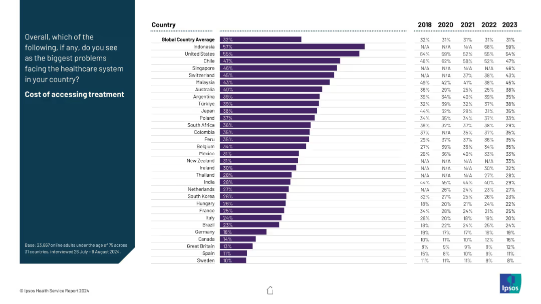
Country bar chart ranking concern about healthcare costs, with historical trend data (2018–2023).
Risk Assessment and Management
Healthcare & Pharmaceuticals
This slide ranks countries based on public concern over the cost of accessing treatment. The five-year trend highlights how financial barriers are a major healthcare issue in nations like Indonesia and the U.S., offering insights into affordability challenges.
healthcare cost, treatment affordability, financial access, Ipsos, survey, global trends, economic barriers, perception
Mixed Chart
IPSOS
Saved
Horizontal bar charts showing agreement and disagreement percentages regarding wealth, career fulfillment, and trust in business leaders, with highlights of highest and lowest countries.
Market Analysis and Trends
Government & Public Sector
This slide explores global attitudes towards wealth disparity, career success, and trust in business leaders, illustrating where these views are most and least prevalent.
wealth disparity, career fulfillment, business leaders, trust, agreement, disagreement, bar chart
Mixed Chart
IPSOS
Saved
Horizontal bar chart by gender/division with icon row below; sidebar text in light gray box.
Market Analysis and Trends
Education & Training
This slide addresses common misconceptions about athletic scholarships, showing average scholarship values by division and gender, while stressing their rarity. Only about 2% of high school athletes receive these scholarships. It also identifies sports eligible for full-ride scholarships.
athletic scholarships, Division I, Division II, college costs, sports
Mixed Chart
JP Morgan
Saved
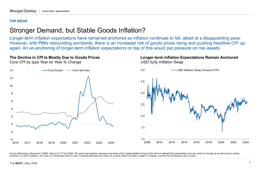
The slide features two line charts side by side. The left chart shows Core CPI by type (Goods and Services) over time, with data points from 2016 to 2024. The right chart displays USD 5y5y Inflation Swap rates from 2008 to 2024.
Market Analysis and Trends
Financial Services
The slide discusses how long-term inflation expectations have remained anchored despite recent CPI declines due to stable goods prices, while also highlighting the risks of rising goods prices amid rebounding PMIs.
Inflation, CPI, Core Goods, Core Services, USD, 5y5y, Inflation Swap, PMIs, Market Trends
Multiple Chart
Morgan Stanley
Saved
Features a comparison table of credit ratings from Moody’s, S&P, and Fitch for various banks as of February 2024.
Competitive Landscape
Financial Services
Compares long-term senior unsecured debt credit ratings of UBS and its peers across major rating agencies.
UBS, credit ratings, peer comparison, Moody’s, S&P, Fitch, competitive, landscape, debt
Table
UBS
Saved
Features a column chart showing the capital expenditure (capex) of major telco operators from 2016 to 2020, with a line graph overlay representing capex to revenue ratio. Color-coded for each operator to show investment patterns relative to revenue.
Operational Efficiency
Telecommunications
Discusses the capital investment trends in the telecommunications industry, highlighting how smaller operators are increasingly investing in expanding their 4G networks, contrasted with Telkom's steady investment strategy.
capex, 4G network, investment, Telkom, telecommunications industry, revenue ratio
Multiple Chart
BCG
Saved
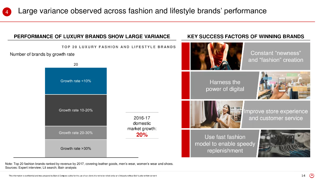
The slide includes a column chart showing the performance of top 20 luxury fashion and lifestyle brands by growth rate, accompanied by key success factors on the right.
Market Analysis and Trends
Retail & E-commerce
This slide analyzes the performance variance among top luxury brands, identifying key success factors such as digital power, customer service, and fast fashion models.
Brand performance, luxury brands, growth rate, key success factors, fashion brands
Mixed Chart
Bain
Saved
Previous
Next
If nothing, comes up, please save your slides first
Create a FREE account to continue browsing
Receive Instant Access to 1,000+ slides from companies like McKinsey, Google, and Goldman Sachs
First Name
Last Name
Email
Password
I agree to all
Terms & Privacy Policy
Thank you! Your submission has been received!
Oops! Something went wrong while submitting the form.
Have an account?
Sign in
Column Chart
Heatmap
Chevron
Org Chart
Infographic
Callouts
Timeline
List
Graphic
Picture
Process Flow
Diagram
Paragraph
Map
Table
Framework
Subtitle
Takeaway Box
Icon
Other Chart
Radar Chart
Waterfall Chart
Mekko Chart
Pie Chart
Scatter Plot
Line Chart
Bar chart
Bullet points