Create a FREE Account
Instant access to 1,000+ real slides from top companies like McKinsey, BCG, Goldman Sachs, Google and many more!
First Name
Last Name
Email
Password
I agree to all
Terms & Privacy Policy
Thank you! Your submission has been received!
Oops! Something went wrong while submitting the form.
Have an account?
Sign in
Library
Templates
Courses
Pricing
My Account
My Slides
My Templates
✦ AI
AI Prompt Library
AI Search
Sign in
Start Here
Logout
My Saved Slides
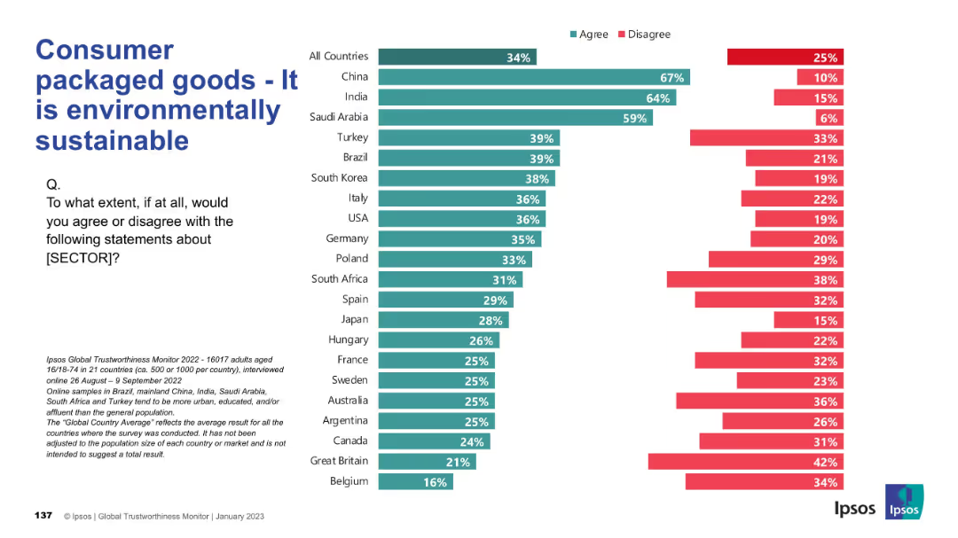
Bar chart format displaying global perceptions of the CPG industry’s environmental sustainability.
Market Analysis and Trends
Consumer Goods
The slide presents data on the perceived environmental sustainability of the CPG sector across different countries, showing varying levels of agreement.
sustainability, environment, green practices, CPG, perception, Ipsos, global, eco-friendly, reputation
Mixed Chart
IPSOS
Saved
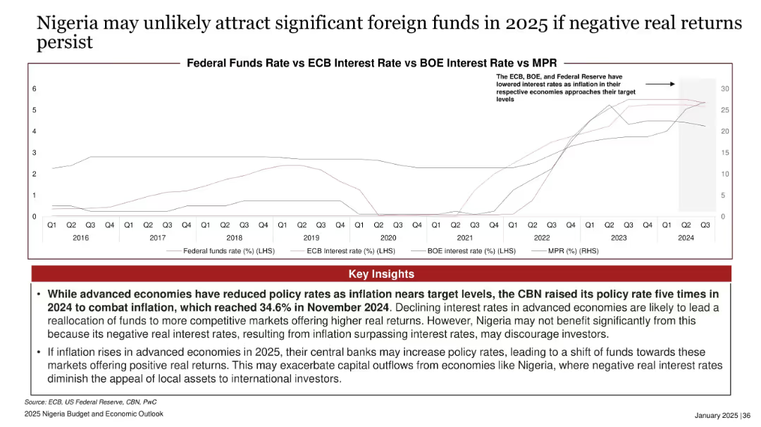
Line chart comparing MPR vs Fed/ECB/BOE interest rates; red insights box at bottom; timeline from 2016 to 2024.
Risk Assessment and Management
Financial Services
Discusses disparity between Nigeria’s high MPR and declining rates in advanced economies, creating negative real returns and discouraging foreign investment. Warns of potential capital outflows if inflation rises in advanced economies in 2025.
interest rates, MPR, negative real return, foreign funds, inflation, advanced economies, Nigeria, investment risk
Mixed Chart
PwC/Strategy&
Saved
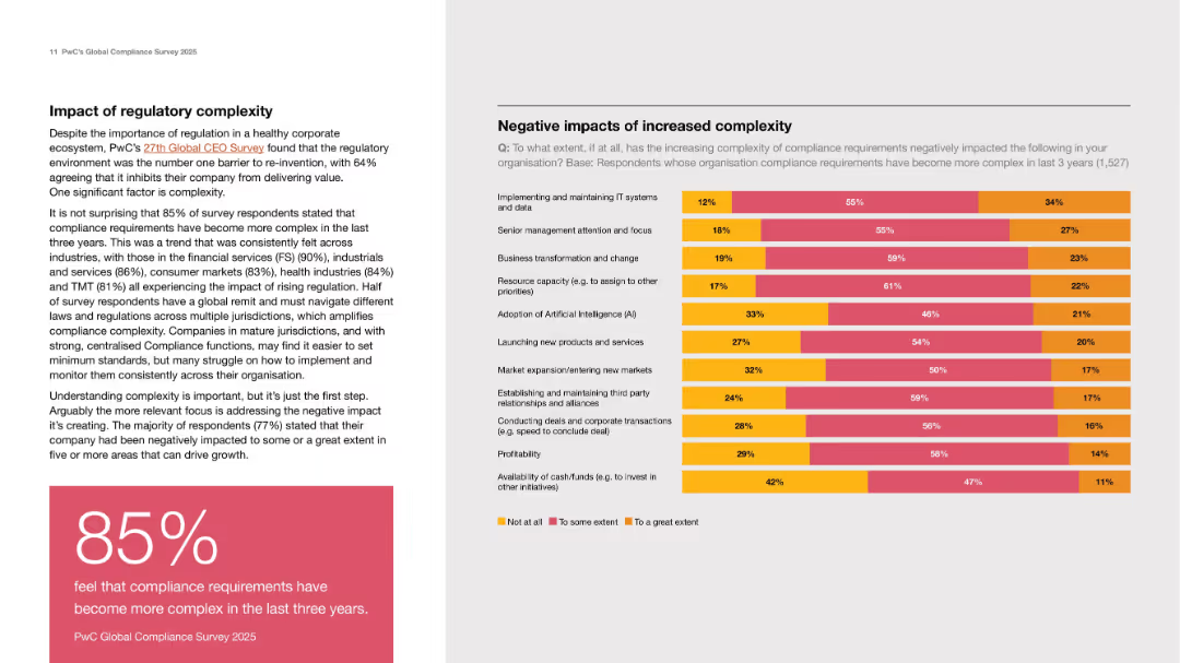
Left text block with statistics and insights; right side shows a stacked bar chart on complexity impact.
Regulatory and Compliance
Professional Services
Highlights how increased compliance complexity negatively affects IT systems, AI adoption, product launches, and profitability. Includes an 85% statistic noting that compliance requirements became more complex in recent years.
compliance complexity, IT systems, AI, profitability, regulation
Mixed Chart
PwC/Strategy&
Saved
Slide features a historical comparison using column chart in gray and purple, showing the workload impact of technology on underwriters.
Human Resources and Talent Management
Financial Services
Shows the trend of technology impact on underwriters' workload from 2008 to 2021, with comparative analysis.
workload, trends, technology, underwriters, comparison
Mixed Chart
Accenture
Saved
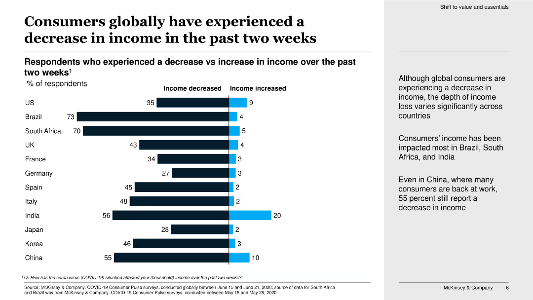
This slide features a horizontal bar chart showing the percentage of respondents in various countries who have experienced a decrease versus an increase in income.
Market Analysis and Trends
Consumer Goods
The slide presents data on how consumers globally have experienced income changes over the past two weeks, highlighting significant income decreases in certain countries.
income, consumers, global, decrease, increase, countries, percentage, bar chart, income changes, survey
Mixed Chart
McKinsey
Saved
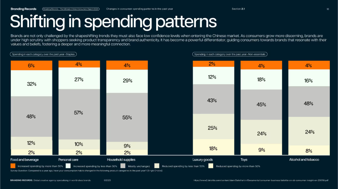
Dual-panel vertical bar segments across categories; dark blue background with white/orange accents.
Market Analysis and Trends
Consumer Goods
Shows how consumer spending in China has changed across both essential (staples) and non-essential categories. Highlights increases, stability, and declines across segments like personal care, luxury goods, toys, etc.
spending change, consumer behavior, staples, luxury, inflation, China retail
Single Chart
McKinsey
Saved
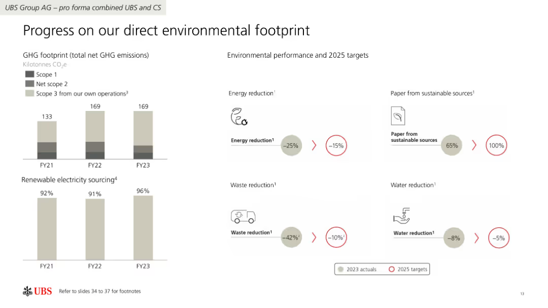
The slide features a combination of column charts and iconography to present data on GHG emissions, renewable electricity sourcing, and environmental performance targets.
Regulatory and Compliance
Financial Services
The slide details UBS Group AG's progress in reducing GHG emissions, increasing renewable electricity use, and achieving environmental performance targets by 2025.
GHG emissions, renewable electricity, targets, UBS, environmental performance
Multiple Chart
UBS
Saved
This slide presents a line graph showing the U.S. market podcast ad revenue percentage share by quarter from 2017 to 2022. Each line is color-coded to represent a different quarter, illustrating trends and changes over time.
Market Analysis and Trends
Media & Entertainment
Analyzes the seasonal distribution of podcast advertising revenue in the U.S. market, noting a decrease in the fourth quarter share in 2022. Useful for understanding seasonal impacts on marketing and advertising budgets.
Quarterly Trends, Podcast Advertising, Revenue Share, Marketing Budgets
Single Chart
PwC/Strategy&
Saved
Uses a bar graph to compare the CAGR of off-grid solar PV installed capacity across several countries.
Market Analysis and Trends
Energy & Utilities
Compares the growth rates of off-grid solar PV capacity across multiple countries, highlighting Nigeria's position relative to its peers.
solar market, CAGR, comparative analysis, off-grid, international markets
Single Chart
BCG
Saved
A bar chart showing reasons for switching vehicle brands, using varying shades of teal. The chart includes percentages and is straightforward in layout.
Market Analysis and Trends
Transportation & Logistics
This slide presents reasons why consumers consider switching vehicle brands, with the desire for something different being the most dominant factor. Useful for analyzing brand loyalty and consumer behavior in the automotive sector.
Brand loyalty, consumer behavior, market analysis, vehicle brands, switching reasons
Single Chart
Deloitte
Saved
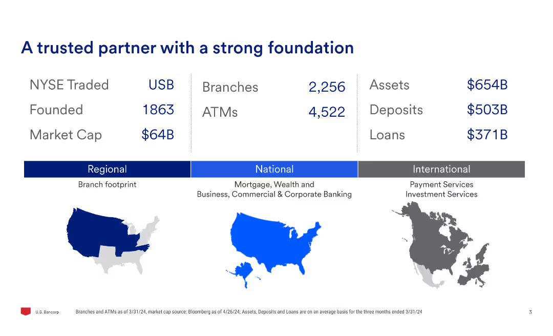
This slide features a minimal design with a three-column layout. The left column contains financial metrics, the center column shows branches and ATMs, and the right column shows assets, deposits, and loans. There are also regional, national, and international maps.
Financial Performance
Financial Services
Provides an overview of the company's key financial metrics, including NYSE trading symbol, founding year, market cap, branches, ATMs, assets, deposits, and loans. It also outlines the company's regional, national, and international presence.
NYSE, trading, branches, assets, deposits, loans, financial metrics, market cap, regional, national
Graphic
Barclays
Saved
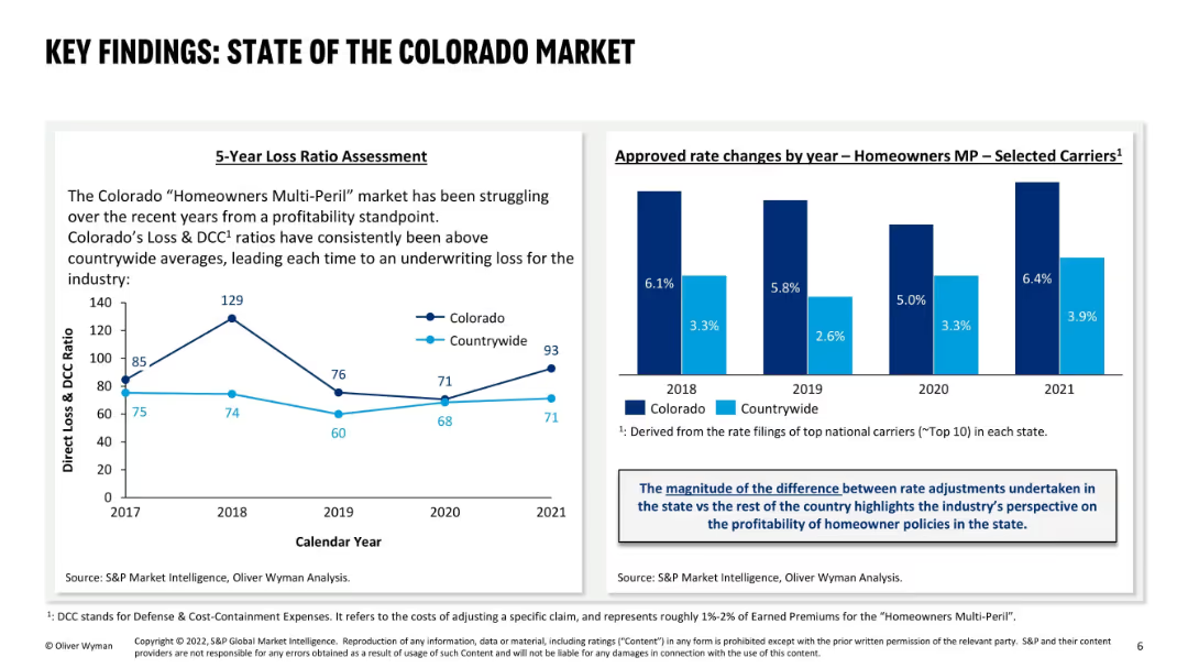
Two-column layout: left side has a 5-year loss ratio line graph; right side has a bar graph of approved rate changes; uses dark and light blue for comparison between Colorado and countrywide; includes explanatory text boxes.
Market Analysis and Trends
Financial Services
This slide evaluates Colorado’s “Homeowners Multi-Peril” insurance market, revealing persistent underwriting losses due to higher loss ratios compared to national averages. It also shows a consistent trend of higher rate increases in Colorado, reflecting industry efforts to offset losses.
Colorado market, loss ratio, homeowners insurance, rate changes, underwriting loss, profitability, MP, state comparison, DCC, carrier performance
Multiple Chart
Oliver Wyman
Saved
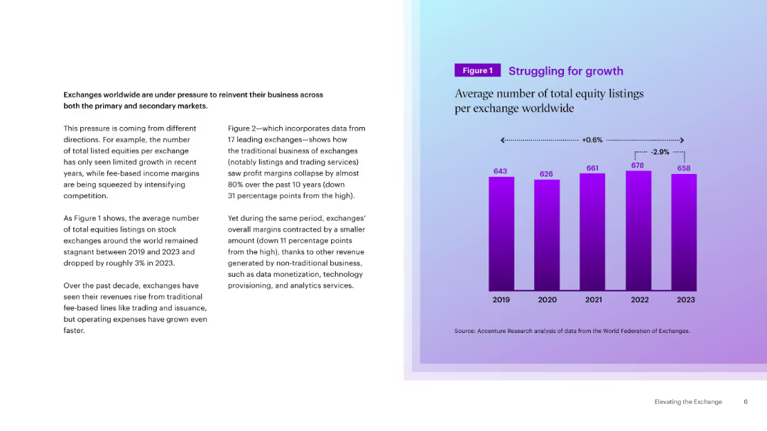
Two-column layout with a bar chart on the right showing average equity listings (2019–2023) and slight trends. Blue-purple gradient background.
Market Analysis and Trends
Financial Services
Highlights the stagnation in equity listings on global exchanges and the pressure for reinvention. Shows a modest decline in average listings, driven by margin compression and competition.
equity markets, listings, exchanges, growth trends, revenue pressure
Mixed Chart
Accenture
Saved
The slide presents column charts comparing the anticipated changes in the use of private vehicles and trains for intercity travel, split by current vehicle ownership status.
Market Analysis and Trends
Transportation & Logistics
Analyzes anticipated changes in vehicle use for intercity travel, considering vehicle ownership.
intercity travel, vehicle usage, ownership, projections
Multiple Chart
McKinsey
Saved
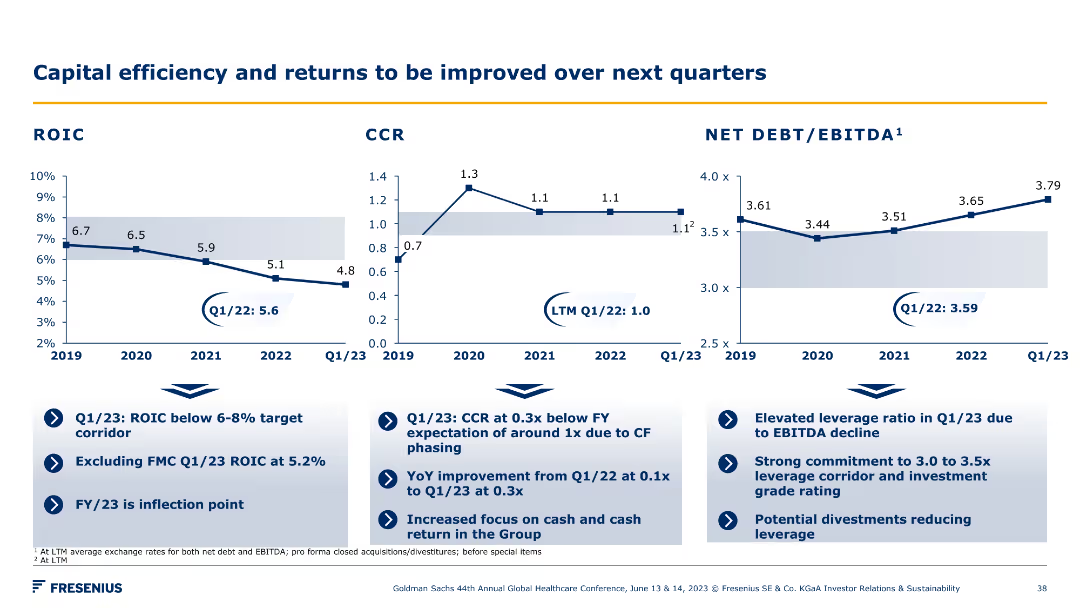
A series of line charts showing ROIC, CCR, and Net Debt/EBITDA trends over several years. Accompanied by bullet points summarizing key insights and improvement strategies.
Financial Performance
Financial Services
The slide presents trends in capital efficiency metrics like ROIC and CCR, and outlines strategies to improve returns and leverage over the next quarters.
ROIC, CCR, Net Debt, EBITDA, efficiency, returns
Multiple Chart
Goldman Sachs
Saved
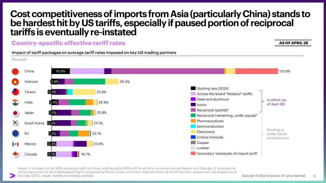
Bar chart with color-coded segments showing total effective tariff rate by country. Categories marked by implementation status.
Pricing Strategies
Industrial & Manufacturing
This slide compares the impact of tariff packages on key US trade partners, especially Asian economies. China faces the most severe rate increases, with potential reinstatement of paused measures likely to intensify effects.
Asia trade, tariffs, pricing, China, competitiveness, imports, implementation, policy impact
Single Chart
Accenture
Saved
This slide contains multiple column charts displaying demographic information about Chinese luxury consumers, including age, education, and gender distribution.
Customer and Market Segmentation
Consumer Goods
Analyzes the demographic characteristics of Chinese luxury consumers, focusing on their youth, education, and predominantly female composition.
demographics, luxury, consumer, China, education, gender, age, distribution, market segmentation
Multiple Chart
BCG
Saved
This slide has a text-heavy format with five sections, each including a header, percentage, description, and associated icon, with a footnote at the bottom.
Market Analysis and Trends
Technology & Software
Details the systemic changes driving the growth of ecommerce in SEA, focusing on demographics, internet infrastructure, GDP growth, payment ecosystems, and retail infrastructure, indicating substantial opportunities for market expansion.
Systemic changes, ecommerce growth, SEA, demographics, internet infrastructure
Header Vertical
Bain
Saved
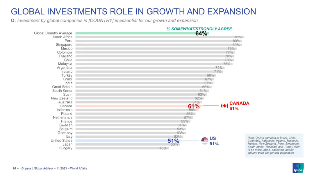
Horizontal bar chart ranking countries by agreement (% somewhat/strongly agree) on the importance of global investment for national growth; highlights global average, Canada, and the US in color. Grey bars used for other countries. Clean, professional layout.
Market Analysis and Trends
Financial Services
This slide shows how respondents in various countries perceive the importance of global investments for their nation's growth and expansion. The global average is 64%, with South Africa leading at 81%. Canada (61%) is slightly below the average, and the US (51%) is significantly lower.
global investment, economic growth, Canada, US, international perception, Ipsos, business expansion, rankings, bar chart, country comparison
Single Chart
IPSOS
Saved
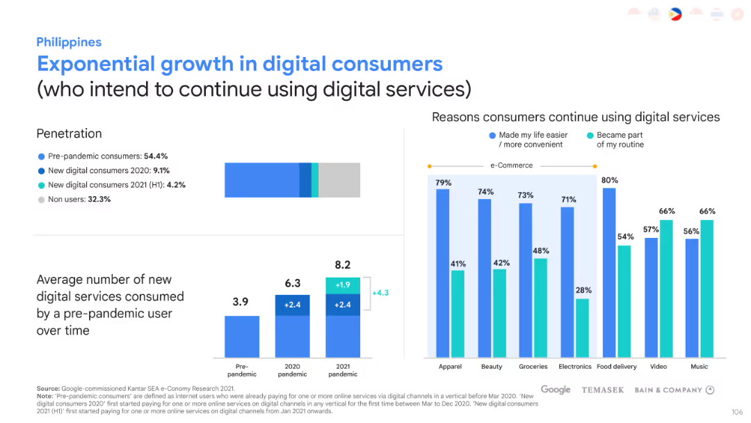
This slide has bar charts and graphs to represent the growth of digital consumers. The layout is balanced with textual information on one side and graphical data on the other.
Market Analysis and Trends
Technology & Software
Analyzes the digital consumer penetration and growth in the Philippines. It also explores the reasons consumers prefer to continue using digital services, highlighting e-commerce adoption.
Digital consumers, Market penetration, E-commerce, Consumer preferences
Multiple Chart
Bain
Saved
A column chart showing changes in total ad-supported television reach for different user categories between January 2021 and January 2022.
Market Analysis and Trends
Media & Entertainment
The slide shows a decline in the potential weekly reach of ad-supported TV, with significant growth in SVOD only users, highlighting a shift in viewing patterns.
ad-supported TV, reach, SVOD, users, decline
Mixed Chart
Nielsen
Saved
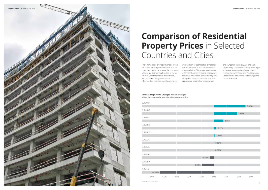
The slide features a bar chart comparing property prices in selected European countries and cities, along with text detailing exchange rate changes. The visual presentation is clear with distinct color usage for data points. Visual complexity is moderate.
Market Analysis and Trends
Real Estate & Construction
Compares residential property prices across European countries and cities, highlighting changes in exchange rates and their impact on property prices. Useful for investors and analysts monitoring the real estate market.
Property prices, residential, Europe, comparison, exchange rates
Mixed Chart
Deloitte
Saved
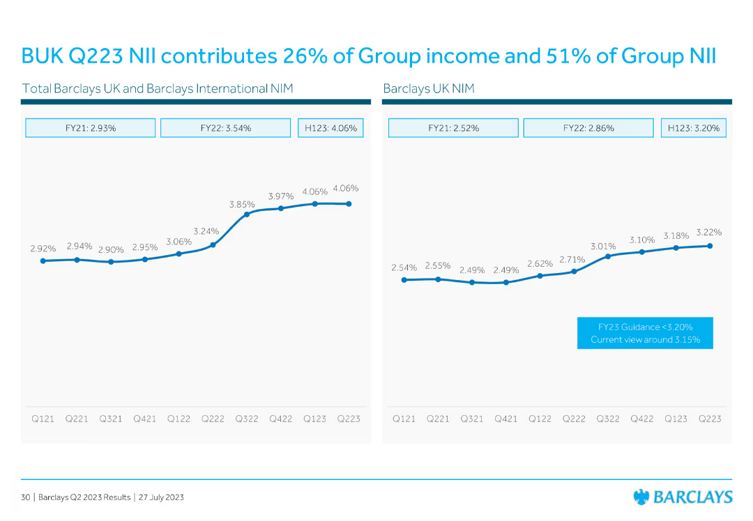
Features line charts comparing net interest margin (NIM) across different periods for Barclays UK and Barclays International.
Financial Performance
Financial Services
Describes the contribution of BUK Q223 net interest income (NII) to the group's overall income and NII, with historical comparisons.
NII, income, group, contribution, NIM
Multiple Chart
Barclays
Saved
Detailed slide with multiple bullet points and percentage indicators, showing the allocation of tasks within a 'Nerve Center' structure.
Strategic Planning
Professional Services
Describes the 'Nerve Center' concept for crisis management, detailing team responsibilities and decision-making processes. Suitable for management strategy sessions.
crisis management, team roles, decision-making, operations, strategy, planning, nerve center, 5Rs
Header Horizontal
McKinsey
Saved
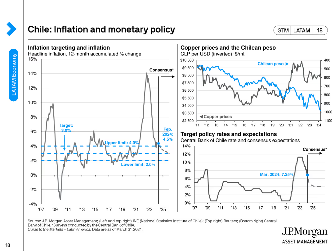
The slide includes three charts: a line chart for inflation targeting, another for copper prices vs. the Chilean peso, and a chart for target policy rates.
Regulatory and Compliance
Financial Services
This slide examines Chile's inflation and monetary policy, emphasizing inflation targeting, copper prices, and target policy rates as of February 2024.
Chile, inflation, monetary policy, copper prices, policy rates
Multiple Chart
JP Morgan
Saved
Previous
Next
If nothing, comes up, please save your slides first
Create a FREE account to continue browsing
Receive Instant Access to 1,000+ slides from companies like McKinsey, Google, and Goldman Sachs
First Name
Last Name
Email
Password
I agree to all
Terms & Privacy Policy
Thank you! Your submission has been received!
Oops! Something went wrong while submitting the form.
Have an account?
Sign in
Column Chart
Heatmap
Chevron
Org Chart
Infographic
Callouts
Timeline
List
Graphic
Picture
Process Flow
Diagram
Paragraph
Map
Table
Framework
Subtitle
Takeaway Box
Icon
Other Chart
Radar Chart
Waterfall Chart
Mekko Chart
Pie Chart
Scatter Plot
Line Chart
Bar chart
Bullet points