Create a FREE Account
Instant access to 1,000+ real slides from top companies like McKinsey, BCG, Goldman Sachs, Google and many more!
First Name
Last Name
Email
Password
I agree to all
Terms & Privacy Policy
Thank you! Your submission has been received!
Oops! Something went wrong while submitting the form.
Have an account?
Sign in
Library
Templates
Courses
Pricing
My Account
My Slides
✦ AI
AI Prompt Library
AI Search
Sign in
Start Here
Logout
My Saved Slides
Column and pie charts with a timeline of portfolio value, clearly demarcated sections for acquisitions, divestments, and asset class distribution.
Strategic Planning
Real Estate & Construction
Used for strategic planning, showing the transition to logistics-focused assets with financial details and portfolio composition. It’s a strategic tool for presentations on investment shifts, asset management, and portfolio optimization within the logistics and real estate sectors.
Logistics, Strategy, Real Estate, Investments, Assets
Multiple Chart
Morgan Stanley
Saved
Another line chart like previous, but for patent applications from 2016–2022. Top 10 firms including Baidu, Origin Quantum etc.
Performance Metrics and KPIs
Technology & Software
Tracks filing behavior for top QT firms from 2016–2022. Most peaked pre-2021 and declined after. Baidu is an exception, continuing to rise. Google and IBM saw the sharpest declines. Indicates shifting strategies or R&D reallocations.
patent applications, QT companies, IBM, Baidu, filing trends, R&D, IP filings
Mixed Chart
McKinsey
Saved
This slide features a combination of text and column charts. It discusses the significance of right-shoring and outsourcing in risk management, supported by data showing current and future expectations.
Strategic Planning
Financial Services
It evaluates the role of right-shoring and outsourcing in risk management, presenting data on how these strategies are currently utilized and expected to evolve. The slide is useful for strategic planning in risk management sourcing.
risk management, sourcing, right-shoring, outsourcing, strategic planning
Multiple Chart
EY
Saved
Features an extensive flowchart diagram with different financial services offered by the firm, divided by client needs, and includes some numerical data points.
Organizational Structure and Change
Financial Services
Details the comprehensive offerings by the firm to support clients during IB transactions and the depth of relationships.
Collaboration, Franchise, Client Support, IB Transactions, Services Offering, Commercial Banking
Table
JP Morgan
Saved
Two stacked bar charts comparing opinions of parents and non-parents on banning AI and smartphones in schools
Regulatory and Compliance
Education & Training
This slide explores attitudes toward banning AI and smartphones in schools. While opinions on banning AI are split, there is broader agreement (especially among parents) on banning smartphones.
AI, smartphones, school policy, parents, regulation, education, bans, ChatGPT
Mixed Chart
IPSOS
Saved
Pie charts depicting market size and Morgan Stanley's share in various financial service categories. Utilizes blue shades and annotations.
Competitive Landscape
Financial Services
Examines Morgan Stanley's market share in different financial service sectors, identifying opportunities to deepen market penetration.
Market share, financial services, Morgan Stanley, client reach, industry sectors, market penetration, opportunity
Multiple Chart
Goldman Sachs
Saved
Pie charts and a mekko chart showing executive profiles and annual revenue distribution specifically for the Auto-OES sector.
Market Analysis and Trends
Transportation & Logistics
Specialized demographic breakdown for the Auto-OES sector, focusing on executive roles and revenue, aiding in targeted market analysis.
automotive, demographics, survey, executive, revenue, market, analysis
Multiple Chart
Accenture
Saved
The slide features a table summarizing various conditioning and pretreatment technologies and their compatibility with different types of feedstocks. Each technology is listed with symbols indicating detailed, applicable, or optimal conditions.
Technology and Digital Transformation
Energy & Utilities
This slide provides a detailed comparison of conditioning and pretreatment technologies, illustrating their compatibility with various biomass feedstocks, aimed at enhancing conversion efficiency.
conditioning, pretreatment, feedstock compatibility, technologies, biomass, conversion efficiency, detailed comparison
Table
Kearney
Saved
Dark background with bold yellow and white text. Features circular graphs, bar charts, and figures. Clearly divided into left-side text explanations and right-side remuneration bars by quartile.
Human Resources and Talent Management
Professional Services
This slide outlines EY Australia's gender pay gaps based on WGEA methodology, including total and median remuneration and base salary differences. It shows visual comparisons by gender across pay quartiles, revealing gaps in compensation and detailing where discrepancies occur. It emphasizes benchmarking against industry standards.
gender pay gap, remuneration, WGEA, EY Australia, salary, pay quartiles, workforce, diversity, women, equality
Multiple Chart
EY
Saved
Dual-panel layout with bar chart on left and stylized stacked blocks on right
Operational Efficiency
Technology & Software
The slide illustrates growth acceleration in revenue and EBIT due to strategic shifts. The bar chart compares FY10–20 vs FY21–23 performance. A stylized chart shows market opportunities such as fraud prevention and consumer empowerment.
EBIT, revenue growth, strategy, double-digit, market potential, FY23
Multiple Chart
Barclays
Saved
Combination of a column chart and textual information comparing regional expectations of changes in remote work over the next three-to-five years. Colors are yellow and gray.
Market Analysis and Trends
Real Estate & Construction
Compares regional expectations of future work changes, noting significant differences in expectations for remote work between Europe, APAC, and Americas.
Cultural Bias, Europe, Changes, Future of Work, Regional, Comparison, Remote Work, Expectations, Survey
Mixed Chart
EY
Saved
Timeline graphic illustrating Apple's evolution with images of products, financial highlights, and a narrative caption.
Technology and Digital Transformation
Technology & Software
Showcases Apple as a leading example of adopting as-a-service models, depicting their growth and services evolution over time.
Apple, as-a-service, business model, evolution, case study, subscription
Linear Flow
Accenture
Saved
Includes a matrix diagram showing different strategic approaches to decarbonisation based on emissions intensity and stakeholder pressure.
Strategic Planning
Environmental Services & Sustainability
Identifies strategies for firms based on their emissions intensity and decarbonisation impetus, suggesting actions from preparing for change to capitalizing on position.
Emissions, reduction, strategy, decarbonisation, intensity, stakeholder, pressure, sustainability
Diagram
EY
Saved
Donut chart of 13 Mt demand by sector and region; text details infrastructure and CCS requirements
Operational Efficiency
Energy & Utilities
This slide focuses on the demand segments that require moderate cost or infrastructure improvements to be viable by 2030. It emphasizes CCS expansion in US and EU for refining, low-carbon ammonia imports, and hydrogen refueling infrastructure for trucking in the US and EU.
CCS, ammonia, infrastructure unlock, cost improvement, hydrogen trucking, refining, 2030 goal, clean energy
Mixed Chart
McKinsey
Saved
The left side of the slide presents a line chart showing the growth vs. value valuations over time, and the right side features a bar chart illustrating the correlation of MSCI World sectors to U.S. 10-year Treasury yield.
Market Analysis and Trends
Financial Services
The slide compares growth and value valuations in developed markets, highlighting trends and sector correlations with Treasury yields. It is used to identify market trends and investment opportunities.
Growth, value, developed markets, MSCI, Treasury yield, market trends, investment, sector correlation
Multiple Chart
JP Morgan
Saved
This slide includes several column charts depicting areas of improvement for risk management functions, focusing on analytics, automation, and collaboration between lines of defense.
Operational Efficiency
Financial Services
It discusses how CROs evaluate the interaction between the first and second lines of defense, with emphasis on analytics, automation, and collaboration in risk management activities. The slide helps in understanding the operational efficiency of risk management practices.
risk management, first line, second line, collaboration, automation, analytics
Multiple Chart
EY
Saved
Three-column layout with financial table, revenue bar chart, and key highlights.
Product and Service Analysis
Financial Services
Reviews Q2 2024 performance of the Corporate Bank division. Highlights include flat revenue, rising provisions for credit losses, steady expenses, and growth in deposits. Segment-level revenue performance for treasury, institutional, and business banking is visualized.
Corporate Bank, Q2 2024, revenue, credit losses, business banking, Deutsche Bank
Mixed Chart
Deutsche Bank
Saved
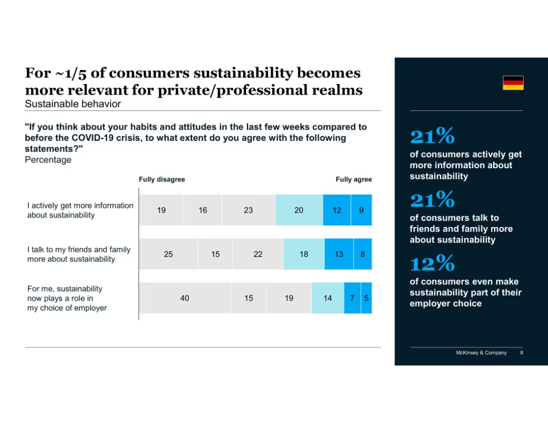
Comparison bar chart showing supermarket vs. discount shopper behavior across product categories
Customer and Market Segmentation
Consumer Goods
Consumers shopping at supermarkets show slightly higher willingness to pay for sustainability across food and non-food categories compared to discount shoppers. The difference is modest but consistent across all segments.
shopping type, supermarket, discounter, consumer behavior, sustainability pricing, product categories, McKinsey, Germany
Mixed Chart
McKinsey
Saved
This slide features multiple data visualizations: line charts showing the tech expense trend, column charts depicting cloud adoption and account opening metrics, and small multiples for mortgage funding and fraud prevention statistics. Each visualization includes performance indicators like percentage points and cost-to-fund ratios.
Technology and Digital Transformation
Financial Services
Demonstrating the impact of technology investments on operational efficiency, this slide provides an overview of tech-related improvements in processes and outcomes. Suitable for presentations on digital transformation or IT strategy.
technology, efficiency, digital transformation, cloud adoption
Multiple Chart
JP Morgan
Saved
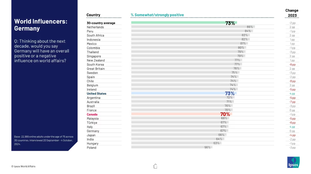
Blue sidebar with instructions; right side chart ranks trust in civil servants across countries. Countries like France rank high; Argentina lowest.
Regulatory and Compliance
Government & Public Sector
This slide visualizes public trust in civil servants, showing significant differences across countries. France, Singapore lead, while Peru and Argentina score lowest.
civil service, trust index, governance, Ipsos, public opinion, countries, regulation
Mixed Chart
IPSOS
Saved
This slide contains a hexagonal diagram with 'Wellness' at the center, surrounded by key drivers such as demographics, healthcare industry, consumer goods, and the environment.
Strategic Planning
Healthcare & Pharmaceuticals
The slide outlines the various factors that will shape the future of wellness, including demographic shifts, technological advancements, and environmental factors. It sets the stage for a discussion on wellness trends.
Wellness, future trends, demographics, healthcare, environment
Diagram
IPSOS
Saved
The slide features two pie charts. The first shows the distribution of total equity assets under management. The second pie chart breaks down U.S. equity assets by investment style.
Financial Performance
Financial Services
This slide outlines the total and U.S. equity assets managed by J.P. Morgan, categorized by investment styles like core, value, growth, and others.
equities, assets, management, investment styles, distribution
Multiple Chart
JP Morgan
Saved
The slide features a column chart comparing feelings of being cut off from family and friends between May and December. It uses different colored bars to represent data from two time periods.
Customer and Market Segmentation
Government & Public Sector
This slide compares the feelings of being cut off from family and friends between two time periods, showing a decrease in such feelings in December compared to May, based on survey data.
feelings, family, friends, comparison, survey, cut off, column chart, time periods, public opinion
Single Chart
IPSOS
Saved
The slide is split into two main sections: one with a line chart showing OPEC crude oil production and oil prices, and the other with a line chart showing the US Strategic Petroleum Reserve. Descriptive text supports each chart.
Market Analysis and Trends
Energy & Utilities
This slide explores the influence of OPEC+ on global oil production and prices, and the US's release of its Strategic Petroleum Reserve. It discusses production cuts and the strategic reserve's impact on the market.
OPEC+, oil production, strategic reserve, US, prices
Multiple Chart
EY
Saved
Comparative bar chart on fairness definitions—equal opportunity vs equal quality of life—broken down by country
Market Analysis and Trends
Education & Training
Respondents were asked whether fairness means equal opportunities or equal outcomes. Most countries leaned toward opportunity. India and Thailand were outliers, favoring quality of life. Change from 2023 to 2024 is also shown.
fairness, equality, public opinion, opportunity vs outcome, Ipsos, international views, societal values, 2024 trends
Mixed Chart
IPSOS
Saved
Previous
Next
If nothing, comes up, please save your slides first
Create a FREE account to continue browsing
Receive Instant Access to 1,000+ slides from companies like McKinsey, Google, and Goldman Sachs
First Name
Last Name
Email
Password
I agree to all
Terms & Privacy Policy
Thank you! Your submission has been received!
Oops! Something went wrong while submitting the form.
Have an account?
Sign in
Column Chart
Heatmap
Chevron
Org Chart
Infographic
Callouts
Timeline
List
Graphic
Picture
Process Flow
Diagram
Paragraph
Map
Table
Framework
Subtitle
Takeaway Box
Icon
Other Chart
Radar Chart
Waterfall Chart
Mekko Chart
Pie Chart
Scatter Plot
Line Chart
Bar chart
Bullet points