Create a FREE Account
Instant access to 1,000+ real slides from top companies like McKinsey, BCG, Goldman Sachs, Google and many more!
First Name
Last Name
Email
Password
I agree to all
Terms & Privacy Policy
Thank you! Your submission has been received!
Oops! Something went wrong while submitting the form.
Have an account?
Sign in
Library
Templates
Courses
Pricing
My Account
My Slides
✦ AI
AI Prompt Library
AI Search
Sign in
Start Here
Logout
My Saved Slides
Multi-chart layout including line graphs and data tables. Shows S&P 500 valuation metrics (P/E, P/B), cost of equity, and sector-level valuation comparisons. Clean and data-dense with side-by-side segmentation.
Financial Performance
Financial Services
This slide provides an overview of absolute and relative valuation metrics for the S&P 500 and its sectors. It compares historical trends in P/E and P/B ratios and evaluates the cost of equity using ERP and Treasury yields. Sector-specific data is organized into clear tables and visuals.
valuation, P/E ratio, P/B ratio, cost of equity, ERP, sector metrics
Multiple Chart
Goldman Sachs
Saved
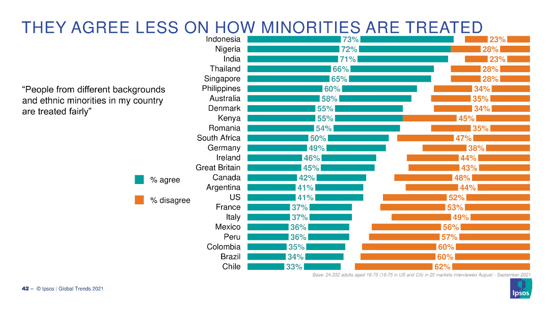
Table with country flags ranks top nations for visit drivers by category; attribute bar on left.
Customer and Market Segmentation
Professional Services
This slide identifies which countries lead in specific travel appeal categories such as natural beauty, safety, and vibrant city life. Australia, Canada, and Switzerland are frequent top-3 nations. The visual links country rankings to attribute importance.
visit, tourism, countries, travel appeal, Ipsos, drivers, global perception, attributes
Mixed Chart
IPSOS
Saved
The slide features a line chart showing wheat production volumes for Canada, Australia, and Ukraine, with annotations explaining the volatility and growth rates.
Market Analysis and Trends
Agriculture & Food Production
The slide explains the volatility in Australian wheat production compared to Canada and Ukraine, emphasizing the factors contributing to slower growth in Australia.
Wheat production, volatility, Australia, Canada, Ukraine, growth rate, agriculture, food production, market trends
Mixed Chart
LEK
Saved
Dual-panel chart; left shows median deal size by stage; right shows deal outcome distribution (up/down).
Risk Assessment and Management
Financial Services
The slide shows a decline in median deal sizes across VC stages in the Americas from 2018–2024, with a concurrent increase in flat and down rounds. This reflects ongoing investor caution and reduced valuations amid persistent macroeconomic uncertainty.
deal size, VC stages, risk, down rounds, investor sentiment, flat rounds, caution, Americas, funding trends
Multiple Chart
KPMG
Saved
Contains comparative data and visual representations, including a column chart and side-by-side comparisons, on CO2 intensity and environmental impacts of nickel and lithium mining in Australia versus other countries. The slide uses distinct colors to differentiate between countries and includes detailed annotations explaining the significance of the data presented.
Competitive Landscape
Energy & Utilities
Showcases Australia's comparative advantage in mining due to lower CO2 emissions and stronger environmental credentials, which could appeal to ESG-sensitive customers and markets.
Australia, mining, environmental impact, CO2 emissions, nickel, lithium, competitive advantage, ESG credentials, global market, sustainable practices
Mixed Chart
Accenture
Saved
Features an individual making adjustments to machinery, symbolizing proactive engagement. Includes statistics about public DEI commitments and funding.
Regulatory and Compliance
Professional Services
Highlights recent trends in DEI commitments among multinational companies and the importance of integrating DEI into business practices.
DEI, commitments, funding, multinational companies, business practices, equity
Multiple Chart
Deloitte
Saved
Table listing the top three most-scaled strategic bets by industry. Percentages shown next to each bet. Left column includes explanatory text.
Strategic Planning
Artificial Intelligence
Outlines the top strategic bets being scaled in different industries, such as fraud detection in insurance and accelerating drug approval in life sciences. Percentages reveal where companies are focusing AI investments to achieve competitive advantage and industry-specific innovation.
strategic bets, scaling, industry focus, fraud detection, AI investment
Mixed Chart
Accenture
Saved
Dark-themed slide with horizontal value chain diagram, arrows and bullet points; callouts highlight benchmarking domains
Technology and Digital Transformation
Technology & Software
Emphasizes the need for unbiased, third-party benchmarking for quantum computing tech stacks using standardized metrics, reproducible methods, and real-world data to support business decisions across the stack from hardware to services.
quantum computing, benchmarking, tech stack, standardized metrics, hardware, software, cloud, third-party
Uncategorized
McKinsey
Saved
It includes two column charts: one showing U.S. private equity investments by sector and the other showing exits by type, with a summary table of sector averages.
Investment Analysis
Financial Services
The slide focuses on U.S. private equity investments and exits, presenting sector-specific investment data and types of exits to offer a comprehensive market overview.
private equity, U.S., investments, exits, sectors, types, data analysis, financial
Multiple Chart
JP Morgan
Saved
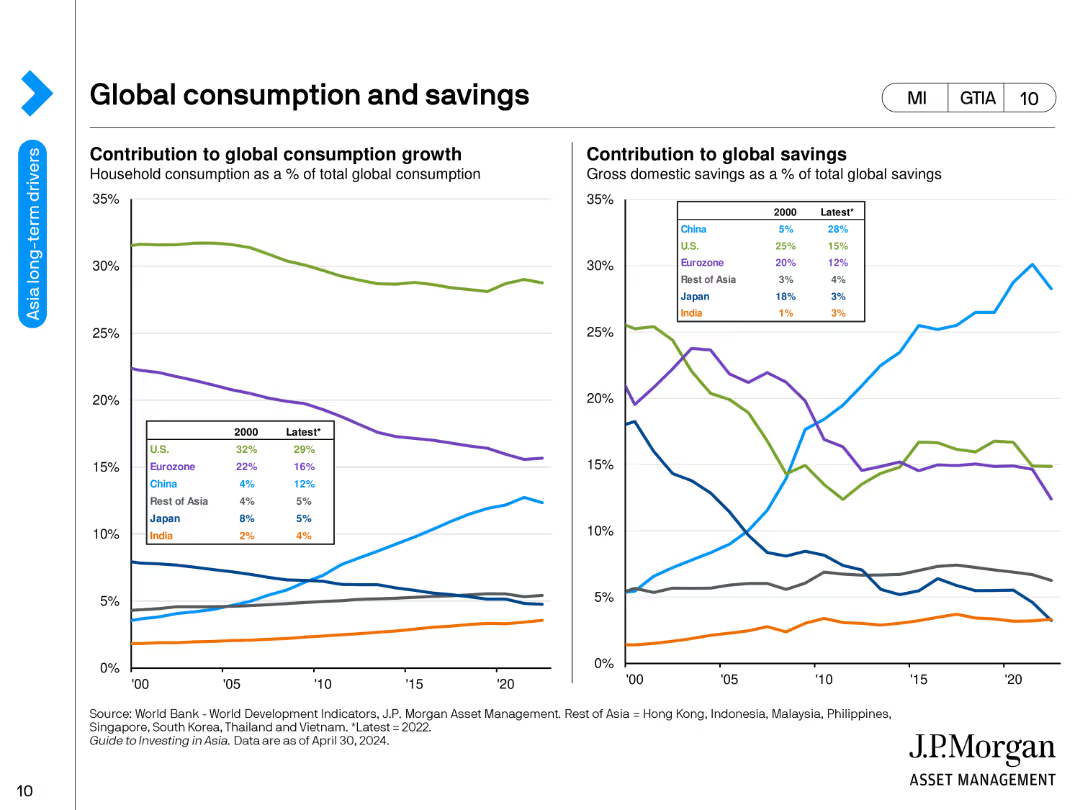
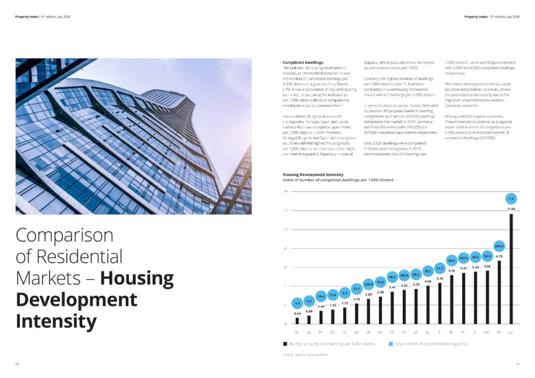
The slide includes a column chart showing the effect of COVID-19 on NPL volumes and ratios across CEE countries, with a text block summarizing the impacts and measures taken by banks. The left side contains an image of a cathedral.
Market Analysis and Trends
Financial Services
The slide analyzes the impact of COVID-19 on NPL volumes and ratios across Central and Eastern Europe, highlighting measures taken by banks and government schemes to support the financial sector.
NPL, COVID-19, financial impact, CEE, measures
Mixed Chart
Deloitte
Saved
Two-bar comparative chart with color-coded segments (Inflation, Growth, Total response) for Euro Area and US. Branded by Goldman Sachs.
Investment Analysis
Financial Services
This slide shows the impact of a 10% tariff (with retaliation) on Taylor Rule-implied policy rates. It indicates that tariffs would lower rates in the Euro area while raising them in the US, due to differences in inflation and growth responses.
tariffs, Taylor Rule, interest rates, Euro Area, US policy, inflation, growth, Goldman Sachs, monetary policy
Single Chart
Goldman Sachs
Saved
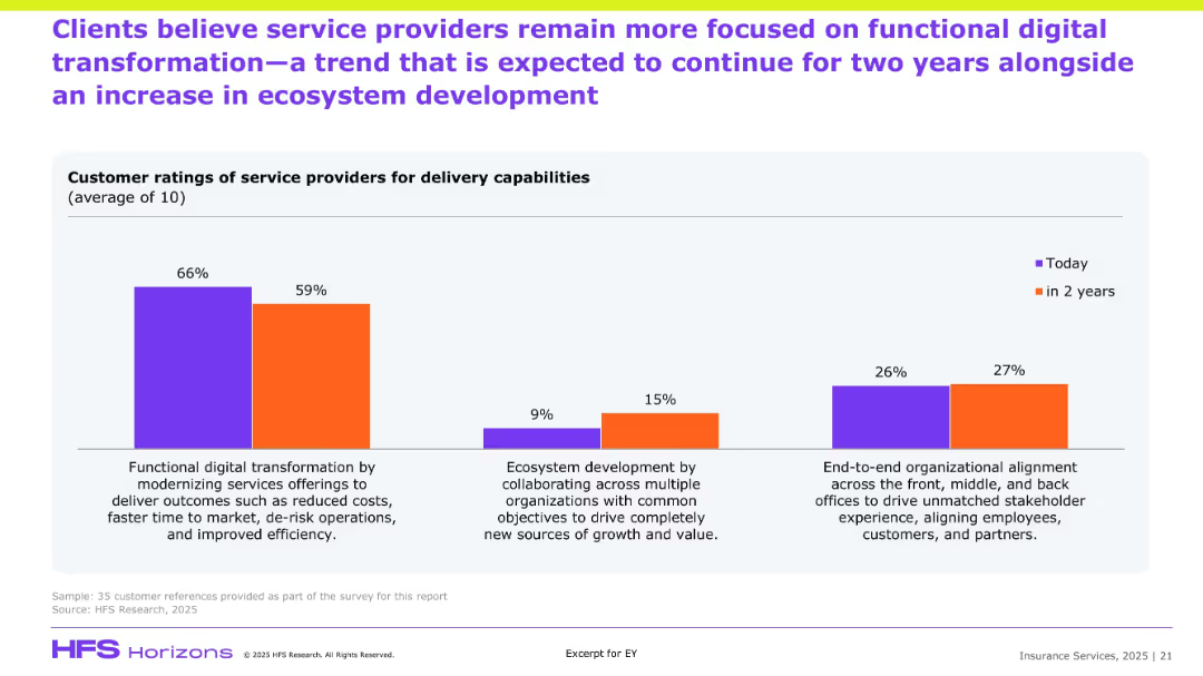
Features bar charts comparing functions within shared services and their expected changes in scope and capacity over time. The layout is straightforward with a focus on future planning.
Strategic Planning
Professional Services
Evaluates future strategic directions for shared services, including increases in scope and capacity. This slide is useful for discussions on long-term planning and the integration of technology in service delivery.
Shared services, strategic planning, scope expansion, technology integration, future trends
Mixed Chart
Deloitte
Saved
Horizontal bar chart grouped by industry; stacked bars in various blue shades with icons above each group; text explanations below
Customer and Market Segmentation
Technology & Software
The slide presents reasons why users prefer call centers over digital channels across industries. Key reasons include the preference to talk to a person (44%) and call centers being faster/easier (43%). Additional reasons include app/credential issues, product availability, and other factors. The layout shows percentages for each reason by industry.
call centers, digital channels, customer preference, human interaction, ease of use, industry comparison, survey data, app issues, product availability, Germany
Single Chart
McKinsey
Saved
Pie charts and a mekko chart showing industry representation and geographical distribution of survey respondents across multiple sectors.
Market Analysis and Trends
Professional Services
Provides demographic insights into a survey, detailing the industry sectors and geographical locations of respondents, useful for market analysis.
demographics, survey, industry, geographic, distribution, sectors, market, analysis
Multiple Chart
Accenture
Saved
Vertical bar chart comparing 2023 vs. 2024 responses across generational groups (Gen Z to Baby Boomers).
Risk Assessment and Management
Artificial Intelligence
This slide tracks the year-over-year change in belief that AI will replace current jobs. Gen Z maintains the highest level of concern, while Baby Boomers show the least concern. Overall, responses have remained relatively stable between 2023 and 2024.
AI job risk, generational perception, technology anxiety, automation, workplace displacement, year-on-year trend, AI adoption
Mixed Chart
IPSOS
Saved
This slide features a column chart breaking down the global foodservice market by ownership and geography for 2022. Different colors represent chains and independent establishments, with a yellow highlight on Italy.
Market Analysis and Trends
Hospitality & Tourism
This slide discusses the market share and growth of chain restaurants globally, emphasizing the significant growth driven by North America. It provides a geographical breakdown of market share for chains vs. independent establishments.
Chains, market share, growth, foodservice, geographical breakdown
Mixed Chart
Deloitte
Saved
An advanced layout that includes a series of bar graphs comparing the company's CRE concentration to its peers. Each bar graph is dedicated to a different aspect of CRE concentration, such as "Other CRE," "Multifamily," and "Office CRE." The slide is information-dense, using different shades of blue and gray to differentiate between the company and its peers.
Competitive Landscape
Financial Services
The slide compares the company’s commercial real estate (CRE) concentration to that of its peers, highlighting a strategic position of having the lowest CRE concentration. It serves to underline the company's prudent risk management practices in loan portfolio distribution.
CRE Concentration, Competitive Analysis, Risk Management, Real Estate, Loan Portfolio, Peer Comparison, Strategy, Market Position
Multiple Chart
Morgan Stanley
Saved
The slide features a structured list of recommendations for government involvement in supporting start-ups, including talent development, fiscal incentives, funding and exit options, and start-up facilitation, with examples from various countries.
Strategic Planning
Government & Public Sector
This slide presents recommendations for government roles in supporting start-ups, suggesting actions like providing tax incentives, setting up VC funds, and developing a start-up ecosystem, with international examples.
government role, start-ups, recommendations, talent development, fiscal incentives, funding, start-up facilitation
Table
Kearney
Saved
The slide includes a bar chart comparing the percentage of respondents expressing various concerns about digital health adoption in 2021 versus 2022, such as patient privacy and solution incompatibility.
Risk Assessment and Management
Healthcare & Pharmaceuticals
The slide addresses the growing concerns regarding digital health adoption, highlighting issues like increased concerns about patient privacy, incompatibility between digital solutions, and the shortage of talent for developing and implementing these solutions.
Digital adoption, concerns, patient privacy, compatibility
Single Chart
LEK
Saved
The slide features a stacked column chart comparing the country weights in the MSCI EM Index for the years 2012, 2017, and 2022, with various colors representing different countries.
Market Analysis and Trends
Financial Services
This slide examines how the country weights in the MSCI EM Index have evolved over the last 10 years, focusing on the proportion of different emerging markets.
MSCI, EM Index, Country Weights, China, India, Brazil, Market Trends, Country Comparison, Emerging Markets, Weight Distribution, Regional Analysis
Single Chart
Morgan Stanley
Saved
Line chart comparing MPR vs Fed/ECB/BOE interest rates; red insights box at bottom; timeline from 2016 to 2024.
Risk Assessment and Management
Financial Services
Discusses disparity between Nigeria’s high MPR and declining rates in advanced economies, creating negative real returns and discouraging foreign investment. Warns of potential capital outflows if inflation rises in advanced economies in 2025.
interest rates, MPR, negative real return, foreign funds, inflation, advanced economies, Nigeria, investment risk
Mixed Chart
PwC/Strategy&
Saved
Stacked bar chart showing satisfaction levels by brand with net satisfaction scores above each. Organized by large, mid, and small-size brands.
Performance Metrics and KPIs
Consumer Goods
Benchmarks net satisfaction across brands based on purchase experiences. Shows variation in customer perception of experience quality, with most brands scoring under 50. Highlights that underwhelming experiences are frequent and satisfaction gaps persist across brand tiers.
satisfaction score, brand comparison, net promoter score, expectations, consumer evaluation
Single Chart
BCG
Saved
Similar to the previous slide, this one includes line charts showing emissions by region under high carbon price scenarios. The charts provide detailed comparisons of emissions trajectories for different regions over time.
Risk Assessment and Management
Environmental Services & Sustainability
This slide focuses on the impact of high carbon pricing on emissions across various regions, aiding in evaluating the effectiveness of carbon pricing policies in reducing emissions and managing environmental risks.
High carbon price, emissions, regions, environmental policies, carbon pricing
Multiple Chart
Deloitte
Saved
Waterfall charts for Q4 and FY 2024 provisioning breakdown; highlights on the right explain components and forecast
Risk Assessment and Management
Financial Services
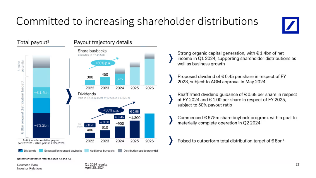
Highlights drivers behind credit loss provisions, such as Postbank integration, commercial real estate, and large events. Provisions are expected to taper in 2025 as risks normalize. Key messages stress portfolio stability, stable indicators, and expected reduction in losses.
provisioning trends, FY2024, Postbank, CRE, hedging, credit losses
Mixed Chart
Deutsche Bank
Saved
Column chart showing the sources of crypto asset acquisition, with categories like centralized trading platforms, friends, and mining/staking.
Market Analysis and Trends
Financial Services
Details the various sources through which crypto asset owners acquire their assets, emphasizing the dominance of centralized trading platforms.
crypto acquisition, trading platforms, asset sources, financial analysis, market trends
Mixed Chart
IPSOS
Saved
Previous
Next
If nothing, comes up, please save your slides first
Create a FREE account to continue browsing
Receive Instant Access to 1,000+ slides from companies like McKinsey, Google, and Goldman Sachs
First Name
Last Name
Email
Password
I agree to all
Terms & Privacy Policy
Thank you! Your submission has been received!
Oops! Something went wrong while submitting the form.
Have an account?
Sign in
Column Chart
Heatmap
Chevron
Org Chart
Infographic
Callouts
Timeline
List
Graphic
Picture
Process Flow
Diagram
Paragraph
Map
Table
Framework
Subtitle
Takeaway Box
Icon
Other Chart
Radar Chart
Waterfall Chart
Mekko Chart
Pie Chart
Scatter Plot
Line Chart
Bar chart
Bullet points