Create a FREE Account
Instant access to 1,000+ real slides from top companies like McKinsey, BCG, Goldman Sachs, Google and many more!
First Name
Last Name
Email
Password
I agree to all
Terms & Privacy Policy
Thank you! Your submission has been received!
Oops! Something went wrong while submitting the form.
Have an account?
Sign in
Library
Templates
Courses
Pricing
My Account
My Slides
My Templates
✦ AI
AI Prompt Library
AI Search
Sign in
Start Here
Logout
My Saved Slides
Slide includes a clear title, three sets of bullet lists under "Traditional approaches" and "Additional approaches", icons, and a clickable white paper download link.
Industry Overview
Technology & Software
This slide presents different digital business models that companies can adopt, such as "Build", "Buy", "Partner", "Invest", and "Incubate/Accelerate". It describes when each approach is most appropriate.
digital business models, build, buy, partner, invest, incubate
Header Vertical
Accenture
Saved
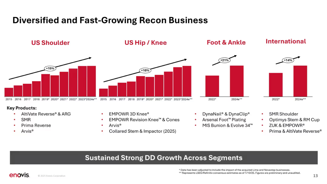
Four bar chart panels by anatomical segment; growth rates annotated; product list below.
Performance Metrics and KPIs
Healthcare & Pharmaceuticals
Shows double-digit growth in US Shoulder, Hip/Knee, Foot & Ankle, and International segments from 2015–2024e. Lists key contributing products and reinforces strong sustained performance across segments.
Recon, growth, segments, shoulder, hip, foot, ankle, KPIs, products
Multiple Chart
JP Morgan
Saved
Contains a line graph comparing TCO for electric and diesel buses over mileage.
Investment Analysis
Financial Services
Analyzes how long-term savings from EVs can offset higher initial costs.
EV, TCO, cost savings, electric buses, diesel comparison
Mixed Chart
PwC/Strategy&
Saved
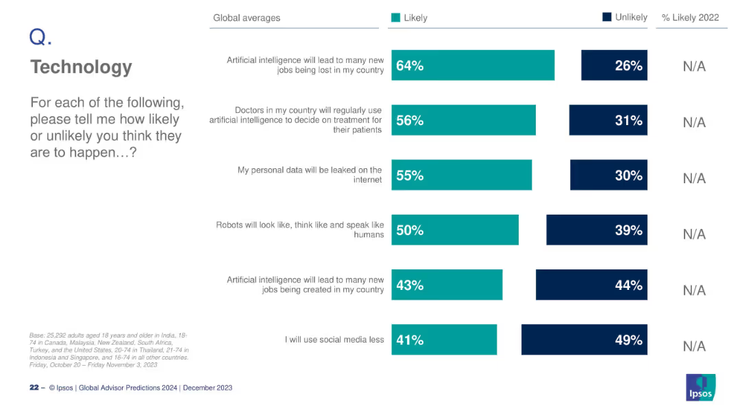
Vertical bar chart with multiple AI-related questions and global responses
Technology and Digital Transformation
Artificial Intelligence
This slide summarizes public opinion on multiple AI-related developments, including job loss, AI in healthcare, data leaks, robot behavior, and social media use. Each is represented by a separate bar with likely/unlikely stats.
AI, job loss, healthcare, data privacy, robots, social media, trends
Mixed Chart
IPSOS
Saved
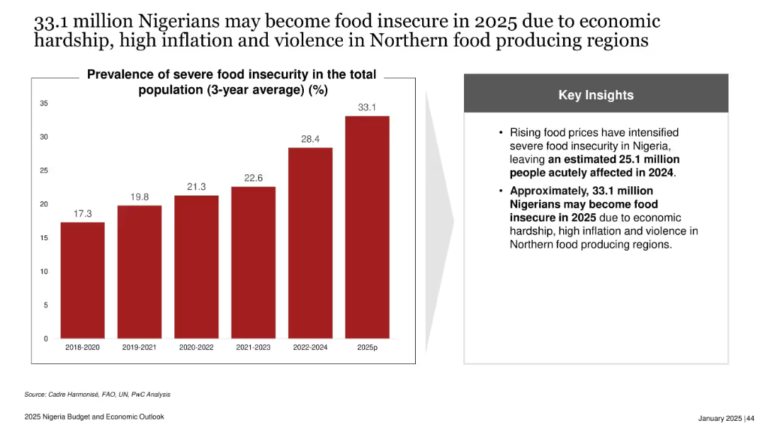
Bar chart on the left showing percentages of severe food insecurity from 2018–2025p; key insights box on the right in grey with bulleted insights. Clean and minimal layout.
Risk Assessment and Management
Government & Public Sector
The slide highlights the rising threat of food insecurity in Nigeria, projecting that 33.1 million people may be food insecure in 2025 due to economic and social challenges. It shows a steady rise in severe food insecurity and emphasizes the urgent need for intervention.
food insecurity, inflation, Nigeria, violence, Northern regions, economic hardship, 2025 projection, rising trend, humanitarian crisis
Mixed Chart
PwC/Strategy&
Saved
The slide displays two column charts with lighter labels, adhering to Tufte's principle to lighten labels for better data clarity.
Technology and Digital Transformation
Professional Services
This slide illustrates the principle of lightening labels to improve the clarity and focus of data presentations according to Tufte's guidelines.
Tufte, data-to-ink, ratio, survey, responses, visualization, light labels, chart, clarity, design
Multiple Chart
EY
Saved
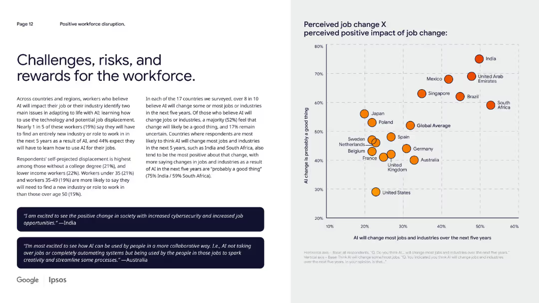
Left-side narrative with two quote boxes and a scatter plot on right mapping perceived job changes vs benefits.
Risk Assessment and Management
Artificial Intelligence
The slide examines perceived job displacement risks due to AI and contrasts it with perceived opportunity. While many expect change, responses vary on whether it’s good. Countries like India and South Africa are most optimistic about AI-driven workforce changes.
workforce change, AI displacement, job opportunity, global perception, future risk
Mixed Chart
IPSOS
Saved
Two column charts. The left chart shows Asia's exports by destination, and the right chart shows Asia's imports by origin for 2003 and 2022.
Market Analysis and Trends
Financial Services
The slide compares Asia's export destinations and import origins in 2003 and 2022, highlighting the changes and trends in trade over the years.
exports, imports, trade destinations, trade origins, Asia, trade analysis, economic trends, regions, financial insights, development
Multiple Chart
JP Morgan
Saved
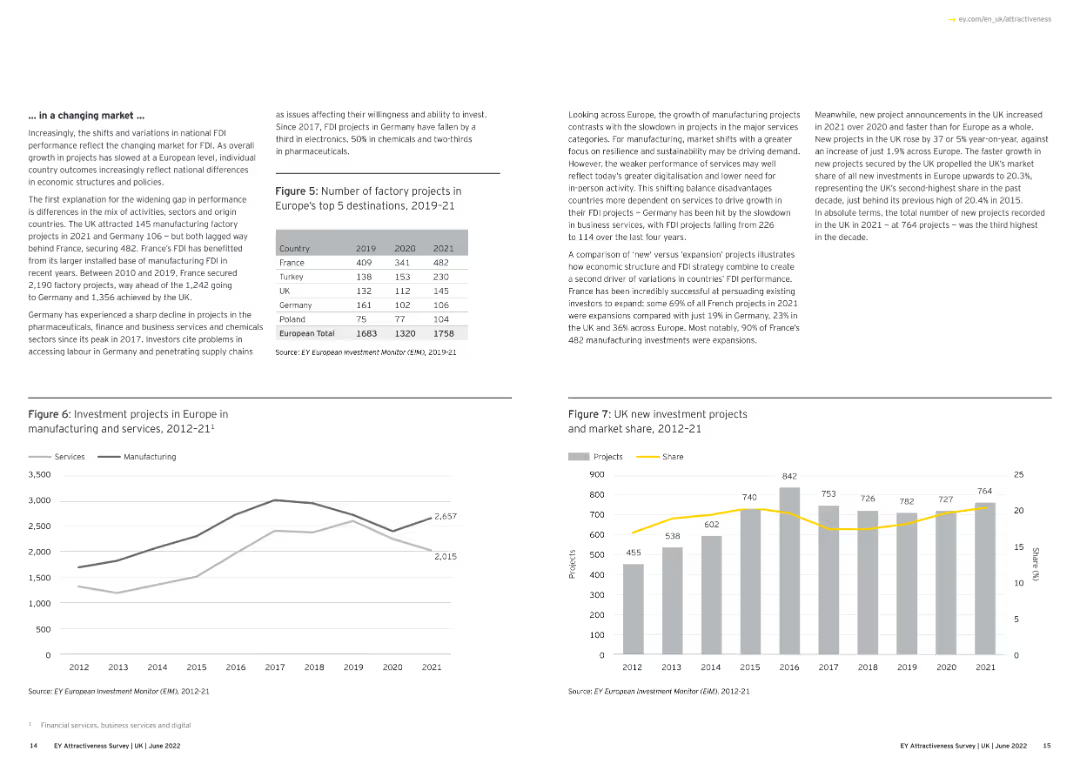
The slide features text and line charts illustrating FDI project trends in Europe.
Market Analysis and Trends
Financial Services
This slide analyzes FDI trends in Europe, emphasizing changes in national FDI performance, the impact of market shifts, and the variation in investment project types and numbers across major European countries.
FDI, Europe, Market Trends, Investment Projects
Multiple Chart
EY
Saved
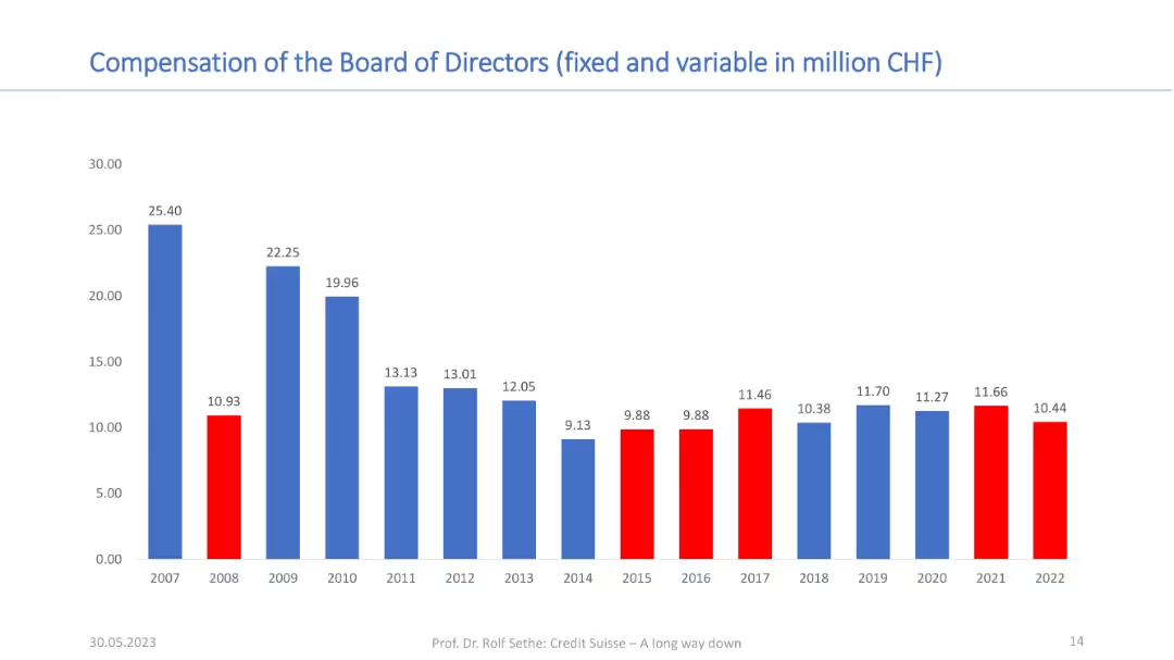
Vertical bar chart with yearly data from 2007 to 2022; red bars highlight specific years; title in blue at the top.
Financial Performance
Financial Services
This slide presents the annual compensation (fixed and variable) of the board of directors in CHF from 2007 to 2022. A declining trend is evident post-2007, with key years highlighted in red to show compensation drops or anomalies.
board compensation, CHF, financials, executive pay, trends, governance
Single Chart
Credit Suisse
Saved
The slide features a diagram showing the biomass-to-energy carbon cycle, detailing the flow of CO2 from biofuel production to consumption, and its subsequent absorption by biomass through photosynthesis.
Technology and Digital Transformation
Energy & Utilities
This slide explains the carbon neutrality of bioenergy through the natural carbon cycle of biomass, illustrating how CO2 emissions from biofuel production and consumption are balanced by biomass absorption.
biomass, bioenergy, carbon cycle, CO2 emissions, carbon neutrality, biofuel production
Linear Flow
Kearney
Saved
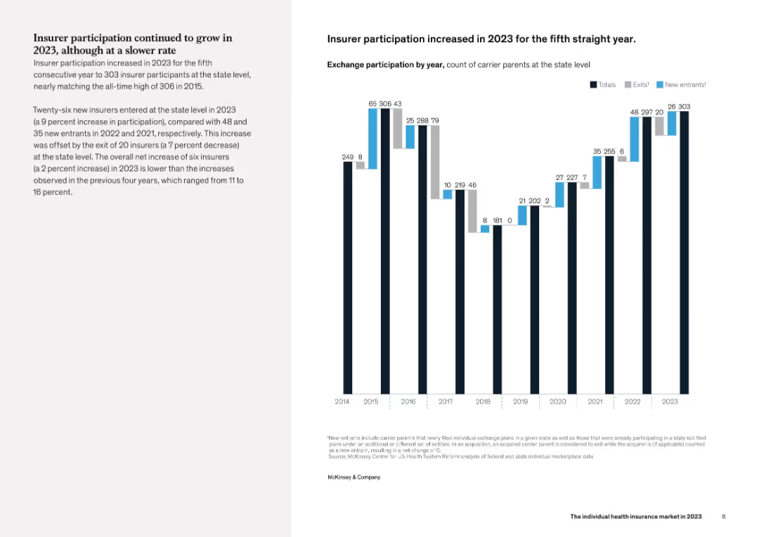
Left-aligned explanatory text with a vertical bar chart on the right showing the number of insurer participants, new entrants, and exits from 2014 to 2023. Visual style is consistent and clean with focus on quantitative trends.
Industry Overview
Healthcare & Pharmaceuticals
This slide details insurer participation trends in the individual health insurance market, showing a net increase in 2023 for the fifth consecutive year. Although the growth rate slowed compared to 2022, new entries still outpaced exits, nearly matching the participation peak seen in 2015.
insurer participation, healthcare, trends, new entrants, exits
Mixed Chart
McKinsey
Saved
Slide with text and images comparing Canada and Ukraine to Australia in terms of wheat production and export, highlighting similarities in supply chains and efficiency.
Competitive Landscape
Agriculture & Food Production
The slide compares Australia's wheat supply chain to Canada and Ukraine, using these countries as benchmarks for efficiency and export market similarities.
benchmarking, wheat supply chain, Canada, Ukraine, Australia
Graphic
LEK
Saved
This slide features two graphs tracking the credit ratings of Macquarie Bank against other financial institutions by Standard & Poor’s and Moody’s from 2007. Each graph is color-coded to distinguish rating upgrades, downgrades, and stability. The slide is information-dense yet remains legible and ordered.
Risk Assessment and Management
Financial Services
It presents Macquarie Bank's credit ratings stability compared to other banks, highlighting resilience in ratings through financial events. This slide is likely used to reassure investors of Macquarie's solid standing and risk management over time, especially during economically turbulent periods.
credit ratings, Macquarie Bank, stability, Standard & Poor’s, Moody’s, financial institutions, risk management, long-term analysis
Multiple Chart
Morgan Stanley
Saved
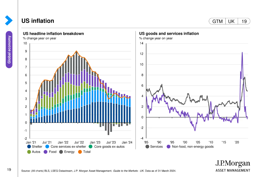
The slide features two line charts: one detailing the breakdown of US headline inflation from January 2021 to March 2024, and the other showing US goods and services inflation year on year since 1985.
Market Analysis and Trends
Financial Services
This slide provides an in-depth look at US inflation, breaking down headline inflation by components and comparing goods and services inflation trends over nearly four decades, highlighting key inflation drivers and trends.
US inflation, headline inflation, goods, services, trends
Multiple Chart
JP Morgan
Saved
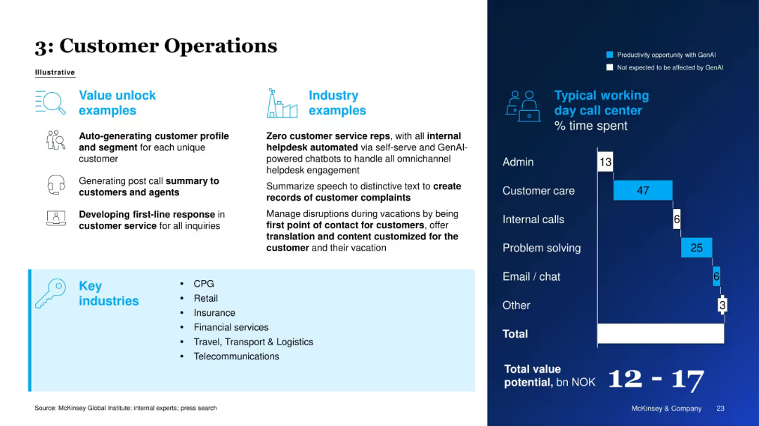
Left panel outlines use cases and industries; right panel displays typical call center time use.
Customer and Market Segmentation
Telecommunications
The slide demonstrates how GenAI can streamline customer service through automated profiling, summaries, and response generation. A call center agent's time distribution is analyzed to show where GenAI improves efficiency.
Customer Service, Call Center, GenAI, Efficiency, Segmentation, Automation, Industry Use Case, Time Savings
Mixed Chart
McKinsey
Saved
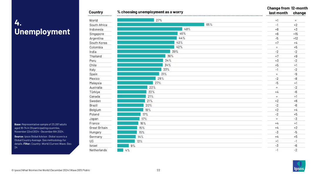
Bar chart of countries with highest concern over unemployment, includes trend comparison to last month and last year.
Performance Metrics and KPIs
Financial Services
The slide reveals 27% globally worry about unemployment. South Africa tops at 65%. It offers insight into short-term and long-term shifts, with notable concern increases in Singapore and Argentina.
unemployment, labor market, joblessness, global survey, economic trends
Single Chart
IPSOS
Saved
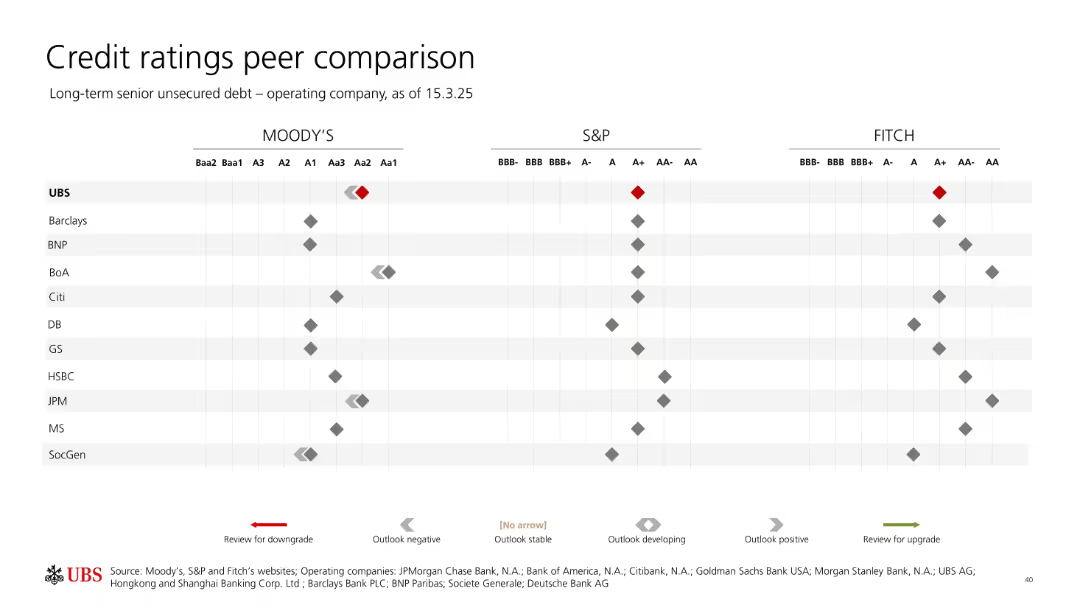
Comparative dot matrix chart with Moody’s, S&P, and Fitch ratings across multiple banks; UBS highlighted.
Competitive Landscape
Financial Services
This slide compares UBS's credit ratings with key global banking peers across Moody’s, S&P, and Fitch for their operating companies. UBS holds relatively strong ratings, indicated with red diamonds, and is benchmarked against competitors like JPM, Barclays, and Citi.
credit rating, UBS, peer comparison, Moody’s, Fitch, S&P, debt rating, bank peers, outlook, unsecured debt
Single Chart
UBS
Saved
The slide has moderate visual complexity, featuring an industrial automation technology stack and corresponding companies in each category. The layout is informative, with a balance between text descriptions and graphic representations of the technology levels and companies.
Technology and Digital Transformation
Industrial & Manufacturing
This slide maps out the landscape of companies in the process automation technology space. It visually categorizes companies by their specialization within the technology stack, providing a comprehensive overview of key players and their roles in the ecosystem.
Automation technology, Company landscape, Industry mapping, Tech stack
Framework
LEK
Saved
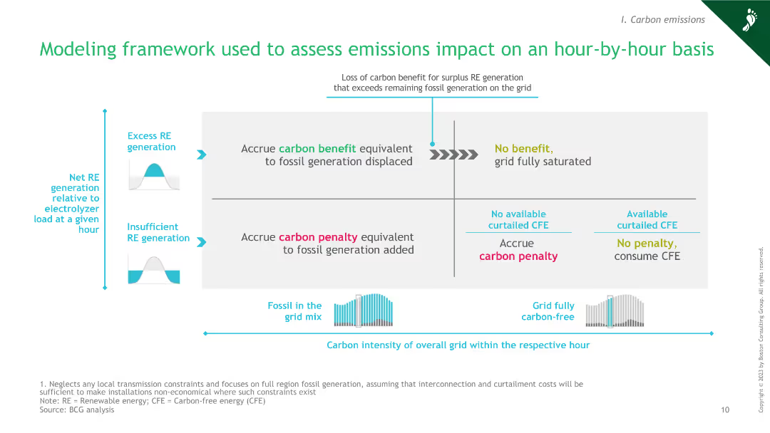
The slide features a diagram explaining the framework for assessing emissions impact hourly, including factors like excess RE generation, carbon benefit, and penalty.
Market Analysis and Trends
Energy & Utilities
This slide presents a modeling framework for assessing emissions impacts on an hour-by-hour basis, highlighting the interplay between excess renewable energy generation, fossil grid mix, and carbon penalties.
green hydrogen, emissions impact, modeling framework, renewable energy, carbon penalty
Framework
BCG
Saved
Contains column charts, data tables, and trend lines. The slide is visually rich with information on cross-border and outbound IPO activities in the Asia-Pacific region.
Market Analysis and Trends
Financial Services
Discusses the trends in cross-border and outbound IPO activities in the Asia-Pacific region for 2019, including transaction sizes and the performance of main and junior markets.
cross-border IPO, Asia-Pacific, market trends, 2019, transactions
Multiple Chart
EY
Saved
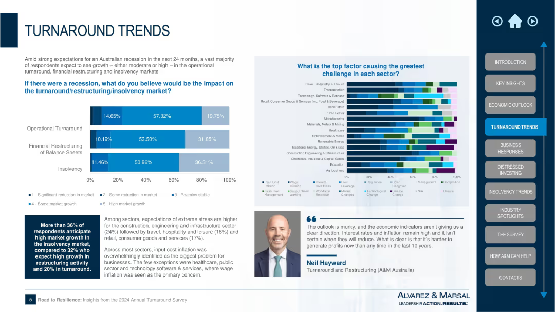
Dual-section layout with bar chart on recession impact across three restructuring areas and a multicolor stacked bar on sector-specific challenges; textual summary and expert quote included.
Strategic Planning
Professional Services
This slide discusses the potential impact of a recession on three key areas: operational turnaround, financial restructuring, and insolvency. It also identifies the top challenges for various sectors, with cost inflation being the most cited issue. The chart reveals significant stress expectations in construction, hospitality, and retail sectors.
recession impact, turnaround, insolvency, restructuring, sector stress, Alvarez & Marsal, inflation, market challenges, Australia
Multiple Chart
Alvarez & Marsal
Saved
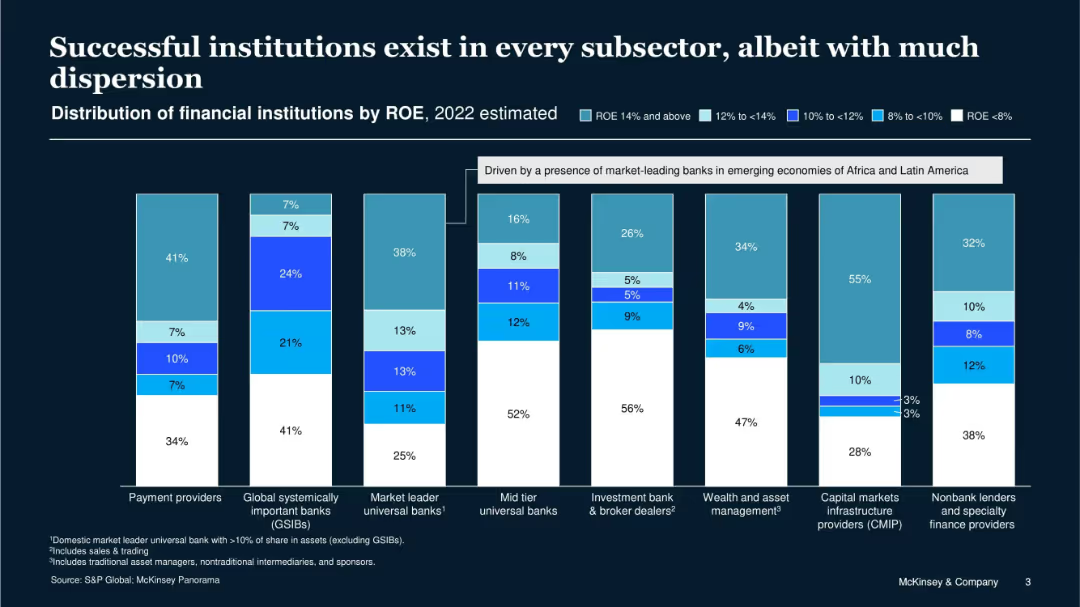
Vertical stacked bar charts showing ROE distribution across financial institution types in 2022; color-coded by ROE range.
Performance Metrics and KPIs
Financial Services
The slide shows ROE variation across financial subsectors, indicating that success is achievable in all categories despite wide dispersion. Certain segments like payment providers and nonbank lenders show high profitability, emphasizing the importance of strategic positioning.
ROE, financial institutions, profitability, dispersion, KPIs, subsectors, 2022, success
Single Chart
McKinsey
Saved
Two distinct graphs are shown. The first graph plots daily growth rates of total cases with a log scale of confirmed cases, categorizing countries by their cases doubling rate. The second graph displays cumulative number of confirmed cases for selected countries with a curve that shows the progression over days.
Market Analysis and Trends
Healthcare & Pharmaceuticals
This slide visualizes the COVID-19 case growth trends and containment efforts across different countries, useful for analyzing epidemic progression and virus monitoring.
COVID-19, epidemic progression, virus monitoring, case growth, containment efforts, daily growth rate, cumulative cases, log scale
Multiple Chart
BCG
Saved
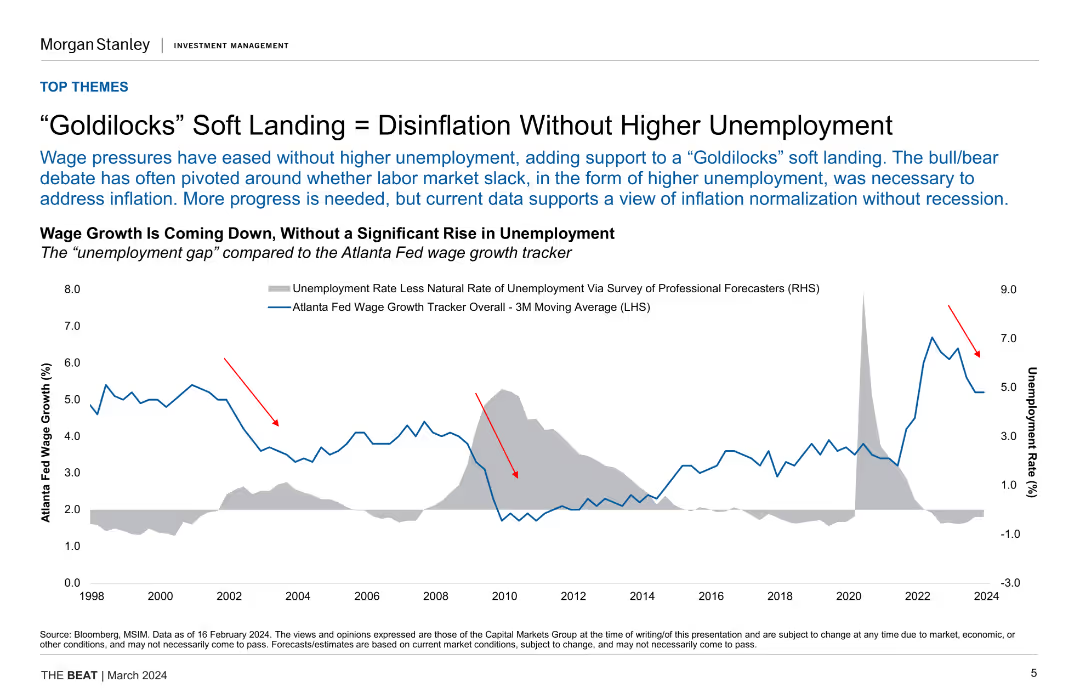
Line chart comparing the unemployment rate with the Atlanta Fed wage growth tracker, showing trends from 1998 to 2024. Includes annotations highlighting key points.
Market Analysis and Trends
Financial Services
Discusses the possibility of achieving disinflation without increasing unemployment, supported by data trends. Useful for economic analysis and policy discussions.
disinflation, unemployment, wage growth, economic analysis, policy discussion
Single Chart
Morgan Stanley
Saved
Previous
Next
If nothing, comes up, please save your slides first
Create a FREE account to continue browsing
Receive Instant Access to 1,000+ slides from companies like McKinsey, Google, and Goldman Sachs
First Name
Last Name
Email
Password
I agree to all
Terms & Privacy Policy
Thank you! Your submission has been received!
Oops! Something went wrong while submitting the form.
Have an account?
Sign in
Column Chart
Heatmap
Chevron
Org Chart
Infographic
Callouts
Timeline
List
Graphic
Picture
Process Flow
Diagram
Paragraph
Map
Table
Framework
Subtitle
Takeaway Box
Icon
Other Chart
Radar Chart
Waterfall Chart
Mekko Chart
Pie Chart
Scatter Plot
Line Chart
Bar chart
Bullet points